
Everyone thinks analyzing data is a piece of cake. 🍰
Just stare at a screen full of numbers, do some random calculations, make a few charts, and you're done.
But is it this easy? Of course not! 🙄
To do proper data analysis, you need to collect, clean, validate, format, analyze, and transform data the right way.
Businesses use data analysis to track all important KPIs, spot trends, and increase business efficiency.
In this article, we will walk you through all the essential steps you need to take when analyzing data and list tools that'd help you in data analysis.
What is Data Analysis?

Data analysis is the process of clearing, formatting, validating, and analyzing data to make data-driven decisions.
No matter what market sector you’re in or what kind of target audience you serve, at some point in time, data analysis will be the most important thing for your business.
According to a survey conducted by Sigma, 63% of companies think that data analysis increases their work efficiency and 57% of companies think data analysis helps them make better business decisions.
The primary purpose of data analysis is to analyze a ton of data, squeeze the most useful information out, and put it in front of you and your team to make crucial business decisions.
When we talk about data analysis in business, the best example we can give is tracking KPIs. If you own a website, there's a very high chance you might look at your Google Analytics kpis and Google Search Console accounts daily or weekly.
You do that to monitor traffic, impressions, CTR, session time, and whatnot. If you see something’s wrong, you ‘analyze’ it further by drilling down the data you have.
This is what data analysis is.
And then, when you’re sure about the reason behind it, you make a ‘data-driven’ decision and try fixing the issue.
But you might be wondering, why is data analysis so important? 🤔
Short answer: It's important for your business growth.
Let's consider you own a website, and its monthly traffic is declining month-over-month. You can't just ignore the fact that you're losing traffic because website traffic is directly proportional to the customer you get over time.
To get to the root of the problem, you will have to analyze target audience data, visitor behavior, demographics, and many more data sets and make a calculated decision.
Now that you know the basics of data analysis let's take a deep dive into how to analyze data for any business.
How to Analyze Data Thoroughly?
Step #1: Define Measurable Goals

Before jumping in and analyzing or even collecting raw data, have clear goals for data analysis.
Business goals help you keep aligned toward a specific objective and track data more efficiently.
When setting goals, they will vary according to the team you're setting them for, the data collected, and your role in the company.
There are different teams in a company, and different teams will have different goals:
-
A marketing team would set a goal of improving organic traffic and making new partnerships
-
A finance team might look to reduce cash burn rate and discover new cost-saving methods
-
The sales team might set a goal of booking more meetings next month
-
The product design team might look to add new features to the product and impress customers
But did you notice one thing in all the above 4 points? The goals mentioned aren’t measurable.
Get this; when setting goals, try having goals that you and your team can measure. This helps you know how your business is performing.
The above-mentioned examples can be converted into measurable goals by being specific:
-
Marketing Team Goal: Increase organic website traffic by 40% and make 5 new partnerships in Q3 2022
-
Finance Team Goal: Reduce cash-burn rate by 20% and discover 3 new methods to save money
-
Sales Team Goal: Book 20 new meetings next month
-
Product Design Team Goal: Add 5 new features to the product in Q3 2022
These goals will help you and your business know what data to collect, tools to use, and in decision-making.
Step #2: Collect Data From All the Sources
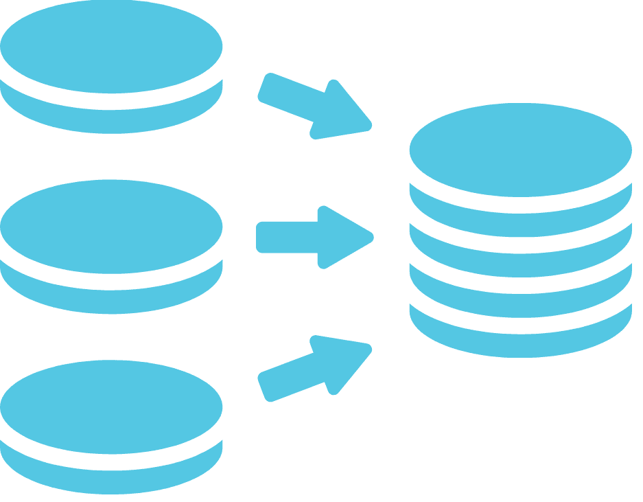
Now that you’ve set measurable goals, it’s time to collect data from all the sources you can.
When collecting data, ensure that you collect both quantitative data and qualitative data.
-
Quantitative Data: Data that you can measure and tweak, for example, a bar graph
-
Qualitative Data: Unstructured data that needs structuring before data mining, for example, reviews or videos
In most cases, quantitative data is stored in databases like Excel, Google Sheets, Airtable, etc. This data can be easily imported into any tool you use for data analysis.
But qualitative data isn't so easy to collect and import. Unlike quantitative data, qualitative data is stored in cloud servers of multiple tools that you might use.
And most importantly, the majority of qualitative data is text-based; that’s not as easy as measuring and analyzing quantitative values.
Here are a few examples of what we mean by qualitative data:
-
Customer emails
-
Customer reviews
-
Support tickets raised by customers
-
Social media comments and other data
And many more…
Pro Tip: Data collection is crucial because your business goals will all be aligned with them. So take time and make sure you collect both qualitative and quantitative data from all known sources.
Step #3: Decide Upon Which Data Analysis Methods to Use

There are six major types of data analysis processes. Let’s look at them one by one.
#1. Text Analysis
Data is not just a random string of numbers; it's sometimes text as well.
Text analysis uses natural language processing (NPL) and machine learning (ML) to convert human language into language that a machine can understand.
The tools used in this process can sort text in accordance with the topics, extract keywords, and read the emotion in the text to give you the intent.
Text analysis is best to answer the question of what is happening and the reason behind it. It's majorly used in businesses that want to analyze customer feedback via reviews, emails, or social media comments.
#2. Descriptive Analysis
Descriptive analysis gives you the answer to exactly ‘What happened’ to a specific data set when analyzing it.
It's one of the most basic types of analysis, to begin with. You can calculate the mean, median, mode, percentage, frequency, etc, with descriptive analysis.
Although it's a very powerful method, descriptive analysis has numbers and therefore can't explain to you the reason behind why you see these specific numbers.
#3. Inferential Analysis
Inferential analysis is the most important analysis process when tracking KPIs for business.
It compares a group of data with historical data and tells you what’s actually happened and the reason behind a KPI’s fall or rise.
So if you have a huge database of all the customers who've bought your product, with the inferential analysis, you can analyze small datasets like repeat customers, customers according to demographics, customers who bought your product via mobile, etc.
This data analysis process is widely used in market research campaigns. A perfect example of this would be a fashion brand trying to figure out the money spent by female vs. male customers.
#4. Diagnostic Analysis
Diagnostic analysis is also known as root cause analysis. As the name suggests, this analysis helps answer the question - Why did it happen?
The process extracts insightful data from the dataset and tries to understand why a KPI crashed or increased a hundred folds.
Patterns and deviations are the two elements diagnostic analysis uses to identify reasons.
The best use of such analysis is to study your customers' behavior.
If you see a sudden spike in customer complaints or see a significant increase in sales via mobile phones, diagnostic analysis is the key to all your questions.
#5. Predictive Analysis
Predictive analysis takes existing data into consideration and predicts what might happen to a certain metric in the future.
There are a lot of 'ifs and buts' when doing predictive analysis, and that's because no one has seen the future (have you 😉).
The best use of predictive analysis is when you track sales KPIs. Based on the demographic, customer salary, age, etc, you can predict how good your business will do in a certain location.
Step #4: Clean and Validate Your Data

After you’ve collected data from several data sources, there will be some errors and inaccuracies that might need corrections. Data cleaning is a practice that aids you with it.
Here are some tips for cleaning your data thoroughly:
-
Add a title to all the rows and columns, so it's easily understandable
-
Remove duplicate rows and columns from your data to avoid confusion
-
Delete all the entries that you might not use when doing data analysis and creating KPI dashboards
-
Ensure that the font size, color, and type are the same throughout for consistency
After clearing data, you can move on to validating your business related data further.
Data validation is the process of eliminating the entry of unwanted data in your dataset.
With no proper validation, measuring KPIs could be a nightmare for you. It's not just time-consuming, but it will also result in incorrect values and waste time.
If you’re just starting your business and have a small data set to track, we’d suggest you use Google Sheets to validate your data. The process is manual but doesn’t take much time.
Here’s how to do it:
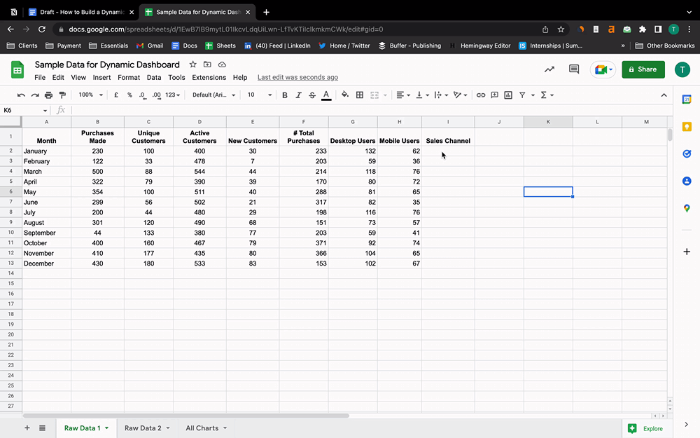
But if you have a large dataset that’s tough to clean manually, you can use a data cleaning tool like Data Ladder to clean data automatically.
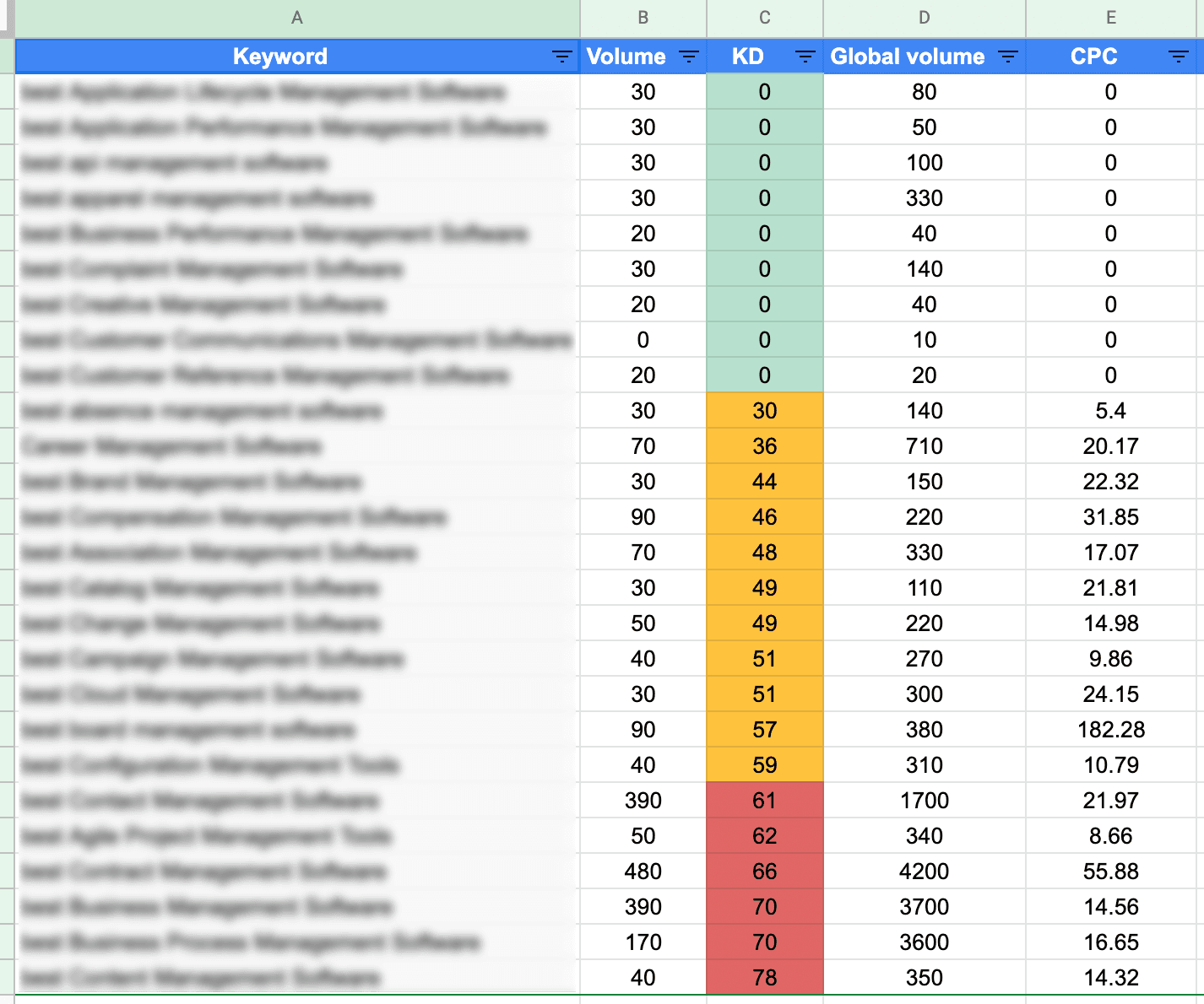
Step #5: Conditionally Format Your Data for Easy Access
After thoroughly cleaning your data, it's time to format it to increase user-friendliness.
Conditional formatting is all about setting limits and color scheming data in order to divide a large data set into multiple smaller groups.
This technique is handy for businesses who want to sort or divide their data by demographics, age, gender, etc.
Step #6: Start Data Analysis and Look for Patterns and Trends
When analyzing data, spotting trends is a crucial part as it will tell you where you’re going wrong.
For numerical data, spotting trends and patterns is easy, but if you have more qualitative data than quantitative data, you might have to drill deep to spot trends.
But remember one thing; trends and patterns aren't always right. Try not to rely so much on the correlation between any two trends.
For example, if you see a huge spike in your YouTube subscription rate and at the same time there are a lot of sales calls booked, don't assume both these things are related.
They might be, or they might not be!
Do a proper data analysis before drawing such conclusions.
Step #7: Compare Your Data with Historical Data
Comparing present data with historical data is an underrated yet impactful technique when doing data analysis.
You won’t be able to find any trends or patterns for your current data set if you look at it in isolation.
Comparing your data with historical data gives you an idea of what needs to be changed in your current strategy so that it's in line with your trend.
Or it might also give you an idea to break the trend (if it’s good for your business).
But it’s not always possible to compare your data with historical data. What if you’re just getting started with your product and have no historical data to refer to?
When such situations arise, industrial benchmarks can come to your rescue.
You can compare your product data with similar company benchmarks and see where you stand.
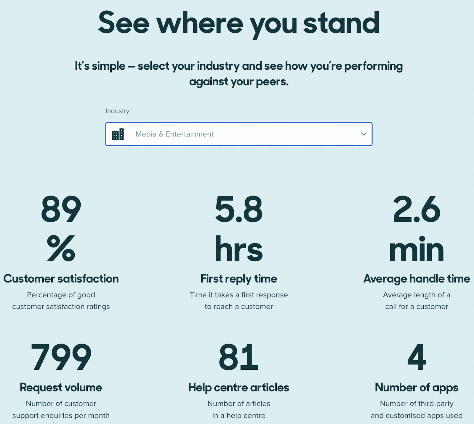
But bear in mind that it's not easy to find a company that's very similar to yours (same size, same revenue, same number of customers, etc.), so use their data as a reference point and compare accordingly.
Step #8: Share Data with Your Team

When you're expanding your business to new horizons, tracking KPIs isn't a one-person job.
With so many different KPIs for various departments in your company, you’d spend your whole day analyzing data, tracking KPIs, and finding solutions.
Instead, hiring a team of experts for each department in your company and persuading them to track KPIs is a better idea, don’t you think?
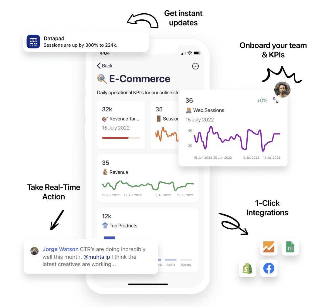
A KPI dashboarding tool like Datapad (disclaimer: this is our tool) helps you onboard your team in seconds. Onboard your team, assign them the department-specific KPIs, and talk to them about these KPIs in real-time via the comment section inside the app.
Step #9: Analyze Data That’s Not In Line with Your Goals

Remember the first step of this step-by-step data analysis process? It was to set measurable goals.
The trends, patterns, and datasets that aren’t in line with your set goals might need attention. You can’t just let things fall into place and expect everything will be good.
Taking action against data that's not in line with your goals is the only thing that will make your business more efficient and, thus, more profitable.
After analyzing data and spotting irregularities, look for the reason behind the rise of fall of a certain dataset. If you think there can be multiple reasons for it, start testing and experimenting and look at what works.
Step #10: Visualize Data the Right Way
From Step 1 to Step 9 - everything was about data analysis. But, in order to read the data appropriately, you need a proper data visualization tool.
A KPI dashboarding software helps you convert the raw data into stunning visual graphs and charts, puts them on a dashboard, and lets you track all the KPI-related data with ease.
With a KPI tracking tool, you can onboard your team, set goals, get notifications about your KPIs, and import data from multiple sources.
So now that you know all the steps you should take to analyze the data, it’s time to look at some data analysis tool that’d take things to the next level.
What are the Best Data Analysis Tools?
#1. Tableau
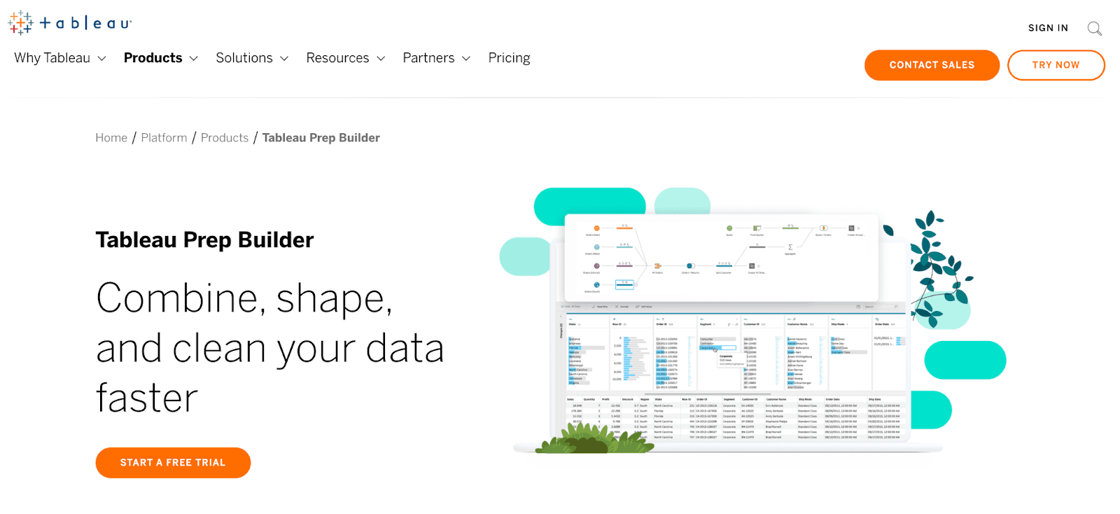
Tableau is an all-in-one data analysis software that lets you combine, shape, and clean data efficiently. It’s trusted by the likes of Verizon, JPMorgan & Chase, and some other big organizations globally, making it one of the most trusted data analysis tools worldwide.
Who Is It For?
Tableau is for mid-sized companies and large enterprises who need to analyze huge datasets in-depth. The tools help you in data validation, spotting trends, and visualizing data to analyze KPIs.
Features
-
Provides a visual and direct path that you can access like a drag and drop builder to import, clean, combine and shape data the way you want
-
Comes with three coordinated views that let you visualize row-level data, profiles in each column, and your data preparation process
-
Get access to Tableau Desktop, servers, and cloud, and import data from any platform you can think of
-
After editing data, you need not wait to see the results; Tableau has the capability to present changes in real-time
-
Has an AI that democratizes data modeling and helps you make better business decisions
-
Has Slack integration that you can leverage to share reports and KPI dashboards with your team and get their insights
Pricing
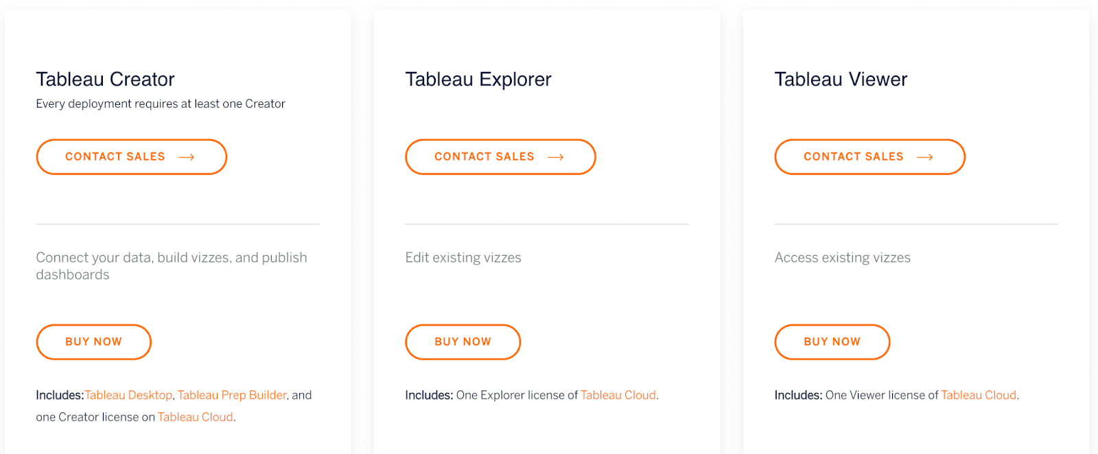
Tableau doesn’t reveal its pricing on the website. You need to contact their sales team to get a quote. But you can select from plans:
-
Creator
-
Explorer
-
Viewer
It also has some add-ons that you might need to analyze and visualize data down the line.
Pros and Cons
Pros
✅ No coding knowledge is required to access Tableau
✅ The tool is mobile-compatible (to some extent)
✅ Great customer support
Cons
❌ You should have technical knowledge about data analysis to use the tool
❌ Lack of functionality and scheduling things
#2. Microsoft Power BI
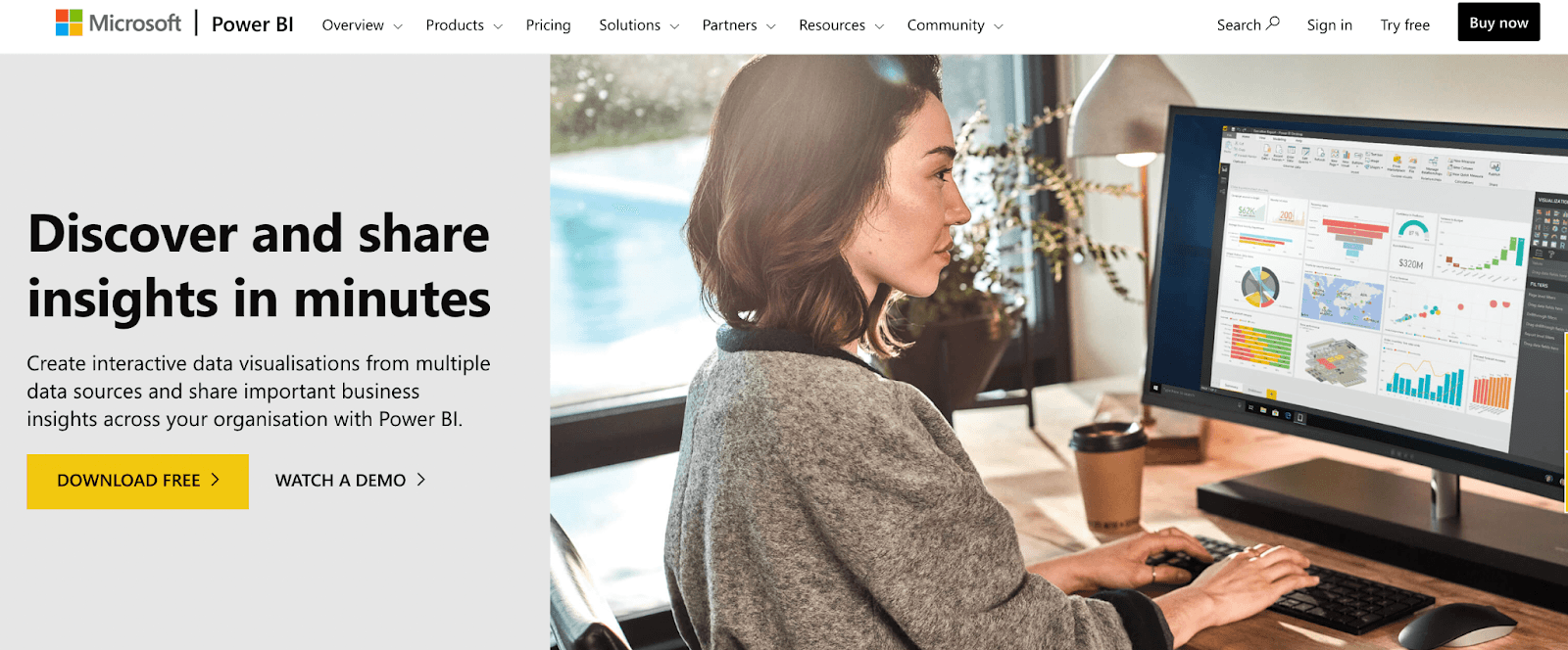
Microsoft Power BI is one of the many tools in the Microsoft suite that helps you analyze and visualize data.
When Power BI is integrated with Excel, a solid data analysis tool comes to life that you can use to validate, clean, and format your data, no matter how big the dataset is.
Who Is It For?
Microsoft Power BI is for Windows business users and all kinds of companies who are addicted to analyzing data via Excel. The tool has some very powerful features you can use for data analysis.
Features
-
Comes with 500+ data connectors, so you can import data from wherever it's sitting
-
The power query of Microsoft Power BI helps combine, transform, and organize all your data at affordable cost, time, and expertise
-
Tableau’s data modeling capabilities allow you to create modeling templates and use them later on; create models automatically via the point-and-click interface
-
Create automatic AI-generated visualizations to get a better understanding of the raw data you import
-
Has more than 100 visuals to select from and create charts and graphs for KPI dashboards manually
-
Lets you onboard your team so that you can share data with them and assign them individual KPIs to track
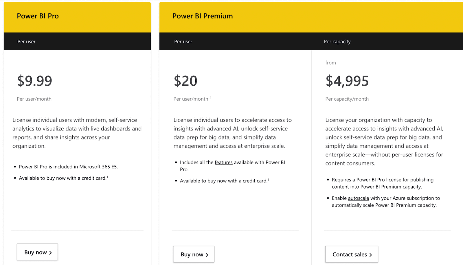
Pricing
Microsoft Power BI has three plans to choose from:
-
Power BI Pro: $9.99 per user per month
-
Power BI Premium Per User: $20 per user per month
-
Power BI Premium Per Capacity: $4,995 per capacity per month
Pros and Cons
Pros
✅ Gives you excel integration and 500+ data connectors to import data
✅ Microsoft constantly keeps updating the tools to implore the CX and remove bugs
✅ Supports custom visualizations
Cons
❌ The user interface isn’t too good
❌ You need to know formulas to implement critical calculations
#3. Looker
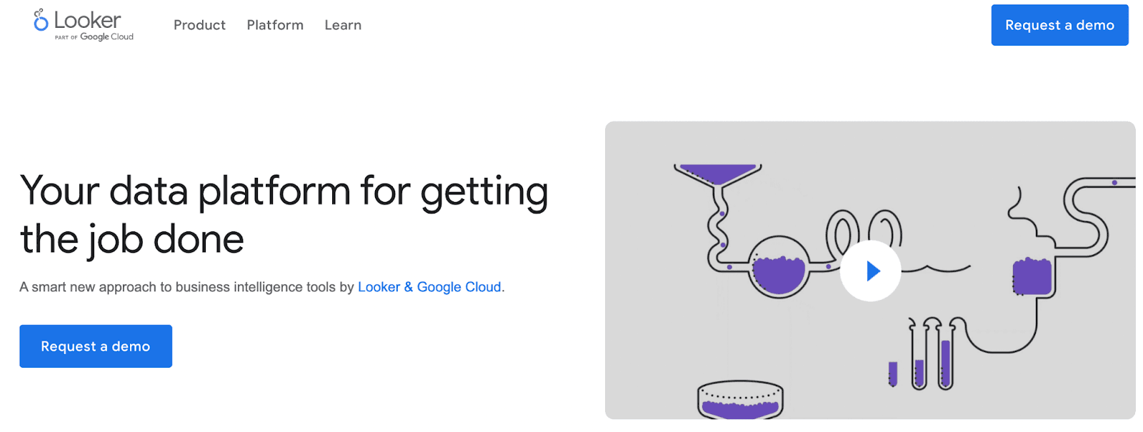
Looker, a part of Google Cloud, is an advanced data analysis tool that helps you model data and sorts it into multiple datasets. The platform has multiple tools to help you out with data analysis and visualization.
Who Is It For?
Looker is for businesses with a strong team of analysts who can do data modeling like a pro. You need to have a good understanding of data analysis elements before using the tool. So the tool isn't meant for complete beginners.
Features
-
Helps you find trends, patterns, and links between multiple data sources and interlink them to visualize data better
-
Analyze row-level and column-level data with effective visualization elements and make data-driven decisions
-
If you're a data analysts, you can use Looker's SQL Runner to fire queries and get answers to all the questions
-
The extension framework of Looker helps you build applications and data experiences easier and faster
-
Create interactive and dynamic KPI dashboards with Looker and drill-down on data to get a birds-eye view of all the operations
Pricing
Looker doesn’t list its pricing on the website. You can book a demo of the platform, test it out, and then the sales team will contact you to discuss the pricing.
Pros and Cons
Pros
✅ Great tool for large analytics projects
✅ Easy UI; you can get accustomed almost immediately
✅ Amazing visualization elements to choose from
Cons
❌ Isn’t much scalable as your data increases
❌ It takes a little more time to upload data than other tools
#4. Metabase
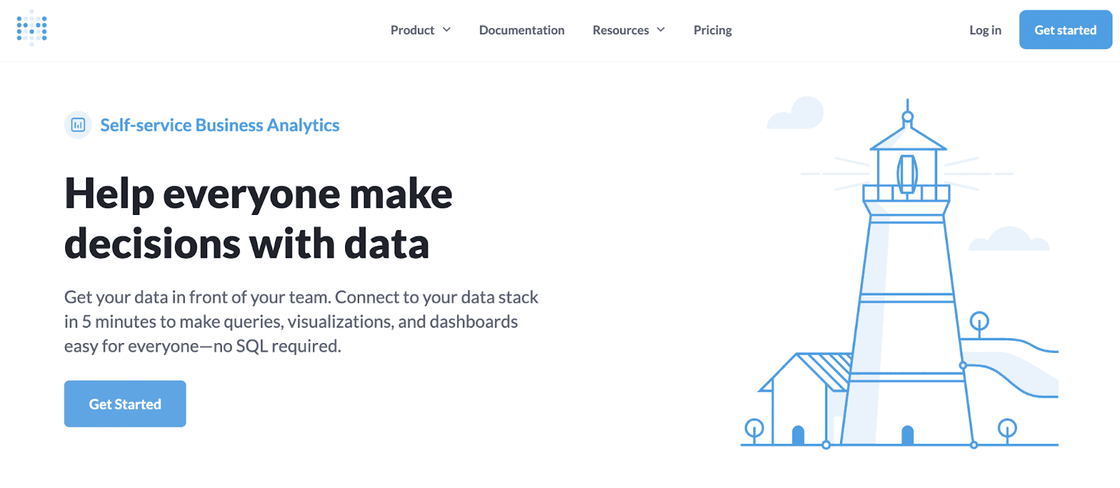
Metabase is a self-service business analytics tool that makes data analysis easy. The tools have enterprise-grade compliance - SOC 2 Type 1, GDPR, CCPA, so you don't need to worry about security and data leaks.
Who Is It For?
Metabase is a tool best suited for enterprises dealing with confidential data. The software has many compliances in place that keep your data safe and secure.
Features
-
Sort, filter, and segregate your data with Metabase to analyze everything in a better way
-
The visual query builder lets you and your team dive deeper into the data
-
Comes with easy-to-build dashboards and sharing options so that you can share dashboards with your team via links, embed them on websites, or share them via social media
-
Integrate Metabase dashboards with your Slack channels to get regular updates in your inbox
-
White label reports and sends them across to your clients to analyze and suggest changes
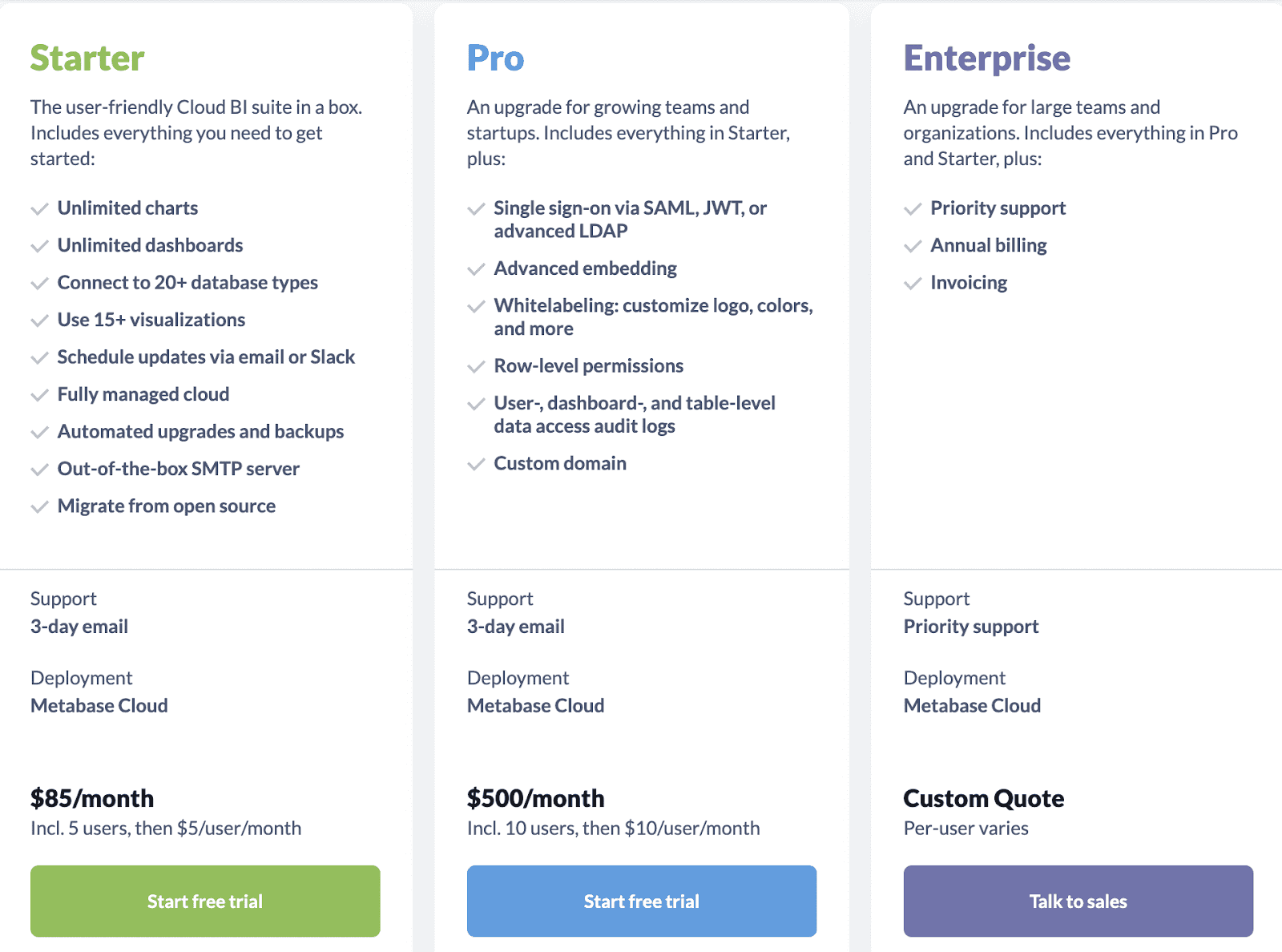
Pricing
Metabase has three plans to choose from:
-
Starter: $85 per month - 5 users
-
Pro: $500 per month - 10 users
-
Enterprise: Contact the sales team for a quote
Pros and Cons
Pros
✅ Fairly simple to use with a clean interface
✅ Has the ability to mail your reports automatically
✅ Drag and drop builder available to create visual graphics for multiple datasets
Cons
❌ Tool’s a little expensive for small businesses
❌ Doesn’t have many tutorial and community support
#5. Domo
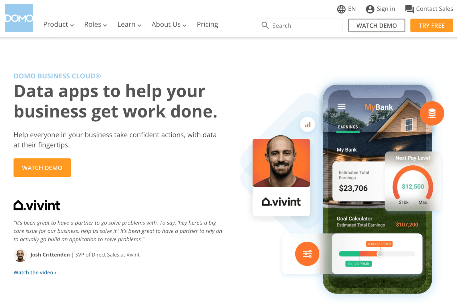
Domo is a self-service business intelligence software that helps small and medium-sized businesses analyze data and track KPIs.
The tool is used by business leaders like DHL, MasterCard, and ebay, which makes it a trustworthy data analysis software.
Who Is It For?
Domo is great for brick and mortar stores that track their KPIs online. Many businesses track supply chain KPIs or consumer-based KPIs via Domo. From manufacturing to retail, every business can use Domo and optimize business operations, no matter what size.
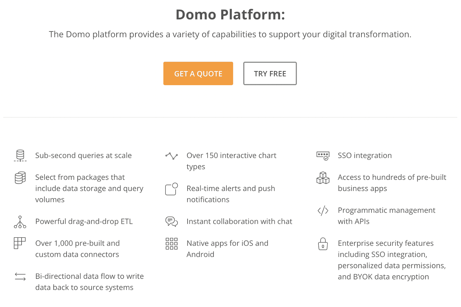
Features
-
Has self-service analytics and automated reporting features to save time and optimize the productivity of you and your teammates
-
Comes with permission management, so you have control over who can edit your data and who can just view it
-
Enable automated alerts to get notifications when your data behaves rather strangely
-
Share live reports via social media, PDF, CSV, or links
-
Lets you perform fully self-service ad-hoc analysis
Pricing
Like Looker and other tools in the list, Domo also doesn't reveal its pricing on the website. You can get a quote by contacting their sales team and trying the platform for free to get started.
Pros and Cons
Pros
✅ Multiple connections with other apps makes it easy to import data
✅ Has built-in formulas, so you don't need any technical knowledge to do the calculations
✅ Provides in-depth insights into customer behavior
Cons
❌ Steep learning curve
❌ Domo university - a platform that offers tutorials isn’t as impactful as it should be
Keep All Your Data in One Place and Share With Your Team
Until now, you might've got a good idea about how to do data analysis correctly. But a business's job doesn't end just by analyzing data; you need to transform that data into visualizations to get an even better understanding of the data.
And for that, we’ve built an epic KPI dashboarding tool - Datapad.
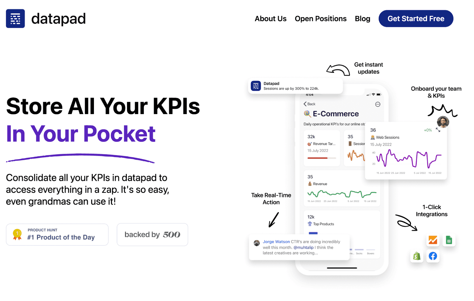
Datapad is a mobile-friendly KPI dashboarding app that you can download on your mobile phones (Android or iOS) and track KPIs on the go.
It gives you quick access to your data. So it doesn't matter if you're at home chilling or in the mountains camping; to access your data, all you need is a cell phone and an internet connection.
But that's just not it; you can even onboard your team in seconds, share all the KPIs with them, and chat with them in real time.
So when you're done analyzing data, use Datapad to transform datasets into stunning visuals and keep all the KPIs in your pocket.