
Some of the best sales dashboard software for visualizing your metrics and KPIs are Datapad, Klipfolio, Databox, Scoro, Qlik Sense, Geckoboard, Looker, Zoho Analytics, Simple KPI, Dasheroo, and Datapine.
In this guide, you will find a detailed review of these sales dashboard software and find out which is the best dashboard solution for your business.
So let’s get started!
What Is Sales Dashboard Software?
A sales dashboard software is a platform that allows you to collect, monitor, and visualize all your sales-related KPIs and metrics.
The software provides a quick overview of your company's performance in context with revenue, leads, conversion rates, monthly/annual profits, and sales growth. 📈
Basically, it uses a combination of visual aids to represent these data in an easy-to-understand format. You can even create your own sales dashboard, but that might consume time, and on another note, it's unnecessary when you have plenty of options to automate the process.
But why do you actually need a sales dashboard software? 🤔
A typical sales dashboard software helps you streamline your sales funnel and pipeline, thereby allowing you to gather valuable insights into your sales performance.
For small to medium-sized companies, managing the sales process becomes daunting at times.
However, implementing the right dashboard solution can help you save time and resources, and also minimizes the risk of human errors.
At this stage, cherry-picking a software is what you must avoid because there are several sales dashboard software in the market boasting about their perfection.
So, how do you choose the best software for your business without getting honey trapped?
Here are a few factors to be considered when choosing a sales dashboard solution for progressive sales teams.
Factors to Consider When Choosing the Best Marketing Dashboard Software
#1. Is It Easy Enough for You to Set Up?
The setup process for any dashboard solution involves many phases: Connectivity to data points, setting up key performance indicators, onboarding team members, and more.
In most cases, it might take hours or even days to get your dashboard up and running.
In sales, where every day is a do-or-die game, you must cast around a software that requires minimal effort to set up. Besides, ensure that your team shouldn't have to spend much time training for using the software.
Pro Tip: Check for the software reviews and ratings online. Focus on three major aspects: Ease of setup, learning curve, and availability of training materials.
#2. Would It Give You Quick Access to Your Dashboards?
Being part of a dynamic market where uncertainties are not uncommon, your dashboard should be handy. Not literally, but you should be able to access it instantly from anywhere.
This, especially, is beneficial for people with offline sales, like real estate agents or retail store owners. Imagine trying to access a specific metric, say monthly sales revenue, only to find out you lost it in the crowd of other KPIs.
By quick access, we also mean that dashboarding software must make available your desired KPIs within seconds, not even minutes ⏳.
Typically, it can be achieved if the software has NLP (Natural Language Processing) or advanced search features.
#3. On the Go Access?
As said, sales is a time-sensitive matter, and people always want to check numbers quite often.
Even when they are off work, traveling, or spending quality time on vacation – the curiosity to check sales numbers never mellows out. 🧐
To access your sales dashboard on the go, ensure that the software you are choosing isn't desktop-ridden. Fortunately, there are plenty of tools in the market that offer mobile-friendly solutions.
Using a mobile-friendly software allows instant access to your sales dashboard anytime and anywhere. So, having a mobile-friendly tool is best in any scenario.
Now that we know what factors comply with a great sales dashboard software, here's a list of 11 software that we thought would be a perfect fit for your sales team.
What Are the Best Sales Dashboard Software?
#1. Datapad

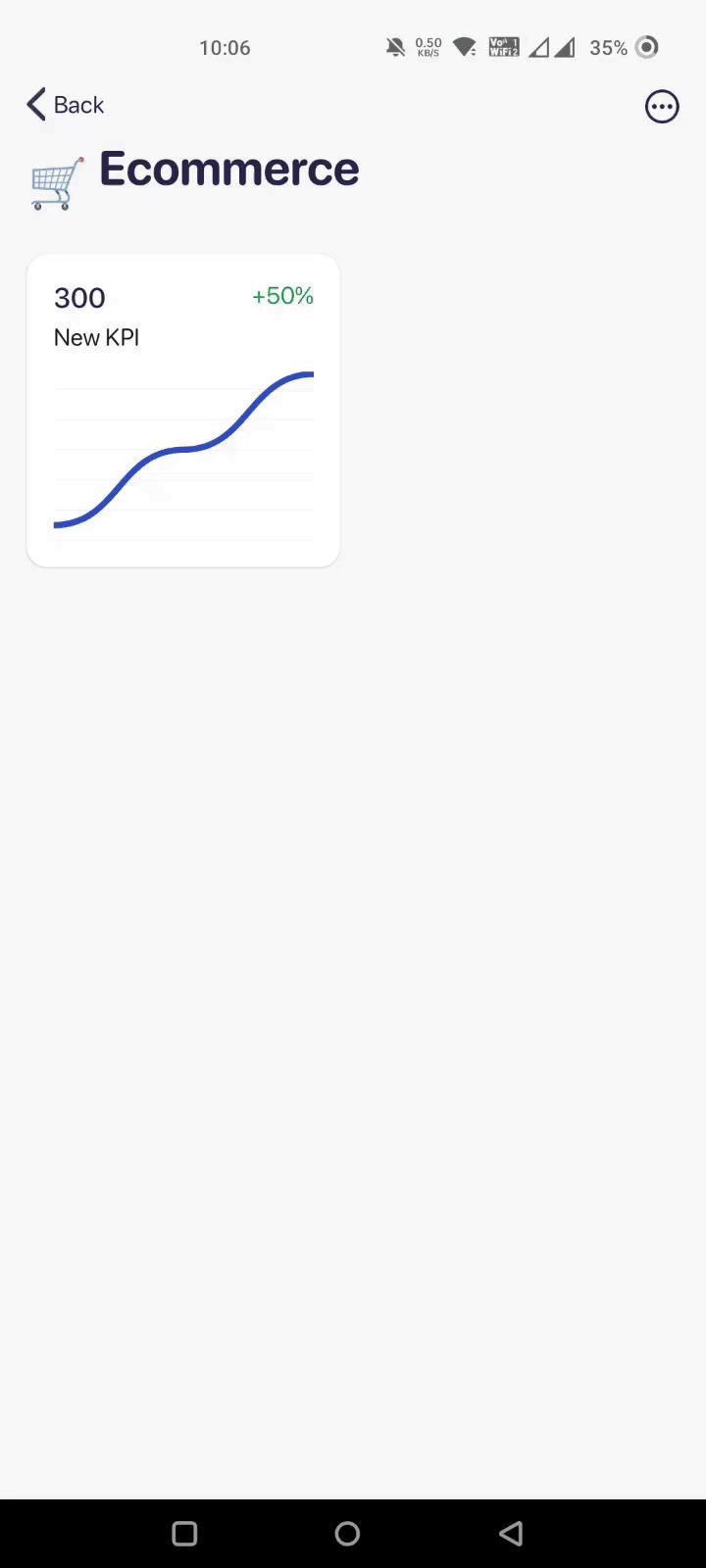
Datapad is the industry's first mobile-only KPI dashboard software. Its mobile-first approach allows you and your team to instantly access your sales KPI dashboard from your smartphone. 📱
Who Is It For?
Datapad is for sales professionals who wish to monitor their sales performance on mobile phones while being anywhere around the globe. Besides, it's a no-code platform perfect for non-tech people and beginners willing to measure their business's sales performance.
Key Feature #1. Instant Access to KPIs
Datapad is a quick and compact tool, with a feature-rich CX enabling it to perform every action that a typical desktop-ridden dashboard software does, or even better.
You can easily view, monitor, and customize your sales dashboard on the go. Besides, Datapad's mobile app is tested for responsiveness, resolution, and compatibility on all known small-screen devices.
Furthermore, we ensured that you save time searching for specific KPIs. So, Datapad allows you to easily search for any KPI or metric just by typing in the metric name in the search bar.
Don’t believe us? See for yourself:

Key Feature #2. One-Click Integrations and Ease of Data Import
Datapad offers one-click integrations to popular data points such as MY SQL Database, Google Sheets, Facebook Analytics, Google Analytics, and many more.
We are also working on enrolling integrations to Shopify, Instagram, and other popular platforms. But for the time being, you can use our manual data import feature to add custom databases to your dashboard.
Here's how you can do it:
Key Feature #3. Team-Collaboration
Our tool allows you and your sales team to collaborate in real-time. You can simply comment under a particular metric to strike a conversation. This is as simple as it sounds.
Imagine being on vacation to the Bahamas ⛱ and suddenly noticing a sudden dip in sales calls. What would you do? Just pack your things and come back home in between vacation?
Nah!
With Datapad, you can easily comment under that KPI and notify your sales team manager to look after the matter.
Meanwhile, the sales manager can continue the discussion forward and keep you updated in the comments. It works just like a thread on Twitter.

Key Feature #4. Flexible Customization Options
Datapad offers intuitive drag-and-drop customization options. It has a gallery of pre-built data visualization elements such as charts, tables, line graphs, and more which you can use to design and customize your dashboard quickly.
You also have the freedom to customize details like fonts, colors, text, and more to change the look and feel of the dashboard. Besides, you can enable role-based management to control who can edit and customize your sales dashboard.
Pros and Cons
Pros
✅ Easy-to-setup and use
✅ Absolutely no-code platform (best for beginners)
✅ Easily setup custom alerts and notifications
✅ Free-forever tool
Cons
❌ No web version available (coming soon)
❌ Not suitable for creating sophisticated dashboards
#2. Klipfolio

From highly customizable dashboards to self-service exploration, Klipfolio empowers you to centralize data and confidently make better data-driven decisions.
Who Is It For?
Klipfolio is a low-code platform that can fit any industry. However, its sales dashboards are mainly used by medium to large-sized organizations with a dedicated sales department and 6-figure numbers to focus on.
Features
-
Use one-click integrations to over 300+ data sources or input data manually via REST/URL, spreadsheets, or custom queries
-
Has an extensive library of formulas and functions that you can use to sort data in minutes
-
Use the in-built Klip Editor to easily customize the look and feel of your dashboard; choose from over 32+ pre-built chart types to quickly visualize data
-
Perform advanced customizations and create stunning visuals elements using HTML, CSS, and Javascript
Pros and Cons
Pros
✅ Great for tracking business sales and revenue
✅ Reliable and responsive support team
✅ An excellent number of integrations and the ability to connect with custom data points
Cons
❌ Does require technical expertise, giving it a steep learning curve
❌ Extremely difficult to configure
❌ It might get slow when visualizing complex databases
#3. Databox
Databox is an easy-to-use dashboarding platform that eliminates the guesswork and simplifies your sales process. It collects all your sales data in one place and allows you to monitor and present data via beautiful dashboards – all in real-time.
Who Is It For?
20,000+ businesses trust Databox with its sales reporting. In fact, it's awarded as the easiest-to-use platform for small businesses.
Besides, Databox offers a free-forever plan, so it might be an ideal option for freelancers and individual sales professionals.
Features
-
Over 70+ one-click integrations to popular data sources and 200+ pre-built dashboard templates to quickly collect and visualize data
-
Easily customize templates or build custom dashboards from scratch using the in-built drag-and-drop dashboard designer
-
Get alerts and notifications regarding KPI trends via emails, push notifications, or Slack; setup automated alerts when a KPI hits a specific threshold point
-
Use white-label reports to easily share and present fully branded dashboards on a custom domain
Pros and Cons
Pros
✅ Excellent number of integrations and custom data-points
✅ Comes with a display-to-TV feature
✅ Offers a free plan
Cons
❌ Has limitations to viewing historical data (depends on the plan you choose)
❌ The mobile app isn't responsive enough (might encounter half-volley graphs and dashboards)
#4. Scoro

Scoro is an award-winning work-management software that helps agencies and consultancies centralize data and streamline their sales pipeline via interactive dashboards and reports.
Who Is It For?
Scoro is for small to medium-sized enterprises who are looking for feature-rich yet affordable sales dashboard software.
Features
-
1000+ integrations to popular data points, including well-known accounting software like Xero and QuickBooks
-
Use predictive analysis to forecast future sales; create custom dashboards to assign, track, and monitor individual team sales target
-
Enable role-based management to control the visibility of sensitive sales data to limited people
-
Create customizable invoices based on quotes, orders, or work reports, and turn documents into personalized PDFs in just a few clicks
-
Simplify invoicing using pre-built client profiles, standard quotes, and multi-currency rate cards
Pros and Cons
Pros
✅ User-friendly interface
✅ Excellent team collaboration feature
✅ Automated billing management
Cons
❌ Being a management platform, it might have a steep learning curve for beginners
❌ Minor bugs in the software, such as the inability to link your team to the CRM
#5. Qlik Sense
Qlik Sense is a cloud-based analytics and data visualization platform that empowers users of all skill levels to easily create flexible and interactive dashboards and make better data-driven decisions.
Who Is It For?
As said, Qlik is for all kinds of users interested in low-code or no-code solutions. It has over 38,000+ customers, including top sales analysts. For the most part, its best use cases are from e-commerce, SaaS, and IT industries with complex sales models.
Features
-
Use the in-built insight-advisor tool to auto-generate analysis reports, get chart recommendations, and pre-built data mashups
-
Create interactive and shareable dashboards; include pre-built visual elements that automatically update in real-time
-
Build automation workflows and trigger event-driven actions using Qlik Sense application automation technology
-
Complete data governance with Data Catalog that makes it easy to find the right data and know its origin and journey
Pros and Cons
Pros
✅ Offers smart analytics like Insight advisor and Advanced Calculations
✅ Allows custom application development
✅ Has flexible and robust security provisions
Cons
❌ Issues regarding resolution and responsiveness in mobile devices
❌ Frequent bugs and glitches in operating Qlik Engine (improper loading, weak ODBC connections, error messaging)
#6. Geckoboard

Geckoboard is an easy-to-use data analytics and dashboarding tool that help businesses collect, monitor, and visualize crucial sales KPIs via professional sale dashboards in real-time
Who Is It For?
1000s of data-driven companies like AirBnB and Buzzsumo leverage Geckoboard's sales dashboard to keep teams focused and measure performance.
Features
-
Instantly connect data from 80+ data sources or pull in data using spreadsheets, Zapier, or custom APIs
-
Use drag-and-drop editor to quickly resize, group, or rearrange dashboard elements; add other widgets such as status indicators, comparison charts, and more
-
Generate shareable links to live dashboards or schedule dashboard snapshots to Slack channels or via emails
-
Enable role-based management to control who can view/edit/access your dashboards
-
Use the display-to-TV feature to present dashboards on big screens across the office to keep the team accustomed to sales targets and achievements
Pros and Cons
Pros
✅ Easy-to-configure
✅ Excellent number of integrations
✅ Interactive user interface
Cons
❌ Doesn’t provide real-time alerts or notifications
❌ Lacks quality customer support
#7. Looker

Looker is a BI and analytics software that helps businesses collect, monitor, and visualize sales-related insights in real-time via interactive dashboards.
Who Is It For?
Looker is an easy-to-use platform, making it an excellent choice for anyone looking for something simple but still providing plenty of insightful information via visual elements and beautiful dashboards.
Features
-
Easily link to multiple databases like BigQuery, Snowflake, and 50+ supported SQL dialects, and maintain multi-cloud data environment
-
Use Looker blocks, embedded visualizations, and more to streamline workflow and create interactive reports and dashboards
-
Has a developer portal that gets you access to overview guides and tutorials for Looker APIs and SDKs, Components, Extension Framework, and the Looker Marketplace
-
Use Looker's mobile app to instantly access dashboards, check on issues, or monitor KPIs on your mobile device
-
Leverage predictive analytics and data modeling to uncover hidden insights
Pros and Cons
Pros
✅ Gives a 360° view of your sales performance
✅ AI and ML-driven predictive analysis and data modeling capabilities
Cons
❌ The platform doesn't integrate with Excel
❌ Limited customizations and visualization options
#8. Zoho Analytics
Zoho Analytics is a self-service BI and analytics platform. Its CRM and sales analytics platform helps you monitor every aspect of your sales cycle, create customizable dashboards and reports, and make better data-driven decisions.
Who Is It For?
Zoho Analytics serves over 2 Million+ users globally, including some top companies like HP, Hyundai, and IKEA.
So, evidently, it's an excellent software for large-sized organizations with tons of sales data to be monitored regularly. However, due to its enterprise-level pricing, it's not a good platform for small businesses.
Features
-
Easily create multi-dimensional reports by mixing different sales data from multiple platforms
-
Use the AI-powered Anomaly Detector widget to compare your actual sales performance with the predicted trend
-
Leverage cohort analysis to uncover hidden insights; easily compare and correlate different sales metrics using quadrant analysis
-
Has an in-built sales comparator that helps you analyze individual sales rep performance over time
Pros and Cons
Pros
✅ Ample amount of customization options
✅ CRM synchronization is pretty good
✅ Comes with a free trial
Cons
❌ Initial setup and training might consume time
❌ Limitations in dashboards and report sharing
#9. SimpleKPI

SimpleKPI is an easy-to-use software that allows sales professionals to collect, analyze, and visualize sales data via beautiful dashboards and reports.
Who Is It For?
Whether you're a beginner or an expert in your field, SimpleKPI is an easy-to-use, simple-to-set-up, and affordable dashboarding solution for all sizes of businesses.
Features
-
Choose from a gallery of pre-built data visualization elements and dashboard templates to quickly create dashboards from scratch
-
Use comparison charts to create multi-dimensional KPI reports and dashboards; easily export reports in multiple formats such as PDF, Word, or Excel
-
Use drill-down and up features and run detailed query searches to delve into your data and discover hidden insights
Pros and Cons
Pros
✅ Interactive data visualization elements
✅ Customizable dashboards and real-time data monitoring
✅ Easy-to-use integration tools
Cons
❌ Not compatible with iOS and Android devices
❌ Lacks some budgeting and forecasting features
#10. Dasheroo
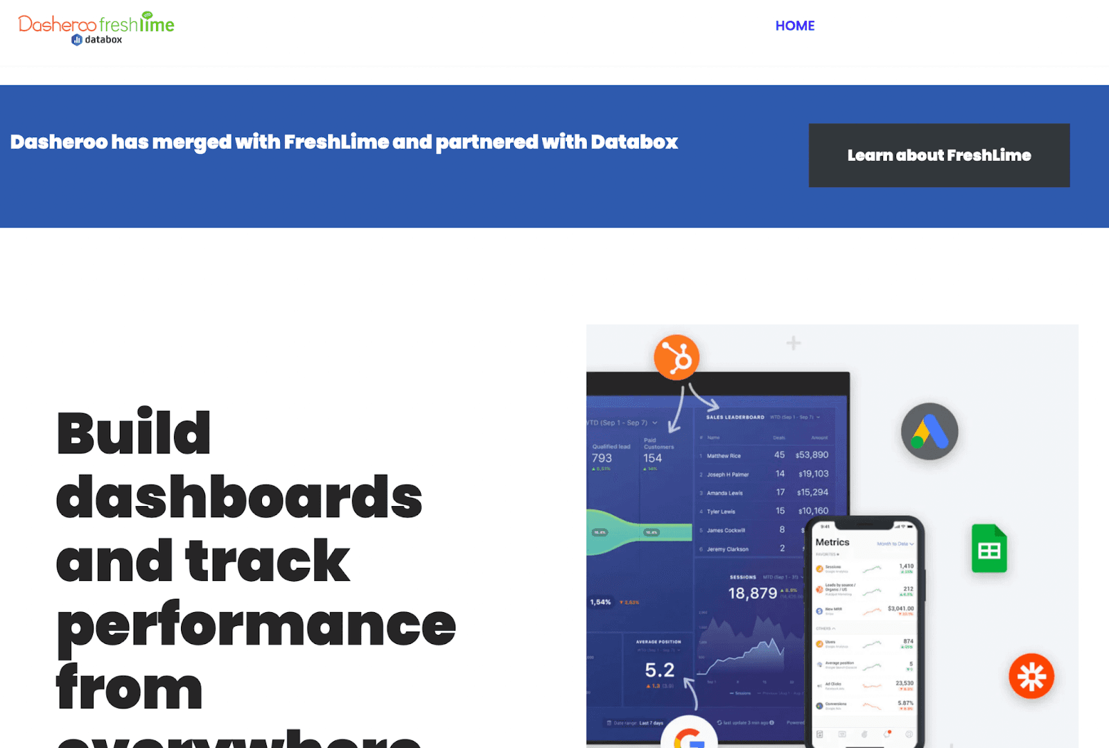
Dasheroo is a simple yet powerful software that allows you to centralize data from multiple applications into a unified dashboard and make better data-driven decisions.
Who Is It For?
Dasheroo is a low-key software, i.e., it's not a great choice for building sophisticated dashboards. However, it does cater to the needs of small biz startup teams and medium-sized enterprises.
Features
-
Excellent team collaboration feature enabling your team to comment and chat in real-time without leaving the platform
-
Get instant alerts and notifications regarding team messages or when a KPI trends above or below a set threshold
-
Easily correlate and mashup data from multiple platforms to generate unique insights
-
Export dashboard and reports in PDF/PNG formats or schedule recurring emails to share dashboards
-
Use slideshow mode to present individual dashboards in boardroom meetings or conferences
Pros and Cons
Pros
✅ Extensive gallery of pre-built templates and visual elements
✅ Easy to setup and use
✅ Includes free-forever plan
Cons
❌ Doesn't integrate with many tools compared to other software in the list
❌ Not suitable for creating sophisticated dashboards
#11. Datapine
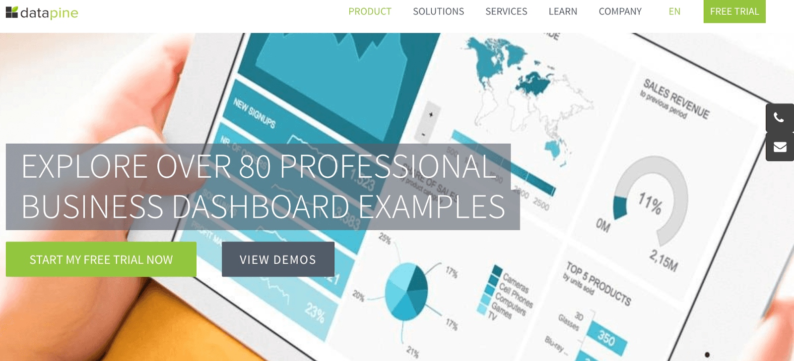
Datapine is an all-in-one BI and dashboard platform empowering everyone to create interactive BI dashboards, generate actionable insights, and make impactful decisions.
Who Is It For?
Datapine is a versatile tool fit for any size company. Its best use cases are from the health, logistics, manufacturing, retail, and FMCG industries.
Features
-
Over 50+ data connectors for databases, flat files, CRM, and ERP data
-
Has an extensive gallery of 80+ pre-built dashboard templates and 25+ chart types to ease your dashboard creation process
-
Use Datapine's intuitive drag-and-drop feature to quickly customize templates or create custom dashboards from scratch
-
Use in-built predictive analysis and forecasting engine to predict future sales trends
Pros and Cons
Pros
✅ Offers role-based management
✅ Cross-device accessibility
✅ In-built white-label feature included with paid plans
Cons
❌ Has a steep learning curve
❌ Some of the advanced features may require knowledge of SQL
Have All Your Dashboards in Your Pocket for Free with Datapad
All the above-mentioned sales dashboard software excel in their own dynamics. But do you know what’s better?
A dashboarding platform that requires no technicalities yet serves your purpose with ease. The best solution for a salesperson is a software that allows you to access your sales KPIs from anywhere around the world.
And yes, we know such software. It’s #1 on our list - Datapad.
Datapad is a completely no-code platform that allows you to instantly access your sales dashboard from your mobile phone.
Besides, our tool never asks for multiple logins and is completely free to use.
No matter how many dashboards you create or team members you onboard – it will still be free to use.
Want to access your KPIs with a click? Scan the QR code below and get started with Datapad!
