![9 Best Metabase Alternatives in 2024 [In Depth Guide]](/_next/image?url=https%3A%2F%2Fframerusercontent.com%2Fimages%2FB9hKA519XfeKvbx3H53hGNMfs3c.png&w=3840&q=75)
Some of the best Metabase alternatives for flawless KPI dashboard creation are Datapad, Looker, Microsoft Power BI, Domo, Grafana, Redash, Holistics, Swydo, and Cluvio.
In this guide, you will find a full comparison between these Metabase alternatives and know which one’s right for your business.
Why Might You Look for Metabase Alternatives?
Reason #1. Scarcity of Features
Although Metabase has an interactive user interface, it lacks some key features to entice users. Such as, the platform lacks drag-and-drop functionality, a feature that can be easily found on any dashboarding platform.
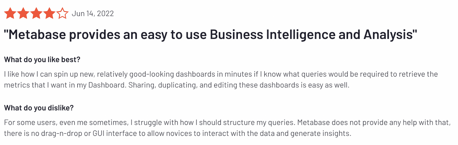
Moreover, the graphs and reports are repetitive and limited, which leaves you with just a handful of data visualization elements.
Reason #2. Steep Learning Curve
When it comes to the learning trajectory, Metabase’s learning curve is steep, like the Alps. It can take a while before you and your team can master the platform's functionalities.
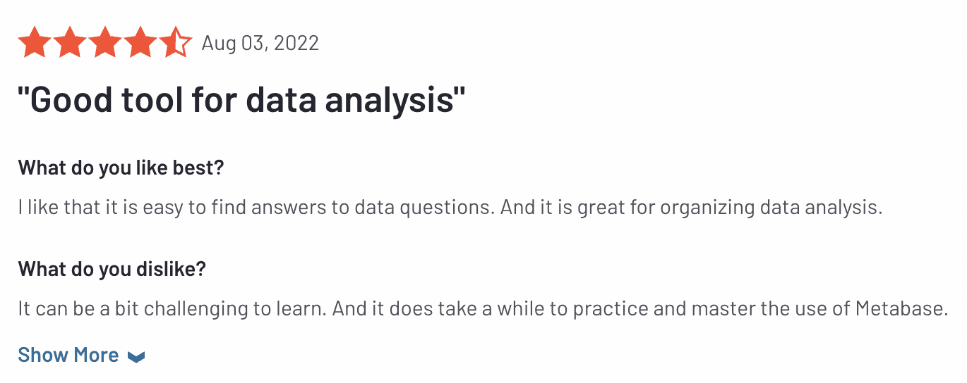
Besides, it can be tricky for a person to create dashboards or datasets with no experience in SQL.
Reason #3. Slow Load Time and Has Some Bugs
Metabase suffers during team collaboration. In many cases, it slows down when multiple business users are accessing the dashboard.

Not only during collaboration but in general, the results load way slowly.
Now that you know why you need to switch from Metabase to another dashboard software let's look at some of the choices you've got.
What Are the Best Alternatives to Metabase?
-
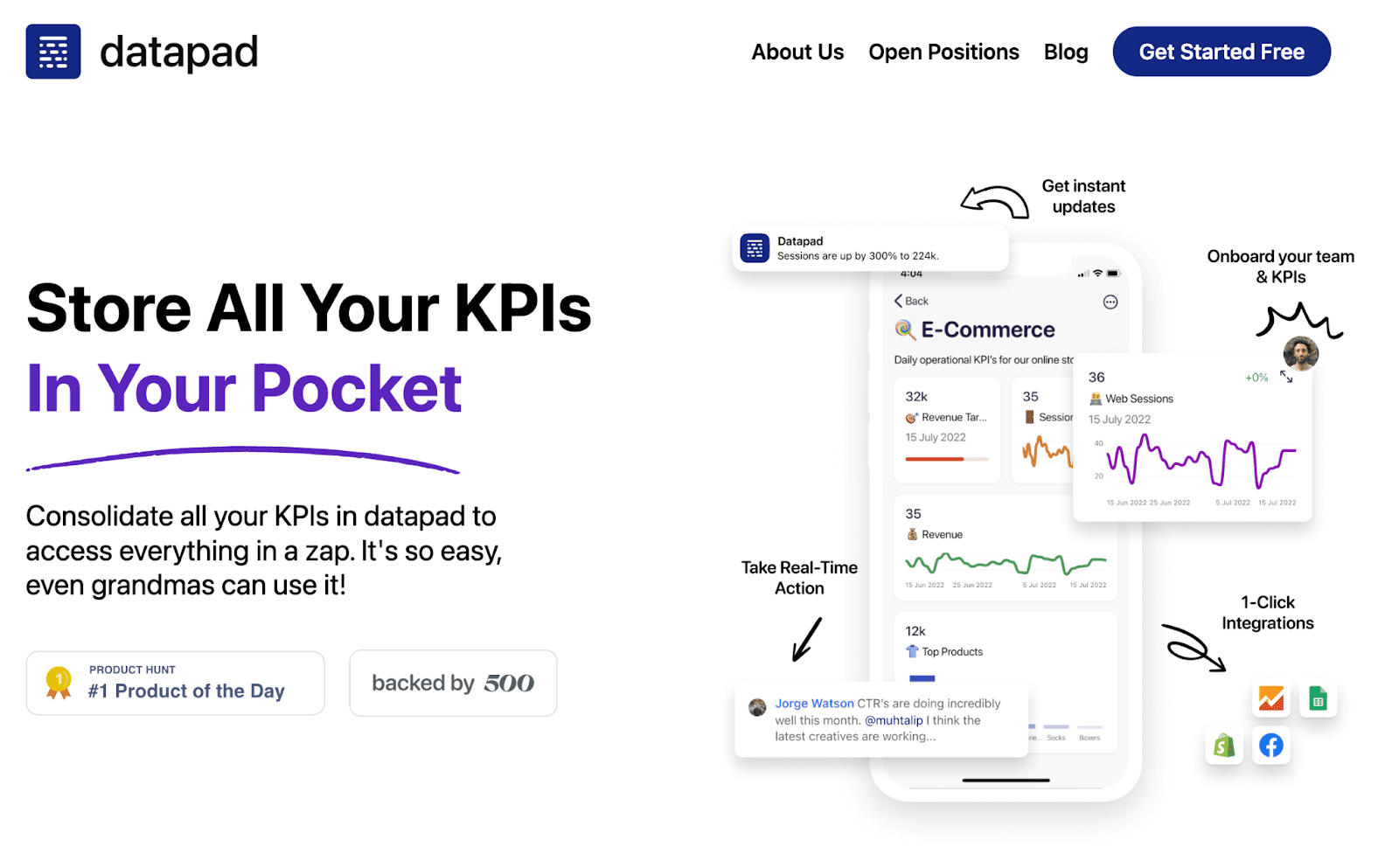
Datapad: Track KPIs via mobile on the go
-
Looker: Tracking marketing-related KPIs
-
Microsoft Power BI: Best for larger teams
-
Domo: Comes with numerous integrations
-
Grafana: Stunning pre-built templates
-
Redash: Best for coders
-
Holistics: Flawless drag-and-drop builder
-
Swydo: Best for sharing dashboards with your team
-
Cluvio: Best for enterprise

#1. Datapad

Datapad helps you track all essential metrics from stunning dashboards.
The beauty of Datapad lies in its simplicity and ease of use. With our tool, anyone in your team with zero technical knowledge can start building reports in mere seconds.
As a go-to solution for Agencies, Datapad makes it easy to onboard new customers with 1-click templates and share performance reports with read-only links.
Datapad also makes it easy to collaborate as a team with the ability to drop comments on KPI cards.
The AI insights tool lets anyone detect anomalies in their data and provides actionable to-do items to increase performance.
Key Feature #1. Templates

Creating reports for your business is no easy task. You have to determine a lot, from which metrics to choose to design the right charts.
If you are an agency and want to create the same reports for multiple clients, then this hassle becomes even more burdensome.
Guess what? Datapad lets you do all this with just a few clicks.
With Datapad's templating features, you can:
-
Choose from a gallery of pre-designed templates and apply them with 1-click
-
Build a custom dashboard and re-use it as a template by changing it's sources
-
Share all connected data sources in the workspace with your teammates
Key Feature #2. Team Collaboration

Tracking KPIs isn't a one-person job when you have a lot of them; you need a team. But not all KPI dashboard tools let you bring your team on board.
Guess what? Datapad lets you do it quickly and easily.
Moreover, you can assign individual team members tasks to handle, goals to achieve, and metrics to measure.
With Datapad's team collaboration feature, you can:
-
Get notified whenever there’s an update for any metrics and KPIs you track
-
Communicate around your metrics and KPIs with your team members
-
Get push notifications on your phone to stay updated with all your KPIs
Key Feature #3. Automated Reports & Scorecards
Wouldn't it be great if you could check your business KPIs first thing in the morning, straight from your inbox?
With our dashboard software, you can subscribe to any dashboard and receive daily email updates.
All you have to do is build a dashboard, click the subscribe button, and set your email preferences.
The best part is you can share reports with anyone, even emails outside of your organization or workspace.
Step 1: Subscribe to a dashboard

Step 2: Check your inbox

With Datapad’s report and scorecard automation, you can:
-
Subscribe to any dashboard
-
Receive daily highlights around all KPIs
-
Send reports to users in and outside of your organization
-
Customize the date range, calculation, and styling of KPIs
Pricing
Datapad has a free tier that includes 1 dashboard. If you want more, you can upgrade to the $30 Standard Plan, which includes 3 dashboards and scales with your usage. Datapad also offers a Business Plan tailored for agencies and includes dedicated customer support.
We are now offering an earlybird discount to all users, so it's a great time to sign up and give Datapad a spin.
3 Reasons Why You Shouldn't Use Datapad?
#1. If You Want to Do a Deep Analysis and Not Have a Quick Overview of Your Data
Datapad is meant for founders and managers who just want to keep an eye on all the KPIs and not dig further. In case there’s something off, they can ask their team to take care of it.
If you’re an individual tracking all the KPIs in-depth and want to know why each KPI is performing the way it is, we’d suggest you go ahead with Metabase or some other KPI dashboarding tool.
But if you just want a managerial view of your KPIs fast and frequently, Datapad will prove to be a great choice.
#2. You Don't Want to Have a Mobile-Only Experience
If you're a desktop-ridden person, our tool isn't the right choice. Our tool does not support desktop dashboarding (it's something being worked upon). Besides, Datapad has an amazing mobile version that has all the features you expect from a desktop-dashboarding tool.
#3. You Need a Lot of Integrations
We’re being honest here! If you are the owner of a large organization or someone who needs tons of integrations to extract data from multiple data points, Datapad will limit your needs.
Although we are consistently working on adding more and more integrations to our platform, as of now, it’s limited to some popular integrations.
Maybe down the line, Datapad would be an excellent choice for sourcing data from multiple data sources, but for now, it isn't.
Pros and Cons
Pros
✅ Has a dedicated mobile app
✅ Supports real-time collaboration
✅ A no-code platform; even beginners can learn how to use it in minutes
Cons
❌ No desktop version (coming soon)
❌ Has selective integrations
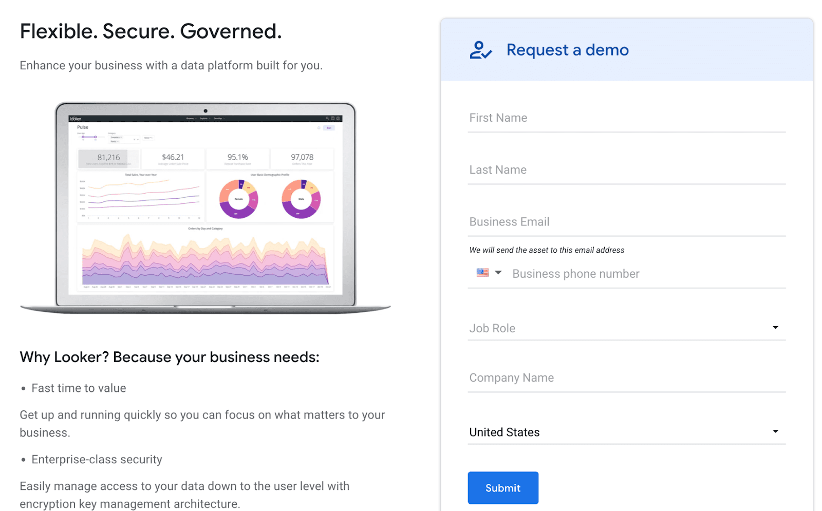
#2. Looker

Looker is an enterprise-grade business intelligence tool that empowers data-driven teams to make better decisions and support business growth.
Who Is It For?
Looker is a modern dashboarding platform used by over 160 companies, including PayPal, Square, 9GAG, and more. It's best for market researchers and data-driven enterprises who want to explore data and make decisions based on data and data only.
Features
-
Leverage data modeling to combine data from multiple data points for a comprehensive view of company metrics and get smarter insights
-
Supports ad-hoc reporting with excellent drill-down analysis and formatting capabilities to uncover hidden insights
-
Has interactive and dynamic dashboards which can be set up to filter data in multiple ways
-
Seamless integrations with Google BigQuery, Rudderstack, Snowflake, and 20+ other known platforms
-
Choose from pre-built data visualization elements such as funnels, maps, and combined charts, or create custom visuals
Pricing
Looker doesn't have any pricing plans mentioned on their official website. However, you can request a demo and discuss the pricing later on.
Pros and Cons
Pros
✅ Real-time customer chat support
✅ Integrations to GitHub
✅ Ease of sharing reports and dashboards
Cons
❌ Custom queries are limited to 5,000 rows
❌ Often lags when processing hefty and complex data
#3. Microsoft Power BI
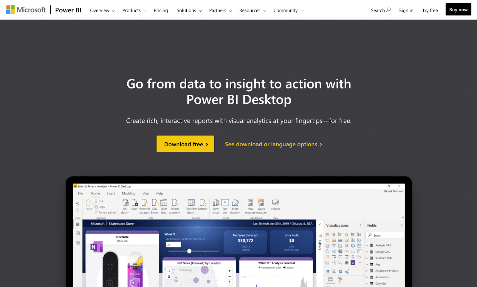
Power BI is a dynamic data visualization and data analytics tool by Microsoft that allows big and small business owners to quickly monitor, analyze, and visualize data.
Who Is It For?
Microsoft Power BI is a self-service platform used by the likes of P&G, Toyota, KPMG, and T-Mobile. The tool is suitable for businesses of all sizes and industries.
Features
-
Provides self-service access to external cloud sources such as Zendesk, GitHub, Marketo, and Salesforce
-
Has an extensive library of over 500+ connectors; easily connects to on-premises and cloud data sources such as Dynamics 365, SQL Database, Salesforce, and more
-
Create data mashups by using Power BI and Azure together to generate deeper and more helpful insights
-
Stay protected with industry-leading security norms like sensitivity labels, end-to-end encryption, and more
-
Quickly visualize data with hundreds of pre-built data visualization elements; download more attractive visuals from AppSource or create custom visuals
Pricing
Microsoft Power BI offers a 60-day free trial. After which, the tool has two premium plans:
-
Power BI Pro: $13.70/user/month
-
Power BI Premium: $27.50/user/month
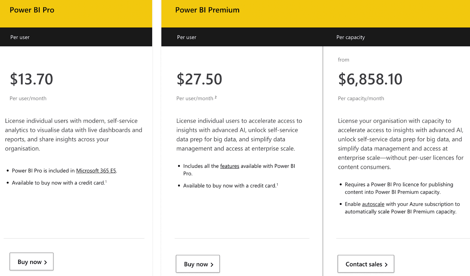
Note: Power BI also offers an enterprise-grade plan starting from $6,858.10. You can contact their sales rep to get yourself the best deal.
Pros and Cons
Pros
✅ Novice users can create robust and interactive dashboards effortlessly
✅ Excellent number of connectors and integrations
Cons
❌ It gets slow and clunky when running complex datasets
❌ Poor user interface leading to a steep learning curve
#4. Domo
Domo is a cloud-based low-code BI and analytics platform that empowers businesses with AI and machine learning capabilities to create interactive reports.
Who Is It For?
With 2,000+ customers, Domo's services are trusted by top companies and organizations like NBA, Unilever, eBay, and more. Its best-used cases are from the IT, SaaS, marketing, and advertising industries.
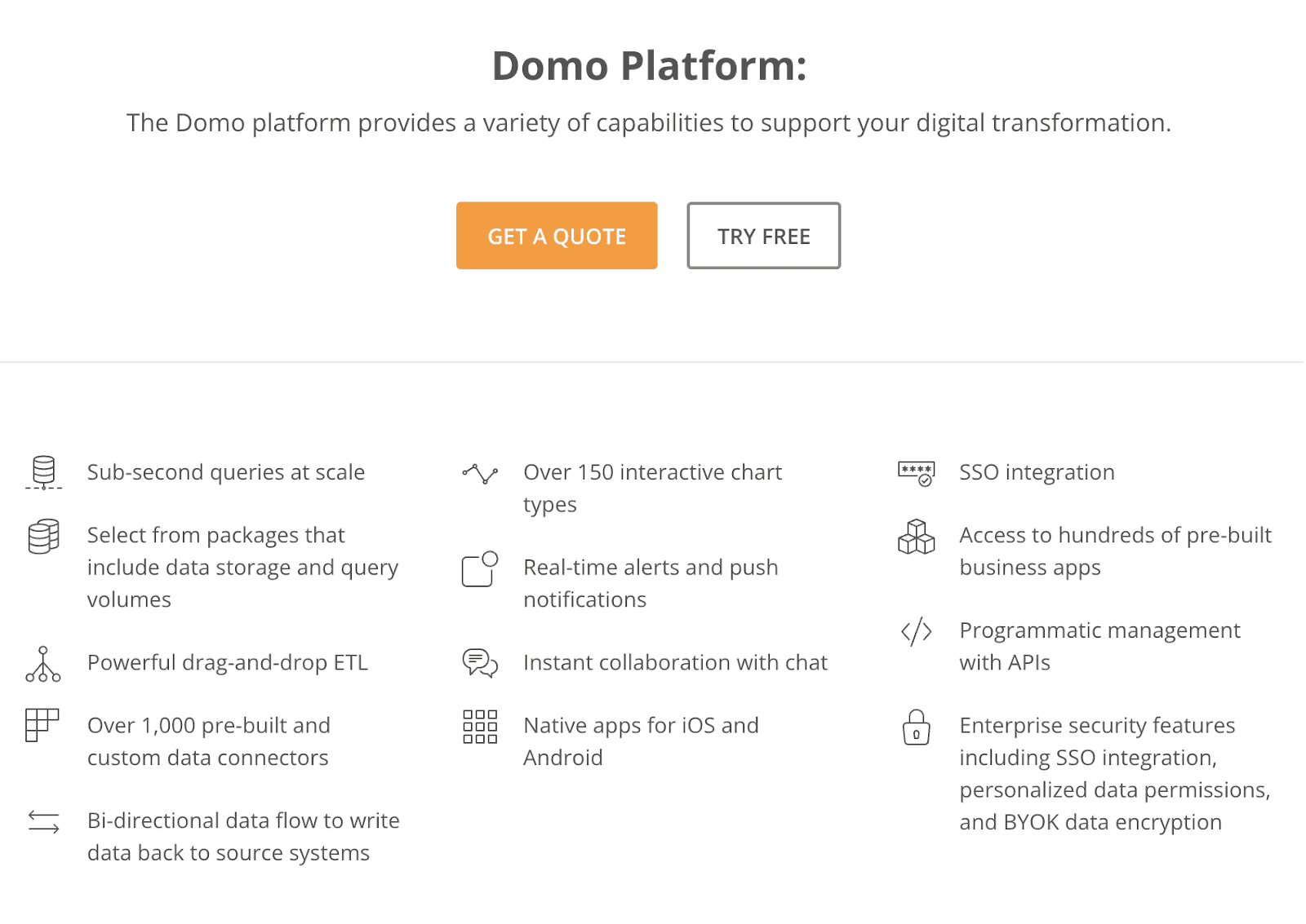
Features
-
Has 1000+ connectors and hundreds of pre-built APIs to allow easy import of data from databases like XML, JIRA, QuickBooks
-
Choose from an extensive gallery of over 150+ chart types and 7000+ unique custom maps, or upload your own map for quick data visualization
-
Use Domo's intuitive drag-and-drop interface to easily visualize complex databases; enable beast mode to perform data mashups from multiple data points quickly
-
Assists data analysis with AI-driven insights and NLP (Natural Language Processing) queries with instant responses
-
Enjoy seamless collaboration with an in-built chat app; enable real-time alerts and push notifications
Pricing
Domo offers a 30-day fully-featured free trial. After the end of the trial, you can connect with a Domo pricing expert and get the best quote for your business.
Pros and Cons
Pros
✅ Has dedicated mobile apps for iOS and Android
✅ Excellent customer support and setup guides
Cons
❌ Doesn’t let you do an in-depth analysis
❌ Poor UI/UX design
#5. Grafana
Grafana is an open-source analytical and dashboarding platform. It uses a unique 'single-pane-of-glass' approach to unify all your data into a unified dashboard with interactive visual elements.
Who Is It For?
Grafana is used by the likes of Salesforce, Tripadvisor, JPMorgan, and more. It's a versatile tool that can fit any industry and company size.
Features
-
Has an extensive gallery of data visualization elements ranging from heat maps to histograms and graphs to geomaps
-
140+ integrations to popular data sources and 20+ pre-built widgets and apps to create custom, interactive dashboards, and reports
-
Create, manage, and silence custom alerts from a single Grafana alerting page; add annotations and tags in between trajectories to make events discoverable
-
Easily customize panels with an in-built panel editor; transform non-time-series data like JSON files into tables with few clicks
Pricing
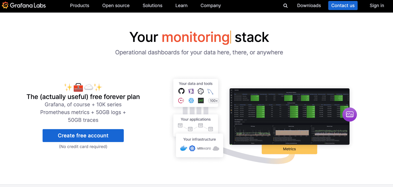
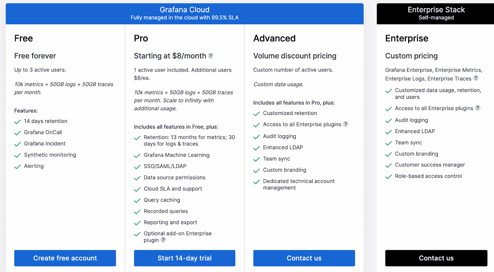
Grafana offers a free forever plan that supports 10K metrics, 50GB logs, and up to 3 active users. It also has a pro plan starting at $8/user; it includes a 14-day free trial.
Apart from this, Grafana has an advanced plan with custom users and pricing. You can connect with their sales rep to get a quote.
Pros and Cons
Pros
✅ Gives real-time alerts and notifications
✅ Good graphical representation with portable graphs and dashboards ( Graph-as-a-code)
Cons
❌ Lacks automation; hard to handle complex and hefty databases
❌ Dashboards and charts are rigid in terms of customization
#6. Redash
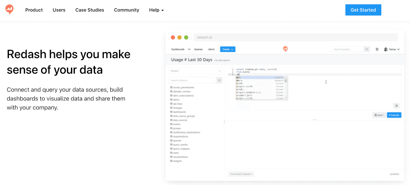
Redash is an easy-to-use BI tool that empowers novice and tech-savvy teams to leverage data and create stunning dashboards.
It allows you to create, monitor, analyze and share unified dashboards with peers effortlessly.
Who Is It For?
Redash helps you make sense of your data and make structural business use of it across your company. It is for startups and mid-sized companies who want simple data visualizations without needing complex functionality.
Features
-
Has a robust online SQL editor allowing the creation of queries in their natural syntax and schema data exploration
-
Has an extensive gallery of charts, cohorts, pivot tables, boxplots, and maps; use the intuitive drag-and-drop feature to rearrange and resize any visualizations
-
Set up custom alerts and notifications for events; schedule auto-update times for results
-
Quickly share dashboards via smart links or secret URLs with peers or clients; enable role-based management to control who can view/edit the dashboard
Pricing
Redash doesn't have any pricing available on its official website. You can connect to their sales rep to get a suitable quote for your business.

Pros & Cons
Pros
✅ Effortless way to connect to a data source or detach any sources
✅ It makes it easier to run standard SQL queries than any public cloud-based data source
Cons
❌ Lack of version control across the system, leading to less traceability
❌ Meant for smaller organizations with less data appetite and lacks scalability features
#7. Holistics
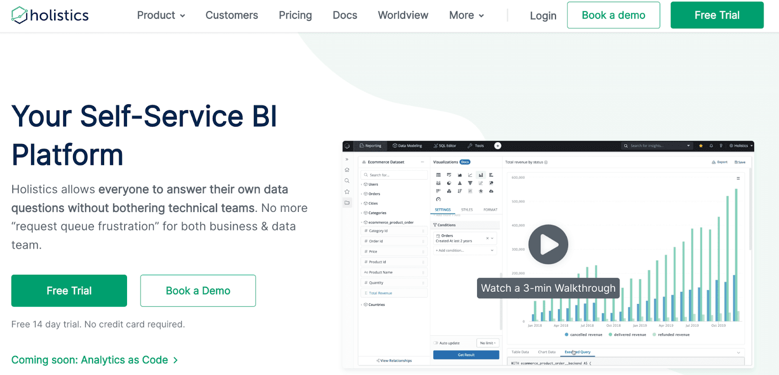
Holistics is a robust self-service platform that allows people to generate their own solutions using complicated data without needing to seek help from the data or engineering teams.
Who Is It For?
Holistics is for people with zero knowledge of coding. It's a self-service BI, meaning you can leverage a drag-and-drop builder to create dashboards and reports.
Features
-
Has databases for non-technical users that they can use and create reports without writing a single SQL query
-
Comes with embedded analytics that lets you create and share dashboards with your partners or customers
-
If you’re a coder, leverage DSL language to define data logics
-
Integrates with Slack flawlessly to send across dashboard screenshots and share them with the team
Pricing
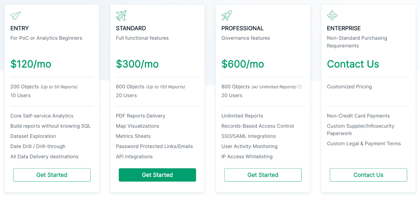
Holistic offers a free trial for 14 days but has a paid plan of $120 per month for entry-level features, $300 for standard features, and professional for $600 at a flat pricing model.
Pros and Cons
Pros
✅ Report scheduling is easy as it can be
✅ Easy SQL support for advanced dashboards and visualizations
✅ Responsive and resolution-oriented customer service
Cons
❌ Lack of visualization options
❌ Can experience UI glitches that might impact dashboard performance
#8. Swydo
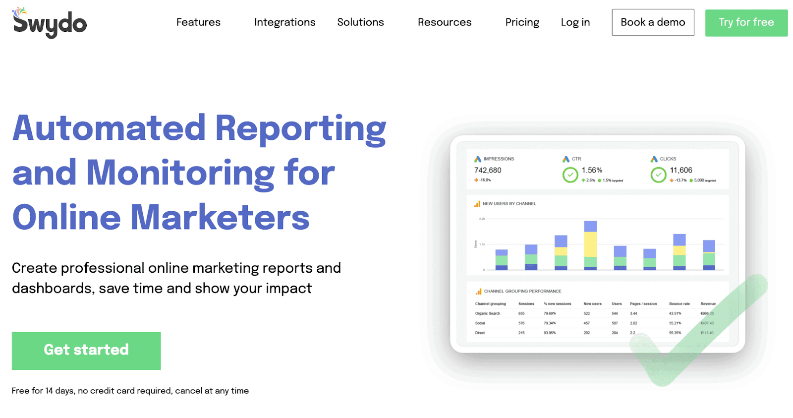
Swydo helps businesses automate reporting of KPIs and create dashboards to track them flawlessly. It's trusted by more than 20,000 companies in 80 different countries.
Who Is It For?
Swydo is built for entrepreneurs and founders who are short on time yet need a tool that gives them an in-depth understanding of the KPIs. It's also built for an agency to track every client's KPIs and generate reports automatically and send them over weekly or monthly.
Features
-
The tool is easy to connect across multiple data sources to pull in data from any platform
-
Create customized white-label reports to send to your clients via emails or share URLs; you can also share reports via PDFs
-
Lets you create reports in 14 different languages with a click
-
Comes with dynamic report templates to generate reports for Google Analytics, Facebook Ads, social media, and much more
Pricing
You can try Sydow out for 14 days for free (no credit card required), but after that, you will have to select a plan depending on the number of data sources you want to import data from.
The pricing starts at $39/month for 10 data sources and goes all the way up to $3,359/month for 2000 data sources.

Pros and Cons
Pros
✅ A comprehensive tool for KPI report creation that’s comparatively easy to use
✅ You can connect up to 2,000 data sources with Swydo without any hassle
✅ While-labeling options available
Cons
❌ Sometimes, users face difficulty in editing text that’s on the dashboard
❌ Has limited design options
#9. Cluvio
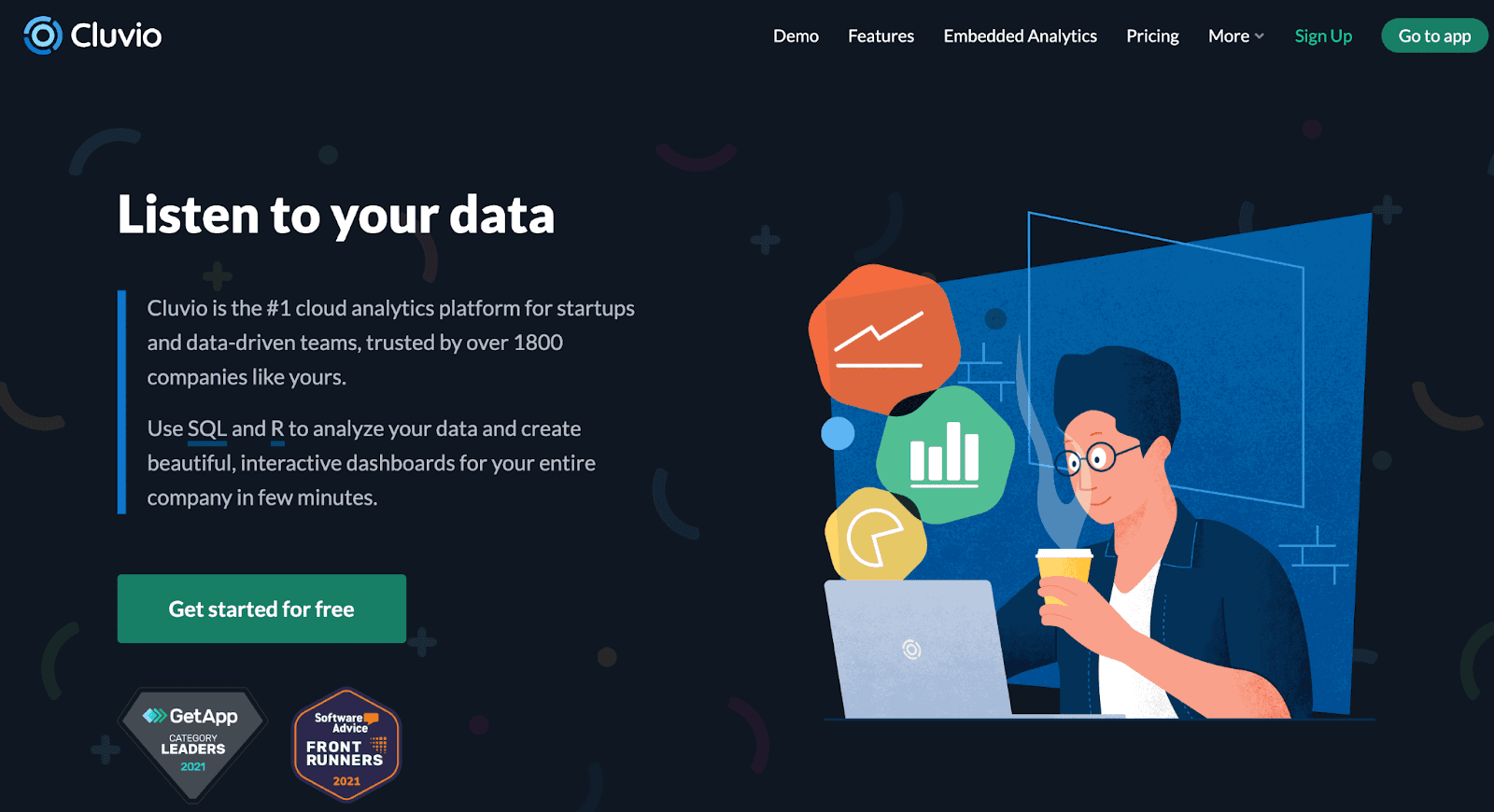
Cluvio leverages SQL and R to analyze data, after which you can use it to create interactive dashboards. It's trusted by the likes of Amazon, Netlify, Doctor.com, and many more brands across the globe.
Who Is It For?
Cluvio is for teams and businesses who are into a little bit of coding and know the basics of SQL and R. The tool is also great if you want to track multiple KPIs daily, as it’s capable of giving real-time data to you and your team.
Features
-
Has more than 10 chart types to choose from for your KPI dashboard
-
Comes with advanced user management and private link sharing, making it easy to keep a handle on your team when tracking KPIs
-
Share dashboards via links for people to access it without even logging in to Cluvio
-
Schedule dashboard sharing via emails to your clients and investors monthly
-
Analyzes SQL queries you fire and suggests visualizations based on it
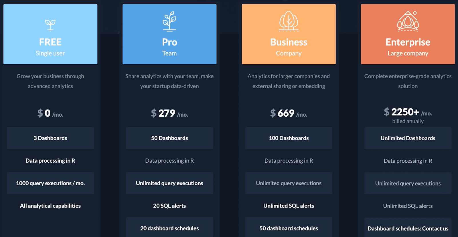
Pricing
Cluvio has four plans to choose from:
-
Free
-
Pro: $279/month
-
Business: $669/month (Comes with a free trial)
-
Enterprise: $2250+/month
Pros and Cons
Pros
✅ Great filter functionality and report creation
✅ Feature-rich and easy-to-use Metabase alternative
✅ Run custom queries and code KPIs on the dashboard
Cons
❌ Steep learning curve for non-coders
❌ A little bit expensive compared to other dashboarding tools
Keep All Your KPIs in Your Pocket?
When it comes to simplicity, Metabase is an excellent tool; there’s no doubt about it. But simplicity isn’t the only thing businesses and founders look for in a KPI dashboarding tool.
Luckily for you, we have an excellent Metabase alternative already built - Datapad.
Datapad lets you track all your KPIs via your mobile phone on the go; all you need is a stable internet connection, and you’re ready to rock.
So sign up for our free mobile app (available for both iOS and Android) and track your business KPIs like a pro.
Read more:
12 Best Dashboard Tools in 2022 [In Depth Guide]