![Best 8 Redash Alternatives in 2024 [In Depth Guide]](/_next/image?url=https%3A%2F%2Fframerusercontent.com%2Fimages%2FG6pWgG3799reZPlThiLR8BeuRsI.png&w=3840&q=75)
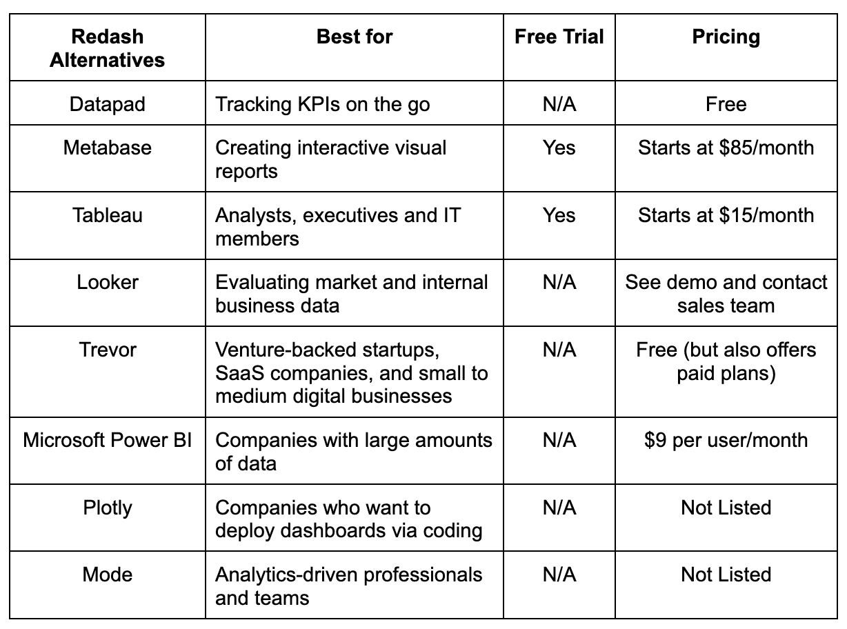
Some of the best Redash alternatives for creating beatiful dashboards are Datapad, Metabase, Tableau, Looker, Trevor, Microsoft Power BI, Plotly, and Mode.
In this guide, you will find a full comparison between the above-mentioned Redash alternatives and know which one is the best for your business.
3 Reasons Why You Might Need a Redash Alternative?
Reason #1. SQL Knowledge Is a Must to Use Redash
Unlike other KPI dashboarding and reporting tools, to use Redash, you must know SQL. Without its knowledge, you can track KPIs but can't generate reports.

There’s a way where you can auto-generate and auto-refresh your reports later, but to create your first KPI report, SQL is the only option you’ve got.
Reason #2. The Tool Isn’t Meant for Large Companies
If you're a company looking to scale your KPI tracking or an agency that tracks KPIs for multiple clients, Redash might just not be the right software for you.
The tool simply doesn't have features that might help you scale the KPI operations of your business.
It’s great for internal use, but you can leverage it to view presentations to your investors, send reports to clients, or bring many team members onboard.

Reason #3. Lacks Integration with Multiple Data Sources
The platform has limited integrations, so you can't pull out data from multiple data sources. This is another reason why Redash isn't a scalable option and is not meant for large companies.
What are the Best Alternatives to Redash?
-
Datapad: Onboard your team in minutes and track KPIs on the go
-
Metabase: Great for quick dashboard creation
-
Tableau: Built for mid-size businesses and large enterprises
-
Looker: Tracking KPIs in-depth
-
Trevor: Best for small businesses, especially SaaS startups
-
Power BI: Stunning visualization options
-
Plotly: Great for coders
-
Mode: Set KPI goals and make data-driven decision
#1. Datapad

Datapad helps you track all essential metrics from stunning dashboards.
The beauty of Datapad lies in its simplicity and ease of use. With our tool, anyone in your team with zero technical knowledge can start building reports in mere seconds.
As a go-to solution for Agencies, Datapad makes it easy to onboard new customers with 1-click templates and share performance reports with read-only links.
Datapad also makes it easy to collaborate as a team with the ability to drop comments on KPI cards.
The AI insights tool lets anyone detect anomalies in their data and provides actionable to-do items to increase performance.
Key Feature #1. Templates

Creating reports for your business is no easy task. You have to determine a lot, from which metrics to choose to design the right charts.
If you are an agency and want to create the same reports for multiple clients, then this hassle becomes even more burdensome.
Guess what? Datapad lets you do all this with just a few clicks.
With Datapad's templating features, you can:
-
Choose from a gallery of pre-designed templates and apply them with 1-click
-
Build a custom dashboard and re-use it as a template by changing it's sources
-
Share all connected data sources in the workspace with your teammates
Key Feature #2. Team Collaboration

Tracking KPIs isn't a one-person job when you have a lot of them; you need a team. But not all KPI dashboard tools let you bring your team on board.
Guess what? Datapad lets you do it quickly and easily.
Moreover, you can assign individual team members tasks to handle, goals to achieve, and metrics to measure.
With Datapad's team collaboration feature, you can:
-
Get notified whenever there’s an update for any metrics and KPIs you track
-
Communicate around your metrics and KPIs with your team members
-
Get push notifications on your phone to stay updated with all your KPIs
Key Feature #3. Automated Reports & Scorecards
Wouldn't it be great if you could check your business KPIs first thing in the morning, straight from your inbox?
With our dashboard software, you can subscribe to any dashboard and receive daily email updates.
All you have to do is build a dashboard, click the subscribe button, and set your email preferences.
The best part is you can share reports with anyone, even emails outside of your organization or workspace.
Step 1: Subscribe to a dashboard

Step 2: Check your inbox

With Datapad’s report and scorecard automation, you can:
-
Subscribe to any dashboard
-
Receive daily highlights around all KPIs
-
Send reports to users in and outside of your organization
-
Customize the date range, calculation, and styling of KPIs
Pricing
Datapad has a free tier that includes 1 dashboard. If you want more, you can upgrade to the $30 Standard Plan, which includes 3 dashboards and scales with your usage. Datapad also offers a Business Plan tailored for agencies and includes dedicated customer support.
We are now offering an earlybird discount to all users, so it's a great time to sign up and give Datapad a spin.
How Does Datapad Compare to Redash?
Redash is a great dashboard creation tool, but it's more for tech people who are aware of how SQL works.
That’s because you might need SQL when importing data, adding it to dashboards, and studying your KPIs.
Although you can create dashboards via drag-and-drop builder and save templates, the option’s not scalable because it simply isn’t meant for it.
On the other hand, Datapad is mobile-friendly that needs no coding or technical knowledge to track KPIs. In fact, you can just tap on elements and create a dashboard in minutes.
So all-in-all, Redash is meant for users who have the technical knowledge and depend a lot on KPIs, and Datapad is for users and businesses who just want an overview of KPI performance but quickly.
You can get the best of both tools by using Redash to drill down on data and Datapad to manage your team.
2 Reasons Why You Shouldn't Use Datapad?
#1. You Don’t Want An In-Depth Analysis But Just Have a Quick Overview of Your Data
Datapad isn't meant for in-depth KPI tracking. The motive of building this tool is to save founders and businesses time. What you get with it is a quick overview of all the KPIs, and you can then guide your team via the app about how to tackle specific KPI outbursts.
#2. You Need a Lot of Integrations
Our app integrates with major data sources (MySQL, Google Analytics, Facebooks Ads, etc), but for now, we've kept the integrations limited.
We are coming up with more and more integrations soon, but now if you want to create 10 dashboards from 100 different data sources, create them with Redash and not Datapad.
Pros and Cons
Pros
✅ Lets your track KPIs from your mobile phones
✅ Bring your team onboard quickly
✅ Assign each team member a KPI and set individual goals
✅ Search KPIs and get their overview quickly
Cons
❌ Lacks some integrations to import data (coming soon)
#2. Metabase
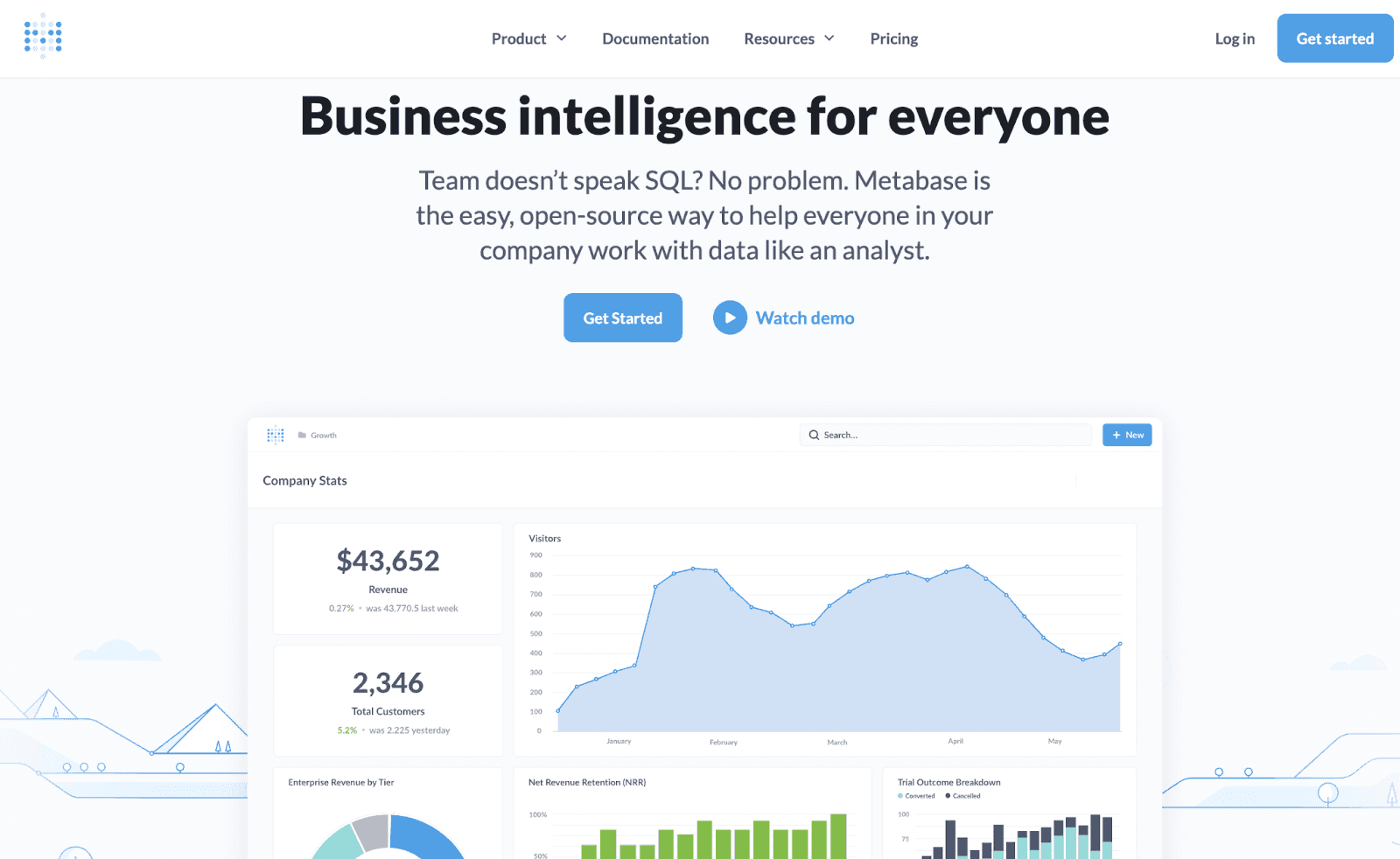
Metabase is a business intelligence software suite allowing you to ask questions about your data without complicated code and jargon and lets professionals visualize their business data accurately.
The platform is used by over 45,000 companies, including Bill.com, Confluent, Coupa, Revolut, Gojek, and others.
Who Is It For?
Metabase is ideal for business professionals and marketers who want to easily create charts, tables, graphs, and real-time reports using the data compiled by the platform.
Features
-
Connect your data stack and create dashboards and visualizations to make data-driven business decisions
-
Automated reports and advanced embedding options allow you to share visualizations in presentations, whitepapers, or publications
-
Integrate Metabase with your SSO to instantly handle team permissions and user signups
-
Offers 15+ built-in visualizations such as pie charts, funnels, line graphs, and others to create beautiful graphics to draw profound conclusions
-
Help your team uncover new insights with the visual query builder, which handles the complexities of aggregations, joins, and more
Pricing
Metabase offers three plans for deploying the software on the cloud and two for deploying it on-premises. Each plan offers a free 14-day risk-free trial. The premium plans available are:
-
Starter: $85/month
-
Pro: $500/month
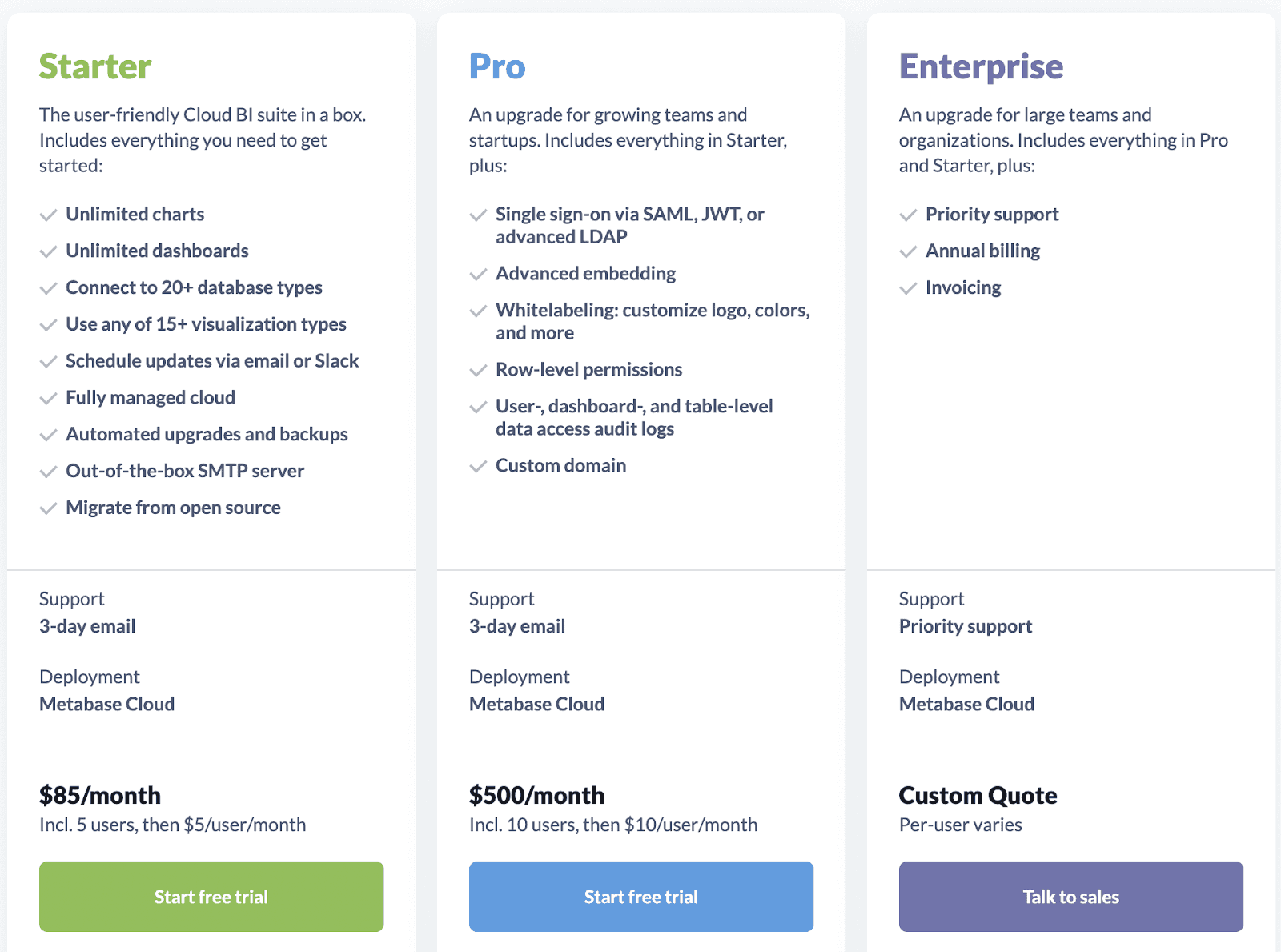
Note: An Enterprise plan is offered for large teams and organizations. However, you’ll need to speak with a sales rep for a custom quote.
If you choose on-premise deployment, the platform is free when used through open source. However, their Pro plan for on-prem deployment costs $500 per month.
Pros and Cons
Pros
✅ Easy to use
✅ Intuitive design makes it easy for beginners
✅ Flexible formatting
Cons
❌ Lacks key features like predictive analytics, ad hoc reports, etc.
❌ Some reviewers noted that Metabase sometimes crashes
#3. Tableau
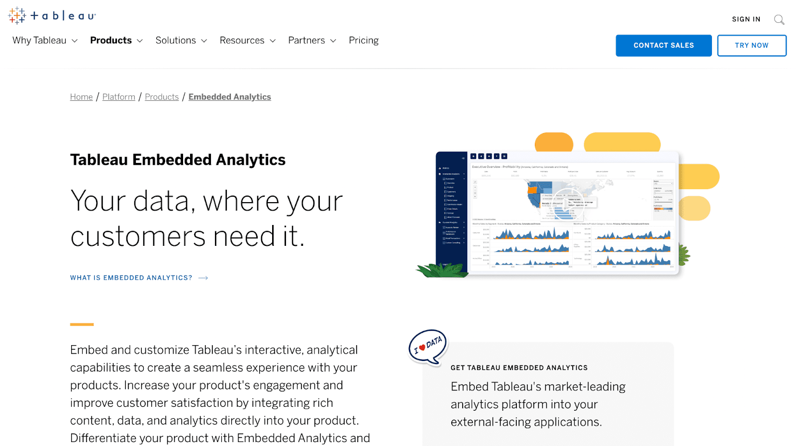
Tableau is one of the first analytics and self-service business intelligence programs that utilize data to help businesses create forecasts and make data-driven decisions.
Their mission is to help professionals understand data to solve problems using advanced technologies like AI-driven analytics and predictions.
Who Is It For?
Tableau is designed for everyone, including analysts, executives, and IT personnel needing a platform to process and examine data to find insights and share them with other team members via KPI dashboards.
Features
-
Integrate CRM analytics into Tableau to predict outcomes and spot trends faster
-
Empower your decision-making with machine learning through their proprietary Einstein Discovery, which delivers predictions and recommendations based on workflows
-
Embed visual and interactive analytics to drive product and customer engagement
-
Host your data and analytics via Tableau cloud or server
-
Self-service data preparation offers a visual path to receive insights faster
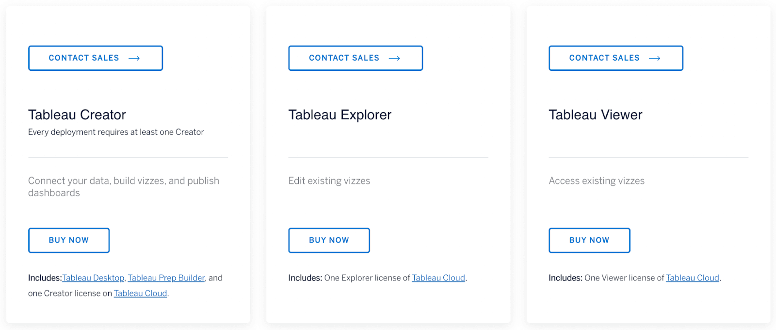
Pricing
Tableau offers a free trial allowing users to explore the platform through desktop, server, or Prep Builders. Besides that, they offer a simple pricing model:
-
Tableau Viewer: $15/month with cloud or $12/month on-premises
-
Tableau Explorer: $42/month with cloud or $35/month on-premises
-
Tableau Creator: $70/month with cloud or on-premises
Pros and Cons
Pros
✅ Intuitive and user-friendly interface
✅ Large collection of visualizations and data connectors
✅ Mature product and a supportive community of loyal users
Cons
❌ Requires substantial training to obtain full mastery of the platform
❌ Limitations in functionality (you can only drag a date range rather than selecting dates)
#4. Looker
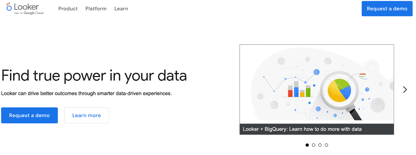
Looker is a business intelligence and analytics application that lets businesses assess and explore data and receive 360-degree views of their customers.
It allows anyone on your team to ask and answer their own questions, create visualizations, drill down to granular detail, and share their discoveries with a link.
Who Is It For?
Looker is the perfect platform for businesses evaluating their market, such as interpreting customer behavior, supply chains, and distribution processes and quantifying customer value.
Features
-
Automatically encrypt backups for data security which includes saved looks, user and database credentials, and query history
-
Embed dashboards, charts, and even a fully explorable analytics experience into any webpage or portal to drive user and customer engagement
-
Scans your existing database and infer relationships to create data models allowing you to go from database to dashboard in minutes quickly
-
Offers plug-ins to highlight your unique data, such as a Calendar Heatmap Visualization feature to display trends over a set period
Pricing
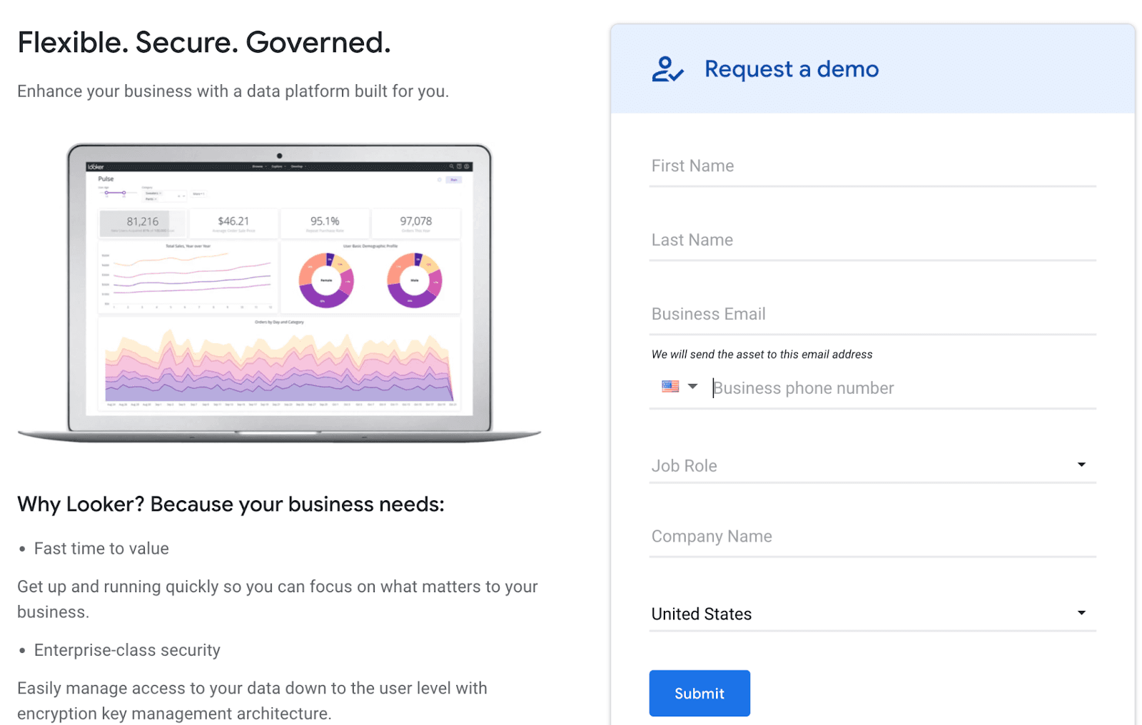
Looker offers customized pricing depending on many factors, such as the number of users who need access and the size of your organization. They feature packages for small, medium, and large companies.
However, currently, they don’t list its prices on their website. You’ll have to request a quote and speak with a Looker pricing specialist so they can create your ideal pricing based on your budget and needs.
Based on several third-party review sites, these are ballpark figures that Looker may offer:
-
$300 to $500 per user/month up to 10 users
-
Additional $50 per month for any users over 10
Pros and Cons
Pros
✅ Uses Git for collaboration and version management
✅ Deep SQL modeling capability
✅ Easy to use and doesn’t require coding knowledge
Cons
❌ Not ideal for small companies because it's pretty expensive
❌ Less visualization and customization options
#5. Trevor
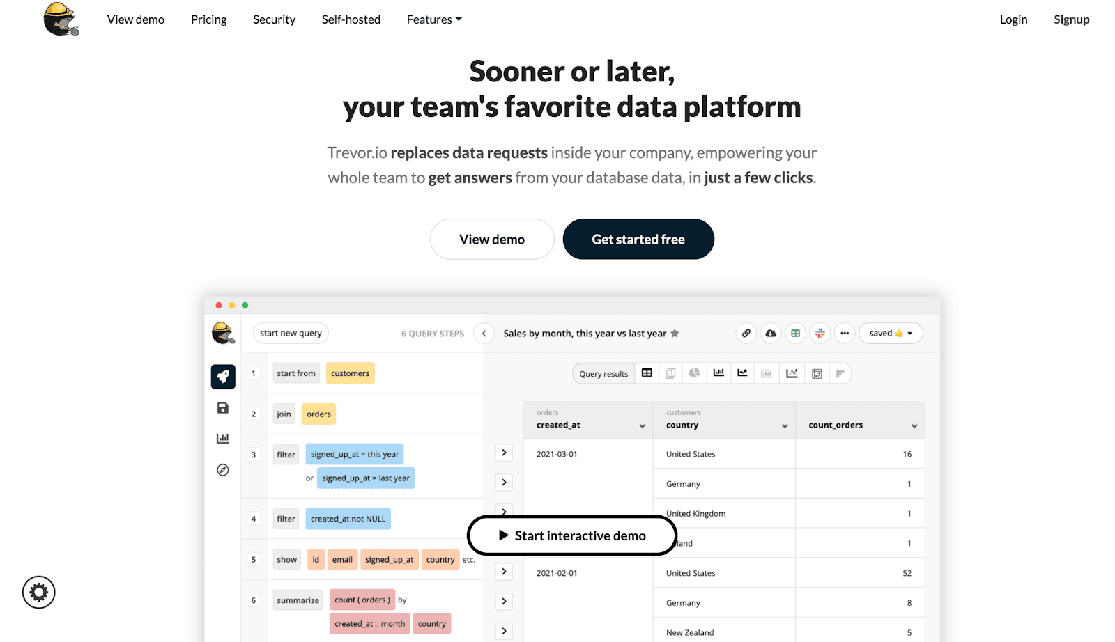
Trevor.io is a data analytics and KPI dashboarding platform that empowers your team members to build reports, receive ad hoc answers on the fly and perform lookups using an intuitive query builder.
It connects your data and organizes it into visualizations allowing you to traverse those relationships.
Who Is It For?
Trevor.io is mostly geared toward growth companies such as venture-back startups, SaaS companies, and other small to medium-sized digital businesses that track specific metrics and KPIs in-depth.
Features
-
Allows anyone on your team to build queries and answer ad hoc data questions intuitively and quickly
-
Create, filter, share and embed beautifully-made dashboards, and display an array of chart types
-
Automatically produces an interactive diagram of your existing database, letting you better understand the relationships that exist
-
Integrates with other tools like Slack, Gmail, Hubspot, Intercom, Twilio and Zapier
Pricing
Trevor offers the Starter, a free plan that provides 3,000 credits per month. Their premium plans consist of the following:
-
Pro: $75/month
-
Enterprise: $500+/month
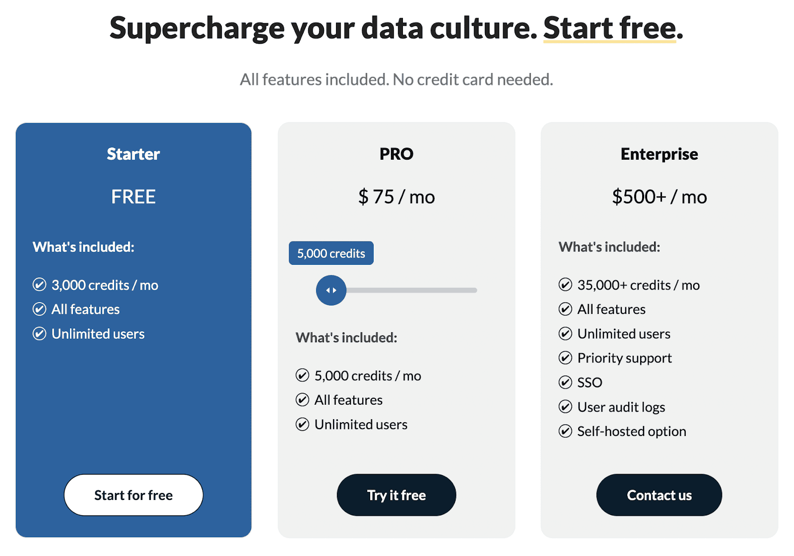
Each plan gives access to more credits. These economical units allow you to run queries on Trevor.io, such as
-
Data feeds
-
Alerts
-
Ad hoc queries
-
Dashboard refreshes
Pros and Cons
Pros
✅ Powers your team with insights without much of a learning curve
✅ Build and answer queries quickly
✅ Lots of integrations to import data from
Cons
❌ Quite expensive for paid plans
❌ Only offers a self-host option at the Enterprise plan
#6. Microsoft Power BI
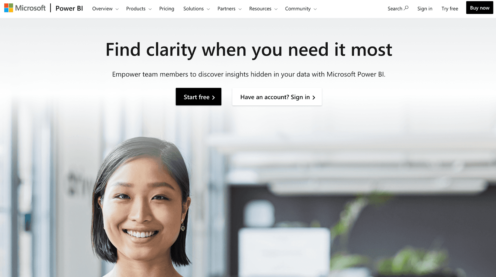
Microsoft Power BI is a data analytics platform that provides custom data visualizations, comprehensive dashboards, and business intelligence tools to uncover hidden insights in your data.
Many prominent Fortune 500 giants like Proctor and Gamble, T-Mobile, and Toyota leverage the power of Microsoft BI to track KPIs and stay on top of their business.
Who Is It For?
Microsoft Power BI is designed for businesses of all sizes, but especially enterprise companies that need data connectors to transfer large sums of data from a wide variety of sources.
Features
-
Features a growing library of over 500 data connectors so that your entire team receives big-picture data for making smarter decisions
-
Identify and evaluate risky behavior patterns with Power BI’s oversight capabilities
-
Bring data to life by transforming complex topics into compelling and stunning visuals to impress key stakeholders and drive customer engagement
-
Power BI Mobile gives you access to your reports, KPIs, and a 360-degree view of your data points on the go
-
Explore data with intuitive conversation language to receive insightful answers to data questions using your own words
Pricing
Power BI offers various pricing structures to provide analytics to meet every organization’s needs. Here are their available plans:
-
Power BI Pro: $9.99 per user/month
-
Power BI Premium: $20 per user/month or $4,995 per capacity/month
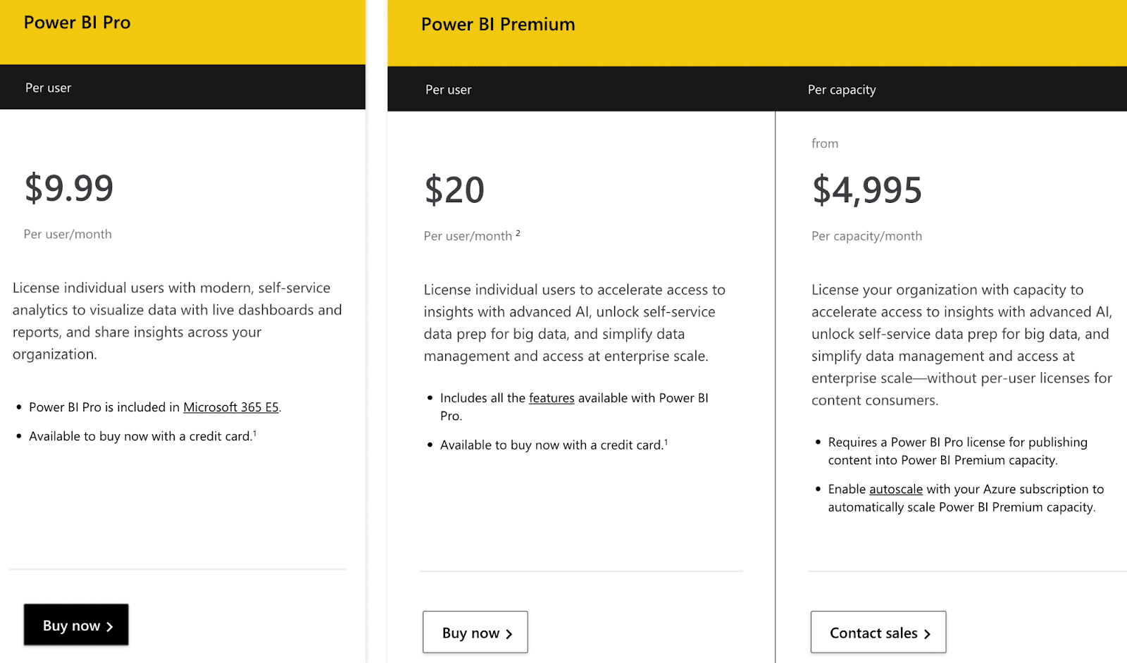
Users can also sign up for Power BI and Power BI Desktop for free to receive data, insights, and visual analytics. However, the premium versions offer more advanced features like AI, data management, and greater capacity and users.
Pros and Cons
Pros
✅ Extremely intuitive and user-friendly interface
✅ Power platform with lots of data source connectors
✅ Exceptional data visualization features
Cons
❌ The refresh cycle can be limited on the free version
❌ Web and desktop versions divide data prep tools
#7. Plotly
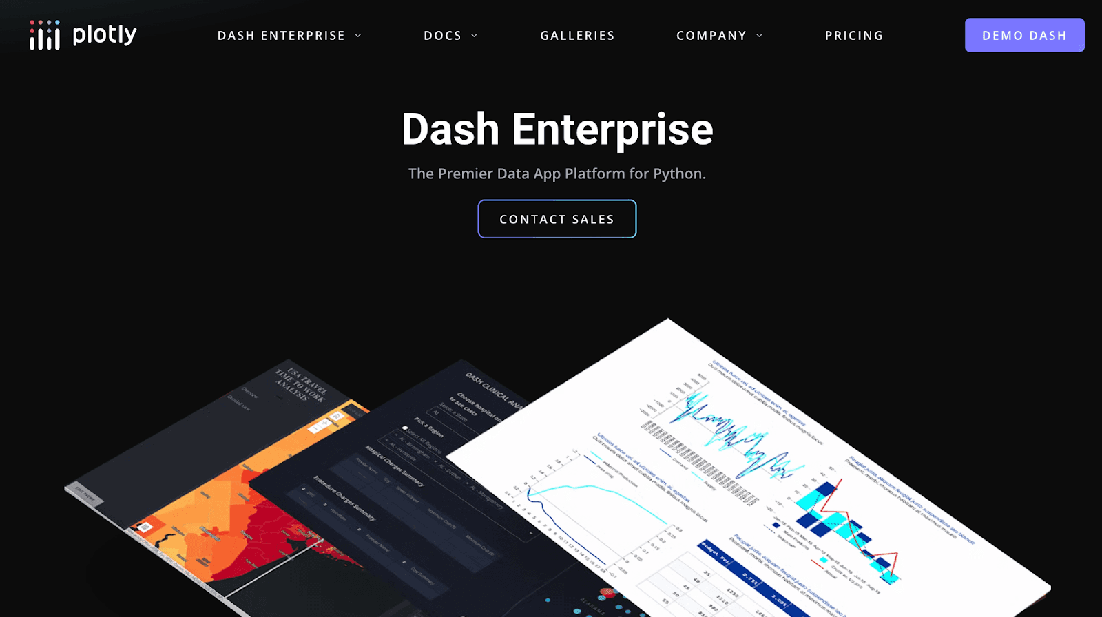
Plotly is a service provider of open-source tools for building, modifying, and disseminating graphical and interactive data online.
They’ve amassed thousands of users who use their platform, including Intuit, General Mills, Campbells, Liberty Mutual Insurance, Cisco, and the Utah Jazz.
Who Is It For?
Plotly is specifically designed for companies who want to build and deploy analytic applications like dashboards using Python, Julia, or R without needing DevOps or Javascript developers.
Features
-
Works with many other data services in Python and delivers plug-and-play Dash app templates for building KPI dashboards
-
Capable of embedding Dash apps into any web platform
-
Features drag-and-drop layouts to your applications
-
Share point-in-time views of your applications and creates on-sharable PDFs and reports
-
Style, customize, and array Dash apps without writing a line of HTML or CSS
Pricing
Like Looker, Ploty doesn’t list its pricing on the official website. You’ll have to complete their web form and speak with a team member to receive a custom price quote. When completing the form, you’ll have to mention whether you’re a professional or a student.
According to several third-party review sources, their starting price is $59 per user per year. Since prices can change, it’s best to contact their team and request a quote.
Pros and Cons
Pros
✅ Comes with several deployment options
✅ Easily onboard your team
Cons
❌ Doesn’t support mobile devices
#8. Mode
Mode is an analytics tool that helps companies make smarter decisions and answer questions by uncovering their data through interactive visualizations.
The platform has been verified by many popular software enterprises such as Twitch, Lyft, Shopify, Zillow, Everlane, and Invision.
Who Is It For?
Mode is designed for a wide variety of analytics-driven professionals and teams, including analysts, IT professionals, and businesses of all sizes.
Features
-
Establish logic and set definitions, and all changes will be propagated to the underlying reports
-
Supports over 60 Python libraries for advanced dashboard editing options
-
Helix data engine lets you filter, aggregate, and process queries fast
-
Helps you build visualize reports along with offering collaborative capabilities for shared findings
-
Visual data exploration can help you drill down on how users interact with your products
Pricing
Mode doesn’t currently publish its pricing on its website. All we know is that they offer three plans:
-
Studio
-
Business
-
Enterprise
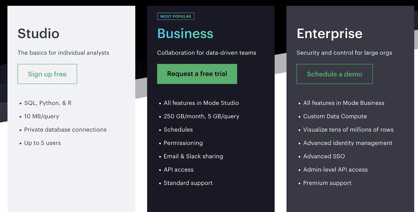
The Studio plan is designed for individual analysts and is free to sign up for. In addition, the Business plan is made for small to medium-sized companies, and you must request a free trial by submitting a web form.
The Enterprise plan requires seeing a demo before receiving pricing.
Pros and Cons
Pros
✅ Simple to generate visuals and export reports
✅ Excellent customer service
✅ Great for running SQL queries
Cons
❌ Applying filters to narrow down data isn’t always intuitive
❌ Occasionally runs slowly and has unpredictable errors
Keep All Your KPIs in Your Pockets with Datapad
Let's face it; for any founder or business manager, time is equivalent to money. If you waste time, you won't be able to bank more cash.
Tracking KPIs is often time-consuming and takes a lot of effort to do it frequently. But that’s when you track them via a desktop opening multiple Chrome tabs and looking at dashboards like a hawk.
With Datapad, all this can go away. Our mobile-friendly app will give you an overview of all the business KPIs in minutes.
Just sign up and download our app, and track KPIs like a pro!