
Did you know that about 1.1 billion people worldwide use Microsoft Excel? 🤯
No matter how old Excel gets, people still stick to excel dashboards and use templates.
Some people use it for data entry, some for bookkeeping, and some for creating dashboards.
We wanted people to know how they can create Excel dashboards and keep an eye on business KPIs, so we did it.
In this article, we have brought to you a tutorial on creating an Excel dashboard and some of the drawbacks you should know about.
But before we start, here’s the TL;DR:
-
An Excel dashboard provides a comprehensive overview of KPIs and metrics using easy-to-understand data visualization elements.
-
Dashboard creation in Excel is a manual-intensive process, which makes it time consuming.
-
To get started you need to build a dataset; you can do this by importing data on Excel or entering it manually.
-
You then need to prepare your data by refining it and removing duplicate entries - Excel will let you do it automatically.
-
Insert charts you want on your dashboard for the data you have with you.
-
Finally create your Excel dashboard and use several customization options to give it a personal touch.
-
Although you can create dashboards on Excel, it’s not an ideal choice. The platform offers less to no automation, it doesn’t show you data in real-time, and it’s tough to onboard your team.
-
You can try Datapad - a mobile friendly dashboard software instead. It lets you automate most of your dashboard creation process, thus saving you time.
What is an Excel Dashboard?
An Excel dashboard provides a comprehensive overview of KPIs and metrics using easy-to-understand data visualization elements.
These elements generally constitute graphs, pie charts, cohorts, tables, and interactive widgets.
In simple words, Excel dashboards are visual representations of large data tracks. It can help you create Static and Dynamic dashboards.
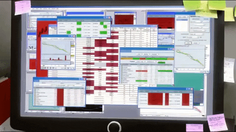
The only hindrance is, you should know how to use Excel to the fullest! Or else, this is how you will find yourself with Excel:
Below we have curated a step-by-step guide on creating a full-fledged dashboard on Excel.
Disclaimer: Although creating dashboards in Excel involves a heavy amount of manual work, it's worth the effort.
So, take a chill- 💊, be patient 🧘🏻♂️, and let's go.
How to Create a Dashboard in Excel?
Here’s a 5-step Excel dashboard tutorial you need to create dashboards in Excel as fast as possible.
Step 1: Build Your Database
Like there's no Hogwarts without Hagrid, there's no Dashboard without Data.

So firstly, we'll see how to import data to Excel.
Excel has a limited number of options to assist the data import process. But hopefully, you will find your preferred option among the few.
Note: If you have a well-organized dataset on another Excel sheet, you can simply copy and paste it.
However, if you are just getting started with the data collection process, here's how and where to begin.
Click on Data and choose.
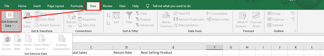
Here, Excel offers your four options to import data:
-
From File: Import data from your PC
-
From Database: Import data from SQL servers, Microsoft, etc.
-
From Text: Import data from text or CSV files
-
From Other Sources: Import data from other sources such as SQL server tables, SQL server analysis cubes, or XML files

Step 2: Prepare Your Database for Action
The dataset you import is called Raw Data.
That's because the database is filled with extra columns, irregular decimal points, and raw numbers, which you ideally don't want on your dashboard.
You see, you only want that part of your database which you need to visualize on your dashboard – the heavy numbers, of course.
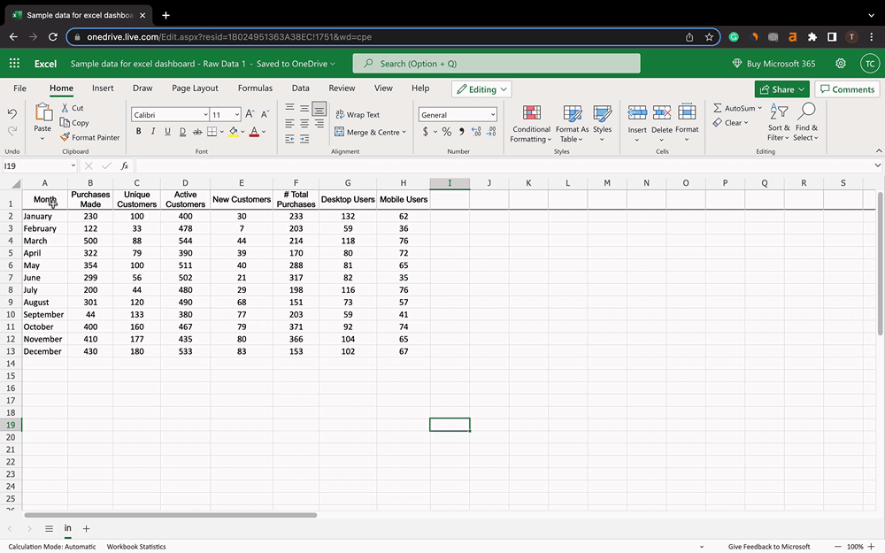
For example, we imported a short dataset from our Monthly Sales Report.
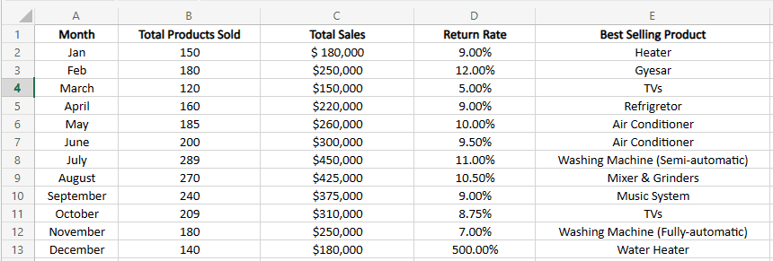
Tell Us: Among the Excel columns from A to E, which one would you prefer not to add to your dashboard?
To extract meaningful data, create another sub-sheet as Chart Tab and copy-paste the dataset from columns into it.
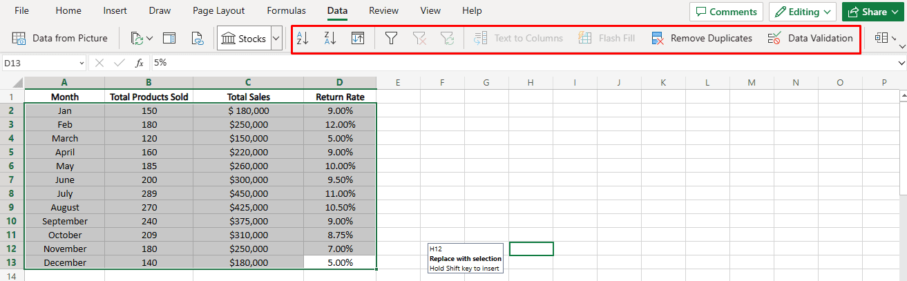
So now you have the dataset you want to visualize. Now let's start preparing this dataset for action.
Excel comes with several in-built tools to ease your data cleansing process. Click on Data, and you'll have the following options available.
-
Alignment: Organize data in ascending or descending order
-
Data Filtering: Add an advanced filtering widget to each column
-
Custom Sorting: Sort data by column, value, color, font color, and order
-
Remove Duplicates: Removes any duplicate data
Furthermore, use Excel formulas to simplify the raw database as much as possible.
Lastly, double-check the dataset for any typos or errors.
Step 3: Custom Format Your Charts for Your Preference
Once your dataset is cleaned and prepared for data analysis, it's time to add some visualizations.
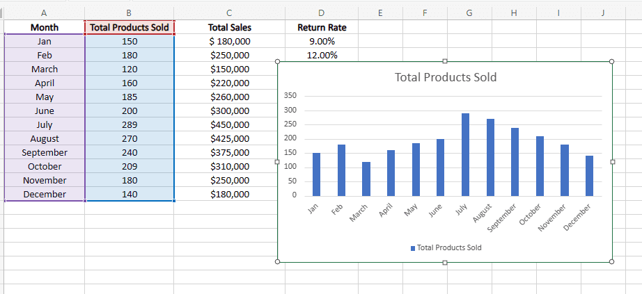
For instance, If you want to visualize the Total Product Sold each month, you need an Excel chart, right?.
Here's how you can make one.
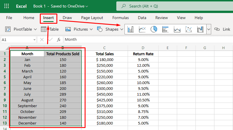
Select the dataset you want to visualize. Then, go to the Insert tab in the top menu bar and choose from Excel's in-built visualization gallery.
Suppose you opted for a bar graph to present the dataset. Here's how it will be presented.
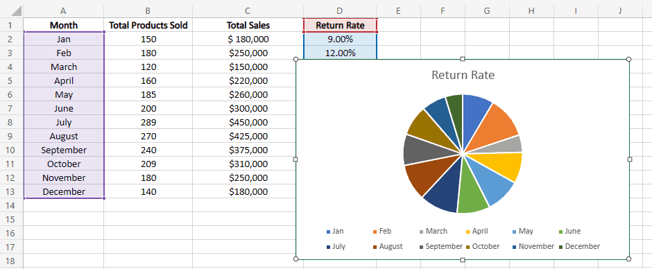
Likewise, if you want to use a different type of visualization to present another dataset, let's say, Return Rate.
Follow the same steps; select the Month and Return Rate columns > Click on Insert > Choose Pie Chart from the visual element gallery. And voila!
Want to use a different type of dynamic chart?
Excel has tons of them, namely:
-
Column Chart or Bar Chart: Visually compare value across a few categories
-
Area and Line Chart: Show trends over time (years, months, or days) or categories
-
Pir or Doughnut Chart: Show the proportion of a whole (generally used for data available in %)
-
Hierarchy Chart: Compare parts to a whole or several columns of categories form a hierarchy
-
Static Chart: Show statistical analysis of your data
-
Pivot Table: To summarize selected columns
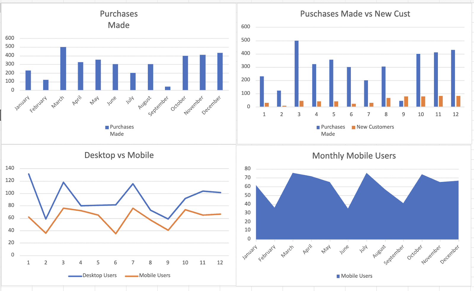
Step 4: Create an Excel Dashboard
In the previous step, you learned to visualize data in different forms and figures.
However, keeping data and its visualization on the same sheet can be daunting later on. ☠
So to build a full-fledged Excel dashboard, create a sub sheet named Dashboard, and move all your data visualization to this sub sheet.
You and your team can use this sheet as the main dashboard. Doing this will also help you to:
-
Display multiple data visualizations under one sheet
-
Control who can access/view/edit the raw data sheet
-
Automatically change graph data by making changes in raw data sheet
Step 5: Customize Your Dashboard
And now to the final step – Customizations.
To start with customizations, Double-click on the chart you want to customize.
A drop-down menu appears on the right sidebar of your screen with the following options.
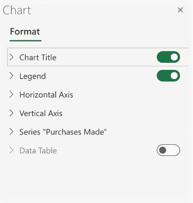
Use it to customize your chart title, data labels, colors, and data table via chart formatting options.
Note: You can also use conditional formatting for advanced customization options.
And that's it! Achievement unlocked! 🏆
You've created your first interactive Excel dashboard. 🎉
But as we said earlier, creating an Excel dashboard is a manual process, let’s understand what drawbacks you might face when tracking KPIs (key performance indicators) on Excel.
Drawbacks of Creating Dashboard with Excel
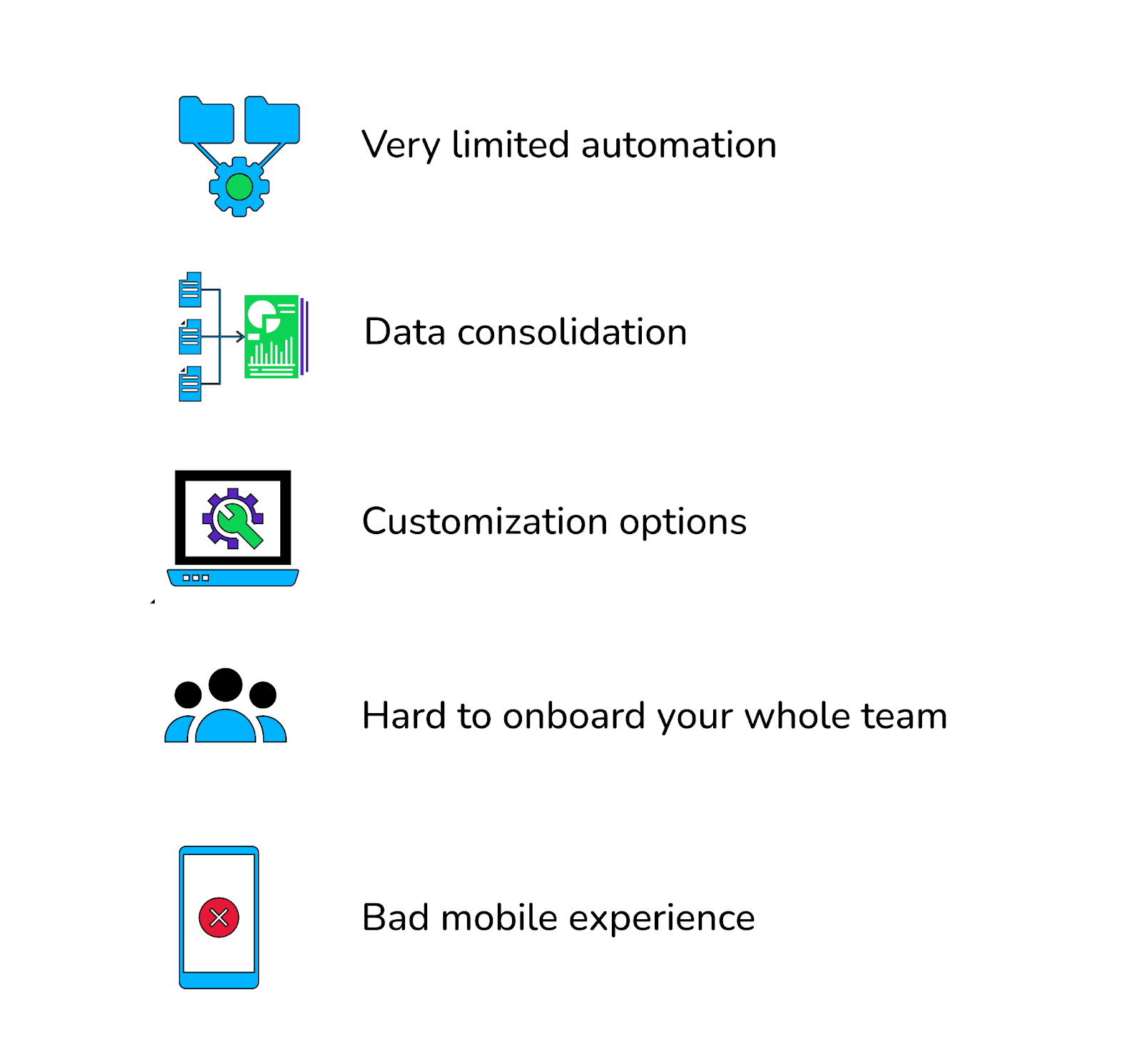
#1. Very Limited Automation
Have you seen an Excel dashboard before? 🤔
It's so clean and organized, with data on one sub-sheet and visuals on the other. And you probably think doing this is an easy task, just copy and paste, isn't it?
But very few know that creating this Excel dashboard took hours of manual work, hundreds of left and right clicks, and concentration hard enough to suffer eye pains and migraines. 🧠
It probably takes hours because Excel provides next to no automation.
Although at the initial stages of data extraction and cleaning, Excel has some features to remove duplicate data. But again, you're advised to double-check the dataset for errors.
#2. No Real-Time Access to Data
For those unaware, in Excel, there's nothing like real-time. ⌛
Unless you're a developer who can connect Excel to a database and code all of the scripts and macros that automatically refresh your data, the data in your Excel spreadsheet will not be in real-time.
And this is a major drawback if we bridge it to creating dashboards in Excel.
You see, what's the purpose of a full-fledged dashboard if the data you're viewing is outdated?
Yet again, you need to suffer through manual processes to update the data repeatedly. And that’s easy, if you work like this 👇🏻

#3. Lacks Customization Options
We compared Excel to other dashboard creation tools, and guess what? Excel needs to catch up on providing out-of-the-box customization options to users.
Yes, it does have customization options. But that's been the same way since 2006.
Moreover, the type of data visualization elements provided by Excel are rigid and limited.
#4. Hard to Onboard Your Whole Team
Let's be real, you ain’t running a six-figure business without a team.
And that makes team collaboration a vital feature of any dashboard. But Excel simply doesn't foster collaboration.
Think about it: If you're using Excel as your main data dashboard and are sharing it with your team, it's challenging to manage the version of the Excel spreadsheet that everyone is seeing. This makes it more difficult to collaborate around the data because stakeholders may be looking at different reports.
Everything results in endless duplication of efforts, lots of unintentional manipulations, and a mess across departments.
#5. Bad Mobile Experience
This could be a bitter problem for gen z entrepreneurs who manage their businesses using their mobile phones.
Excel isn't mobile-friendly at all. 📵
Even if you manage to view your Excel dashboard using the XLCubed mobile app, the flexibility and responsiveness you enjoy in its web application aren't the same elsewhere.
Next, let’s go through some dashboard examples.
5 Free Excel Dashboard Templates
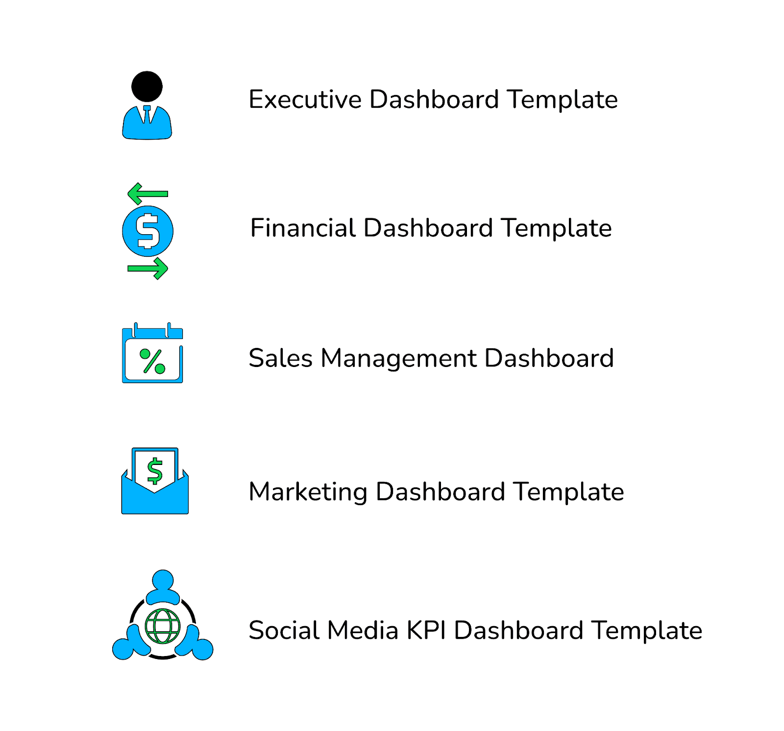
#1. Executive Dashboard Template
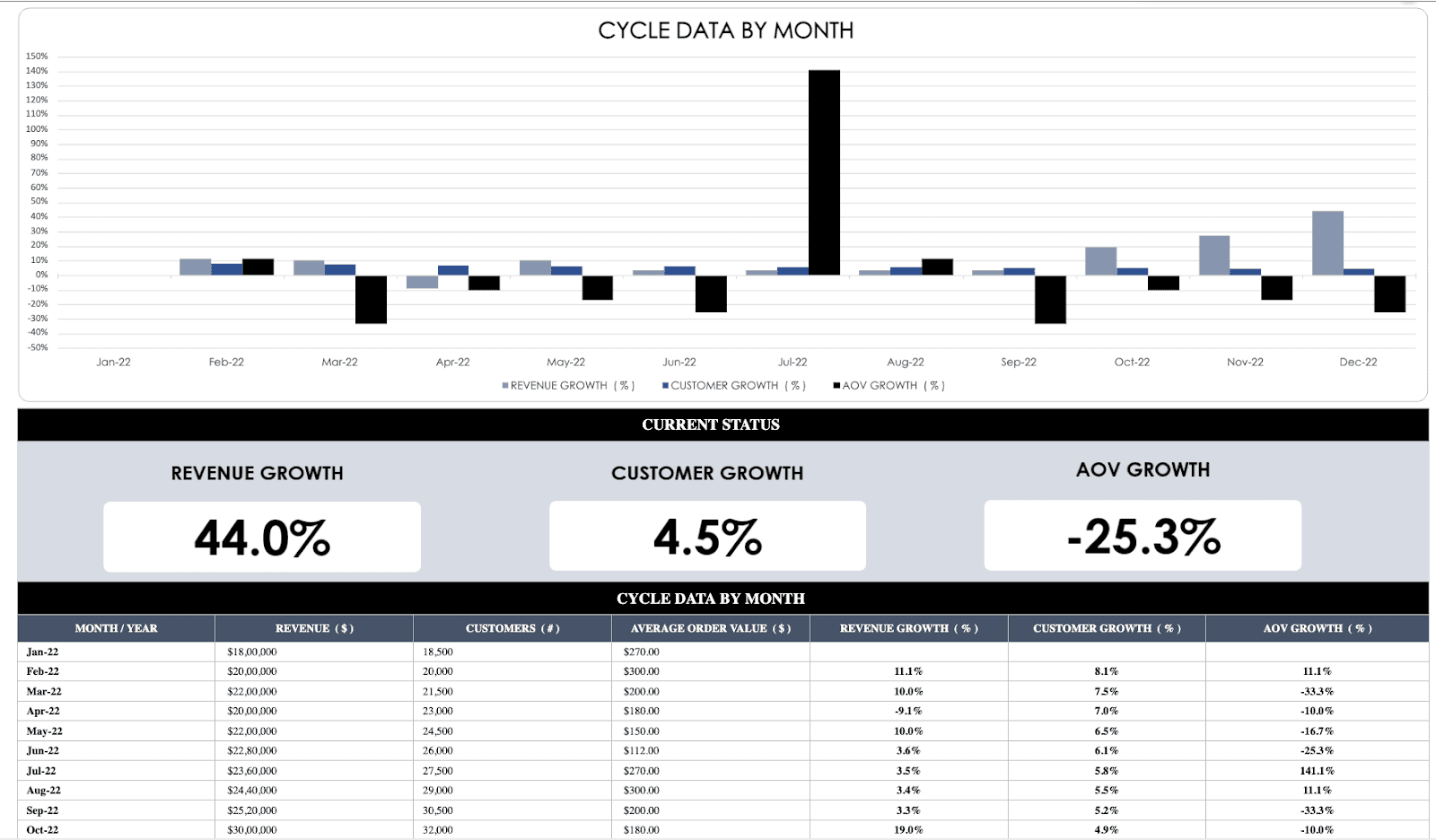
An executive dashboard is a dashboard reserved for the c-level executives or upper management of any organization.
These dashboards typically contain high-level information for leadership to quickly make accurate data-driven decisions. Apart from this, these dashboards also help executives to:
-
Drive productivity
-
Grow Revenue
-
Reduce risk or take calculated risks
KPIs You Can Track
-
Monthly Recurring Revenue: The amount of money your company expects to receive from customers on a monthly basis
-
Average Order Value (AOV): Average amount of money each customer spends per transaction with your business
-
Revenue Growth Rate: Measures the month-over-month percentage increase in revenue
-
Customer Growth Rate: Measures the percentage increase in the number of customers compared to previous months
-
AOV Growth Rate: Calculate the percentage increase in average order value on a month-over-month basis; ideal for measuring marketing and retention strategies
Apart from these metrics, some common KPIs can easily be found in an executive dashboard, such as gross profit margin, EBITA (Earning before interests, taxes, and amortization), ROAS (Return on Ad Spend), etc.
#2. Financial Dashboard Template
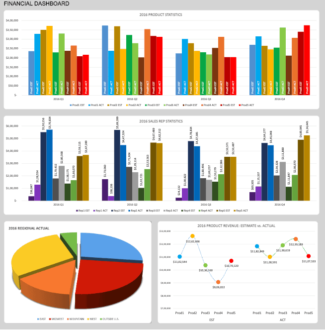
A financial dashboard depicts a company's overall financial health, some might even use it for financial modeling. It's generally used by CFOs (Chief Finance officer) or finance and accounting departments to visualize, monitor, and report a company's financial well-being to stakeholders.
The dashboard template we are discussing here focuses on rather granular metrics showcasing a company's core financial status. 💰
It uses comparative analysis to measure actual and forecasted financial results.
Forecasts are created at the start of the financial year and are normally updated every quarter. By creating a realistic forecast, a business can better understand if they are ahead or behind budget to where they would expect to be at that time of year.
KPIs You Can Track
-
Product Sales Est vs. Actual: Compares the revenue generated from the sale of different products against the forecasted revenue
-
Regional Est vs. Actual Revenue: Compares the quarterly sales (estimated and actual) made by geographical area
-
Sales Rep Statistics: Tracks the amount of sales generated by individual sales representatives against their quarterly sales targets
-
Annual Revenue Per Product (ARPR): Measures the actual annual revenue generated per product vs. the forecasted revenue
Other Common KPIs
-
Working Capital: Measures the amount of capital available for performing day-to-day operations of the business
-
Net Burn Rate: The amount of money a company is losing per month after burning the profits for the month
#3. Sales Management Dashboard Template
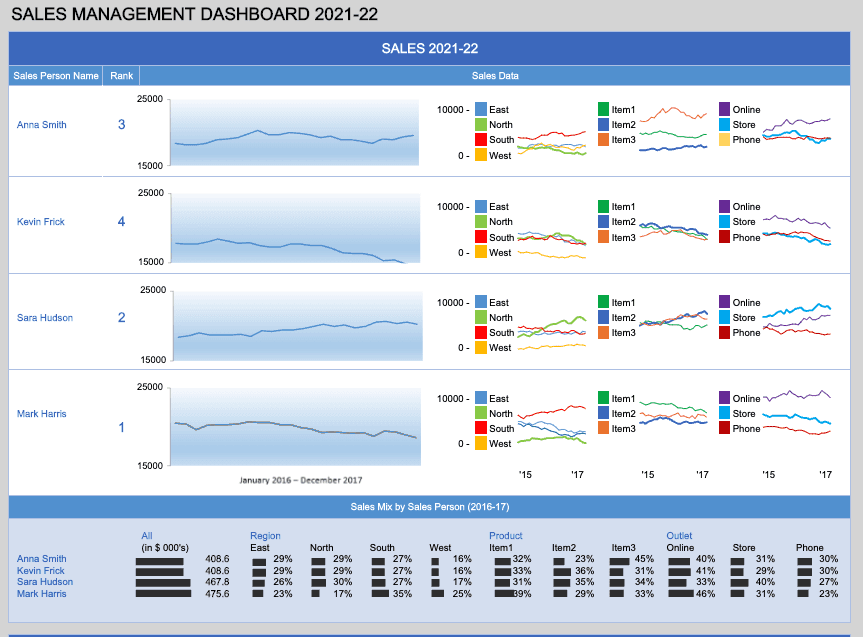
Sales dashboards are essentially used by sales managers and c-level executives to get a comprehensive overview of their sales efforts.
These dashboards generally focus on monthly targets and sales pipeline; however, the content of a sales management dashboard varies from company to company.
But in the end, they all reflect the same thing - Sales.
The diversified roles and responsibilities a sales manager handles on a regular day are all tracking with a sales management dashboard.
KPIs You Can Track
-
Total Sales: Calculates the total amount of revenue generated from the sale of products or services on a monthly or annual basis
-
Product-Region-Outlet Mix: Segments the total sales via product, region, and outlet (online/store/phone) for a comprehensive overview of overall sales
-
Sales Mix by Sales Person: Evaluates the overall sales generated by individual sales reps based on region, product, and outlet
-
Product-Region-Outlet Mix Trends: Uses a plethora of stacked bar graphs to represent sales figures by item, outlet, and region
Besides, the template also uses a ranking system (gamification feature added to dashboards to boost employee morale) to rank sales representatives based on sales generated and target achieved.
#4. Marketing Dashboard Template
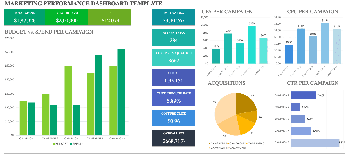
Since the advent of online marketing, the role of marketing professionals has diversified to a certain extent.
They need to track every trend, every competitor, and every penny spent on marketing campaigns.
Additionally, they need to analyze all the possible marketing metrics to figure out the most sought-after marketing strategy for the business.
This marketing dashboard template is the perfect fit for marketing teams.
KPIs You Can Track
-
Budget vs. Spend Per Campaign: Measures the total budget allocated against the total spends made per campaign
-
Cost Per Acquisition: Calculates the cost incurred in acquiring new customers
-
Cost Per Click (CPC): Measures the amount of money you are entitled to pay to the publisher when a user clicks on your ad
-
Return on Investment (ROI): Evaluates the gain or loss made from investment in marketing activities or campaigns
-
Click-Through-Rate: Measures the total number of clicks your ad receives to the total number of times it was viewed
#5. Social Media KPI Dashboard Template
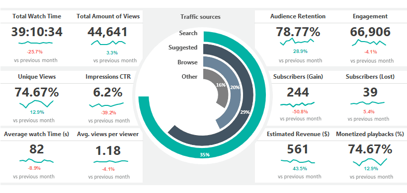
A social media dashboard template provides insights into your social media performance.
This particular dashboard template has a classic grid layout allowing you to easily measure 10+ key social media metrics under one roof.
Moreover, under every metric scorecard, you can check the percentage growth in metrics compared to past performances.
KPIs You Can Track
-
Traffic Source: Measures the percentage of incoming traffic from organic searches, referrals, or paid sources
-
Total Watch Time: Calculates the total amount of time people have spent watching your videos or ads
-
Total Impressions: The total number of times your post or ad was shown in users' feed
-
Unique Views: Accounts for the total number of viewers who viewed your webpage or social media page for the first time or from a different device
-
Audience Retention Rate: The rate at which you can retain your existing subscribers or follower over a given period
-
Engagement Rate: Measures the level of engagement your content gets as a percentage of your audience; tells how well your content resonates with your target audience
-
Estimated Revenue: A predictive metric used to forecast the revenue goals from social media campaigns and online marketing efforts
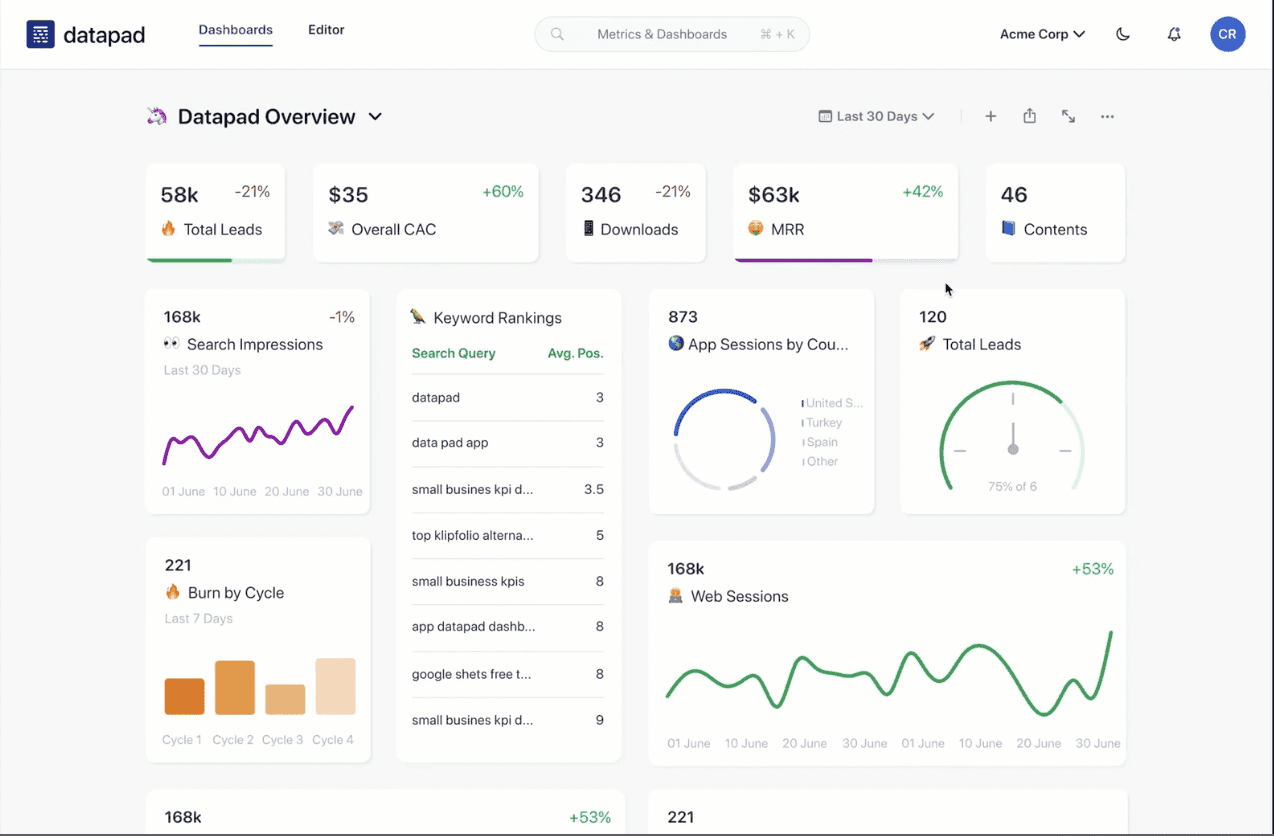
Best Alternative to Excel Dashboards: Datapad
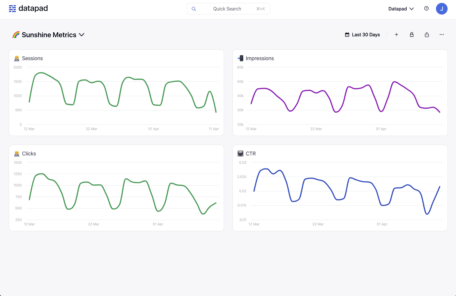
Datapad is the industry's leading mobile-first KPI dashboarding platform that allows anyone to collect, monitor, and analyze crucial business metrics under single platform.
Unlike Excel, you won't need to write custom codes to import data (or worksheet) and keep it fresh by manually editing it until someone reviews it.
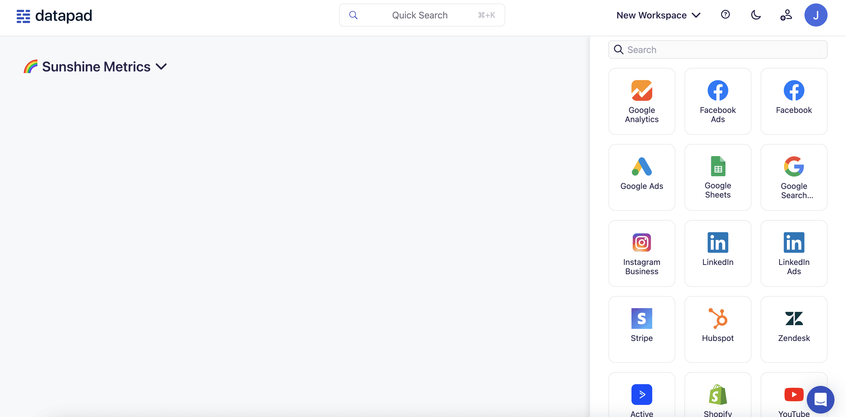
Our tool offers one-click integrations to top data sources, making it possible for literally anyone to connect and import data in real-time – absolute no-code.
Here's how you can quickly create a dashboard on Datapad without getting a migraine. 😷
Step 1: Choose how you want to import data to your dashboard: Manually or Automatically
Step 2: Check out our amazing gallery of pre-built data visualization elements and choose the best way to represent your data
Step 3: Share the live dashboard with teammates and stakeholders with a click
And that's it!
Both Excel and Datapad have a 5-step process to create dashboards but do you know where we save your time and effort?
In terms of automation. 🤖
Having said that, here're a few key features of Datapad which make it the best alternative to Excel dashboards.
#1. Ease of Data Import
You guys know how complicated it is to import data to Excel workbooks. The manual work just doesn't seem to end.
But not anymore.
With Datapad, you can automate the whole process of importing and preparing raw data for action. You can opt for our one-click integrations from top data sources to automatically import data to your dashboard.
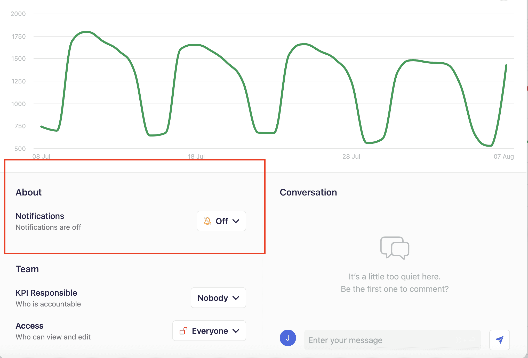
#2. Seamless Team Collaboration
Datapad offers a collaborative working environment even if you are miles apart from your team.
Our tool has an in-built collaboration feature that allows your team to communicate in real time simply by commenting under metrics.
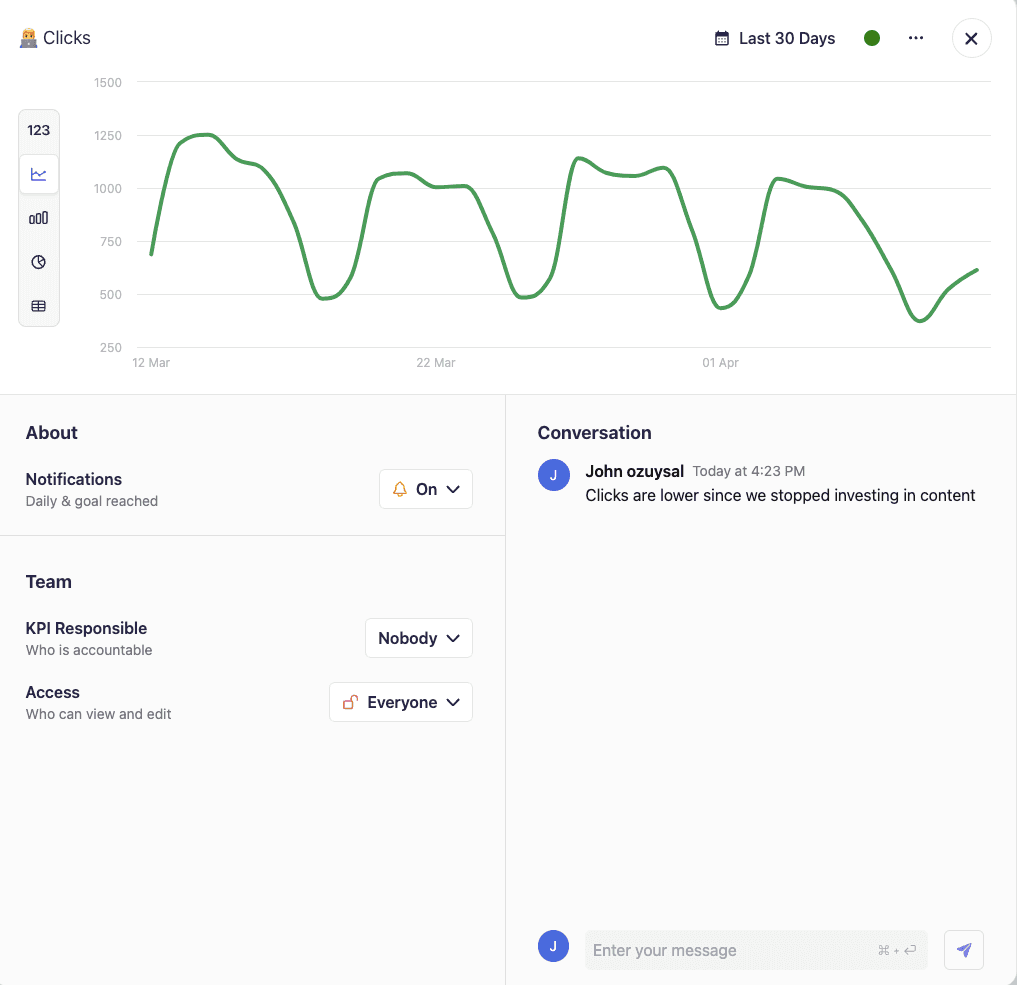
Likewise, your teammates can continue the discussion under your comments until the team agrees or disagrees completely with you (Just like Twitter threads). 😉
Additionally, you can invite your teammates and stakeholders onboard via our one-click email invitations 📧 to your dashboard.
#3. Real-Time Alerts and Notifications
This is something that you can never expect when creating dashboards on Excel.
Excel won't send you any alerts even if the world goes down. 🔕
But we will 🔔
With our real-time alerts, you get to:
-
Make the most out of time-sensitive situations
-
Enable automated event-based alerts for KPIs
-
Get real-time notifications for team messages
Pov: You don't have to keep checking your dashboard to avoid missing an important message or event. We're here to remind you.
#4. Customizability
Have you seen our gallery of data visualization elements? It's kind of WoW from the epiglottis.

We've tons of chart types, Excel tables, bar graphs, and custom widgets to help you create eye-catching dashboards.
Moreover, you can easily customize every section of your dashboard using our intuitive drag-and-drop editor.
That's right, just pick-hold-drop.
We won't mind if you use Excel dashboards. But we would definitely mind if someone (probably a young founder) takes a dig at you for using Excel.
So why not keep your raw data on Excel and let Datapad do the visual heavy lifting?
Sing up today to create stunning dashboards !