![We Tested 11 Best Cyfe Alternatives in 2024 [In Depth Guide]](/_next/image?url=https%3A%2F%2Fframerusercontent.com%2Fimages%2F5Y8BKurdAiIABbRJCNvwoEmGjU.png&w=3840&q=75)
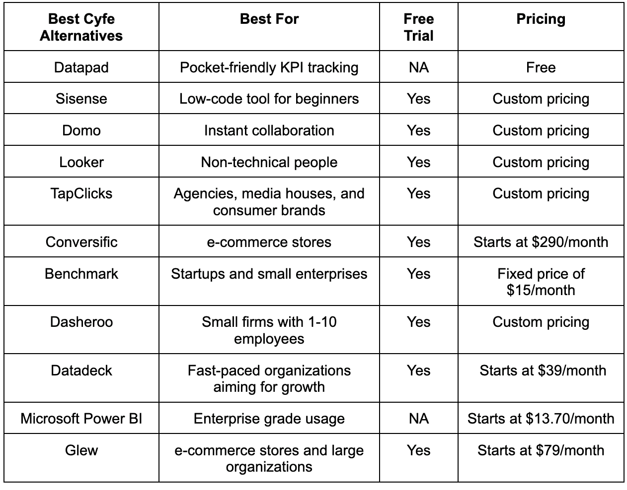
Cyfe alternatives with great user interfaces are Datapad, Sisense, Domo, Looker, TapClicks, Conversific, Benchmark, Dasheroo, Microsoft Power BI, and Glew.
In this guide, you will find a full comparison between all the tools we just mentioned and how they’re better than Cyfe in varying use cases.
Disclaimer: The information below is accurate as of Feb 12, 2024.
Before we dive in and talk about the tools you see in the table, let’s understand why you might be looking for a Cyfe alternative.
Why You Might Look for a Cyfe Alternative?
Reason #1. Poor User-Interface
Cyfe fails to provide users with a friendly dashboarding solution. Its user interface is often deemed outdated by users.

Moreover, a poor user interface brings up a steep learning curve for individuals and organizations. For example, some users found it difficult to understand the metrics tracking.

Even the design of the software is pretty simple, not even close to grabbing users' attention.
Reason #2. Crippled Customization Options
For the most part, Cyfe is not as customizable as you thought it would be. If you have a customized dashboard or a custom theme in mind you want to use, you can't. Let's look at what Zakary H - a Marketing Manager, says about Cyfe's customization options.

So, Cyfe is definitely not for marketing professionals. But here's another big thing.
Cyfe doesn't even allow you to customize its pre-built widgets. That's how rigid it can get in terms of customizations.

Reason #3. Limited Integrations
Another good reason to choose a Cyfe alternative is its weak integrations.
We came across several feedbacks where users weren't happy with Cyfe's built-in integrations. And there’s not much you can do about it - not our words but customers.
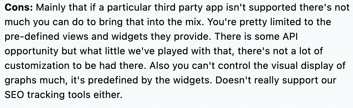
Imagine creating an incomplete dashboard due to a lack of data sources or trouble importing data from popular services. Why would you even choose that software?
Now that you are aware of why you might need a Cyfe alternative. Let's now look at the complete picture - explore these advanced dashboards that can be perfect for your business.
What Are the Best Cyfe Alternatives?
Even though there are many similar tools in the marketplace, they don't match Cyfe's genre and functionality. Therefore, we have compiled a list of the 11 best Cyfe alternatives to ease the drill and save you time.
-
Datapad - Pocket-friendly KPI tracking
-
Sisense - No-code platform for beginners
-
Domo - Intuitive interface for instant collaboration
-
Looker - Powerful visualization tools
-
TapClicks - Drive better ROI
-
Conversific - Increase revenue for e-commerce stores
-
Benchmark - Ease of data import and export
-
Dasheroo - All-in-one performance management
-
Datadeck - Real-time monitoring
-
Microsoft Power BI - Self-service BI and data visualizations
-
Glew - Revenue growth with data-driven business decisions
Let's now talk about all the alternatives mentioned earlier in the article in detail.
#1. Datapad

Datapad helps you track all essential metrics from stunning dashboards.
The beauty of Datapad lies in its simplicity and ease of use. With our tool, anyone in your team with zero technical knowledge can start building reports in mere seconds.
As a go-to solution for Agencies, Datapad makes it easy to onboard new customers with 1-click templates and share performance reports with read-only links.
Datapad also makes it easy to collaborate as a team with the ability to drop comments on KPI cards.
The AI insights tool lets anyone detect anomalies in their data and provides actionable to-do items to increase performance.
Key Feature #1. Templates

Creating reports for your business is no easy task. You have to determine a lot, from which metrics to choose to design the right charts.
If you are an agency and want to create the same reports for multiple clients, then this hassle becomes even more burdensome.
Guess what? Datapad lets you do all this with just a few clicks.
With Datapad's templating features, you can:
-
Choose from a gallery of pre-designed templates and apply them with 1-click
-
Build a custom dashboard and re-use it as a template by changing it's sources
-
Share all connected data sources in the workspace with your teammates
Key Feature #2. Team Collaboration

Tracking KPIs isn't a one-person job when you have a lot of them; you need a team. But not all KPI dashboard tools let you bring your team on board.
Guess what? Datapad lets you do it quickly and easily.
Moreover, you can assign individual team members tasks to handle, goals to achieve, and metrics to measure.
With Datapad's team collaboration feature, you can:
-
Get notified whenever there’s an update for any metrics and KPIs you track
-
Communicate around your metrics and KPIs with your team members
-
Get push notifications on your phone to stay updated with all your KPIs
Key Feature #3. Automated Reports & Scorecards
Wouldn't it be great if you could check your business KPIs first thing in the morning, straight from your inbox?
With our dashboard software, you can subscribe to any dashboard and receive daily email updates.
All you have to do is build a dashboard, click the subscribe button, and set your email preferences.
The best part is you can share reports with anyone, even emails outside of your organization or workspace.
Step 1: Subscribe to a dashboard

Step 2: Check your inbox

With Datapad’s report and scorecard automation, you can:
-
Subscribe to any dashboard
-
Receive daily highlights around all KPIs
-
Send reports to users in and outside of your organization
-
Customize the date range, calculation, and styling of KPIs
Pricing
Datapad has a free tier that includes 1 dashboard. If you want more, you can upgrade to the $30 Standard Plan, which includes 3 dashboards and scales with your usage. Datapad also offers a Business Plan tailored for agencies and includes dedicated customer support.
We are now offering an earlybird discount to all users, so it's a great time to sign up and give Datapad a spin.
How Does Datapad Compare to Cyfe?
Firstly, Datapad is too advanced in comparison to Cyfe. However, without daydreaming too much, we have compared the two platforms simply.
Parameters
Datapad
Cyfe
User-Interface
User-centric interface
Simple but a little confusing
Customizations
Ample customization options
Limited customization options
Mobile-Friendliness
Highly mobile responsive design
Not compatible with all mobile devices
Pricing
Free
Relatively high as per the market rates
Pre-Built Integrations
Integrates will all major data sources
Has integrations with all major data sources
So, as per the comparison chart above, it's pretty clear why Datapad is too advanced compared to Cyfe.
Now let's dive in the details of other Cyfe alternatives so you can choose the best-suited dashboarding analytical software for your business.
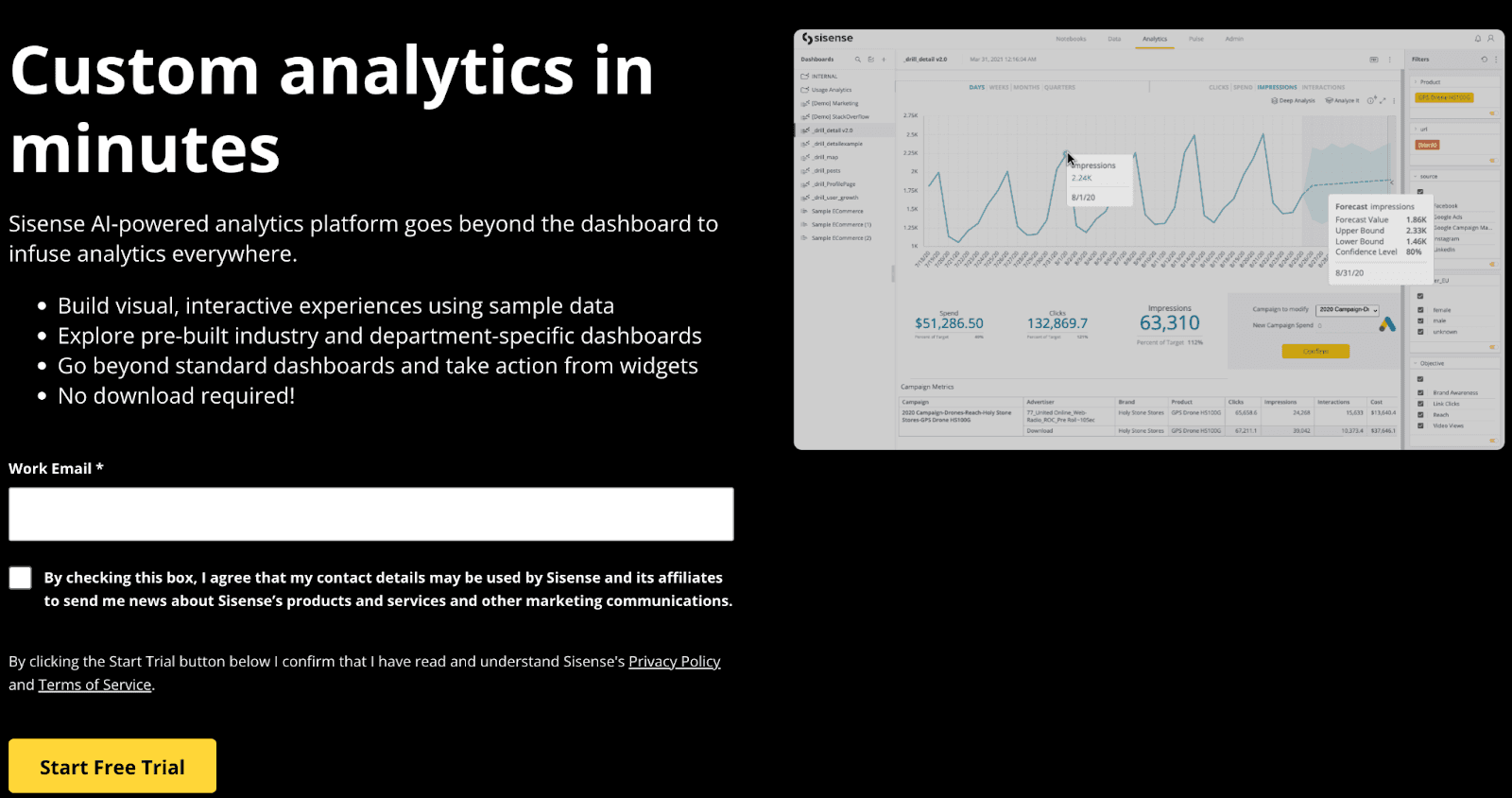
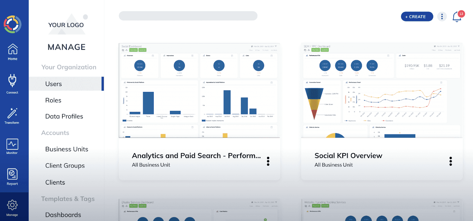
#2. Sisense

Sisense is a leading BI and cloud analytics platform specializing in infusing analytics into your business workflows and products.
The platform is trusted by the likes of Philips, Skullcandy, ZoomInfo, and more for making excellent business decisions.
Who Is It For?
Sisense is an excellent enterprise-grade BI platform. It's best suited for medium-sized enterprises with complex databases and hard-to-handle data management processes.
Features
-
Easy-to-use drag-and-drop customizations with extensive library of pre-built templates, smart calculation widgets, and charting options for quick visualizations
-
Pre-integrated data pipelines to quickly ingest, prepare, and visualize complex data within minutes
-
Use Sisense AI-assisted data prep to refine bulky data for analysis automatically
-
In-built SDKs allow users to take actions in external applications from within your dashboard
-
Leverage smart Sisense URLs to share dashboards and export widgets; allows users to create and customize PDF reports
Pricing
Sisense doesn't specify any pricing plans on its official website. You can fill out a form and get started with a free trial. After you’ve used the platform thoroughly, their sales team will contact you for pricing.
#3. Domo

Domo is a low-code data app platform that empowers businesses with powerful BI and data visualization tools. Its self-service business analytics provides complete data accessibility and offers businesses the flexibility to create interactive dashboards hassle-free.
Who Is It For?
With over 2000+ customers, Domo is best suited for business owners, webmasters, and salespeople.
Features
-
Get actionable business intelligence insights on your key metrics and prioritize data to make the right data-driven decisions
-
Easily create custom dashboards with a mix of multiple business metrics; get access to over 150+ interactive chart types for quick visualization - no coding required
-
Enable self-service BI to unlock Domo's intuitive interface for teams and business partners for instant collaboration
-
Set custom notifications and alerts for changes in trends or team activities on the dashboard for secure management
Pricing
You can try Domo out for free, but to get a customized quote, you can fill out a form and wait.

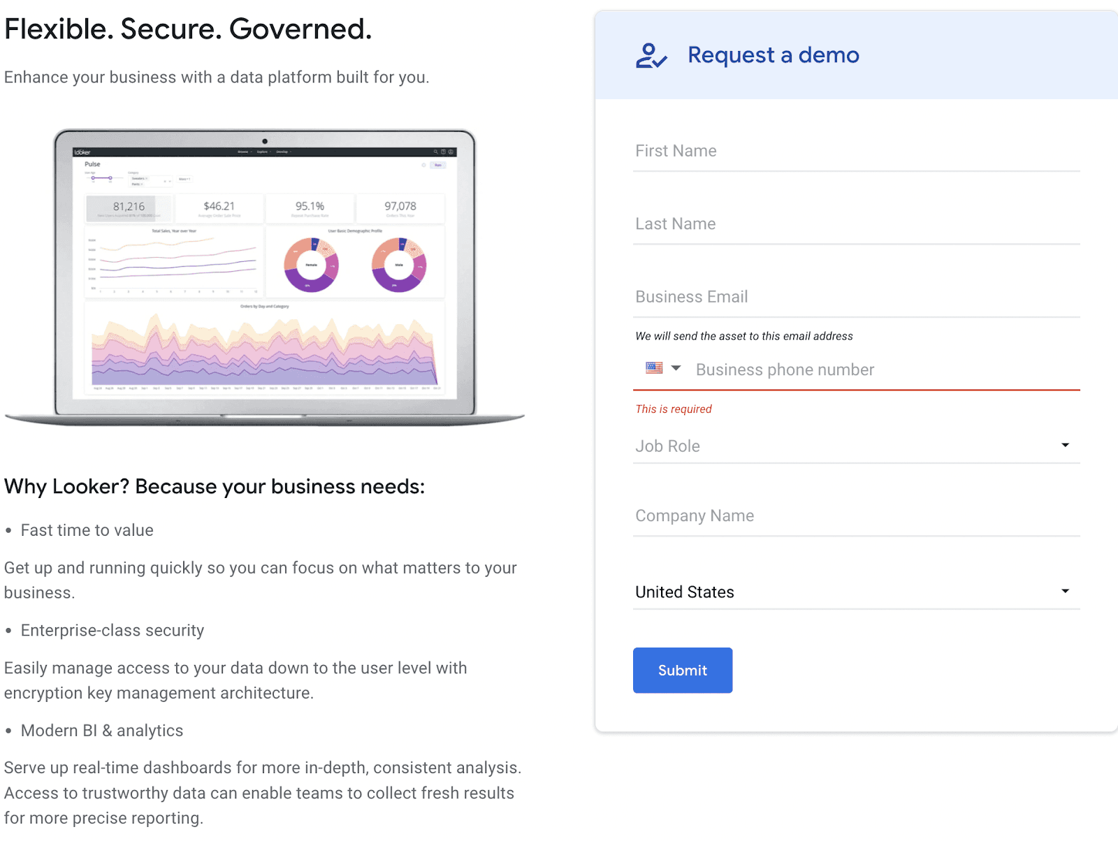
#4. Looker

Looker is a robust cloud-based business intelligence software that offers a new approach to KPI tracking and reporting.
The platform enables businesses to collect, centralize, monitor, and analyze meaningful data from multiple sources. Thereby helping leaders make better data-driven decisions.
Who Is It For?
Looker is best for organizations with a non-technical background. It’s also a user-friendly tool that doesn’t have much of a learning curve - perfect for beginners.
Features
-
Unlock 360° view of your data by creating a mix of KPIs and custom metrics to drill down deeper into your business performance
-
Create stunning dashboards and reports with Looker's pre-built components, modules, and embedded analytics
-
Has a dedicated marketplace that offers app integrations, Looker blocks, and custom plug-ins to ease your development process
-
Build interactive and dynamic dashboards with Looker's powerful visualization tools; control how someone can view your dashboard or create individual dashboards for specific departments
Pricing
Looker has no set pricing policy for its services. However, you can request a demo and know about the pricing later.
#5. TapClicks
TapClicks is a dashboard business intelligence tool that helps you track KPIs the right way.
It’s a leading provider of unified marketing operations, analytics, and reporting solutions. It helps marketers drive better ROI by creating interactive dashboards with real-time data and automated reporting.
Note: To begin with, you need to interlink all your ad accounts or your Google Data Studio with the software. Then, the platform allows you to create stunning visualizations and beautiful dashboards to make better data-driven decisions.
Who Is It For?
TapClicks best suits agencies, media companies, consumer brands, and individual marketers who plan to drive higher ROI from data-driven decisions.
Features
-
Create custom dashboards to analyze and optimize all your ad networks; integrate TapClicks with multiple data sources to link ad data with web conversions and sales
-
Embedded budget and KPI pacing feature; set budgets, automatically pause campaigns before overspending, and analyze overall progress under a unified dashboard
-
Perform A/B tests to enhance your visual reports by comparing actual ad creative with specific ad-level business metrics
-
Get access to real-time data from multiple data sources such as Google Ads, Facebook Ads, Google Analytics, Google Sheets, Salesforce, and HubSpot
-
Has a white label option to personalize your dashboards and reports with your branding
-
Get a holistic view of your marketing operations with 100+ metrics and advanced filtering options to drill down helpful business insights
Pricing
TapClicks offers a 14-day free trial period. Apart from this, TapClicks has multiple subscription plans based on your business needs. You can fill in a form to book a demo, and their sales rep will contact you in no time.

#6. Conversific

Conversific is an all-in-one e-commerce business intelligence tool. It helps e-commerce store owners monitor store performance, generate actionable reports, and make profitable decisions.
Who Is It For?
Unlike other dashboarding software, Conversific is focused on e-commerce stores. We say this because the platform is trusted by more than 40,000+ e-commerce stores for performance monitoring and reporting.
Features
-
Uses a metric-first approach to automatically showcase all important business metrics first so you can focus on KPIs that matter
-
Get clear and actionable insights to identify leakages and miss-flow of money better
-
Save time by automating the process of compiling, cleansing, and visualizing your data for 10X faster data analysis
-
Get tailored recommendations and data-driven tips to increase sales and conversions; automated audit check of crucial metrics to identify what's wrong
-
Offers store certification and quality benchmark to make your store stand out from the crowd
Pricing
Conversific offers a free plan which includes one store access, five reports, and 1500 orders/year. Besides this, the platform has three paid plans:
-
Business: $29/month
-
Growth: $79/month
-
Scale: $199/month

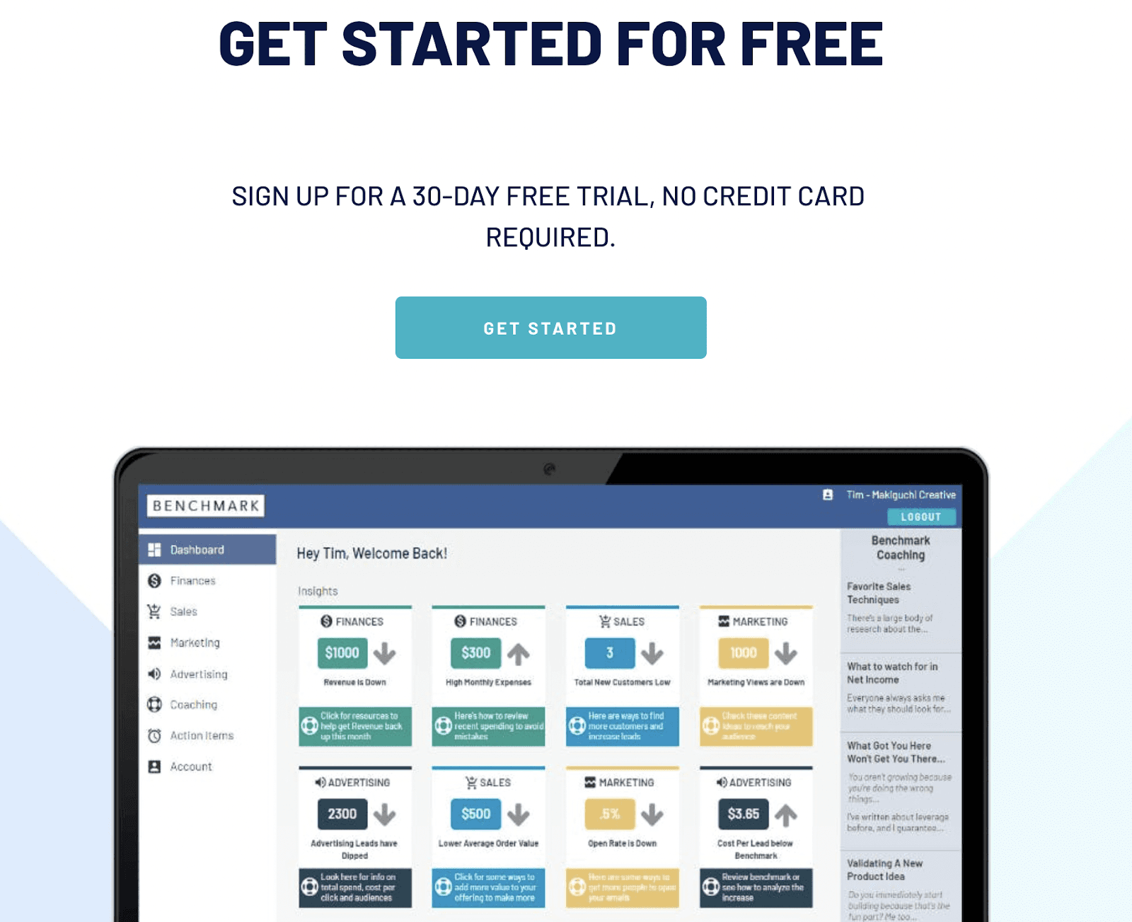
#7. Benchmark App

Built using Bubble on Amazon Web Services, Benchmarks is an advanced business intelligence software that provides clear and actionable insights from bulky data.
The platform helps businesses create an easy-to-understand dashboard for managing finance, sales, marketing, and help in business growth.
Who Is It For?
Benchmark is a feature-rich yet affordable analytical and dashboarding tool for small enterprises with 1-20 employees.
Features
-
Has a fully functional web app built using Bubble on Amazon Web Services; track your data and view insights anytime and from anywhere
-
Get free access to a large community of founders and creators; enjoy free coaching resources such as blog posts, articles, and white papers
-
Easily track and monitor your revenue, order value, marketing, and advertising efforts from a unified dashboard or specific dashboards for each purpose
-
Create colorful dashboards with easy-to-understand visuals; use a metric-first approach to analyze essential metrics
Pricing
Benchmark offers a 30-day free trial (no credit card required). Apart from this, Benchmark has a simple pricing policy of $15/month.
#8. Dasheroo

Dasheroo (the birth child of Databox) offers a holistic approach to managing and visualizing complex business data.
Its business dashboards aim to provide businesses with actionable insights generated by compiling data from multiple data points.
Who Is It For?
Dasheroo is an affordable dashboarding solution with a sustainable amount of integrations and well-built connectors. Hence, it's best recommended for small teams and enterprises engulfed in limited data.
Features
-
Comment and chat in real-time with your team right from within Dasheroo and get the team focused on results
-
Get instant group notifications when your chosen metric crosses the threshold
-
Easily share dashboards and reports via scheduled recurring emails or export via PDF and PNG formats
-
Allows easy integration of custom data sources with its in-built JSON and Push API webhooks - no technical jargon required
-
Broadcast your dashboard to team meetings and conferences via scheduled slideshows
Pricing
Dasheroo comes with a 30-day risk-free trial, limited to 4 dashboards and 12 insights. The subscription version of the tool is yet to be publicly available; hence, the pricing is still a surprise.
#9. Datadeck
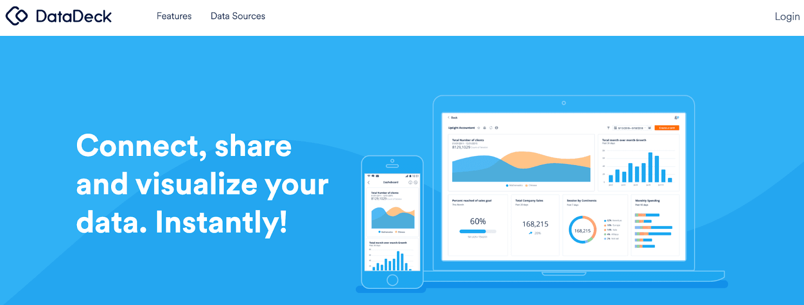
Datadeck is a modern-day data dashboarding platform helping data-driven businesses monitor strategic goals with powerful visualizations.
It empowers business owners to connect, analyze, and share meaningful real-time data from a centralized dashboard.
Who Is It For?
Datadeck is best suited for lean and fast-paced startups. Its beautiful dashboards allow seamless real-time monitoring of crucial KPIs for measuring business performance.
Features
-
100+ pre-integrated data sources such as Slack, Facebook, and Google Analytics for easy import of data from multiple data points
-
Set goals, track performance, and measure results from a centralized dashboard; enable a bird-eye view to drill down deeper into your data
-
Choose from an extensive library of pre-built templates; intuitive drag-and-drop functionality for easy customization and data visualization
-
Enjoy real-time access to your data from anywhere with Datadeck's highly responsive mobile app
-
Set up automated alerts for updates on your business health or change in your chosen metrics
Pricing
Datadeck offers a 14-day free trial. After which, Datadeck has two premium plans:
-
Start-up: $49/user/month
-
Business: $129/user/month
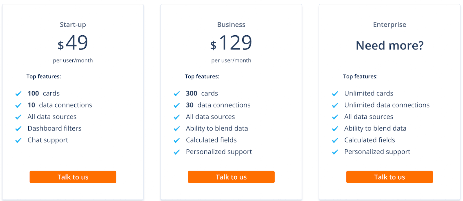
Note: Datadeck also has an enterprise-grade plan. The plan has custom pricing options, and you must connect with their sales team to get a quote for the same.
#10. Microsoft Power BI

Microsoft Power BI is a fantastic self-service data visualization and reporting tool that lets you and your organization make data-driven decisions.
Some of the top companies enjoy the platform's services, including P&G, Toyota, KPMG, and more.
Who Is It For?
Microsoft Power BI is a fast-track, robust, and scalable data visualization solution for various industries. It's a low-code platform, allowing anyone to use it to create stunning visualizations.
Features
-
Share rich data visualizations with your team to assist them in grasping the nature of the KPI and making appropriate decisions
-
Has a highly responsive mobile app that allows you to access and monitor important KPIs on the go
-
Use intelligent tools such as AI-assistant, Excel integrations, and custom data connectors to find and share meaningful data
-
Has advanced filtering options such as Power Query or SQL to perform relational database analytics
-
Integrated with the industry's leading security capabilities such as sensitive labeling, end-to-end encryption, and real-time monitoring
Pricing
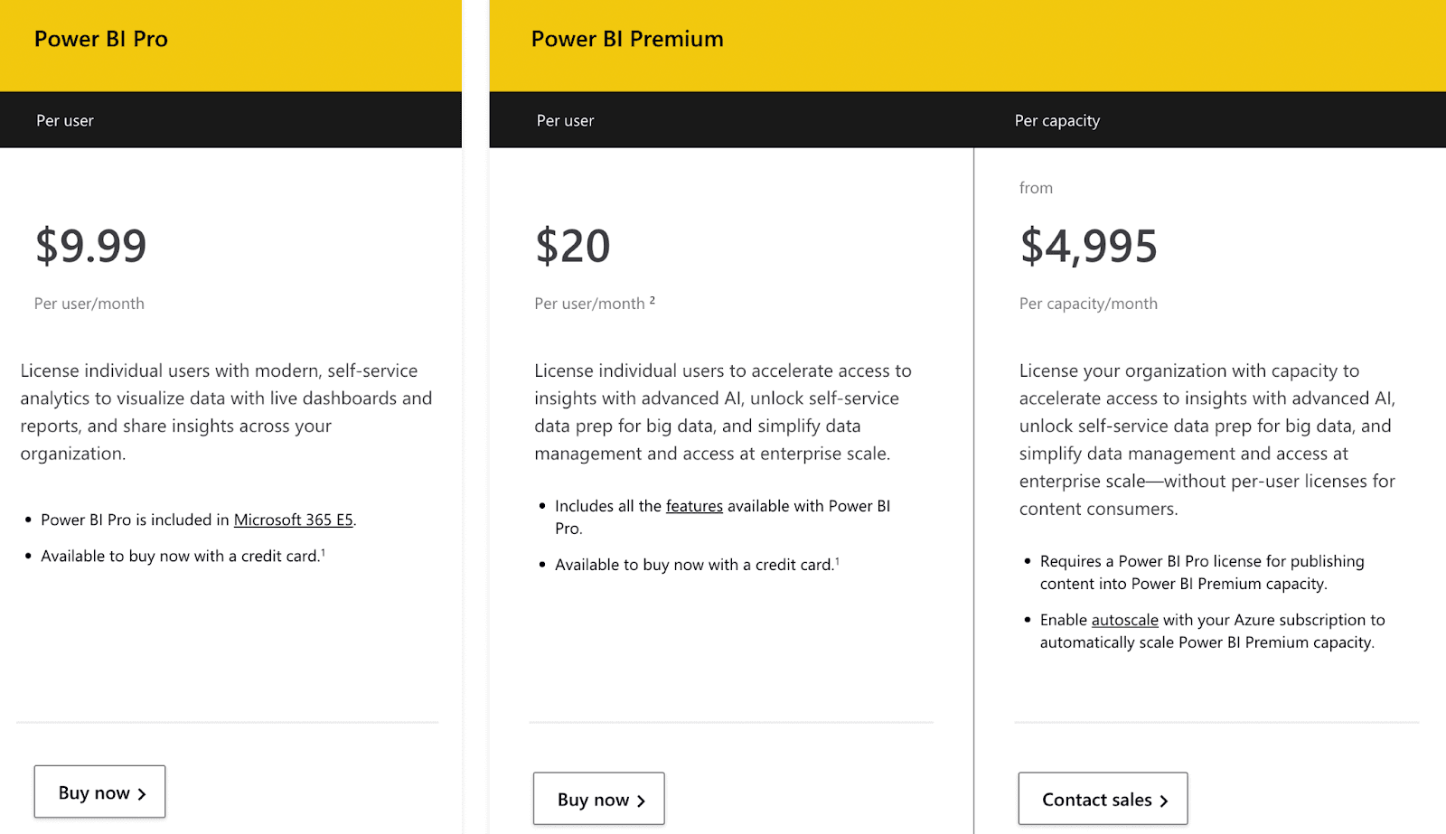
Microsoft Power BI offers a free plan with limited features. Apart from this, it has two plans:
-
Pro: $9.99/user/month
-
Premium: $20/user/month or $4,995/capacity/month
#11. Glew

Glew is an all-in-one e-commerce analytics and reporting tool enabling organizations to generate higher revenue by providing real-time actionable insights.
Who Is It For?
As stated above, Glew is an e-commerce BI software best suited for established e-commerce stores.
Features
-
Offers seamless custom integrations with leading tools across e-commerce, operations, marketing, warehouse management, and more to give you cross-platform reporting
-
Get delivered your business performance snapshot on a daily, weekly, or monthly basis; set up automated alerts to stay updated with changes in your chosen metrics
-
Has 200+ pre-built KPIs, visualization, and data filtering tools to drill down into your data for better insights
-
Create custom reports and dashboards with a blend of multiple KPIs from various data points to get hands-on hidden insights
Pricing
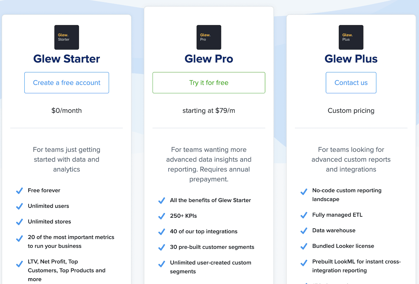
Glew offers a free forever plan with unlimited users and stores, but not unlimited metrics - it gives 20 of the most critical metrics. Besides the free plan, Glew has two paid plans:
-
Pro: $79/month
-
Plus: Custom Pricing
Wrapping Up
Cyfe is undoubtedly a solid platform for measuring and analyzing your business performance via interactive dashboards. However, as mentioned in the article, it lacks a variety of parameters that make it a KPI tracking and comprehensive data optimisation platform.
Now, since you're investing your hard-earned money to ease your KPI tracking process, these alternatives will do a better job than Cyfe (for specific use cases as mentioned).
Among these alternatives, Datapad is the most admired and compatible alternative to Cyfe. Its mobile-friendly interface and robust APIs allow you to collect, manage, and analyze critical business data from anywhere in the world.
Related content: Cyfe vs. Geckoboard vs. Datapad: Which Tool is Best For You? [2022]
Frequently Asked Questions (FAQs)
Q1. What is Cyfe?
Cyfe is a self-service all-in-one business intelligence platform that helps you track KPIs via online dashboards. You can build real-time dashboards and track KPIs related to social media, analytics, marketing, sales, and many more.
Q2. Is Cyfe Free?
Cyfe gives you a 14-days free trial to test the platform out, but isn’t a free-to-use platform.
After the trial ends, you have four plans to choose from:
-
Starter: $19/mo
-
Standard: $29/mo
-
Pro: $49/mo
-
Premium: $89/mo
Q3. What key dashboard features does my KPI software need?
Here are the major components that a KPI dashboard tracking too must have:
-
Mobile Optimization: To track all KPIs from your mobile with ease
-
Data Import: Automatically and manually data import from a variety of sources
-
Customization: Must be able to change colors, fonts, select charts, etc to build a brand identity
-
Team Collaboration: Should be able to bring your sales or marketing team onboard with ease
-
Real-Time Tracking: Real-time data refresh helps you stay on top of things
Q4. What are some other tools that can be used to create dashboards?
-
Datapad: Track KPIs from your mobile phone on the go
-
Databox: Build real-time dashboards and do marketing analytics the right way
-
DashThis: Import data from multiple data sources with ease
-
Klipfolio: Best for beginners and small businesses
-
Plecto: Gamify KPI dashboards and reports to build a smart dashboard
-
Geckoboard: View KPIs on the big screen (single dashboard in free plan)
-
Power BI: Powerful too to analyze your data