![Best 8 Microsoft Power BI Alternatives in 2024 [In Depth Guide]](/_next/image?url=https%3A%2F%2Fframerusercontent.com%2Fimages%2FXDcpiMLu3ABhnNZK5pVejKzyTE.png&w=3840&q=75)
Some of the best Microsoft Power BI alternatives for ease of use are Datapad, Tableau Desktop, Sisense, QlikSense, Zoho Analytics, Cyfe, Holistics, Ubiq, and IMP Cognos Dashboard.
In this guide, you will find a full comparison between these alternatives and get to know which one is the right fit for your business.
Why Might You Look for Power BI Alternatives?
Reason #1. Crowded User Interface
Undoubtedly, Power BI is a great platform to work on. But it does have some major challenges, like its user interface.
Power BI’s user interface is pretty complicated to grasp in a glimpse. Although pro analysts may find the UI cool, novice users can have a hard time learning the functionalities and processes of the platform.

Besides, we came across a few reviews where users compared Tableau with Power BI and cited that the UI of Tableau is far easier, quicker, and learnable than what Power BI offers.
Reason #2. Complexity In Handling Bulky Data
Suppose you're an enterprise with a ton of data. Tracking KPIs is already a tough thing. And if there are complications with data importation as well, it becomes a nightmare for you.
Power BI can't handle a ton of data all at one time; it consumes a lot of RAM, so your desktop can heat up and slow down every process.
Not just this, but it also creates a lot of temp and cache files that might fill your disk quickly.
Reason #3. Rigid and Complex In Itself
Power BI isn't an easy-to-understand tool. It takes a significant amount of time for you and your team to get the hang of it, import data, create dashboards, and finally analyze them. With larger teams, it could prove to be really time-consuming and exhausting.

What Are the Best Alternatives to Microsoft Power BI?
Considering the above reasons, it’s time to look forward to some good BI tools. Here’re the best alternatives we reviewed:
-
Datapad: Best for importing data and tracking it with your team
-
Tableau Desktop: Best for in-depth KPI analysis
-
Sisense: Used by mid-sized companies
-
QlikSense: Stunning pre-built templates
-
Zoho Analytics: Affordable solution for tracking KPIs
-
Holistics: Self-serve business intelligence for non-tech users
-
Mixpanel: Easy to use
-
Geckoboard: Cast dashboards on TV

#1. Datapad

Datapad helps you track all essential metrics from stunning dashboards.
The beauty of Datapad lies in its simplicity and ease of use. With our tool, anyone in your team with zero technical knowledge can start building reports in mere seconds.
As a go-to solution for Agencies, Datapad makes it easy to onboard new customers with 1-click templates and share performance reports with read-only links.
Datapad also makes it easy to collaborate as a team with the ability to drop comments on KPI cards.
The AI insights tool lets anyone detect anomalies in their data and provides actionable to-do items to increase performance.
Key Feature #1. Templates

Creating reports for your business is no easy task. You have to determine a lot, from which metrics to choose to design the right charts.
If you are an agency and want to create the same reports for multiple clients, then this hassle becomes even more burdensome.
Guess what? Datapad lets you do all this with just a few clicks.
With Datapad's templating features, you can:
-
Choose from a gallery of pre-designed templates and apply them with 1-click
-
Build a custom dashboard and re-use it as a template by changing it's sources
-
Share all connected data sources in the workspace with your teammates
Key Feature #2. Team Collaboration

Tracking KPIs isn't a one-person job when you have a lot of them; you need a team. But not all KPI dashboard tools let you bring your team on board.
Guess what? Datapad lets you do it quickly and easily.
Moreover, you can assign individual team members tasks to handle, goals to achieve, and metrics to measure.
With Datapad's team collaboration feature, you can:
-
Get notified whenever there’s an update for any metrics and KPIs you track
-
Communicate around your metrics and KPIs with your team members
-
Get push notifications on your phone to stay updated with all your KPIs
Key Feature #3. Automated Reports & Scorecards
Wouldn't it be great if you could check your business KPIs first thing in the morning, straight from your inbox?
With our dashboard software, you can subscribe to any dashboard and receive daily email updates.
All you have to do is build a dashboard, click the subscribe button, and set your email preferences.
The best part is you can share reports with anyone, even emails outside of your organization or workspace.
Step 1: Subscribe to a dashboard

Step 2: Check your inbox

With Datapad’s report and scorecard automation, you can:
-
Subscribe to any dashboard
-
Receive daily highlights around all KPIs
-
Send reports to users in and outside of your organization
-
Customize the date range, calculation, and styling of KPIs
Pricing
Datapad has a free tier that includes 1 dashboard. If you want more, you can upgrade to the $30 Standard Plan, which includes 3 dashboards and scales with your usage. Datapad also offers a Business Plan tailored for agencies and includes dedicated customer support.
We are now offering an earlybird discount to all users, so it's a great time to sign up and give Datapad a spin.
#2. Tableau Desktop
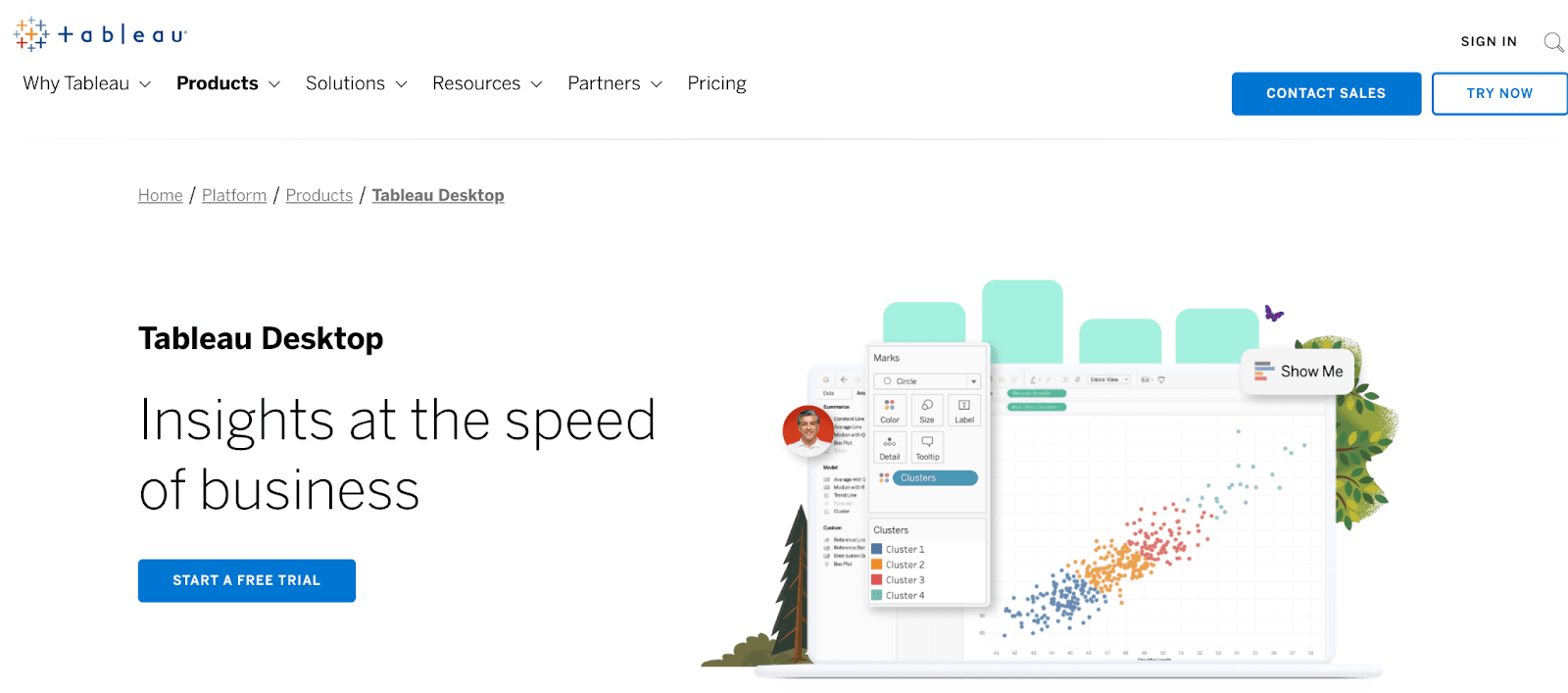
Tableau Desktop is a self-service data visualization software that allows business owners to access, analyze, and visualize data to make impactful business decisions.
The platform aims to support the entire analytics journey, from data preparation to deep analysis to the shared insights that drive the business forward.
Who Is It For?
Tableau Desktop is widely used across every industry or department may it be IT, sales, finance, marketing, HR, customer service, and any other. It’s also a great dashboarding software if you want to drill down further into your data.
Features
-
Leverage live visual analytics for real-time data exploration; perform data cleansing, mashups, and complex calculations without writing a single line of code
-
Use augmented analytics and smart data preparations to generate faster and deeper insights
-
Make smarter decisions using AI-powered predictive modeling, what-if analysis, guided model building
-
Quickly integrate and visualize results from R, Python, Einstein Discovery, and MATLAB to scale models
-
Get data-driven alerts and enjoy seamless collaboration across teams and departments via Slack
-
Quickly set up the platform with the help of training videos, resources, and Tableau's online community
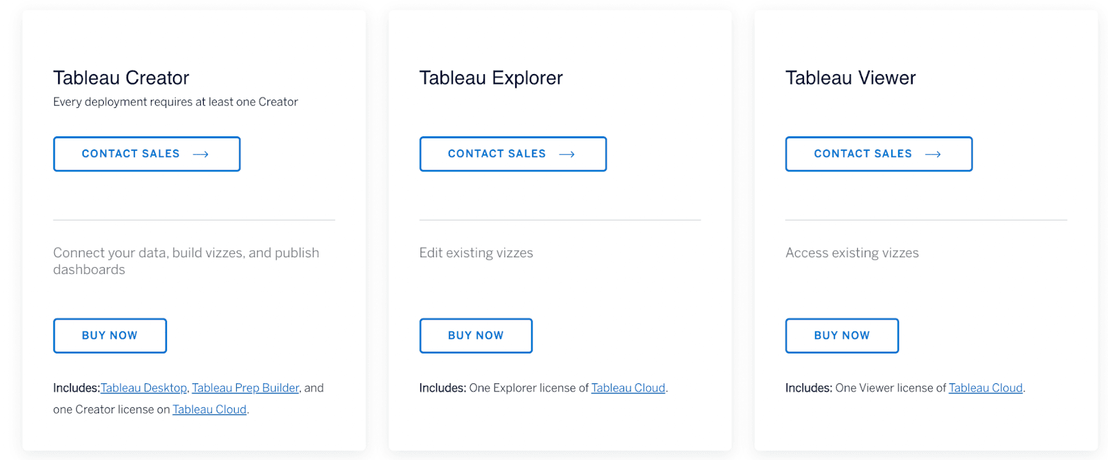
Pricing
Tableau offers a 14-day free trial. After which, it has three paid plans, namely:
-
Tableau Creator
-
Tableau Explorer
-
Tableau Viewer
The pricing of these plans is not mentioned on the website. You may contact their sales rep to get a quote. Besides, students and teachers can enjoy 1 year of Tableau Desktop, Prep, and eLearning for free.
Pros and Cons
Pros
✅ Fantastic UI/UX design
✅ Flexible and capable of visualizing complex data
Cons
❌ Steep learning curve (hard to use)
❌ Limited functionality
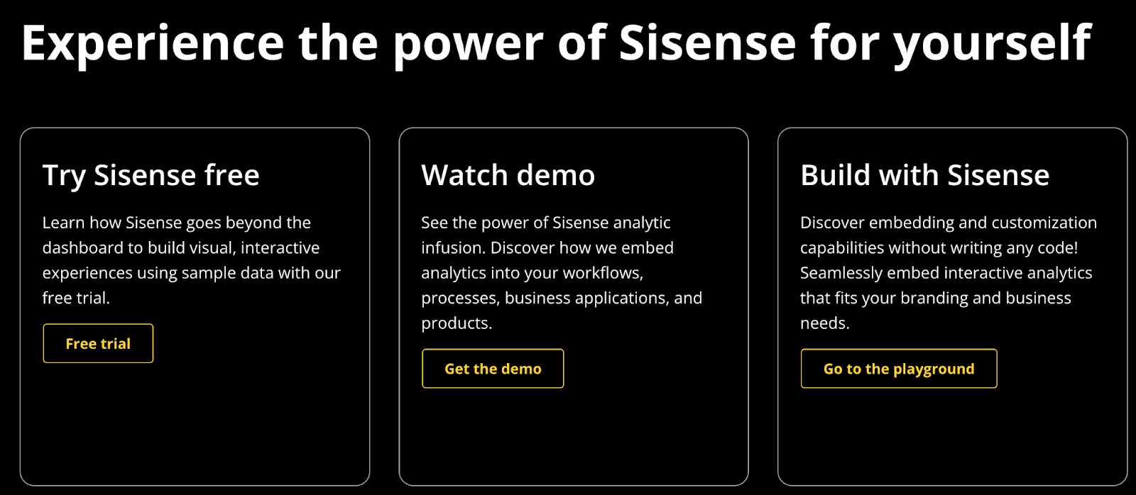
#3. Sisense
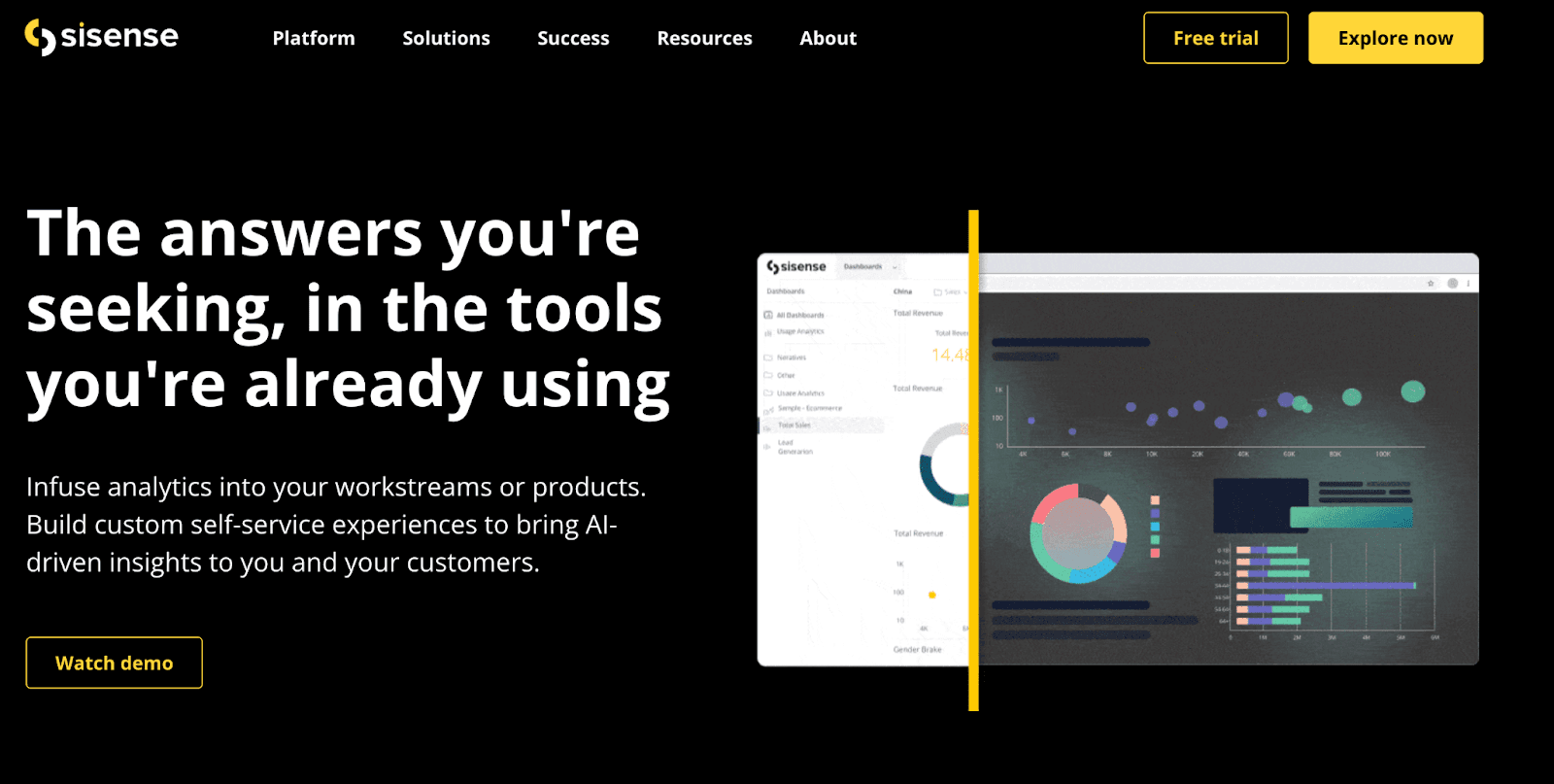
Sisense is a BI and cloud analytical platform that allows businesses to infuse AI-driven analytics into work streams or products.
Its self-service BI and AI-driven insights help data-driven leaders make quick and impactful business decisions.
Who Is It For?
Sisense is a leading BI platform used by the likes of Philips, Skullcandy, ZoomInfo, and more. The most popular use cases of Sisense are from IT, Finance, Healthcare, Marketing, and advertising industries.
Features
-
Over 100+ pre-built data connectors and a robust data engine to extract live data from data warehouses and social platforms
-
Leverage built-in code-first statistical and predictive analysis libraries and ML technologies to uncover future opportunities and outcomes
-
Has an intuitive drag-and-drop interface and AI-powered charting recommendations to quickly customize dashboards
-
Choose from a gallery of pre-built templates and custom APIs to create app-like functionality within the dashboards
Pricing
Like Tableau, Sisense offers a 14-day free trial, after which it has a custom pricing policy. You can contact their sales reps for further pricing details.
Pros and Cons
Pros
✅ Robust architecture and numerous APIs and connectors
✅ Premium access control and security
Cons
❌ Frequent lags and bugs
❌ Lacks some basic features like font formatting
#4. Qlik Sense
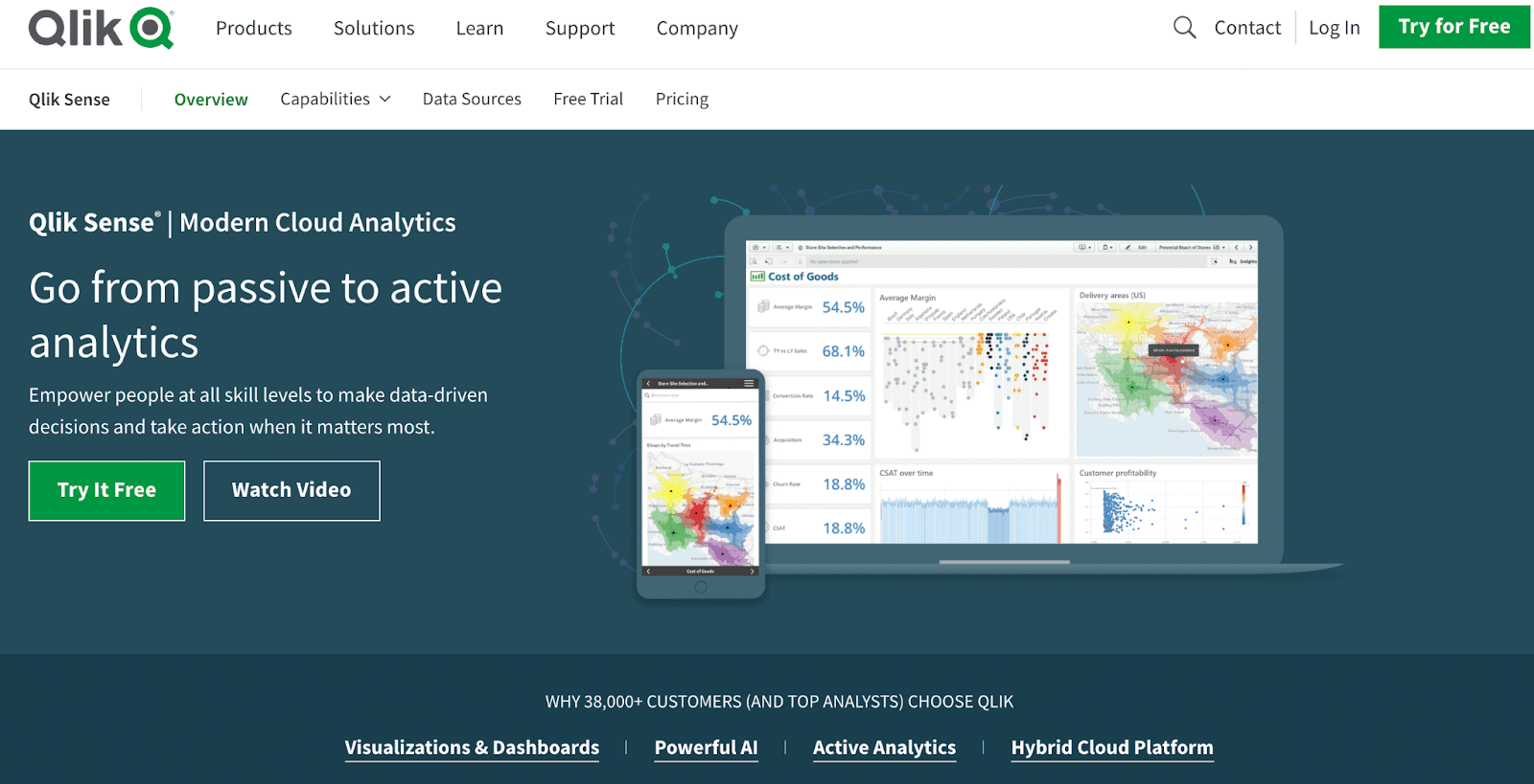
Qlik Sense is a web-based leading cloud analytics and business intelligence platform that empowers business owners and analysts to simplify data analysis and make impactful decisions when it matters the most.
Who Is It For?
With over 38,000+ customers, including Samsung, Honda, and DocuSign, Qlik Sense is best suited for the IT and automotive industry and large organizations with 50-200 employees.
Features
-
Choose from a broad library of interactive dashboards and visualizations that convey the meaning of data via graphs and charts
-
Use search-based discovery and insights advisor for AI-driven analysis, charts recommendations, and data mashups
-
Set up alerts and notifications to proactively monitor business; enable application automation to trigger event-driven actions which automate routine tasks
-
Add narrative and context to business analytics, and create discussion threads to interact actively with data
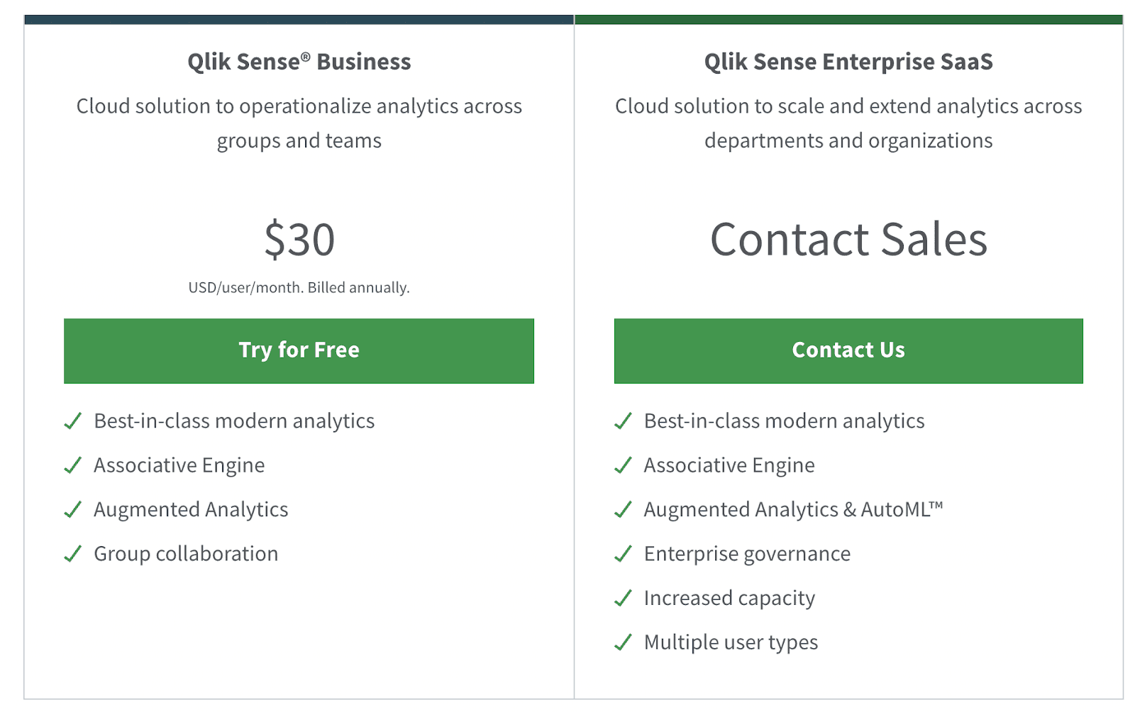
Pricing
Qlik Sense offers a 30-day free trial. After trial expiration, the platform has two premium plans, namely:
-
Qlik Sense Business: $30/user/month
-
Qlik Sense Enterprise SaaS: Contact sales
Pros and Cons
Pros
✅ You can build your own data warehouse
✅ Dedicated mobile apps for iOS and Android
Cons
❌ Steep learning curve
❌ Might struggle with calculations and combining formulas
#5. Zoho Analytics
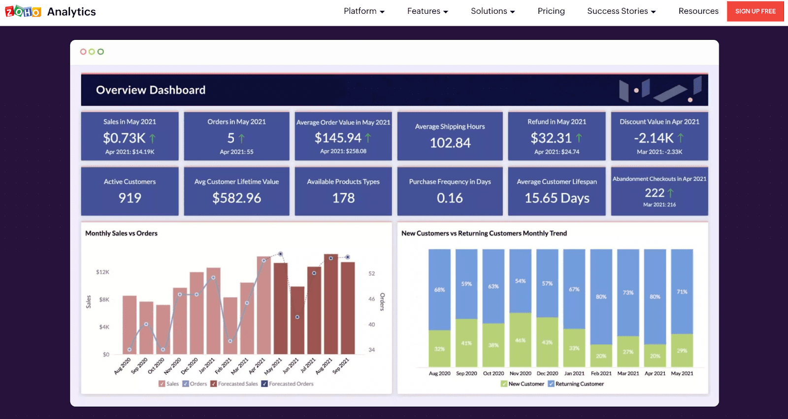
Zoho Analytics is yet another popular BI and analytics tool that allows businesses to analyze data from a wide variety of data sources. The platform enables you to structure, transform, and clean your data set for effective and easy analysis and reporting.
Who Is It For?
Zoho Analytics is trusted by over 2 million business users, and it's a popular choice among top companies such as IKEA, HP, Suzuki, and many more. Preferably, the platform best fits in with large organizations with > 50 employees and keeps track of complex databases and KPIs.
Features
-
Easily connect and blend data from over 250+ data sources and 500+ pre-built integrations to popular platforms
-
Use smart-cleanse to get your raw data cleansed and prepared for analysis; easily transform raw data using 250+ transform functions like pivot, summary, and more
-
Has an extensive gallery of pre-built charts, widgets, pivot, summary, and tabular views to create insightful reports and dashboards
-
Use its intuitive drag-and-drop interface to effortlessly create dashboards; also, use the drag-and-drop designer to customize reports and dashboards
-
Make use of Zia insights, predictive analytics, what-if analysis, and more to generate quick insights from data
Pricing
Zoho Analytics offers a 15-day risk-free trial. Apart from this, it has four subscription plans, namely:
-
Basic: $30/month
-
Standard: $60/month
-
Premium: $145/month
-
Enterprise: $575/month
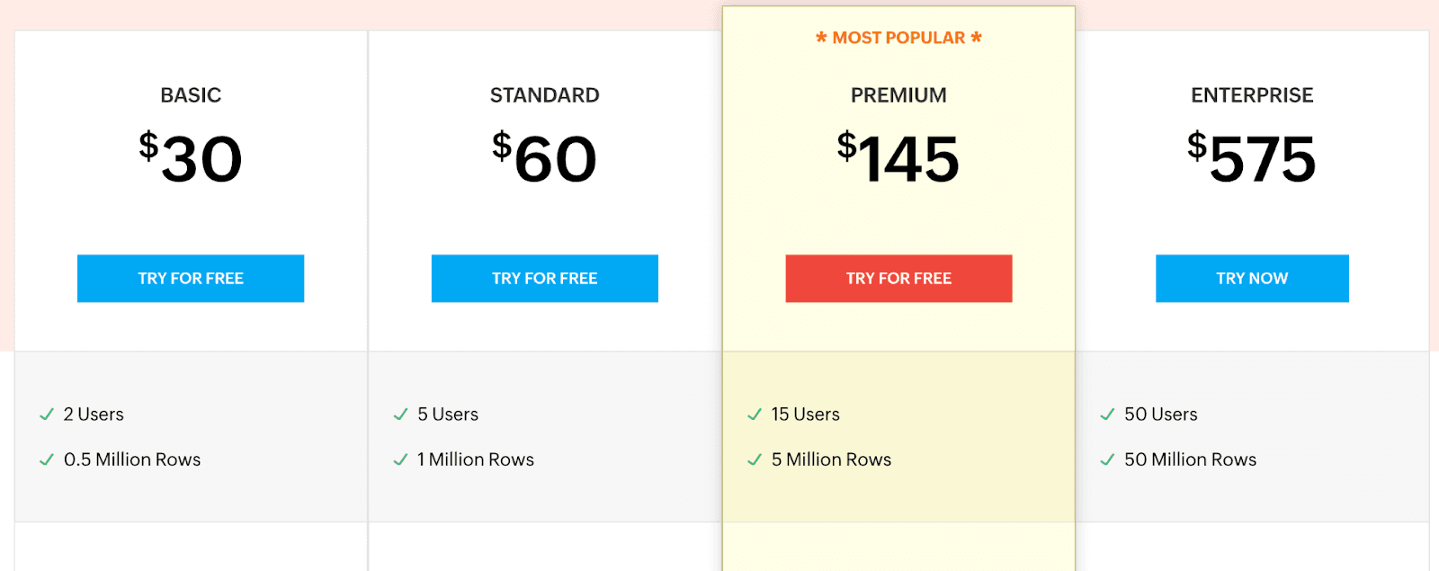
Note: Zoho Analytics also offers a free forever plan on its on-premise set-up.
Pros and Cons
Pros
✅ Free forever plan available
✅ Dedicated mobile app
✅ Excellent number of connectors and integrations
Cons
❌ A bit of technical jargon involved
❌ Not very intuitive UI/UX interface
#6. Holistics

Holistics is a self-service business intelligence tool that enables non-technical users to build their own data visualizations and insights without needing complicated code or involving your data team for requests.
It allows businesses to execute ad hoc queries, connect multiple SQL databases, visualize data, and predict trends.
Who Is It For?
Holistic’s usage-based pricing model is perfect for small to medium-sized businesses since it lowers the financial impact and reduces costs for data analytics and KPI tracking.
Features
-
Self-service capability to build charts, and reports without writing SQL
-
Share insights with a single click and integrates with Slack, email, webhooks, and more
-
Embed visuals directly to any application for better client reporting
-
Complex visualizations that deliver more in-depth insights for smart decision-making, such as Geo Maps, Metric Sheets, Conversion Funnel, and Retention Heatmaps
-
Centralize data definitions with the data catalog function and receive a visual lineage to see how data flows into actionable insights
Pricing
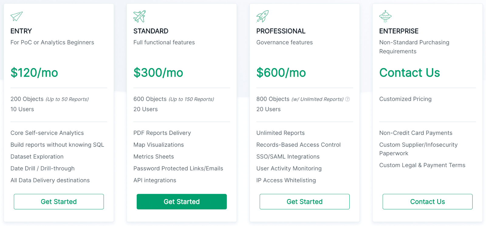
Holistics take a more transparent approach to its sales process. They offer a 14-day free trial, providing full access to their tool. Additionally, they run on a usage-based pricing model, where the more reports you create and users you have, the more you pay.
With that said, there are four pricing plans:
-
Entry: $120/month
-
Standard: $300/month
-
Professional: $600/month
An Enterprise plan is offered to match the needs of larger organizations. If you’re seeking more data capabilities, you’ll need to contact their sales team to receive customized pricing for their Enterprise plan.
Pros and Cons
Pros
✅ An affordable and fair pricing model
✅ Easy to build reports without coding or technical knowledge
✅ Advanced visuals for greater insights and data points
Cons
❌ Design options are minimal
❌ Limited branding options for customizing reports
#7. Mixpanel

Mixpanel provides real-time data analysis to identify patterns and understand how users engage with your website.
It’s a powerful analytics tool that helps you retain more customers to boost your business.
Trusted by more than 7000 customers across the world, Mixpanel is one of the most used product analytics tools around.
Who Is It For?
Mixpanel is the perfect tool for companies who are looking for a product market fit. Aside from that, early-age startups can also benefit from its Growth Plan.
Features
-
Interactive reports give a more detailed insight into how a user is engaging with your website
-
Lets you build customized dashboards in minutes so that you can track all your business key performance indicators (KPIs) in a single place
-
Specialized Ad hoc analysis to understand the hidden pattern behind a trend so you can get to the root of the problem
-
Group analytics help B2B companies dive deeper into customer usage patterns to prevent churn and drive growth
-
SOC2 Type II certification and advanced encryptions ensure end-to-end customer data privacy
Pricing
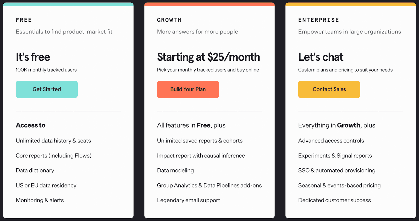
Mixpanel’s free plan offers to track 100k users on a monthly basis. Apart from the free plan, it also has two paid plans.
Pros and Cons
Pros
✅ Can create personalized and customizable dashboards
✅ Commendable customer service
Cons
❌ Can be overwhelming for beginners due to the excessive number of elements
#8. Geckoboard

Geckoboard helps you maintain dashboards and let your teams focus on the most critical metrics for the business.
Who Is It For?
Geckoboard is for teams who don't want to get distracted by numerous insights and reports which don’t sit under their core KPIs.
Features
-
Over 80+ integrations and a robust set of APIs to easily import data from any data source; custom integrations are offered on demand as well
-
Share live dashboard via Slack or email; also lets you export dashboard to CSV
-
Easy resizing, rearranging, and regrouping of your dashboards and reports
-
Cast KPI dashboard on the big TV screen to track KPIs comfortably with your team
Pricing
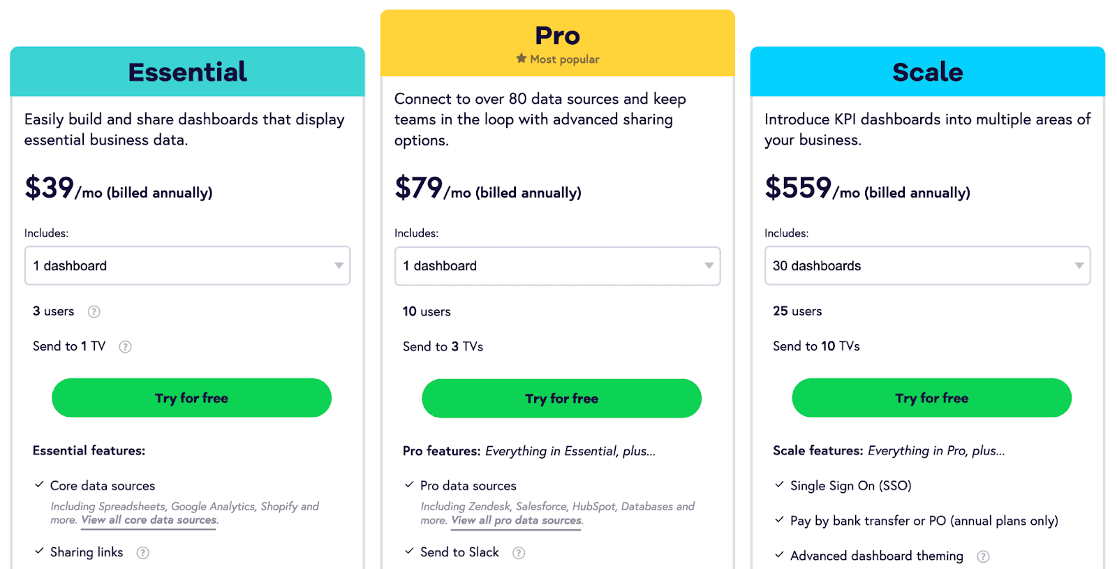
Geckoboard has both free and paid plans. The free plan lets you import data from spreadsheets and create 1 dashboard to test it out. But if you want to use Geckoboard to its maximum potential, go with a paid plan:
-
Essential: $39/month
-
Pro: $79/month
-
Scale: $559/month
Pros and Cons
Pros
✅ Best support team to help you with integration hurdles and dashboard assembly
✅ Easy to use interface with tips to help collaborators navigate the system
✅ Shareability and scheduling across email and Slack
Cons
❌ Limited data visualization libraries
❌ Lacks dashboard customizations for pro customers
Keep All Your KPIs In Your Pocket?
To summarize, Power BI is good but Drilling down data and analyzing every KPI in-depth isn’t what everyone in the business needs to do.
You, as a founder, can build a team that might do this for you and come to you with insights. All you can do is just keep an eye on all the KPIs, sort of an overview.
That is a much less time-consuming and efficient use of any founder's time.
Datapad lets you do this exactly. By signing up and downloading the app on your phone, you can track your business KPI from anywhere in the world.