
'Gantt Chart' – the name itself sounds overwhelming, no?
Even if you ask the 2 Billion Google sheets users on how do you make a Gantt chart on Google sheets?
Most of them would go like:

[Yeah the GIF is buffering, nothing wrong with your device ��]
Gantt charts aren’t everyone’s piece of cake, yet they are no rocket science.
In this article, we’ll walk you through a step-by-step tutorial on how to make a Gantt chart on Google sheets. Time to face the music. 🎶
But before we get into it, here’s a TL;DR you might want to see:
-
Creating a Gantt chart in Google sheets is a 6-step process, you first need to prepare your database, calculate task duration, create a stacked bar graph, customize the graph to make it a Gantt chart, customize for personalization, and then add dependencies if needed.
-
Later in the article you will find 5 Gantt chart templates that you can make a copy of and use.
-
Making Gantt charts in Google Sheets isn’t everyone’s cup of tea; it takes a lot of time, isn’t mobile-friendly, team onboarding can be tough, and has some more drawbacks.
-
Try our tool - Datapad, a mobile-friendly software to create Gantt charts or any other kind of charts and dashboard that takes care of all the drawbacks you face when creating Gantt charts on GSheets.
How to Create a Gantt Chart in Google Sheets?
Step #1. Input Data
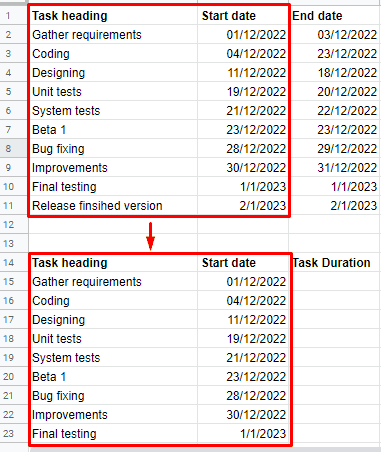
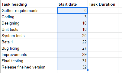
Open a blank Google spreadsheet and make three columns, namely:
-
Task Heading: Includes each task name
-
Start Date: When did the task begin?
-
End Date: When did the task end?
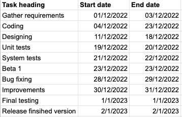
As a sample dataset, we have created a table with ten tasks and their start and end date.
Now to create a Gantt chart, you need to calculate time durations for every task.
Had a hard time with Maths? 🤔
No worries, we've got the formulas ready for you.
Step #2. Calculate Task Duration
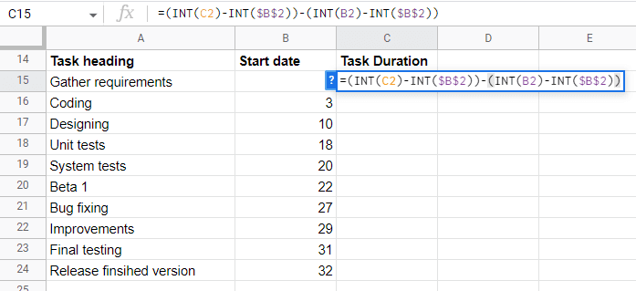
Create a second table with three columns:
-
A: Task Heading
-
B: Start Date
-
C: Time duration
The first two columns are similar to the above table. So simply copy-paste the values of both columns in the second table.
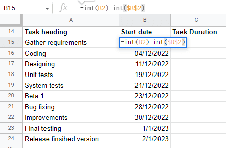
Next, you need to figure out the start day for each task so that the bars accurately display the start date and task duration.
To do so, use the Google spreadsheet formula: =int(B2)-int($B$2)
Note: This formula translates into 👉🏻 Current Task's Start Date – The First Task's Start Date
In our formula, B2 represents the first value in the original 'start date' column. You can change this variable if your table positioning is different.
Insert the formula in the second table's first cell of the start date column (B15 in our case). And then press Enter.
Let's be real; the first/earliest task will obviously start on day 0. And so did our formula.
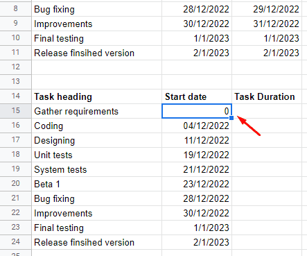
Now click and drag the blue box in the same column until you reach the last task heading.
The sheet converts the timestamp to an integer for the number of days in the date range. Like it did for our dataset.
Now, to calculate each task's duration, copy-paste the below formula into the first cell of the Task Duration column (C15).
= (INT(C2)-INT($B$2))-(INT(B2)-INT($B$2))
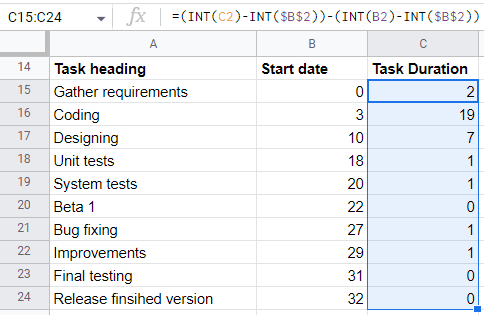
In the task duration column, Sheets calculate the number of days to completion of each task.
Like in our dataset, the first task requires two days to finish. Similarly, copy and paste the formula down to the last task in the same column.
Again, if you have a different table alignment, the cell numbers in the formula will change accordingly.
Step #3. Create a Stacked Bar Graph
Highlight all the cells in the second table, then click Insert > Chart
Google sheets automatically present you with a stacked bar graph. Side by side, it also opens up the Chart Editor on the right sidebar.
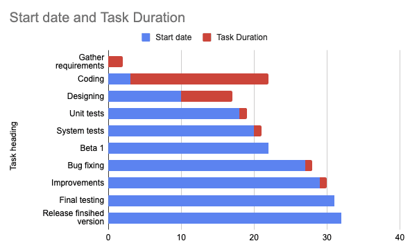
Now let's see how to insert a Gantt chart in Google sheets.
Step #4. Change Bar Chart Appearance Into a Gantt Chart
Click on the Start Date bar on the chart. In our example, it's represented by the color blue.
As we click on it, the series section opens up in the customizer on the right sidebar.
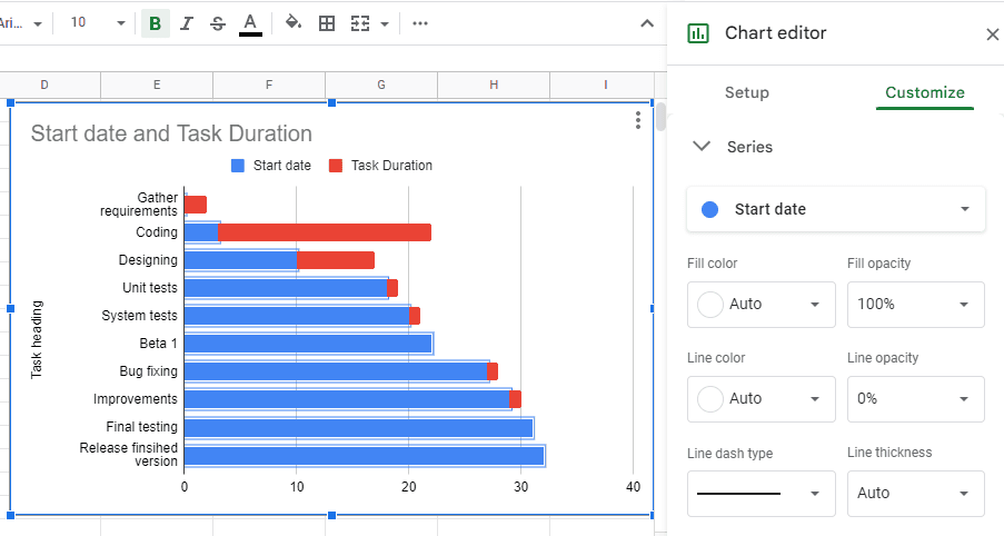
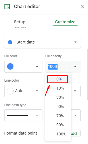
Next, click the Fill Opacity drop-down menu and go for 0% opacity.
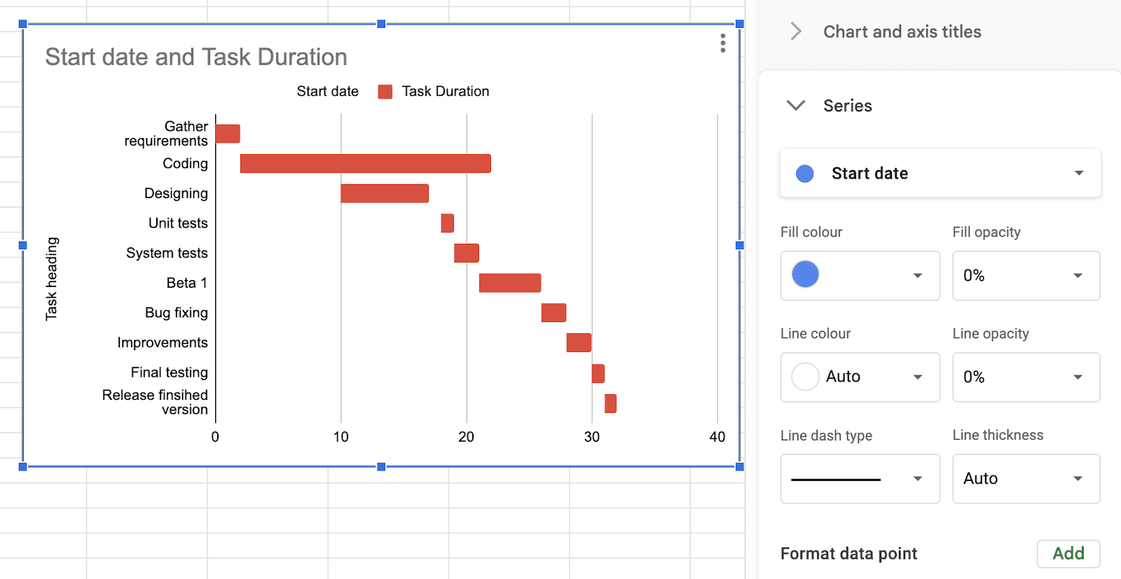
How to add a Gantt chart in Google sheets? Guess what! You already did it. 😉
You see, when you change the opacity of the Start Date bar to 0%, your stacked bar chart resembles a classic Gantt Chart.
Now the question remains, how to edit Gantt chart in Google sheets?
So for that, you can use the customizer, which offers various elements to customize every section of your Gantt chart.
Step #5. Customize Your Gantt Chart
We'll start with basic customizing options first.
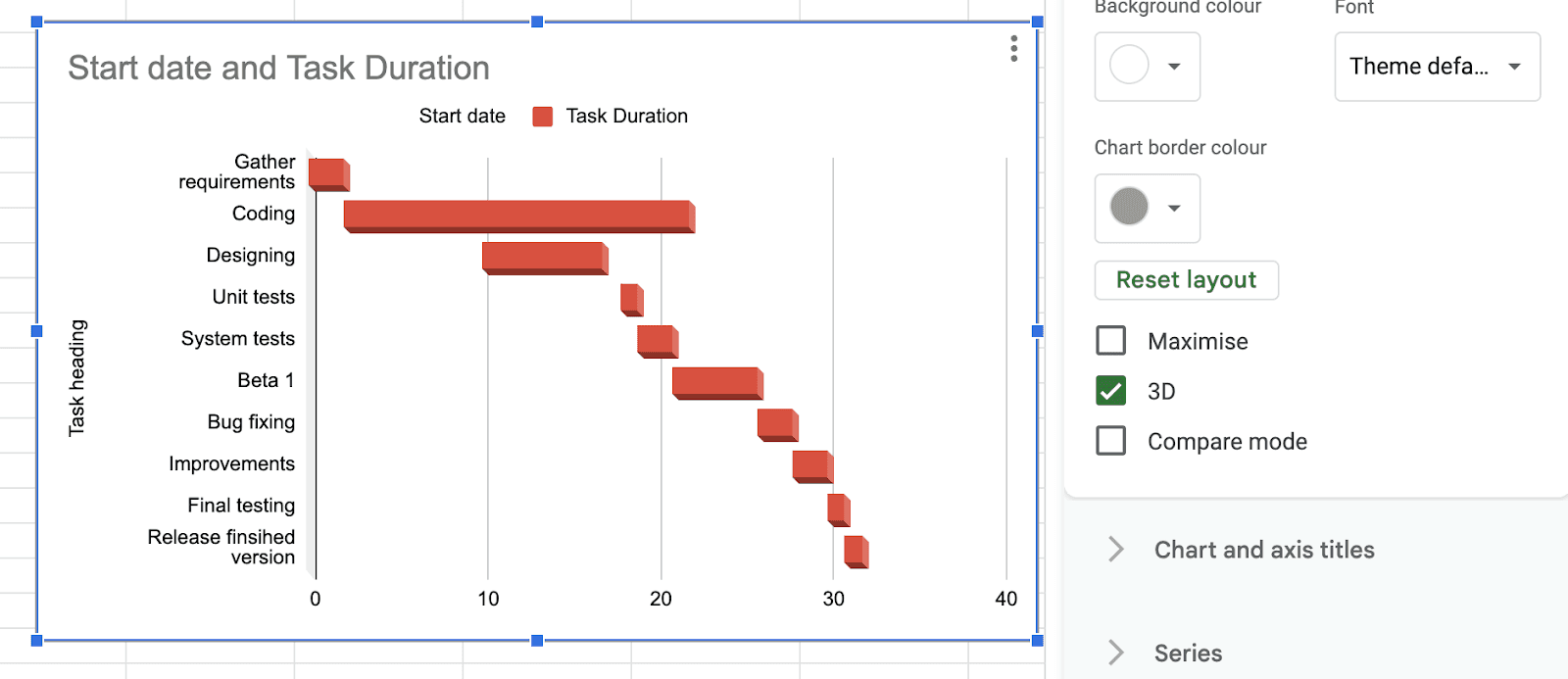
#1. Chart Style
Click on Customizer > Chart Style. Or you can simply double click on the chart to edit it.
You can change the background color, font style, and chart border color from here.
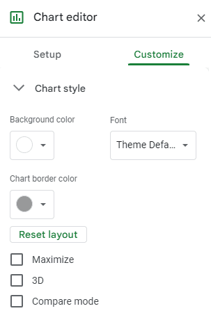
Furthermore, you can also tick on one of these boxes – Maximize, 3D, Compare mode – to change the view of your Gantt chart.
For example, we thought of presenting our chart in 3D, and here's how it looks.
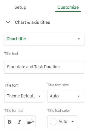
Next, for those unaware, we'll show how to change title of Gantt chart on Google sheets.
#2. Chart & Axis titles
Click on the Chart & axis titles element below the chart style. From this section, you can change the chart title text, font style, size, and colors.
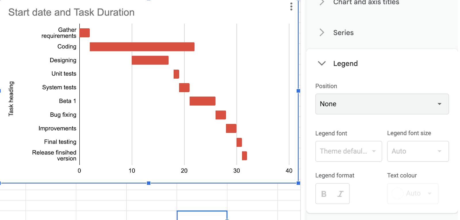
#3. Legend
What's a legend?🤔
Nah, we’re not talking about Dwayne Johnson.
A legend in charts resembles the various types of data in the Gantt chart.
In our dataset, we have two legends.
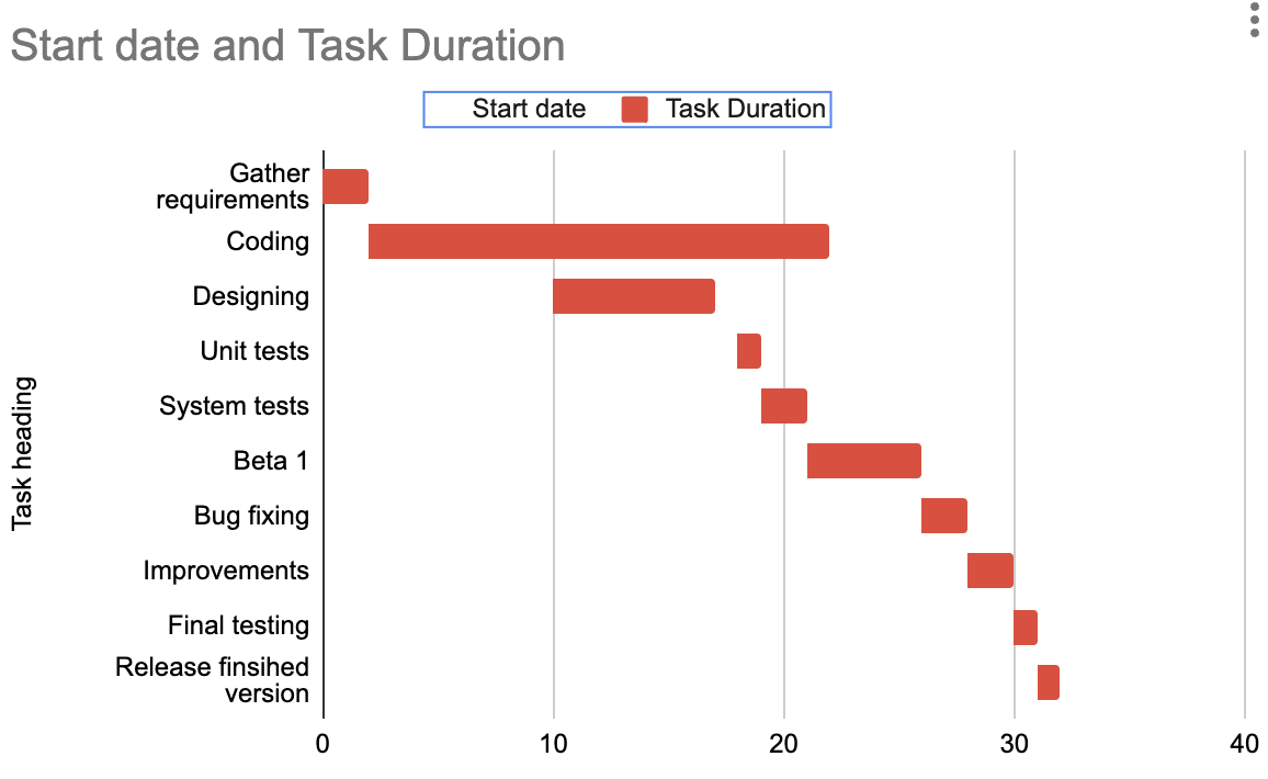
Ideally, a Gantt chart doesn't require a legend since we have to visualize a single dataset, i.e., Task Duration.
It's better to hide the legend column and give more space to the actual chart. Here's how to do it.
Open Customizer > Legend > Position > None
Step #6. Add Dependencies to Your Gantt chart
Adding dependencies allows you to create a dynamic Gantt chart that updates in real time.
Dependencies here mean that tasks depend on one another's initiation or completion.
Using Google sheets formulas, you can easily map dependencies among tasks. Below we have explained three significant dependencies around Gantt charts.
#1. End a Task to Start Another
The dependency means a task can only be started once the previous task is completed.
💭 Think about it: Which task can be completed before another can start?
For example, in our dataset, Unit Tests can only be started once Designing is complete. So here, Unit Tests (B5) depend on Designing (C4).
So we’ll put this formula in B5: =MAX(C4)+1
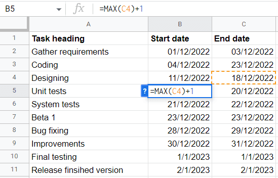
The date in B5 will automatically push one day further to the date of completion of the previous task.
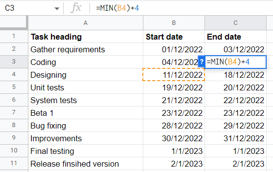
#2. Start a Task Before Ending Another
In some cases, we start a task without ending the previous task. No kidding! We actually do that.
In fact, managers often do that because each task is interlinked in one way or another.
For instance, we might start the design tasks without ending the coding tasks because we may also require some coding from a design perspective.
In such dependencies, we create a buffer period for the previous task. So, we'll add this formula at the end date of the coding task (C2):=MIN(B4)+4
Here, B4 is the start date of the dependent task, and +4 is the additional number of days the task will remain active after the initiation of another task.
#3. Finish to Finish
In this, a task must finish in order to finish another.
As in our example, Improvements (C9) need extra days to complete even after final testing (C10).
You see, you might encounter a problem during final testing and choose to improve instead of launch.
In C9, use this formula:=MIN(C10)+1
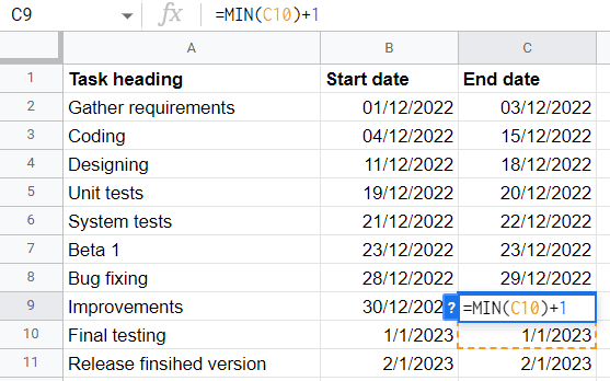
This formula conveys that Improvements need one buffer day to finish after final testing is done and dusted.
5 Free Gantt Chart Templates in Google Sheets
#1. Google Sheets Gantt Chart Marketing Template
A well-organized marketing Gantt chart allows you to manage your marketing activities effortlessly and utilize time efficiently. Marketing teams often use it to map their goals and streamline tasks and processes to work parallelly with the goals.
Simply put, Gantt charts in marketing can help you with:
-
Better planning and scheduling
-
Lesser complexity
-
Clear task dependencies
-
Improved communication
-
Better utilization of time
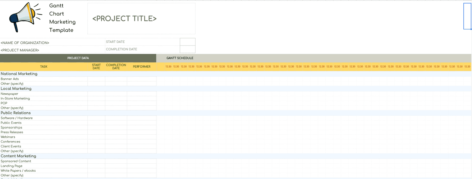
Template Link: Gantt Chart Marketing Template
This particular marketing Gantt chart template displays the complete time span of specific marketing activities, including:
-
The start and completion date of the project.
-
The list of tasks that need to be done.
-
The start date and finish date for each task.
-
Who is working on what?
-
What tasks are dependent on each other?
-
The progress made in each task.
Moreover, it has categorized marketing tasks based on local and national marketing, public relations, content marketing, online advertisements, and more.
Besides, the template is a great assistance in planning and scheduling not only marketing but also many other projects.
#2. Project Management Gantt Chart Template
You can also use a Gantt Chart as a project management tool to visualize the overall project planning over time. In general, it measures the actual work completed to the estimated completion rate for a determined period.
Project managers ideally use this type of Gantt chart to streamline operations or tasks and prepare a project timeline to present to oneself and other stakeholders in the organization.
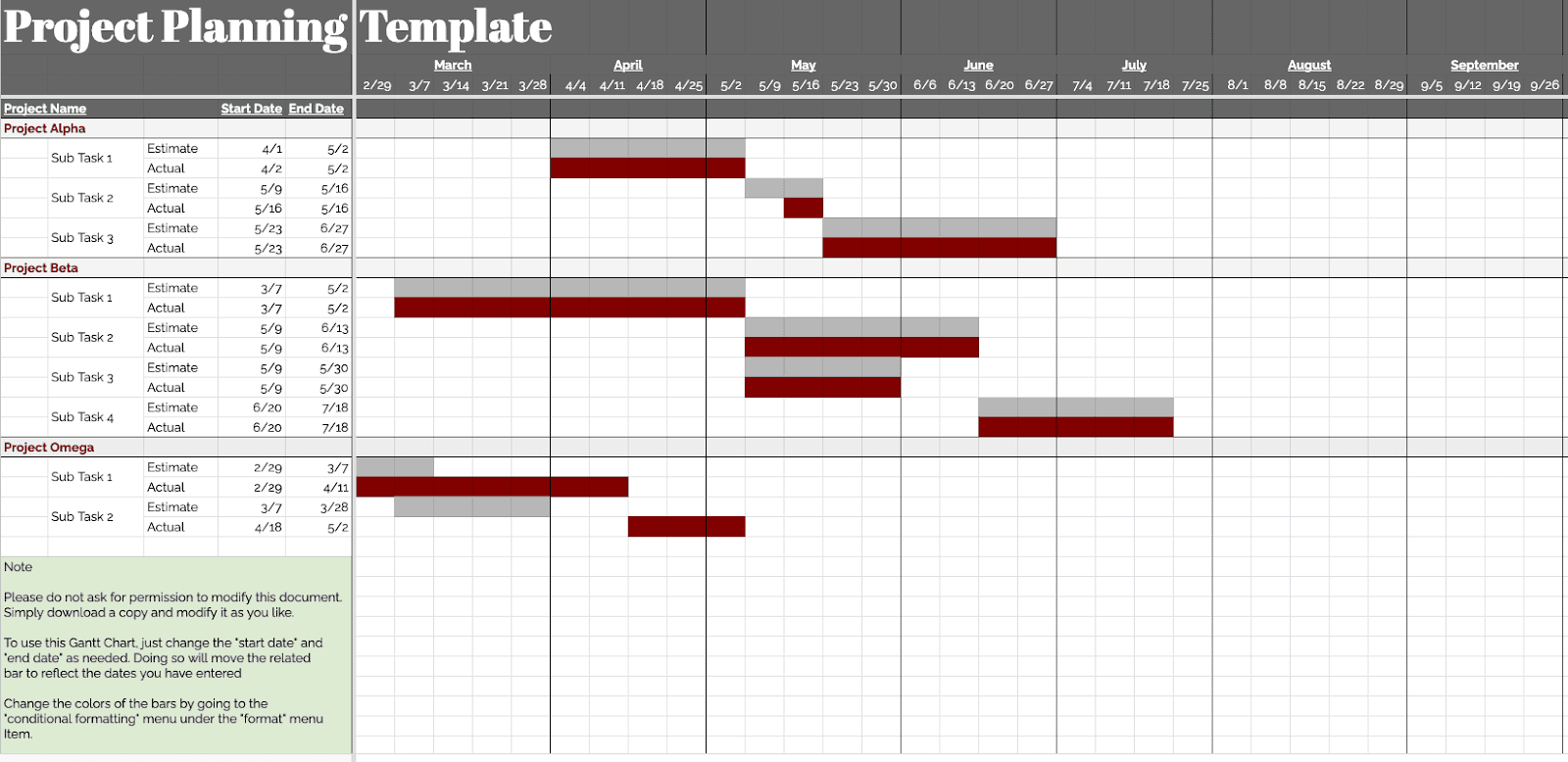
Template Link: Project Management Gantt Chart
This project management Gantt chart template does precisely the same for you. In one section, you get to put in data such as:
-
Major projects
-
Subtasks for each project
-
Start and end dates
-
Estimated and actual dates
And on the other half, your data is visualized via a Gantt chart in real time.
#3. IT Project Gantt Chart
An IT project Gantt chart functions similarly to a project management Gantt chart. The only differentiator is that this Gantt chart focuses primarily on managing IT projects.
That being said, IT project managers typically use it to show what work is scheduled to be done, when it is to be started and when it is expected to be completed.
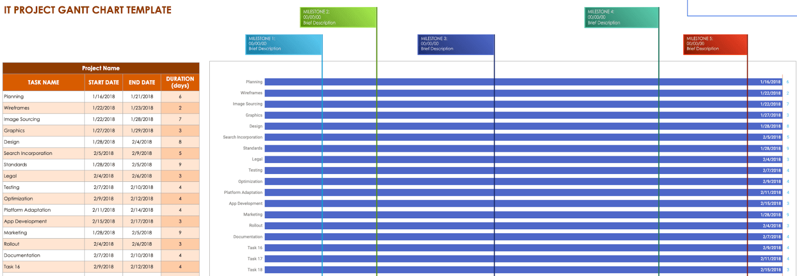
Template Link: IT Project Gantt Chart
Like any other chart, this specific IT project Gantt chart has four columns – task name, start date, end date, and duration.
And since the chart template is specific to IT, the tasks mentioned include wireframes, graphics, testing, optimization, etc.
Apart from the dataset, the Gantt chart is segmented into 4-5 milestones with specific dates and a brief description hooked to every milestone.
#4. Event Marketing Gantt Chart
An event marketing Gantt chart provides a visual timeline of your event plan. You can group tasks based on type, dependency, or priority and add a start and completion date to every other project.
Such kinds of Gantt charts are used by organizations and agencies that frequently conduct sponsored events, conferences, or meet ups.
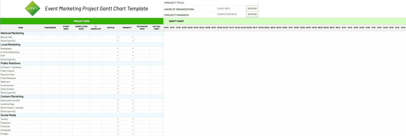
Template Link: Event Marketing Gantt Chart
The convenient structure of this template and the stylish design make it great for planning and scheduling various projects. Here are what other things you get when using this template:
-
Performer: To gauge the team's performance on individual tasks
-
Start and completion date: Determines the beginning and end date of a task
-
Completion %: Defines to what percentage a particular task is completed
-
Status: A dropdown to indicate the status of a task (In progress, completed, paused, overdue)
-
Priority: Set priority levels for individual tasks (High, medium, low)
-
Estimated cost: Forecasted cost for completing a particular tasks
-
Actual cost: Actual cost incurred for completing the tasks
#5. Sales Management Gantt Chart
As the name suggests, a sales Gantt chart is used by sales teams to graphically represent various sales activities under one roof. It also helps depict the performance of individual sales team members in every stage of the sales process.
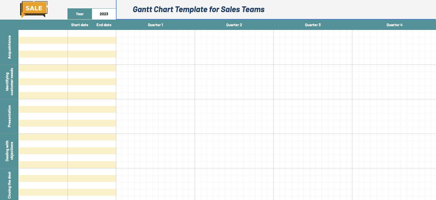
Template Link: Sales Management Gantt Chart
This sales Gantt chart depicts the performance of a sales manager in five stages:
-
Acquaintance: Create a basis for an exchange relationship
-
Identifying customer needs: Time required to identify customer needs
-
Presentation: Time needed to pitch and present the customer with the product
-
Closing the deal: Actual time taken to close deals every quarter
Drawbacks of Creating Charts with Sheets
#1. Not a Mobile-friendly Platform
Google sheets might seem like one, but it isn't a mobile-friendly platform.
Although it does offer a dedicated mobile app, the process becomes even more complicated compared to the web version, especially when creating Gantt charts.
Creating Gantt charts requires you to input formulas and perform numerous calculations on the go. Things get worse when you need to do all these with a poor navigational design and weakly-optimized mobile responsiveness.
Gsheets have both disadvantages. You may often find it exhausting to scroll through rows and columns. Plus, you may often encounter incomplete graphs needing you to scroll over and view them in two perfect halves.
Too much scrolling, right? In some time, we'll show you how Datapad (our tool) helps you overcome this issue.
#2. Time Consuming & Labour Intensive
Similar to Excel, Gsheets is not a gen z tool.
Gen z prefers AI as an assistant or to automate things, unfortunately, Google sheets have next to no AI - processes.

A step or another, you would be compelled to press, enter, click, or type the future action to create charts.
Like previously, you saw an intensive 6-step process on how to create a Gantt chart in Google sheets.
It's tough out there.😪
#3. Might Slow Down When Processing Hefty Datasets
Descending from a mighty-mighty company (Alphabet), Sheets aren't the first choice when dealing with complex datasets.
You may often face problematic situations like
-
Mishandling of data
-
Lags and glitches when scrolling or performing calculations
-
Unresponsive sheets
Besides, for companies dealing in terabytes of data, Google sheets automatically become a second choice to modern-day chart creation tools like Datapad.
Sheets, at max, offer 10,000,000 cells for new and converted documents. Evidently, it needs 100,000X more cells to fit in a terabyte of data.

#4. Limited Customization Options
Sheets has a customize tab but it offers limited options. You're limited to choosing from a set of pre-built charts which were last updated a decade ago.
Moreover, none of the charts turn out to be appreciated as stunning!
Simply put, charts prepared in Gsheets aren't aesthetically pleasing for viewers. And there's little you can do to enhance it.
Instead, as customizations, you can only edit the chart's fundamentals like title, fonts, text, and so on.
Create Stunning Charts with Datapad
Datapad is designed to make data analysis easier, especially for those using Google Sheets. Whether you're creating a dashboard to track sales or a graph to visualize trends, Datapad integrates seamlessly with your Sheets to provide powerful insights.
The beauty of Datapad lies in its simplicity and ease of use. With our tool, anyone in your team with zero technical knowledge can start building reports in mere seconds.
#1. Google Sheets Integration:
Tired of copying and pasting data from your spreadsheets into visualization tools? Or worse, rebuilding your charts every time your data updates? Datapad solves this headache by connecting directly to your Google Sheets, transforming your data into stunning visualizations without the technical complexity.
With Datapad's Google Sheets integration, you can:
-
Connect any Google Sheet with just a few clicks—no coding required
-
Watch as your dashboards update automatically when your spreadsheet changes
-
Visualize complex data in ways Google Sheets alone simply can't handle
-
Create beautiful, presentation-ready charts without fighting with formatting
Say goodbye to spreadsheet limitations and hello to data that works for you, not the other way around.
#2: AI-Driven Analysis
Ever wished you had a data analyst on call 24/7? With Datapad, you basically do. Skip the complex Excel formulas and simply ask questions in plain English like "What's our best-performing ad channel?" or "Show me last quarter's conversion trends." Datapad's AI instantly generates the perfect visualization to answer your question.
With Datapad's AI-powered analysis, you can:
-
Ask questions in everyday language and get immediate visual insights
-
Uncover hidden patterns and relationships in your data automatically
-
Focus on making decisions instead of fighting with chart settings
-
Transform complex data into clear, actionable intelligence in seconds
Your data has stories to tell—Datapad helps you hear them through simple conversation.
#3. Scheduled Reporting
End the monthly reporting grind forever. Datapad automatically delivers fresh insights straight to your inbox or Slack channel on your schedule. Set up your dashboard once and let automation take over—whether you need daily metrics, weekly performance snapshots, or monthly executive summaries. Choose from our library of ready-made templates to get started even faster with industry-specific KPIs and visualizations. Your team stays informed with zero manual effort, while you focus on acting on insights instead of creating reports. Perfect for agencies managing multiple clients or busy teams that need consistent data without the hassle.
Collaboration and KPI dashboards must go hand in hand, that’s how a company excels in KPIs tracking and setting strategic goals.
💭Food For Thought: We wanted to be innovative with our collaboration feature and thus spent hours brainstorming about how to make collaborations easy yet real-time.
So, here we are!
#4. Downloadable Reports
Sharing insights with your team or stakeholders should be straightforward. With Datapad, you can download your reports in PDF or HTML format, making it easy to distribute them. Whether you need to attach a report to an email, share it on a project management tool, or print it for a meeting, Datapad has you covered. No more scrambling to capture screenshots or manually compiling data. Your reports are ready to be shared in a professional format at the click of a button.
#5. Web Search Feature
Sometimes, understanding your data requires context from the wider world. Datapad's Web Search feature allows you to pull in external data for sector benchmarks and trends, enriching your analysis. Whether you're comparing your sales figures to industry averages or looking for the latest market trends, Datapad can help you find the information you need. This feature ensures that your analysis is not just based on internal data but also informed by external factors, giving you a more comprehensive view of your performance.Make Your Excel Dashboards Look Stunning with Datapad.
Table of Key Features and Benefits
| Feature | Description | Benefit |
| Google Sheets Integration | Connects directly to Google Sheets for data analysis. | Seamless workflow, leverages existing data. |
| AI-Powered Analysis | Allows plain English queries, generates graphs and dashboards. | Reduces technical barriers, fast insights. |
| Dashboard and Report Creation | Supports bar graphs, line charts, pie charts, Gantt charts, etc. | Visualizes data effectively for decision-making. |
| Scheduling Reports | Delivers reports via email or Slack at scheduled intervals. | Keeps users informed without manual effort. |
| Download Options | Reports available in PDF or HTML format. | Easy sharing with stakeholders or teams. |
| Web Search Feature | Pulls external data for benchmarks and trends. | Enhances analysis with industry context. |
Datapad is a free kpi dashboard tool that allows you to connect data sources and keep track of all your metrics in one place. We claim that Datapad is the easiest kpi tool out there.
If you are keeping your dashboards on excel or sheets, you can use our integration to take all your data from spreadsheets and build stunning dashboards on Datapad.