![We Tested the Best 11 Dashboard Reporting Tools and Here's Our Review [2023]](/_next/image?url=https%3A%2F%2Fframerusercontent.com%2Fimages%2Fstdv3d5uw6TdxpX2KfsDWDPYAE.jpg&w=3840&q=75)
Some of the best dashboard reporting tools for staying on top of your business are Datapad, Dundas BI, YellowFin, Whatagraph, Octoboard, Inetsoft, Infor Birst, Knowi, QlikSense, Domo, and Looker.
In this guide, you will find a detailed review of all the dashboards mentioned above reporting tools.
But before we get into the details, here’s a tl;dr to save you time 😉
What is a Dashboard Reporting Tool? What are the Benefits of Using a Dashboard Reporting Tool? Yellowfin Dundas BI Whatagraph Octoboard Inetsoft Infor Birst Knowi Qlik Domo Looker Wrapping Up

What is a Dashboard Reporting Software?
Dashboard reporting tools are solutions that allow you to monitor, analyze, visualize, and interact with data over a unified platform.
In general terms, these tools help you convert raw data into knowledgeable insights. They do so by extracting meaningful data from databases and presenting them in charts, graphs, or other visualization formats.
Food For Thought: Dashboard reporting tools empower businesses with data-driven decision-making and business intelligence capabilities. Let's get this through a quick example.
Suppose you’re working on a marketing campaign that has several aspects being measured and analyzed. You spend hours accumulating tons of data from your marketing campaign, but at a glance, they are just numbers ranging from zero to infinity.
Neither these numbers are anywhere near to be called insights, nor do they attract your stakeholders or team leads.😞
Now, because everyone misunderstands the data, it becomes pretty useless (although it has every story to tell about your campaign's performance).
Here's when the dashboard reporting tool saves your efforts!
The tool helps you create stunning visualization of your business key performance indicators (KPIs). Thereby transforming messy data into easy-to-understand insights for anyone from non-technical employees to stakeholders.
While this is one of the primary advantages, dashboard reporting tools have many more things to offer.
What are the Benefits of Using a Dashboard Reporting Tool?
#1. Make Your Data Tell Stories
Believe it or not, dashboard software can let your data speak for itself. They can transform data into stunning visuals and derive a complete story that gets you every small business-related statistical detail.📊
#2. Saves Time and Resources
Evidently, the tool can be a great time-saver for hustling geniuses. It can help you automate the entire process, from data extraction to visualization, all with a single click.
Plus, as it automates everything, you don't need your employee to spend hours working on the process.
#3. Data-Driven Decision Making
Now that you have a data-driven story and ample time in hand. You are more sure of making decisions by analyzing what's working for you, the KPI trends, and the wrong-doings.
With a knowledgeable database served in front of you, you can easily take suggestions from your team and stakeholders for future campaigns and business strategies.
What are the Best Dashboard Reporting Tools?
Before we begin reviewing the best dashboard reporting tools, we at Datapad have created our software (for the same purpose).
So, before talking about our competitors, we will shed some light on our mobile-friendly dashboard reporting software.
Want to explore Datapad by yourself? Try it for free today.
If you don't want to read the whole article, we prepared a short overview video for you 🎥
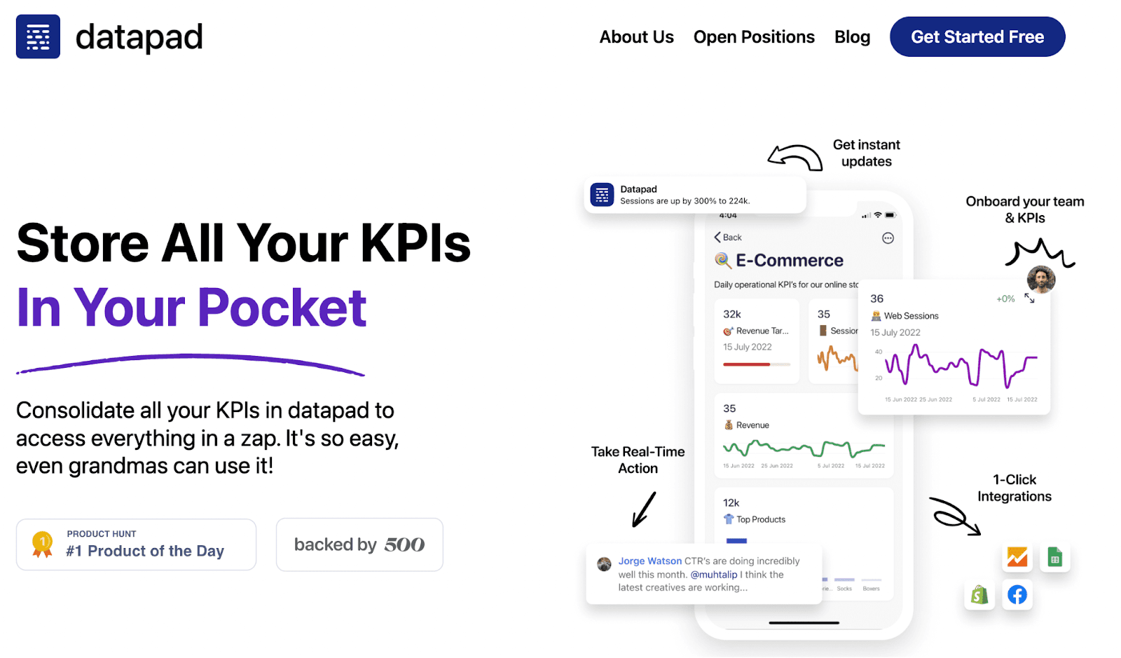
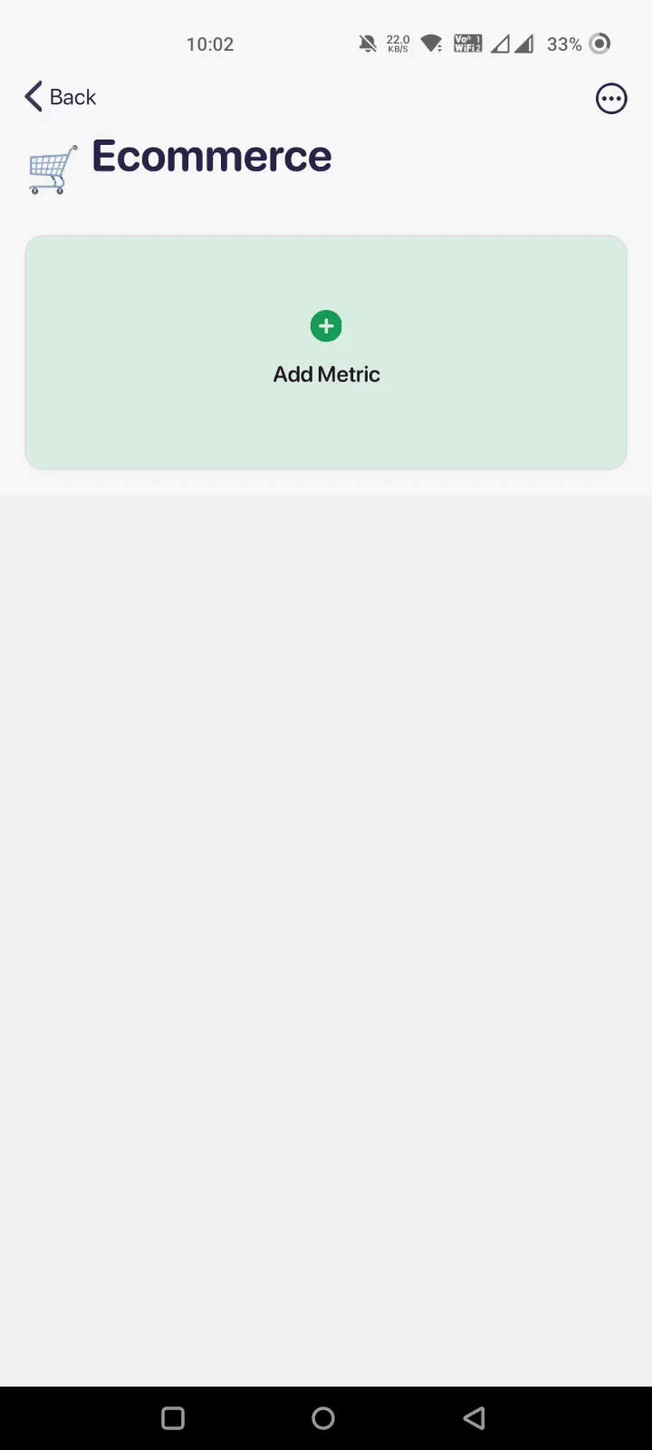
Datapad is a mobile-first dashboard reporting software that allows business owners to instantly access KPIs via their mobile phones.
Our tool is power-packed with lightning-fast speed, effective team collaboration, and flawless compatibility across all known devices.
Before we dive into its features, let's get one thing straight:
Who Is It For?
Being a mobile app, Datapad is for people who want a quick glance at their business KPIs on the go or are on a vacation because they can't leave their work behind. It's for small to medium enterprises who love hustling, even in the mountains.
Features
#1. Instant-Access to Metrics
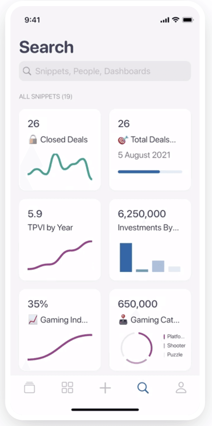
You’re the closest to your metrics when using Datapad. We believe so because our tool is optimized for lightning-fast performance. It allows you to view, monitor, and edit KPIs instantly from a dedicated mobile application (all you need is reliable network connectivity).
With Datapad, you get:
-
Instant access to dashboards
-
Search to find metrics quickly
-
Blazing-fast performance
What’s more, you can also search KPIs on a dashboard via our search bar functionality to quickly access, review, and act on them.

#2. Team Collaborations
We understand how competitive the business environment is and how your business needs a set of brilliant marketers and growth enthusiasts to scale your business over time.
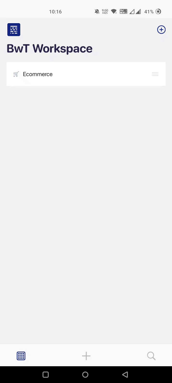
You can onboard your team with Datapad in just seconds. Here’s how:
Therefore, we have built Datapad to provide quick and effective communication with your team. Our tool lets you comment below your specified metric and get your team working on your suggestions within minutes.
Here's what we did:
Suppose one of your KPIs shows a negative trend and seeks immediate attention. You can simply comment under that specific KPI, and your comment will be notified to your team in real-time, wherever they are.

Moreover, with our mobile-first interface, you can assign tasks, set goals, and monitor team performance, all under your fingertips.
Datapad's team collaboration feature allows you to:
-
Comment under KPIs and broadcast messages to your team in real-time
-
Get alerts and notifications regarding team activities around the dashboard
-
Assign, monitor, and analyze the team's performance on the go
-
Take control over time-sensitive metrics with proactive decisions
#3. Automatic and Manual Data Extraction
Unlike other dashboard reporting tools, we have ensured that Datapad is flexible for all operations. For example, with our tool, you can enjoy automatic and manual data entry.
We have integrated Datapad with some of the top data sources like Google Analytics, Facebook Ads, MySQL, Google Sheets, and more.
But we know this isn't enough. Hence, we are tirelessly working towards integrating our platform with Shopify, Airtable, Tableau, HubSpot, etc.
Meanwhile, our tool allows you to import data effortlessly with our one-click integrations.
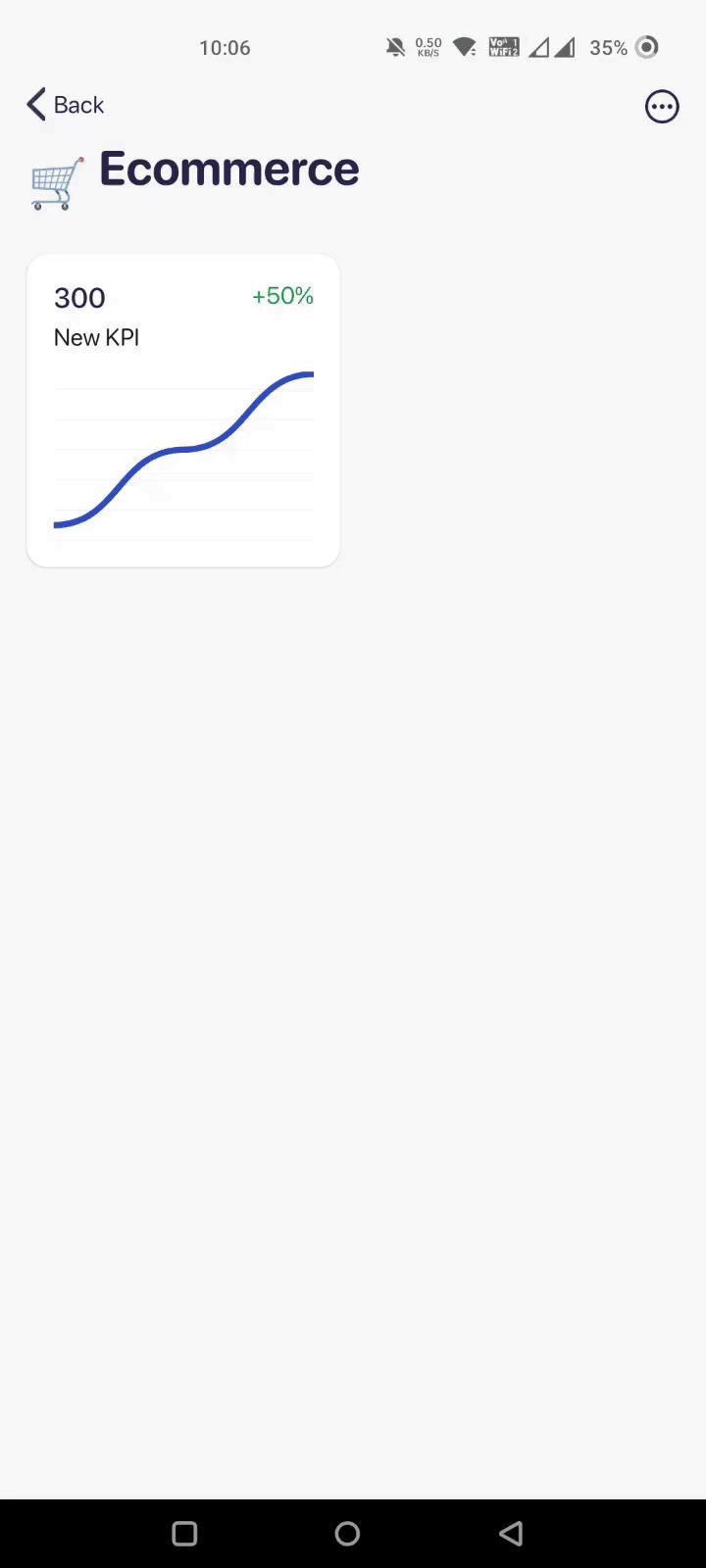
If you feel the need to enter a KPI detail manually, don't worry, we've got you covered. 😊
With Datapad's robust data import feature, you can easily:
-
Import and export data (manually or automatically)
-
Customize and tune dashboards to fit your data structure
-
Create custom metrics and formulas, and set achievable goals or milestones
Pricing
Here's the good part! We have made Datapad free for all. You can use it without spending a dime or hiring a technical analyst for administration.
Pros and Cons
Pros
✅ Easy access to your dashboards
✅ Keep everything on your phone for instant access
✅ Set up alerts and push notifications to stay on top of your business
✅Completely Free
Cons
❌No web version right now (coming soon)
❌Not good for creating sophisticated dashboards
#2. Dundas BI

Dundas BI is a state-of-the-art BI and analytics platform that simplifies the data exploration and visualization process through its fine-tuned dashboard reporting capabilities.
Who Is It For?
Dundas BI is an enterprise-grade software best suited for mid-to-large enterprises and software vendors.
Features
-
Build interactive dashboards with its intuitive drag and drop design tools and responsive design options
-
Post questions, comments, and follow-ups directly on specific metrics and control who can view comments (permission management enabled)
-
Automate the entire reporting process, including report creation, delivery, bursting, and printing
-
Use the ad hoc reporting tool to drill down critical information for analysis and distribution quickly - no coding required
-
Choose from a gallery of pre-built tables, charts, scorecards, treemaps, and more to create stunning data visualizations
Pricing
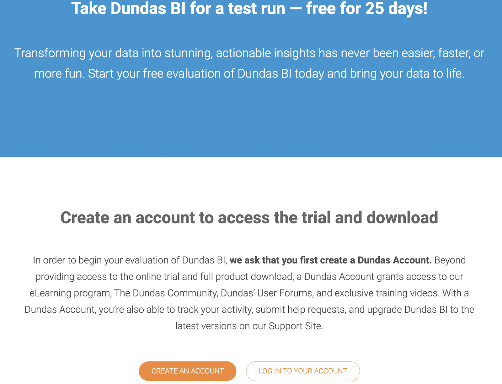
Dundas BI offers a generous 25-day free trial. Apart from this, the platform offers custom plans as per your business requirements. However, you would need to request a quote from Dundas BI to know the pricing.
Pros and Cons
Pros
✅ Lower learning curve
✅ Powerful data visualization ability
✅ Access dashboards via web and mobile-based apps
Cons
❌ Trouble in analyzing large data sets (may lag or take time)
❌ Mobile app lacks optimization and responsiveness
#3. YellowFin

YellowFin is an all-in-one analytical suite that helps businesses solve data complexity with automation, data storytelling, collaboration, and interactive dashboards.
Who Is It For?
YellowFin is flexible to fit in any industry. It serves over 29,000+ companies across the globe, including the likes of Coca-Cola, Honda, Vodafone, Bmc, and more.
Features
-
Create actionable dashboards with an intuitive drag-and-drop builder, graphic tools, and pixels-perfect infographics
-
Use no-code action buttons on the dashboard to allow users to act without leaving the application
-
Get threshold-based alerts and notifications when your preferred metrics surpass a determined benchmark
-
Easily collaborate with multiple contributors to co-create compelling data stories and visualizations
Pricing
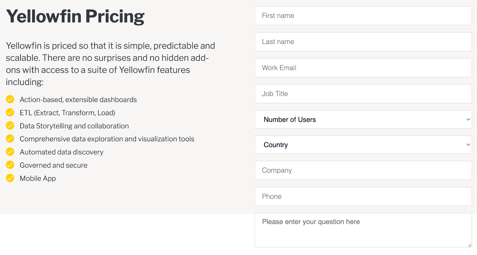
YellowFin offers a 30-days free trial. After which, you are offered two plans: Enterprise Analytics and Embedded Analytics. Both plans have custom pricing, and you need to request a quote for the same.
Pros and Cons
Pros
✅ User-friendly interface - even beginners find it easy to use
✅ Priority support for any plan you choose from the two options
✅ Easily scalable solution
Cons
❌ Resource requirement keeps growing with every update
❌ User training is weak in terms of tutorial videos and guides
#4. Whatagraph

Whatagraph is a cross-channel reporting tool that empowers businesses to collect, measure, and analyze marketing data via interactive dashboards and reports.
Who Is It For?
Whatagraph is best suited for marketing agencies and in-house marketing teams. Since the tool has cross-channel reporting, it's best for analyzing data from campaigns running on multiple platforms.
Features
-
Easily collect data from multiple data points or campaigns and present it under one roof with augmented cross-channel reporting
-
Automatically create comprehensive reports and share reports with clients via automated report delivery
-
40+ integrations to popular marketing platforms like Google Analytics, Ahrefs, Facebook, and more; collect custom data via API integrations
-
Use the custom white-labeling feature to align reports with your brand color, fonts, logos, and other details
Pricing
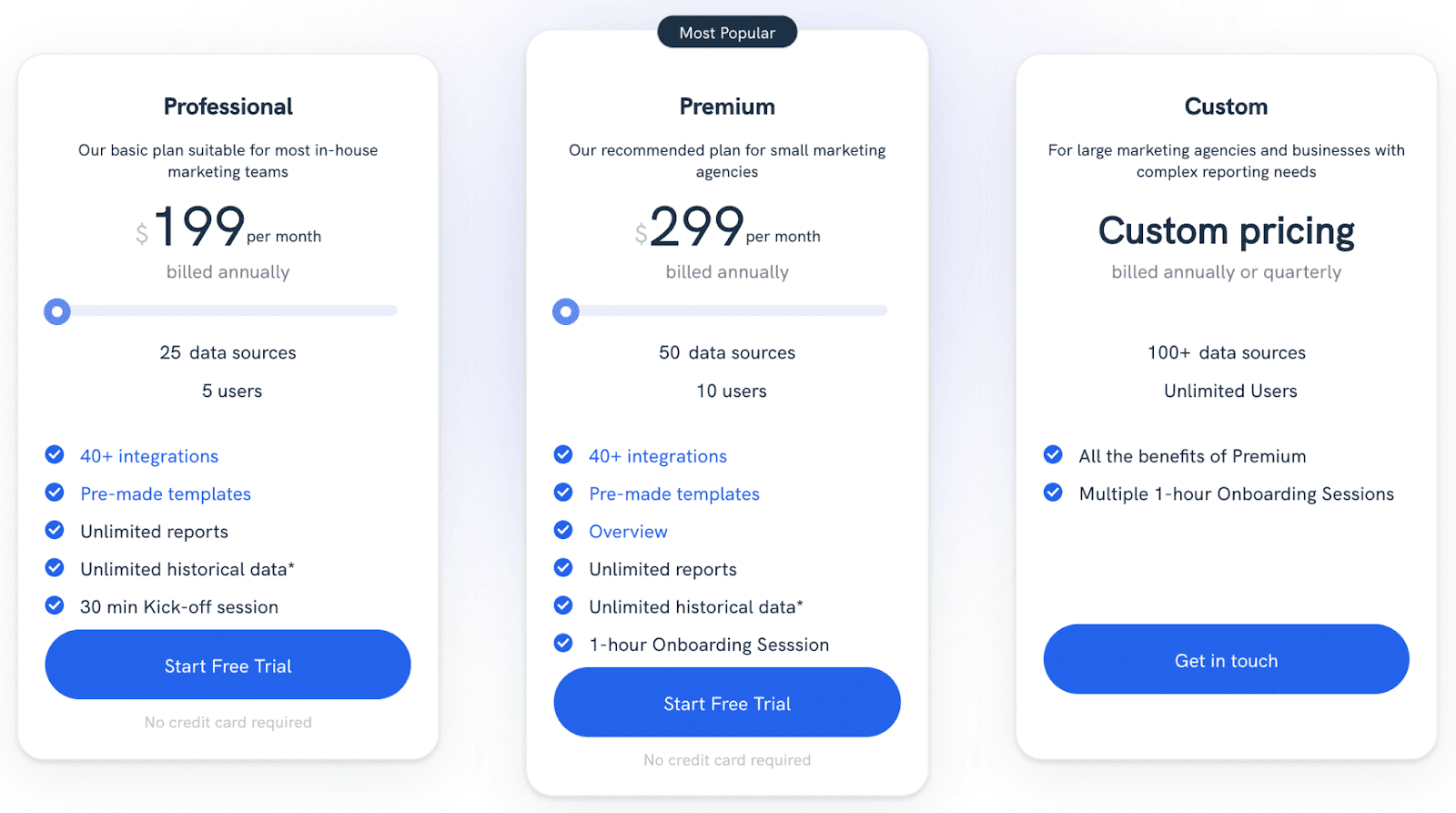
Whatagraph offers a 30-day money-back guarantee with all its plans. With that being said, it has three plans:
-
Professional: $199/month
-
Premium: $299/month
-
Custom
Pros and Cons
Pros
✅ East to set up and learn (lower learning curve)
✅ Able to generate highly customizable and tailored reports
✅ Can import data from multiple data points with ease
Cons
❌ Lacks 24/7 support
❌ API disconnects frequently
❌ Platform has poor UI
#5. Octoboard
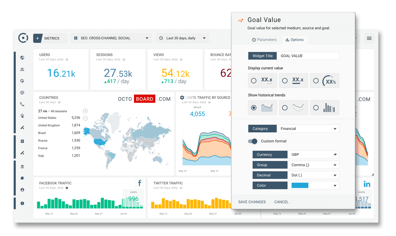
Octoboard is a cloud-based business performance dashboard that helps businesses track, monitor, and analyze KPI trends and make smarter business decisions.
Who Is It For?
With over 18,000+ customers, we feel Octoboard is best for anyone who wants to measure their business performance, from freelancers to a SaaS based startup to large-size corporations - everyone can benefit from the tool.
Features
-
Has over 2500 pre-defined metrics and 350+ pre-built dashboard templates, which can easily be modified and configured for any device within seconds
-
Constantly monitor business data changes and send automated reports via Slack and email; display live dashboard on TV with display-on-TV feature
-
70+ integrations to SEO, PPC, and other channels for data import; create cross-channel reports to analyze custom metrics
-
Granular user management enables control over who and how someone can access dashboards and reports
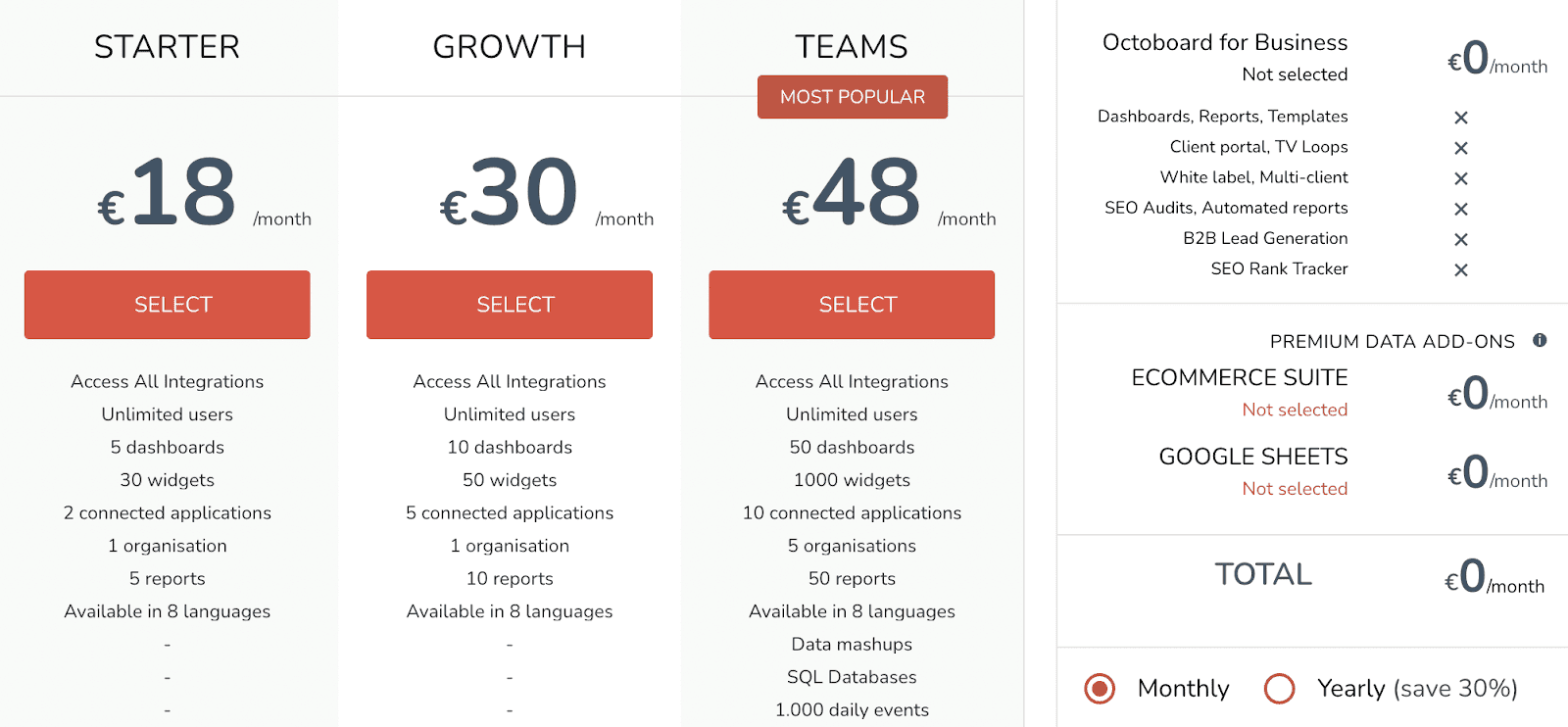
Pricing
Octoboard offers a free plan for its dashboarding tool. Besides that, it has three paid plans:
-
Starter: €18/month
-
Growth: €30/month
-
Teams: €48/month
Pros
✅ East to setup with brilliant UX
✅ Can build white-labeled reports with ease
✅ Unlimited users with the free trial
Cons
❌ Scaling can be expensive if you’re an agency
#6. Inetsoft

Inetsoft is a data intelligence and dashboarding tool that helps businesses back actionable insights in the form of sophisticated business dashboard solutions and reports.
Who Is It For?
Inetsoft is a powerful and flexible business solution that can fit all industries and organizations. It's used by some of the highest global authorities, such as the World Health Organization (WHO), CIA, NASA, and IBM.
Features
-
Use data mashup - a unique feature to easily and quickly utilize all data to maximize business benefits
-
Comes with multiple integrations to help you with data modeling, data transformation insights, and a super easy WYSIWYG (what you see is what you get) report design
-
Intuitive self-service BI offers pre-built calculated fields, advanced filtering, and a built-in search engine to navigate to any data point easily.
-
Create custom dashboards with a library of graphical representations and a well-built scorecard system right out of the box
Pricing
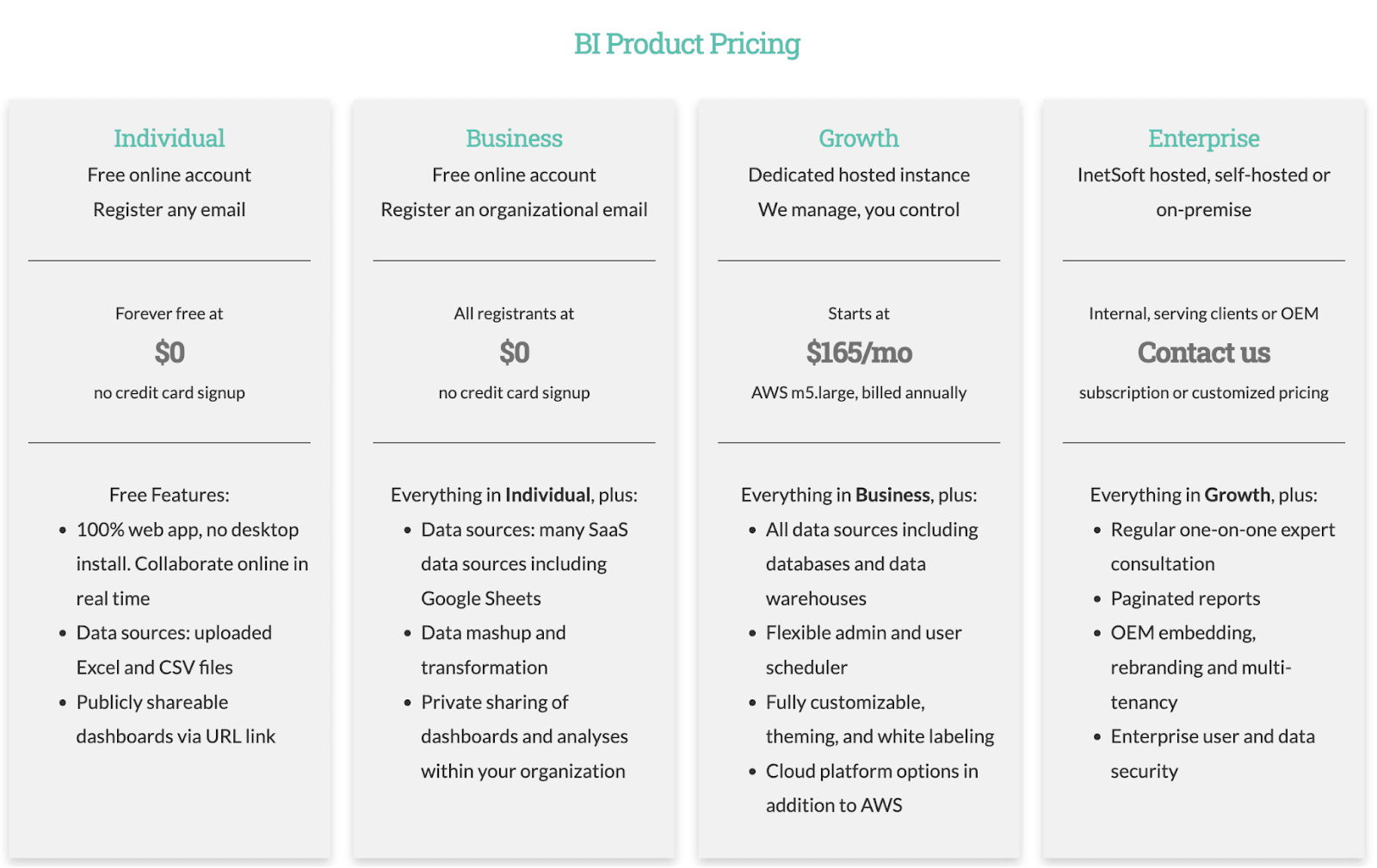
Inetsoft offers free forever plans for individual marketers and businesses. Apart from this, it has two plans, namely:
-
Growth: $165/month
-
Enterprise: Custom pricing
Pros and Cons
Pros
✅ Reliable tool for moving massive datasets/data warehouses
✅Offers risk maintenance and ease of use for non-technical users
Cons
❌Steep learning curve
❌Not ideal for day-to-day performance measurement
#7. Infor Birst

Infor Birst is a native BI and analytics tool that helps businesses break down and simplify complex processes in less time than other business intelligence tools.
Who Is It For?
Trusted by many automobile, travel, and data-driven companies like Miller, Pilot, etc. We can say that Infor Birst best suits the automotive industry and IT firms.
Features
-
Modern-day data architecture enables you to manage data in a secure, scalable, and adaptable manner
-
Use networked BI to blend centralized and decentralized data modules and analytical content
-
Offers enterprise-grade governance and security without compromising speed and agility
-
Has an adaptive user interface with visual data discovery, interactive dashboards, and pixel-perfect reporting capabilities
Pricing
Infor Birst doesn't have any pricing mentioned. You can request a quote from their pricing page.

Pros and Cons
Pros
✅Does data warehouse modeling for you (handy for ecommerce businesses)
✅Rapid report and dashboard development
✅Enable report scheduling to get alerts and notifications
Cons
❌Lack of training modules and resources
❌The tool’s a bit inaccurate while tracking KPIs
#8. Knowi
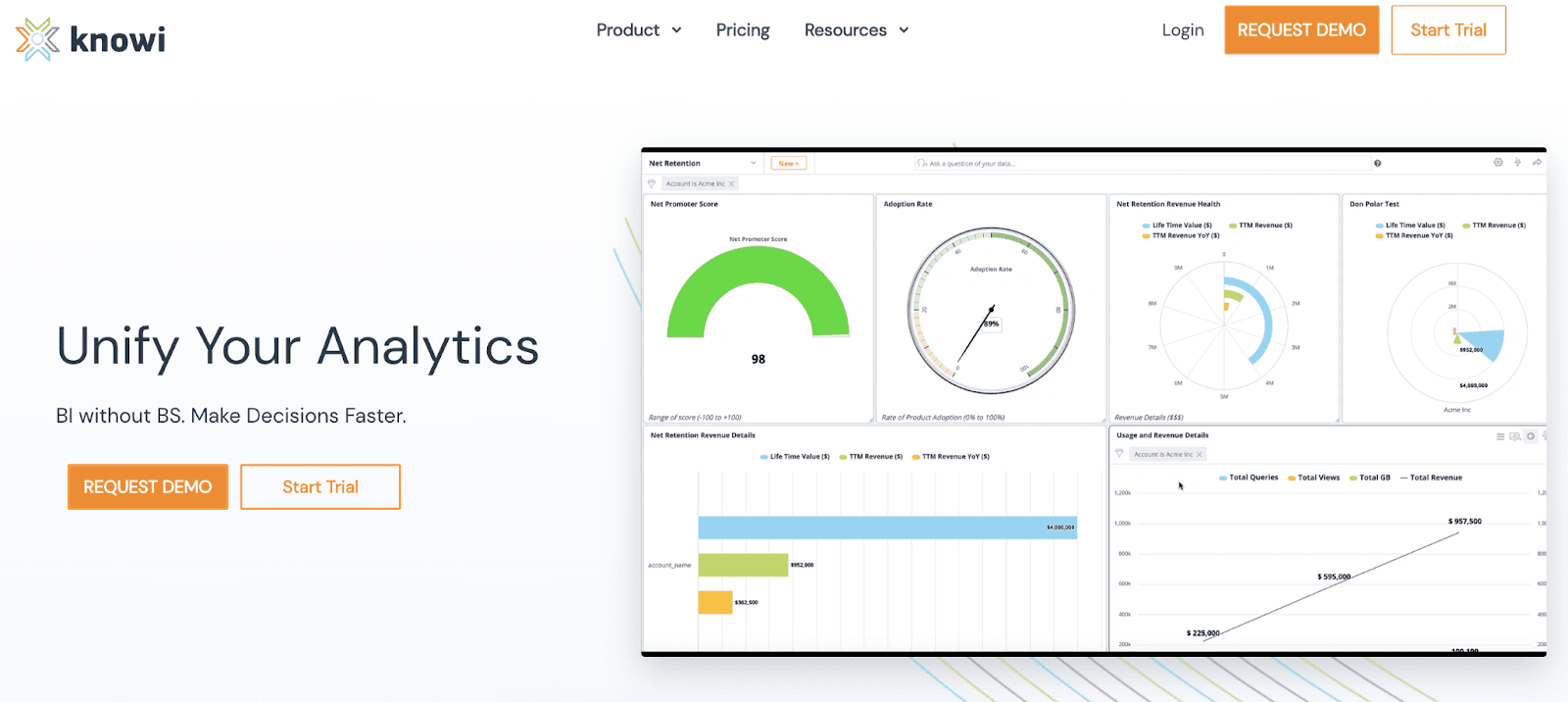
Knowi is a modern-day BI platform that allows businesses to analyze and manage data from multiple databases via dynamic dashboards and search-driven analytics.
Who Is It For?
Knowi is best for all kinds of industries and business sizes. It's also a popular tool among non-technical users.
Features
-
Enable search-based analytics to ask questions directly into the Knowi dashboard and get instant visual insights
-
Use augmented analytics to prepare, evaluate, and integrate your data
-
Create regular schedules for data alerts and charts to be broadcasted across channels to keep everyone looking at the same metrics
-
Use its visual query builder to create interactive dashboards without writing a single line of code
Pricing
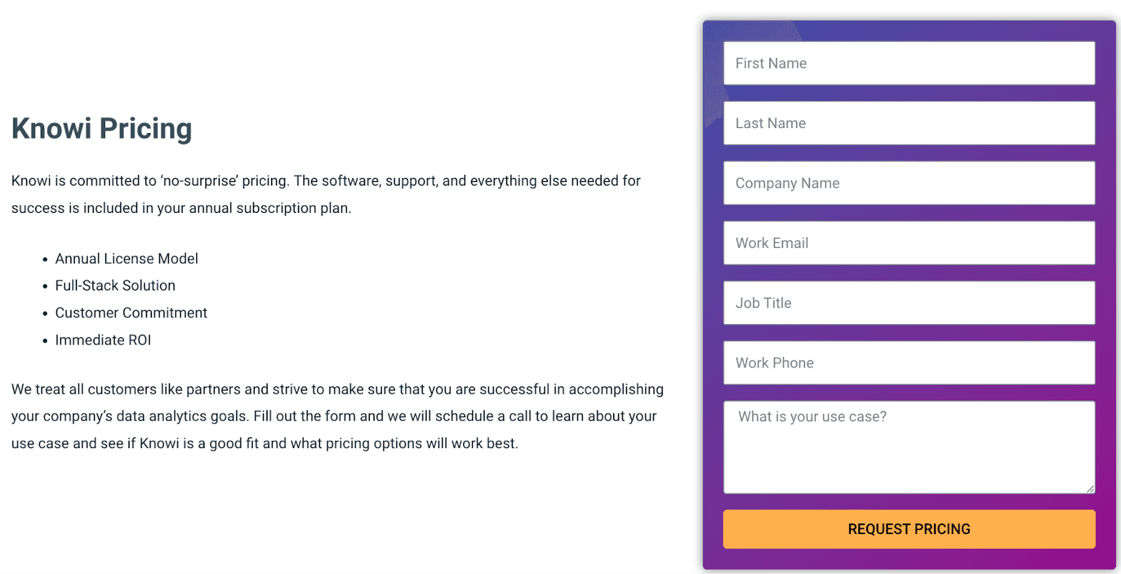
Knowi offers a 21-day free trial. Besides that, it has a custom pricing policy.
Pros and Cons
Pros
✅Knowi is a full-stack solution to tend to all your KPI tracking needs
✅Has plenty of visualization options
✅Easy for beginners to use because of its interface
Cons
❌Doesn’t have many connectors
❌No mobile app available
#9. QlikSense

Qlik Sense is a leading dashboard reporting tool that helps enterprises transform raw data into meaningful analytics, thereby making better data-driven decisions.
Who Is It For?
With over 38,000+ customers, Qlik Sense can serve all kinds of industries and businesses. However, it has a steep learning curve making it ideal for technical users and IT companies. In fact, it's trusted by top tech companies like Samsung, Volvo, and Lenovo.
Features
-
Has a world-class library of visualization tools that helps to convey meaning and provide shapes to raw data
-
Use Insights advisor for auto-generated analysis, chart recommendations, and custom data metrics
-
Easily create and share interactive dashboards with teams and investors via popular formats like excel, spreadsheets, csv, or PDFs
-
Pre-built Natural Language Processing (NLP) allows Insight Advisor to understand user intent and respond with the best answers
-
Get real-time alerts and notifications regarding changes in data or trends; use event-driven actions to automate routine tasks
Pricing
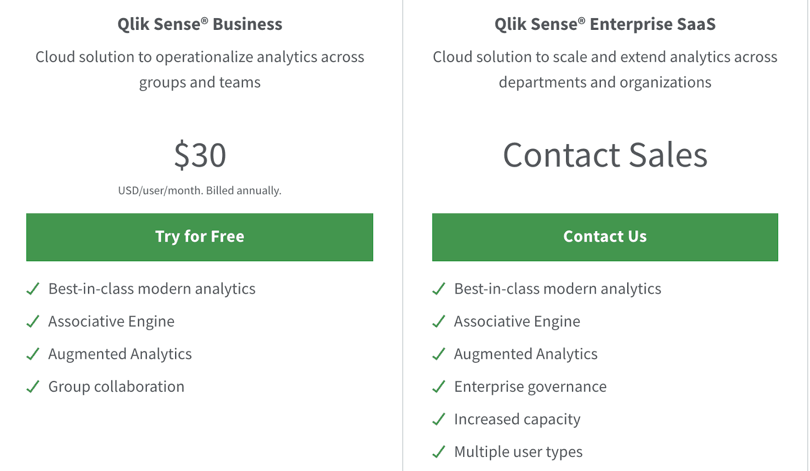
Qlik Sense has a 30-day free trial. Besides this, it offers two premium plans:
-
Business plan: $30/month
-
Enterprise plan: Custom pricing
Pros and Cons
Pros
✅Granular user management gives you great control
✅Has enhanced SQL language that lets coders fire queries
✅Allows integrations with all types of data sources
Cons
❌ Fewer custom visuals and limited customizations
#10. Domo

Domo is a self-service BI and analytics platform that empowers businesses with powerful data visualization capabilities and flexibility to create interactive dashboards.
Who Is It For?
Domo is trusted by top global brands, including Unilever, NBA, Cisco, and more. For the most part, Domo is best for mid-sized enterprises (51-1000 employees) and the computer software industry.
Features
-
Create custom dashboards and formulas with a mix-up of metrics; creatively use over 150+ pre-built charts and tables for quick visualization - no code required
-
Use self-service power BI to activate Domo's built-in interface for teams and partners for instant collaboration and better decision making
-
Get custom alerts and notifications for changes in trends or ongoing team activities for security and real-time decision making
Pricing
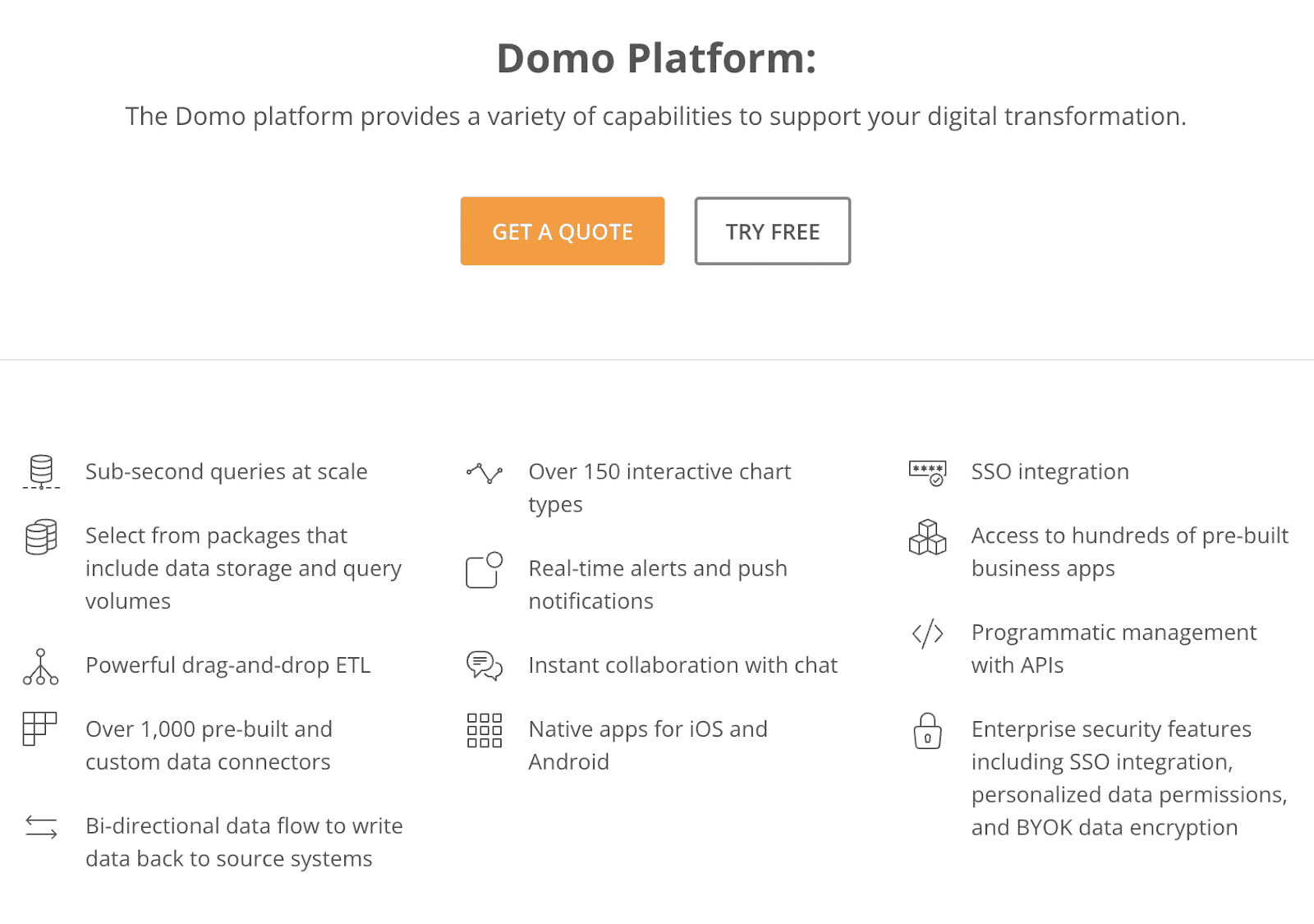
Domo offers a risk-free trial period. Apart from this, Domo has a custom pricing plan. You can ask for a quote on their pricing page to get the best deal.
Pros and Cons
Pros
✅Has hundreds of cloud-based apps to connect to
✅Comes with ERP/data warehouses
✅Well-built connectors and integrations
Cons
❌Poor customer support
❌Slows down when dealing with large databases
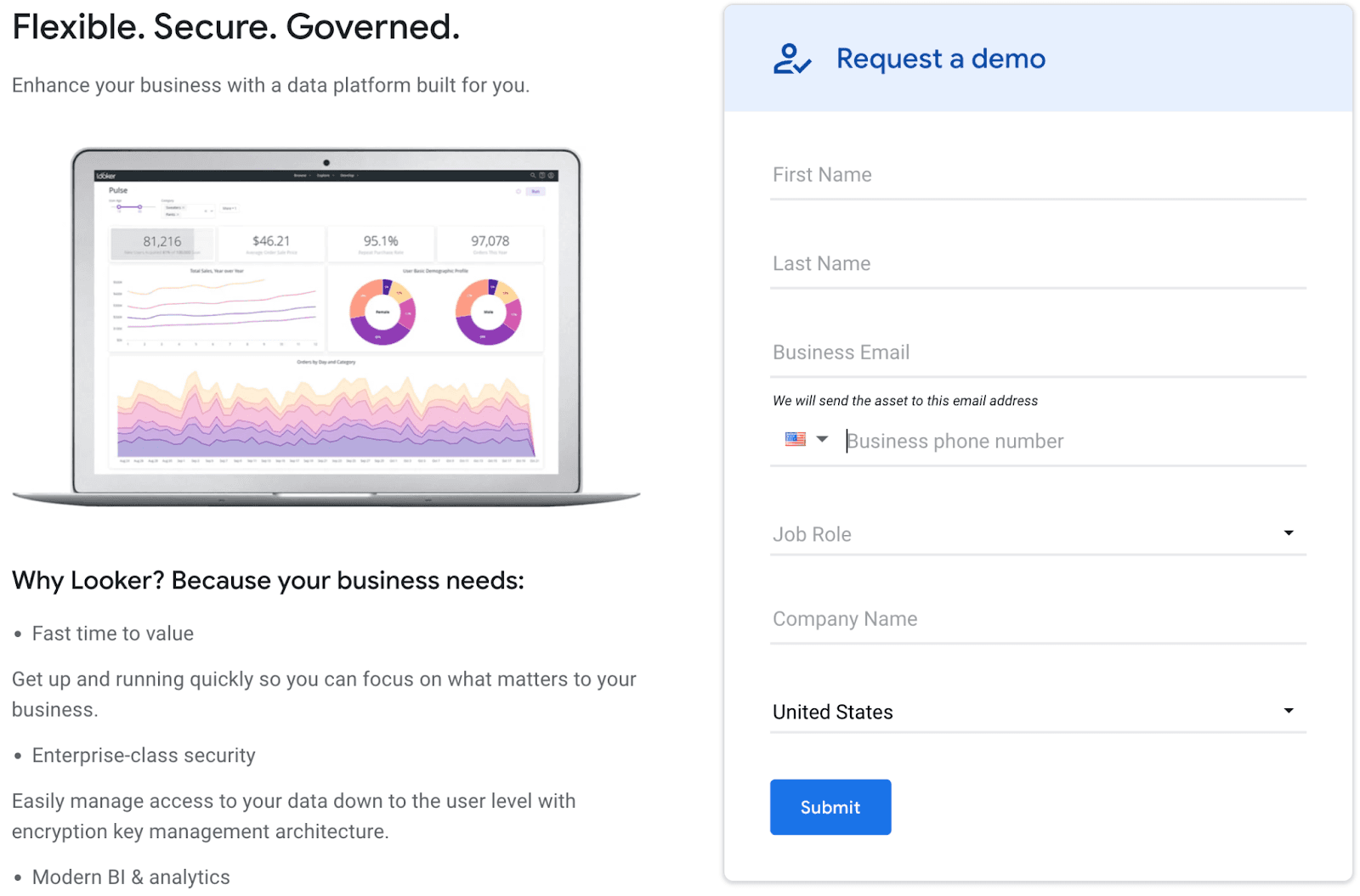
#11. Looker
Looker is a dashboarding reporting tool that enables businesses to collect, monitor, visualize and analyze data from multiple sources. Hereby helping data-driven leaders make better decisions.
Who Is It For?
Looker is an enterprise-level software, best for non-technical background organizations. More like marketing and advertising agencies, e-commerce stores, etc.
Features
-
Unlock a comprehensive view of data by creating custom metrics and formulas to drill down deeper into business insights
-
Use pre-built widgets, elements, visualization tools, and embedded analytics to create interactive dashboards and reports
-
An extensive online marketplace that offers app integrations, blocks, and custom plug-ins to speed up the dashboard development process
-
Enable granular user management to take control of how someone accesses the dashboard or create individual dashboards for specific departments
Pricing
Looker has no specific pricing mentioned on its website. However, you can request a quote from their pricing page on the website.
Pros and Cons
Pros
✅Reliable customer support (live chat feature)
✅Highly customizable dashboards
✅Dedicated marketplace for add-ons
Cons
❌Steep learning curve
❌No SQL/command-line interface
Wrapping Up
You might wonder what's conclusive from this extensive review of so many tools.🤔
Each tool has its pros and cons, and quoting the perfect tool among them is something we would like to avoid.
That's because every dashboard reporting tool has features pertaining to specific business needs.
We performed this review to get an in-depth overview of every tool, so you won't waste time signing up one by one.
But if you're looking for something super easy and lightning quick to track your business KPIs - try Datapad for free.
Frequently Asked Questions (FAQs)
Q1. What is a dashboard reporting tool?
Dashboard reporting tool allows you to monitor, analyze, visualize, and interact with data over a unified platform. In general terms, these tools help you convert raw data into knowledgeable insights.
Q2. How do you create a reporting dashboard?
Creating a reporting dashboard is no different than creating a normal one. If you’re using a mobile app like Datapad, you can create a dashboard in 4 simple steps:
-
Sign in and create a dashboard
-
Enter KPIs to track in the dashboard automatically or manually
-
Bring your team onboard in seconds
-
Set push notification and alerts for when a KPI misbehaves
Q3. What are the benefits of using a Dashboard Reporting Software?
-
Send reports to your clients and investors easily
-
Track KPIs and generate report for your team every month or quarter
-
Assign each individual or department a reporting dashboard and compare performance every quarter