
How to Build a Dashboard: The Easiest Way in 2022
In this guide, we are going to show you the easiest way to build a dashboard as a non-technical person. You won't need help from your technical team to follow the method we are going to mention here.
How Do You Make a Good Dashboard? 1.Decide on the Goal of Creating Dashboards 2.Identify Your Data Sources 3.Choose the Right Chart Type 4.Define What Metrics You Want to Track 5.Pick Your Colors When Building Dashboards 6.Ensure that Your Dashboards are Mobile-Optimized 7.Onboard Your Team Members 8.Communicate with Your Team Around Your KPIs Datapad: Keep all Your Dashboards in Your Pocket
How Do You Make a Good Dashboard?
A good dashboard is no rocket science. All it needs to be is clean, interactive, and user-friendly, supporting the objectives of forward-thinking businesses. However, there are certain principles or steps to consider if you want to design a stunning dashboard.
Let's get through these steps one by one.
#1. Decide on the Goal of Creating Dashboards
Before actually building your dashboard, you must steer clear of the three questions below:
-
For whom are you doing this?
-
How are you going to approach it?
-
What are you expecting out of it?
First and foremost, if you’re planning to share a dashboard with your team, your team should be kept in mind.
Eventually, they are the ones who will use your dashboard to drill down data. And, they are the ones for whom you're building it.
Try to make your dashboard user-friendly. Put yourself in your team members’ shoes and visualize the context and device they might use to access your dashboard. Let your dashboard serve a purpose to your team. It can be as simple as providing clear information from messy data.
Next, you need to figure out why you’re doing this and what outcomes you expect?
To get started, you need to consider those KPIs and metrics that will add value to your goals.
Revolve your dashboard around questions like:
-
What exactly needs to be measured?
-
Who will measure it?
-
What is the time interval to be measured?
Frequently answering such questions allows you to make purpose-driven decisions. Plus, once you clearly understand your goal, it becomes easier to collect, analyze and measure data (more on this later).
#2. Identify Your Data Sources
When it comes to building new dashboards, data collection can be an overwhelming and time-consuming process. However, it's an integral part of creating a good dashboard.
For starters, there are two kinds of data sources: Internal and External.
Internal data sources are those when data is collected from within the organization, for example, from company databases, sql reports, and files.
Whereas, external data sources are those when data is collected outside the organization. For example, collecting customer data from a third-party platform or tool.
You must be clear on the source of data you are accumulating and that the data being sourced is accurate and reliable. For the most part, data is the backbone of any great KPI dashboard and has the power to make or break your business.
Therefore, you should identify your probable data points before rushing your data collection process. Later, these data points will be frequently used to update your data regularly.
We advise you to prepare a list of data sources, no matter if its social platforms or Excel spreadsheets and keep track of all the sources you use to pull data into your dashboard.
Lastly, it helps when a KPI dashboard tool provides some kind of automation to do this. And Datapad does just that.
Datapad is a KPI visualization tool that gives you the choice of importing data automatically (via one-click integrations) as well as manually.
Let’s first see how you can import data to Datapad automatically.
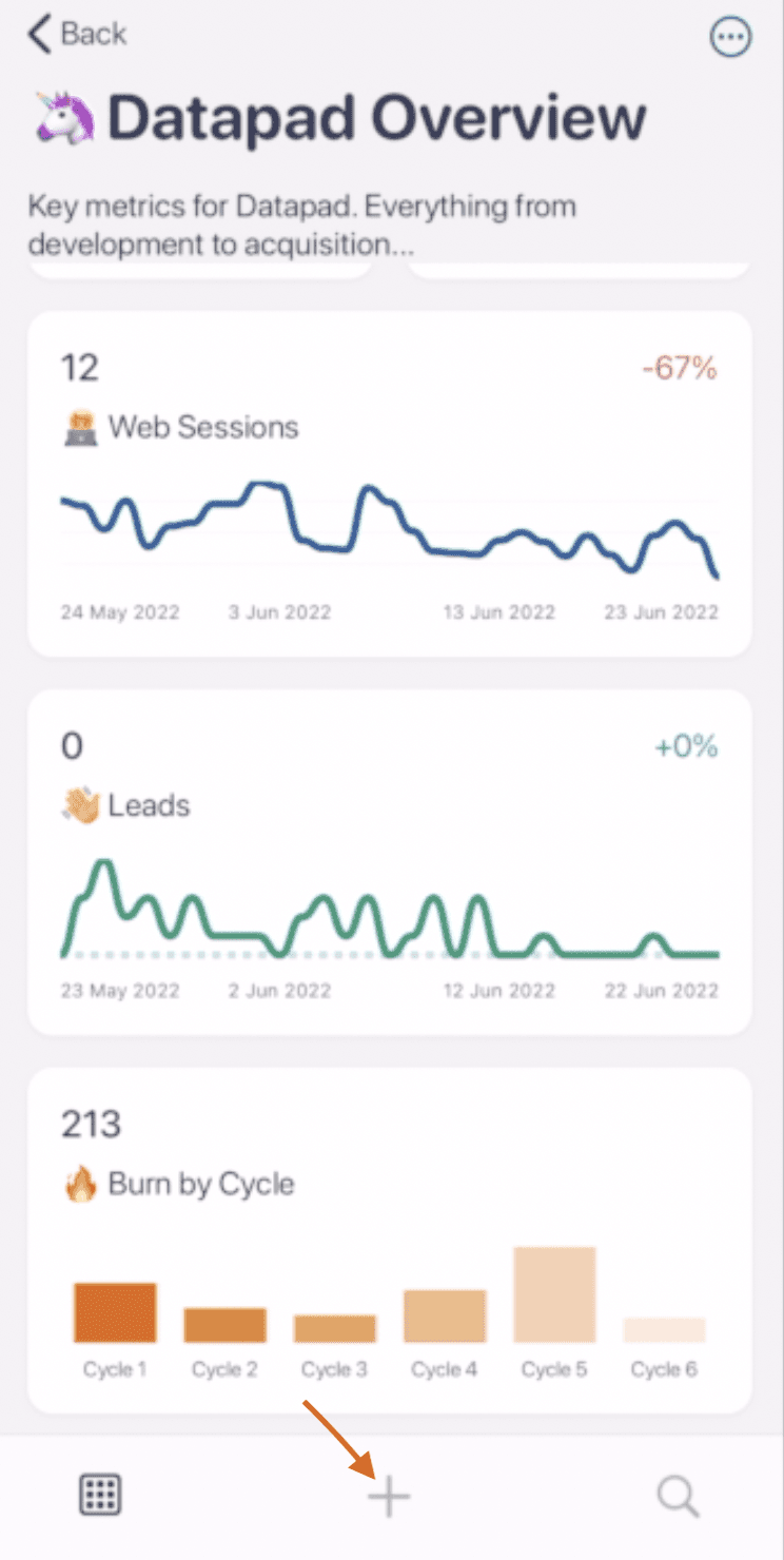
Step 1: Sign in to your account and click on the ‘+’ button at the bottom of your screen.
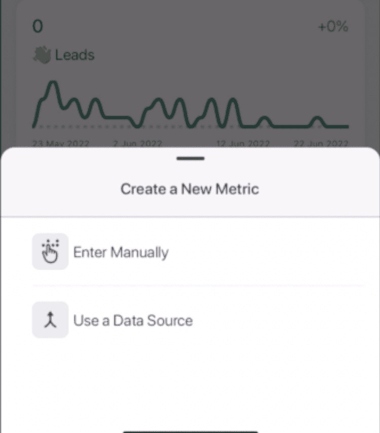
Step 2: Press the button ‘Use a Data Source.’
Step 3: Choose the data source from the several options Datapad gives you. Our platform integrates with the likes of Google Analytics, Facebook Ads, Tableau (owned by Salesforce) and many more.
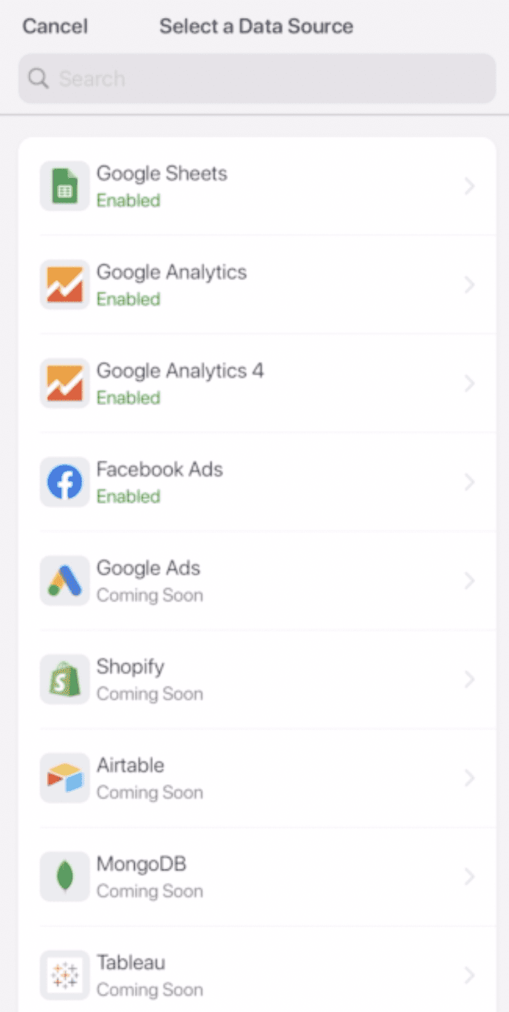
Note: We’re coming up with new integrations regularly.
Here’s how you can import data manually.
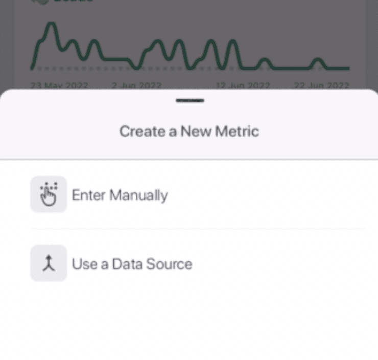
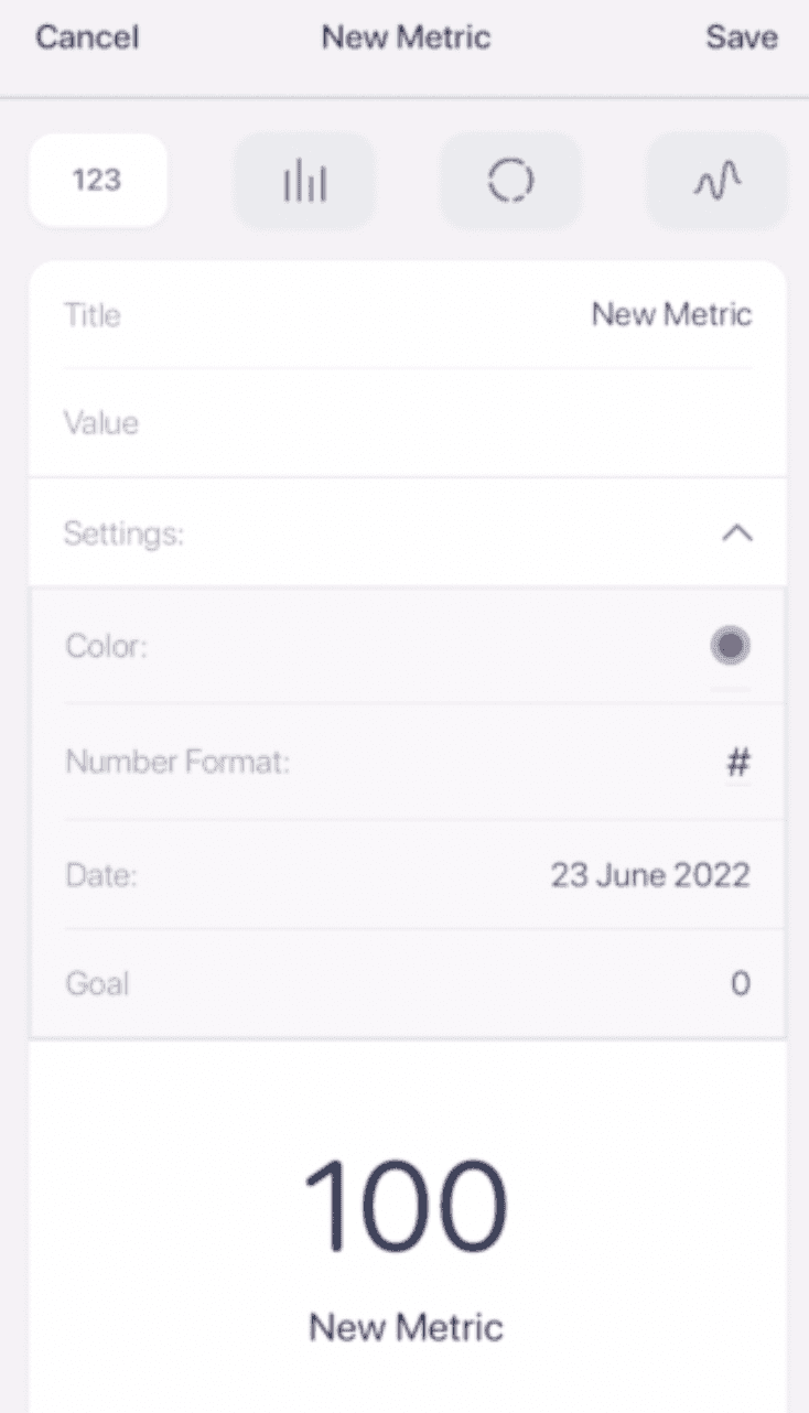
Step 1: After clicking the ‘+’ sign, instead of tapping on Use a Data Source button, just press ‘Enter Manually.’
Step 2: Enter the title, value, and set goals for your desired KPIs, and that’s it.
#3. Choose the Right Chart Type
Modern-day dashboarding software comes along with ease to merge and visualize data the way you want. However, it's still important to choose the right data visualizations and chart types to display your real-time data in an accessible and understandable manner.
Dashboard-centric charts interrelate your data and visualization efforts. They are classified into four primary categories: relationship, distribution, composition, and comparison.
To choose the right chart type for your analytics dashboard, you should first look into the KPIs and metrics you will track and measure from your dashboard.
When you’ve finalized the KPIs, you can choose a chart from the list below to represent it:
-
Line Charts: Great for displaying patterns of change over a period of time
-
Bar Charts: Excellent for comparing multiple items and easily recognizable patterns
-
Pie Charts: Ideal for rapid scanning, not very effective in displaying all data (users mainly notice the bigger slice)
-
Sparklines: Compact charts useful for displaying large metrics and trends; no individual values are displayed
-
Scatterplots: Great for advanced visualizations; aims to find the correlation between two variables
-
Gauge Charts: Easy-to-understand charts with a colorful representation of different values of the same metric
You should know: There's another chart type known as bubble charts which experts find unfit for a dashboard (but you might’ve seen them on a dashboard).
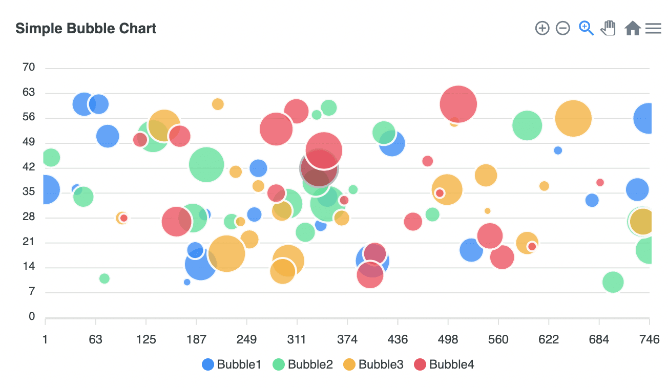
We’d suggest you stay away from them; the reason being, they lack preciseness and clarity and require too much focus even to consume simple information.
The chart types mentioned above show that different charts are available depending on how and what you want to communicate through your KPIs on the dashboard.
For the most part, stick and aim for the four categories mentioned above to choose the right chart type and present your data set in the most engaging form.
Let’s now see how you can add a chart from Datapad to a dashboard.
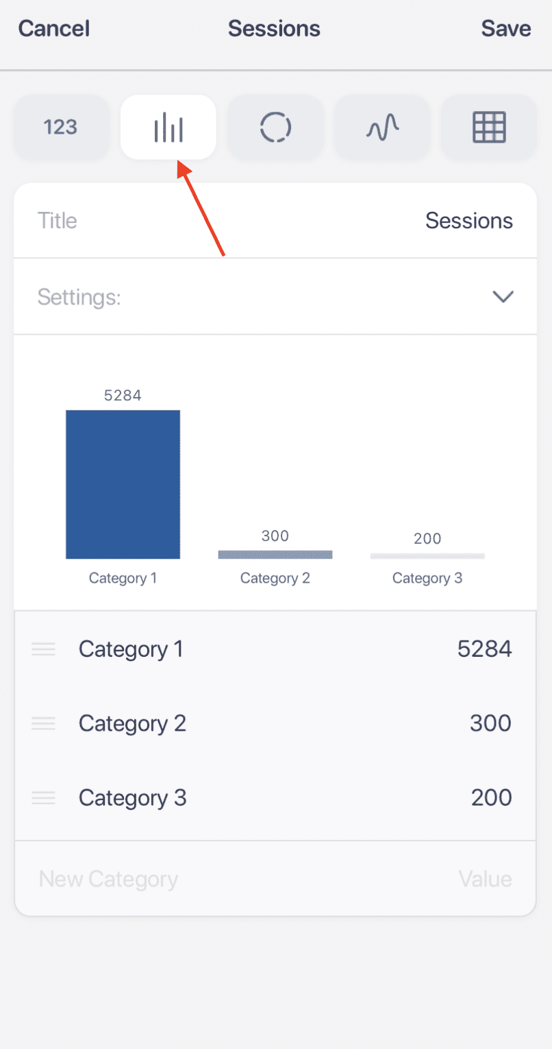
Step 1: Click the ‘+’ button you see at the bottom of your mobile devices.
Step 2: Press ‘Enter Manually’ to add a KPI to Datapad.
Step 3: On the top of your screen you will see four icons, those are the type of charts you can use with Datapad. Press on the first icon to get a bar graph.
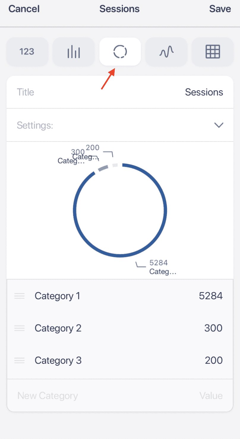
The second type is a pie chart. You can fill out the category 1,2, and 3 (add more if you want) and get pie chart build in seconds.
You can also try out the line chart for several use cases or build a table.
#4. Define What Metrics You Want to Track
Once you have decided your ultimate goal, identified data sources, and opted for the right chart type. It's time to consider the key performance indicators (KPIs).
By term, KPIs define your business performance and help you shape the direction of your dashboard. These indicators summarize your data and present them as actionable insights on your dashboard.
Eventually, KPIs gauge your performance against your goals. Being said that, let's get an idea of what KPIs align with your business goals.
Here's a list of five important metrics businesses should keep an eye on.
#1. Customer KPIs
Customer KPIs define your business relationship with your customers and vice versa. For example, customer retention KPI, customer satisfaction KPI, total email subscribers, CAC (customer acquisition cost), and more.
#2. Operational KPIs
Operational KPIs are used to measure employee satisfaction. Since frequent layoffs or poor productivity can hinder your business operations. Examples of operational KPIs include employee turnover rate, employee retention rate, and more.
#3. Financial KPIs
As the name suggests, financial KPIs are inclined toward measuring your business's profitability or financial health. For example, net profit margins, gross profit margins, accounts receivables, and inventory turnover rate. These metrics help you improve business intelligence.
#4. Marketing KPIs
A set of KPIs tracks your marketing campaigns and generates actionable insights to improve your current business strategy. These metrics include monthly website traffic, qualified leads, and call-to-action conversion rates. #5. Sales KPIs
Sales KPIs help you analyze your sales funnel efficiently. It gives you insights into your lead-to-sales conversion rates. Some sales KPIs include revenue growth, sales by month, cost per lead, annual sales comparison, etc.
A set of purpose-driven KPIs allows you to analyze what's working for you and what's not. It gives you a data-driven approach to your performance and aligns your daily operations with your long-term goals.
#5. Pick Your Colors When Building Dashboards
Besides being insightful, your dashboard should have the right blend of colors to make it easy to understand and attractive to eyes.
Unlike the boring PowerPoint presentations from the 90s, the modern dashboard is minimalistic and clean.
You don't need to be an expert in crafting a stunning dashboard design. All you need to pick is the right combination of colors that precisely display each aspect of your dashboard.
For example, you can choose a color combo that fits your business identity or a completely different color palette (till it doesn’t hurt your eye).
Whatever is your go-to option, make sure you stay consistent with limited (2-3) color combinations throughout your design.
Moreover, here're some common color mistakes to avoid
-
Excessive use of highly saturated colors (bright orange, bright yellow, etc.)
-
Using high-tone color pixels
-
Using poles-apart colors to display similar metrics
Although these mistakes seem simple, they can greatly impact your dashboard readability and user interest.
Here’s an example of a Marketing dashboard we have at Datapad.
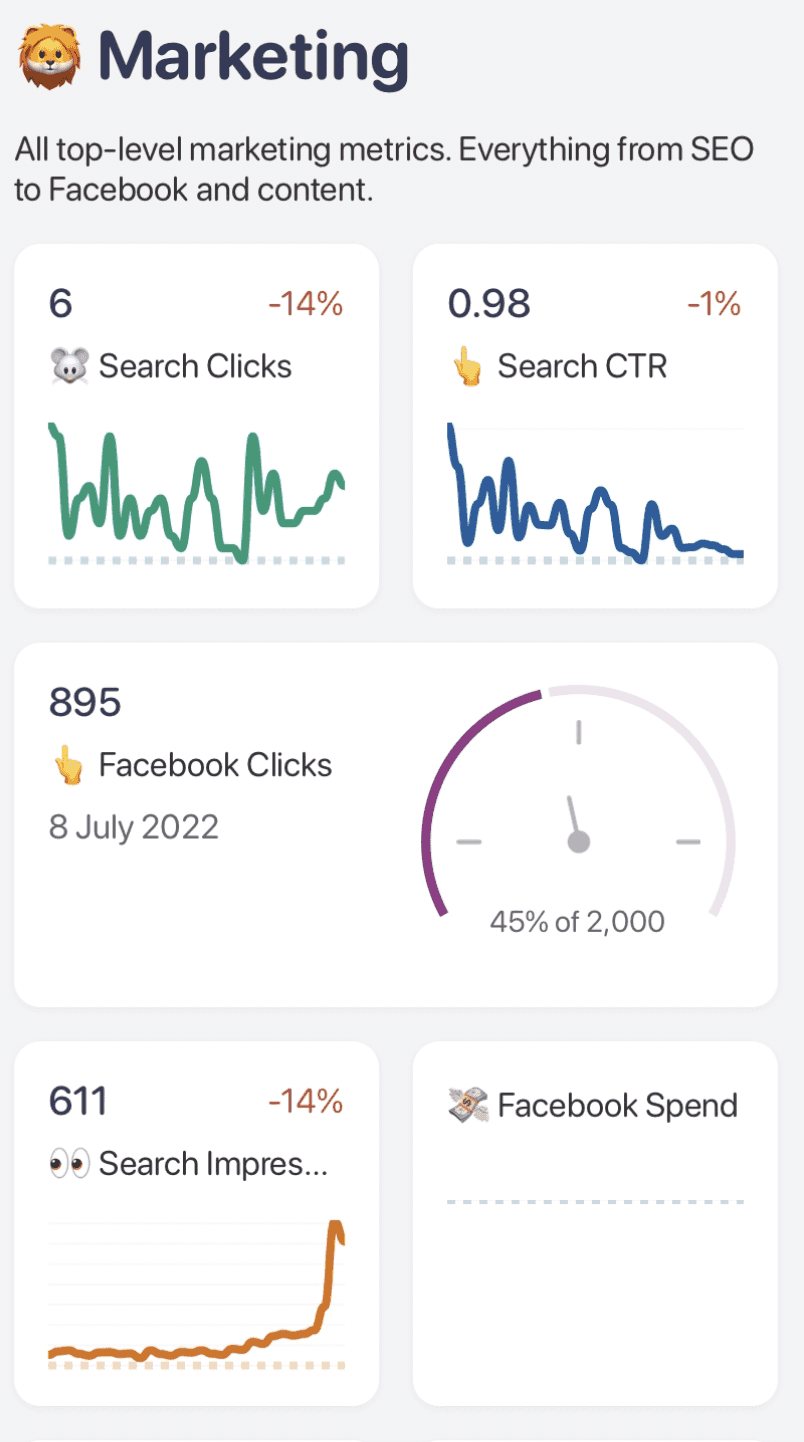
Do you notice how clean and soothing to the eyes it is?
#6. Ensure that Your Dashboards are Mobile-Optimized
With 5.32 billion mobile phone users globally, another great practice for designing awesome dashboards is optimizing them for mobile devices.
By allowing remote access to your most critical metrics, you can flexibly manage your business from anywhere around the world.
But bare in mind, your mobile dashboard layout isn't the same as your desktop version.
Since mobile phones are compact and have smaller screens, your dashboard will need to fit in the space; therefore, the KPI positioning will differ from what it's on your desktop.
To do so, make sure to use mobile-friendly dashboard templates. Plus, while designing for mobiles, remember to showcase the most important metrics first and pull back other casual details to enhance user focus on key metrics.
Moreover, take into consideration the Big Finger Element and Thumb-scrolling principle.
The big finger element suggests that not all users have small fingers to click on comparably small buttons. To make your dashboard user-friendly, enlarge the clickable elements in your dashboard.
Secondly, thumb-scrolling refers to the habit of individuals using their mobiles just with their thumb. However, this limits their access to certain mobile screen areas, but they are positive about it.
So, when your users love using their mobile via thumb. You should ensure your dashboard elements are not distanced far from their reach. This allows a better user-friendly experience and enhances the ease of working on your dashboard via mobile phones.
But with Datapad, you don’t need to worry about any of this. Because our mobile app helps optimize dashboard for mobile by default.
Our app lets you:
-
Track KPIs from anywhere in the world
-
Get easy access to your metrics in time-sensitive situations
-
Communicate with your team around the KPIs via live comment section
#7. Onboard Your Team Members
Another significant feature of a good dashboard design is team onboarding.
Even though your data is well-presented in a dashboard, it still requires a dedicated team to measure, analyze, and determine outcomes from lengthy databases.
That's why you should be able to onboard and share dashboards with your team easily. It must allow you and your team members to view, rearrange, and edit data in real time.
For example, if you need to present a marketing dashboard, it would make sense to ask the team, executives, or relevant stakeholders to provide you with constructive feedback on the dashboard, whether it's focused on campaign performance, marketing budgets, or lead generation strategies.
This way, you can be sure to respect the best practices for dashboard design and deliver outstanding visuals.
One other thing that might help you create dashboards easily is if a platform has permission management features.
A KPI tracking app like Datapad can help you bring your team onboard easily and quickly.
What’s more, you can assign unique KPIs to individual team members, assign them a dashboard, and let them work their magic.
The team collaboration features of Datapad lets you:
-
Get notification wherever the KPI’s out of bounds
-
Communicate with you teammate via comment section
-
Get push notifications on your phone to stay updated with all your KPIs
#8. Communicate with Your Team Around Your KPIs
Suppose you want to provide feedback or share suggestions about a specific metric. You wouldn't want to write down the matter, message your team lead on Slack, and keep visiting the dashboard to check if the updates were made.
Instead, how good would it be if you could communicate and collaborate while staying within your dashboard. That's a sign of a good dashboard - ease of communication.
A good dashboard allows your team to communicate around your KPIs in real time.
For example, Datapad is a modern-day dashboarding solution that allows you to comment below KPIs and let other teammates see your messages in real-time. This enables seamless communication and a collaborative work culture around teammates.
Datapad: Keep all Your Dashboards in Your Pocket
Datapad is a pocket-friendly dashboarding tool that allows business users to collect, measure, analyze, and visualize crucial KPIs from your mobile phones.
The platform offers a highly responsive mobile dashboarding experience enabling you to manage your business performance from anywhere in the world.
Besides assisting with team communications, Datapad has a clean, minimalist design, with KPIs and elements built keeping in mind the big finger users and the thumb scrollers.
Moreover, Datapad's highly customizable dashboards allow you to change color and make interactive dashboards in minutes.
Right now, our app is in its beta testing stage. To enroll as a beta user, you need to simply fill out a form, and Datapad's executives will shortly address you to its large community of beta users.
Frequently Asked Questions (FAQs)
How Do You Make a Good Dashboard?
-
Determine your ultimate business goals
-
Identify key metrics that align with your goals
-
Choose a mobile-optimized dashboard template
-
Select the right chart type for quality visualizations
-
Encourage team collaboration and communication
How Much Does it Cost to Build a Dashboard?
Creating a well-featured dashboard can cost you somewhat between anywhere between $50 to $1000 per month. However, if you’re hesitant on spending on KPI tracking in your initial phase, Datapad is a free solution you can try out.
What Skills Do I Need to Build a Dashboard?
Creating a dashboard requires a mix of soft and hard skills, such as:
-
Analytical & Visualization Skills
-
Data Modeling & Transformation Skills
-
Math & Statistical Skills
-
Research skills
-
Technical know-how (just a bit)
Can You Create Dashboard in Google Sheets?
You can build google sheets dashboard and design it for your own use case. It's is not the best way of building dashboards but if you are beginner and you only want to track some metrics for yourself than it could be a good option. The easiest way of using sheets for dashboard is by using google sheets dashboard templates.