![We Reviewed Top 9 Google Data Studio Alternatives, and Here is Our Review [2024]](/_next/image?url=https%3A%2F%2Fframerusercontent.com%2Fimages%2FlyreVEcmp40WwxP6B4YP5sQ7w.png&w=3840&q=75)
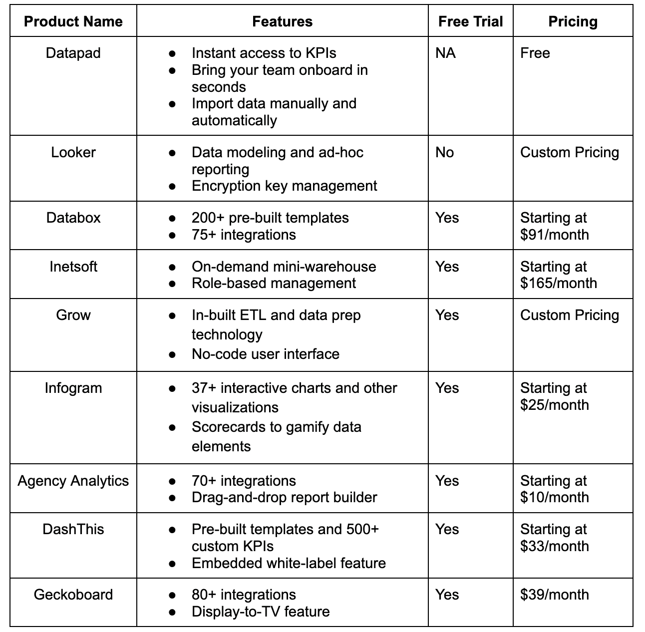
Some of the best Google Data Studio alternatives for easy tracking of KPIs are Datapad, Looker, Databox, InetSoft, Grow, Infogram, Agency Analytics, DashThis, and Geckoboard.
In this guide, you will find a full comparison between these Data Studio alternatives and know why they’re better.
Datapad Looker Databox Inetsoft Grow Infogram Agency Analytics Dasthis Geckoboard
Why Might You Look for Google Data Studio Alternatives?
Reason #1. Report Creation Takes Too Long
Although you get several pre-built report templates, they're all not perfect for copy-pasting purposes. You often need to spend a lot of time customizing the report as per your requirements.
For the most part, data collection and visualization get more challenging as you scale up with Google Data Studio. You start encountering frequent delays in updating sources and lags in refreshing and stacking data.

Even though you have already spent enough time figuring out the perfect bars and graphs to represent your data, these additional delays might waste your time.
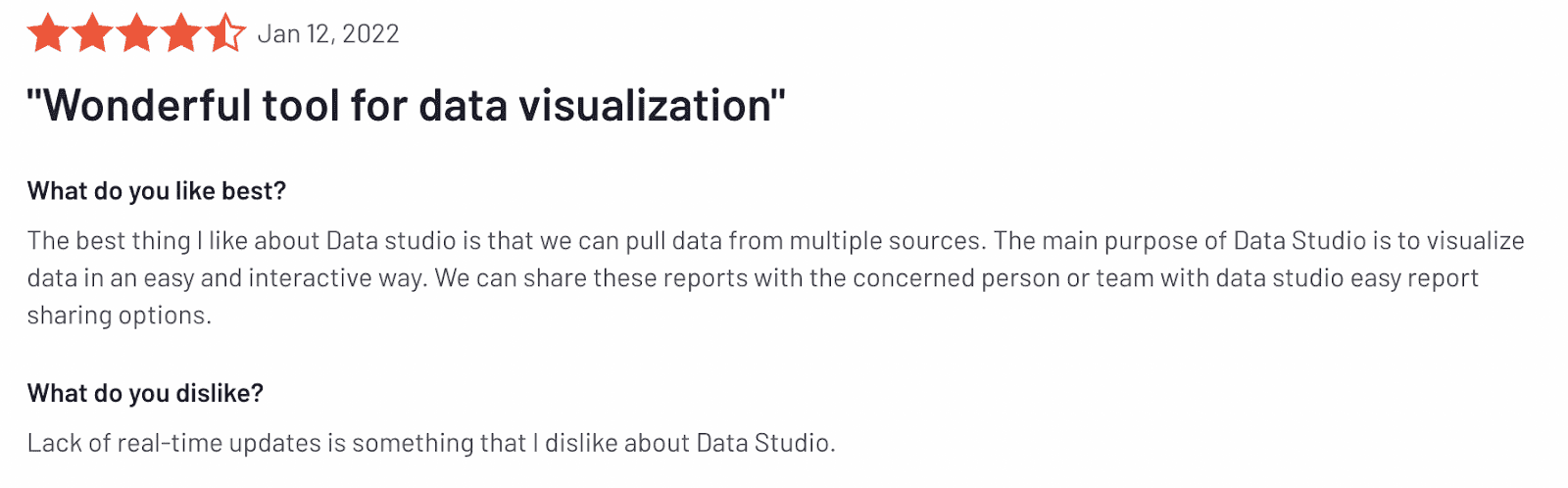
Reason #2. Lack of Real-Time Updates
Real-time updation of data is also an issue with Google Data Studio. We came across several complaints from data researchers about how long it takes to obtain data that is 100% accurate.
Although the platform is backed by plugins to combat the issue, when it comes to creating up-to-date reports, the user interface is something you would still dislike.
Similarly, Google Data Studio lags when using real-time data and report connections as queries get more complicated and lengthy.
Reason #3. Limited Customization Options
Google Data Studio isn't a suitable solution for large agencies and organizations with large clientele and several KPIs to track. You may ask why.

Data Studio limits you with the number of charting options you can use for data visualizations. You must know that with Google Data Studio, you're limited to as low as 50 components and data points per page.
Although the platform provides an interactive user experience, advanced users may find the customization features lacking compared to other business intelligence and data visualization tools.
Reason #4. Lack of APIs and Integrations
Lastly, among the weaknesses mentioned above, the lack of APIs for automation and the limited data sources is something that you will crave when using Google Data Studio.
In today's hyper-competitive business environment, automation is a sought-after feature for any tool, irrespective of its functions and purpose.
For example, top-performing agencies often need ad-hoc data delivered daily or at least weekly, in addition to monthly or quarterly reports.
While that's possible using manual processes in Google Data Studio, the absence of any way to reliably employ agency automation (without employing workarounds) can quickly throw a wrench in your reporting workflows.
When talking about integrations, there's no doubt that Google Data Studio provides seamless integrations within Google's ecosystem. However, the same becomes complicated when you want to source data from a third-party application.

The lack of native integrations to popular data sources like HubSpot or Salesforce might turn out to be a problem for users.
What are the Best Alternatives to Google Data Studio?
-
Datapad: Best all-in-one mobile-first alternative for Google Data Studio
-
Looker: Well-integrated into Google’s ecosystem
-
Databox: Do complex data visualizations with ease
-
InetSoft: Comes with unique data mashup technology
-
Grow: No-code BI and data visualization
-
Infogram: Beautiful dashboards and visualization elements
-
Agency Analytics: Build for agencies to send across white-labeled reports
-
DashThis: Automated marketing reporting software
-
Geckoboard: Easy to share dashboards on TV screens and with teammates
-
Qlik Sense: Extensible and customizable APIs
It’s now time to review the above-mentioned alternatives in detail.
#1. Datapad

Datapad helps you track all essential metrics from stunning dashboards.
The beauty of Datapad lies in its simplicity and ease of use. With our tool, anyone in your team with zero technical knowledge can start building reports in mere seconds.
As a go-to solution for Agencies, Datapad makes it easy to onboard new customers with 1-click templates and share performance reports with read-only links.
Datapad also makes it easy to collaborate as a team with the ability to drop comments on KPI cards.
The AI insights tool lets anyone detect anomalies in their data and provides actionable to-do items to increase performance.
Key Feature #1. Templates

Creating reports for your business is no easy task. You have to determine a lot, from which metrics to choose to design the right charts.
If you are an agency and want to create the same reports for multiple clients, then this hassle becomes even more burdensome.
Guess what? Datapad lets you do all this with just a few clicks.
With Datapad's templating features, you can:
-
Choose from a gallery of pre-designed templates and apply them with 1-click
-
Build a custom dashboard and re-use it as a template by changing it's sources
-
Share all connected data sources in the workspace with your teammates
Key Feature #2. Team Collaboration

Tracking KPIs isn't a one-person job when you have a lot of them; you need a team. But not all KPI dashboard tools let you bring your team on board.
Guess what? Datapad lets you do it quickly and easily.
Moreover, you can assign individual team members tasks to handle, goals to achieve, and metrics to measure.
With Datapad's team collaboration feature, you can:
-
Get notified whenever there’s an update for any metrics and KPIs you track
-
Communicate around your metrics and KPIs with your team members
-
Get push notifications on your phone to stay updated with all your KPIs
Key Feature #3. Automated Reports & Scorecards
Wouldn't it be great if you could check your business KPIs first thing in the morning, straight from your inbox?
With our dashboard software, you can subscribe to any dashboard and receive daily email updates.
All you have to do is build a dashboard, click the subscribe button, and set your email preferences.
The best part is you can share reports with anyone, even emails outside of your organization or workspace.
Step 1: Subscribe to a dashboard

Step 2: Check your inbox

With Datapad’s report and scorecard automation, you can:
-
Subscribe to any dashboard
-
Receive daily highlights around all KPIs
-
Send reports to users in and outside of your organization
-
Customize the date range, calculation, and styling of KPIs
Pricing
Datapad has a free tier that includes 1 dashboard. If you want more, you can upgrade to the $30 Standard Plan, which includes 3 dashboards and scales with your usage. Datapad also offers a Business Plan tailored for agencies and includes dedicated customer support.
We are now offering an earlybird discount to all users, so it's a great time to sign up and give Datapad a spin.
How Does Datapad Compare to Google Data Studio?
Comparatively, both platforms are free to use. However, Google Data Studio comes with a steep learning curve for novice users. Datapad, on the other hand, is an easy-to-use tool with a fantastic user interface.
When it comes to automation and customization flexibility, again, Google Data Studio lacks behind in many ways. Here're a few other reasons why Datapad can be a better alternative to Google Data Studio.
3 Reasons Why You Shouldn't Use Google Data Studio
#1. If You Want to Do a Deep Data Analysis and Not Have a Quick Overview of Your Data
With Google Data Studio, you can't drill down data as much as you can with Datapad or any other KPI dashboarding tool.
Although it’s a free tool, you need some depth to analyze KPIs and make data-driven decisions.
It’s crucial because your company’s growth depends on results that come out of KPI tracking.
#2. You Don't Want to Have a Mobile-Only Experience
Mobile phones, being your closest family member, helps you in every possible way. And you expect your dashboarding tools to be mobile-friendly, right?
Unfortunately, Google Data Studio canvas doesn't have a responsive design. This means your dashboard won't fit your mobile screens.
And even if it does (miracles happen, you know), you are bound to stare at this because editing an unresponsive dashboard would be a headache.
#3. You Need Several Integrations
Google Data Studio isn't a great choice if you're a large organization with a lot of data to monitor for different layers and departments.
Although the platform is well-integrated into Google's ecosystem, sourcing data from an external source is time-consuming.
Plus, the tool lacks integrations to some popular platforms like HubSpot and Salesforce.
#2. Looker
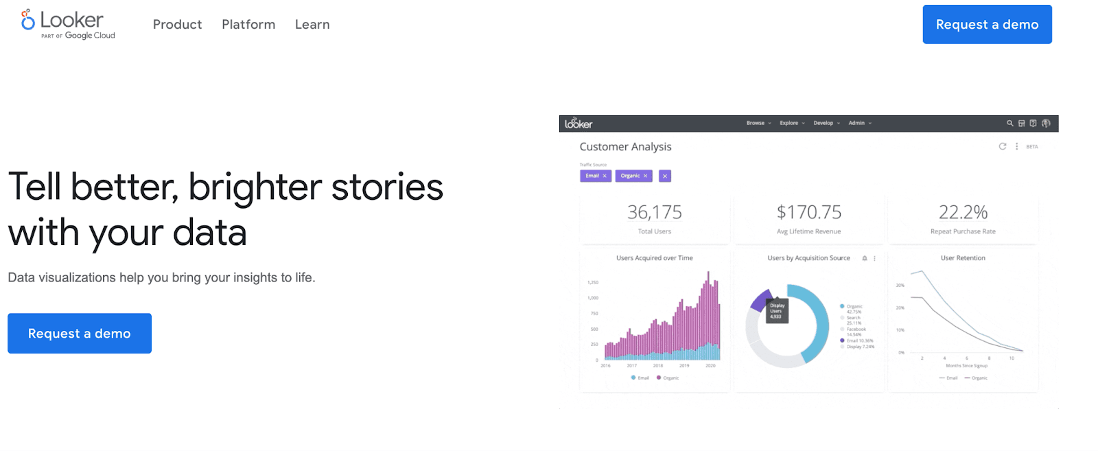
Looker, a product of Google's ecosystem, is a leading data visualization and analytics tool that helps you visualize your data to tell better stories.
It's an enterprise-grade platform for BI, data applications, and embedded analytics to help you explore and share actionable insights in real time.
Who Is It For?
Looker is a modern dashboarding platform used by over 160 companies, including Square, TypeForm, 9GAG, and more. It's best for market researchers and data-driven enterprises who want to explore data.
Features
-
Has interactive and dynamic dashboards that give the flexibility to drill-down data and get a bird's-eye view of operations
-
Choose from an extensive gallery of data visualization elements such as funnels, Maps, and combined charts, or create your own visuals
-
Quickly connect with multiple databases via BigQuery, Redshift, Snowflake, and 50+ supported SQL dialects
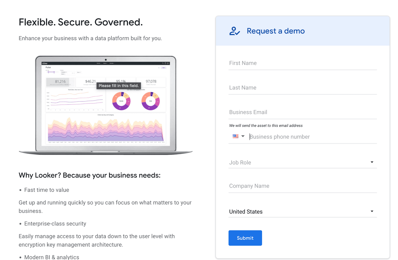
-
Easily manage access to your data down to the user level with encryption key management architecture
-
Supports data modeling and ad-hoc reporting to create custom metrics for granular insights
Pricing
Looker offers a free trial. You can request a demo of the software. However, it doesn't have any pricing information mentioned on its official website. You can request a quote from their pricing page.
Pros and Cons
Pros
✅ Reliable customer support
✅ Easily share reports and dashboards via smart URLs
Cons
❌ Steep learning curve (difficulty on onboarding teams)
❌ Lacks visualization and customization capabilities
❌ Slows down when processing complex data
#3. Databox

Databox is an award-winning dashboarding and business intelligence platform that helps you and your team quickly connect your data, build and share reports, monitor trends, and discover insights. Everything from a unified dashboard and in real-time.
Unlike Google Data Studio, Databox has a dedicated mobile app. More than 20,000+ businesses have benefited from the magic of Databox.
Who Is It For?
Databox is suitable for small to large businesses and offers mobile apps for iOS and Android devices.
Features
-
Over 200+ pre-built report templates and thousands of data visualization options to quickly build dashboards and reports
-
Easily customize your dashboard with its intuitive designer tool - no coding required
-
Integrations with 75+ popular tools; import data from SQL database, Google Sheets, or Zapier
-
Quickly blend data from multiple sources to create custom metrics and get a granular view of overall business performance
-
Get performance alerts via email, Slack, or in-app notification and discover trends quicker
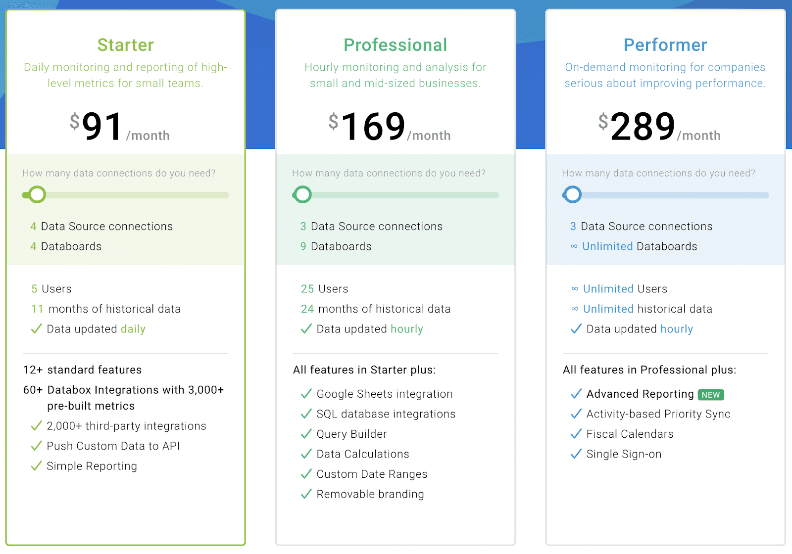
Pricing
Databox offers a free-forever plan that includes 3 Data Source Connections, all standard features, and 60+ Databox Integrations. Apart from this, Databox has three premium plans:
-
Starter: $91/month
-
Professional: $169/month
-
Performer: $289/month
Pros and Cons
Pros
✅Has a dedicated mobile app
✅Ample amount of integrations and data connectors
✅Stunning data visualizations
✅Easy-to-customize and share dashboards
Cons
❌No Youtube integration
❌Steep learning curve (requires time for training)
#4. InetSoft
InetSoft is an easy, agile, and robust BI and dashboarding software that helps businesses blend data from multiple sources and present them with stunning visuals under one unified dashboard.
Who Is It For?
InetSoft's users range from Fortune 500 organizations to power users, data scientists, and small businesses.
Features
-
Has a 100% responsive web application that adapts to all devices and ensures maximum self-service
-
Interactive dashboards that are already wired with built-in interactions and customization to enable an end-user analysis
-
Enable role-based management to selectively grant access to who can view and edit data and visual elements
-
Leverage InetSoft's on-demand mini-warehouse that mashes up all sources with a high-performance data engine
-
Unique data mashup technology and in-built machine learning engine that enables administrators to mix data from multiple sources and generate accurate insights
Pricing
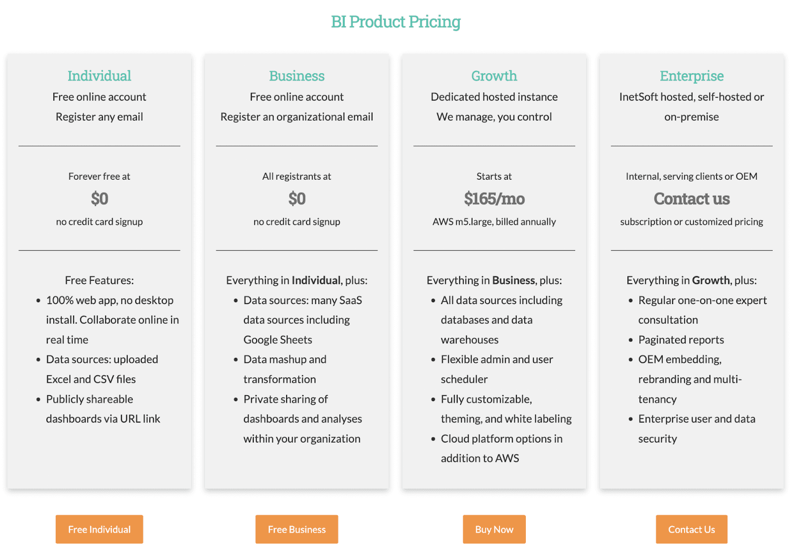
InetSoft offers free-forever individual and business plans. Besides this, it has two other plans:
-
Growth: $165/month
-
Enterprise: Contact Sales
Pros and Cons
Pros
✅Architecture is open to easy integrations and data modules
✅Allows to translate or localize your dashboard
✅Reliable customer support
Cons
❌Outdated UI/UX
❌Intricate data blocks can be challenging to manage
#5. Grow
Grow is a no-code BI and analytics platform empowering data-driven leaders and business owners to make progressive business decisions.
The platform allows you to create highly customizable dashboards for monitoring business performance and key activities across your organization.
Who Is It For?
Grow is a cloud-based platform best suited for small to medium-sized enterprises for their KPI tracking and data visualization needs.
Features
- In-built ETL and data prep technology to prepare, cleanse, and transform data across multiple data sources; integrations with HubSpot, Shopify, and more popular platforms
- Has an extensive gallery of data visualization elements, including pre-built charts, bubbles, tables, maps, and more, to quickly visualize datasets
- Use dashboard filtering to dynamically change displayed metrics data based on date, number, or category
- Easily share dashboards via email, smart URLs, or instantly post an individual post on Slack channels
- White-label dashboards and reports before sending them across to your clients or investors
Pricing
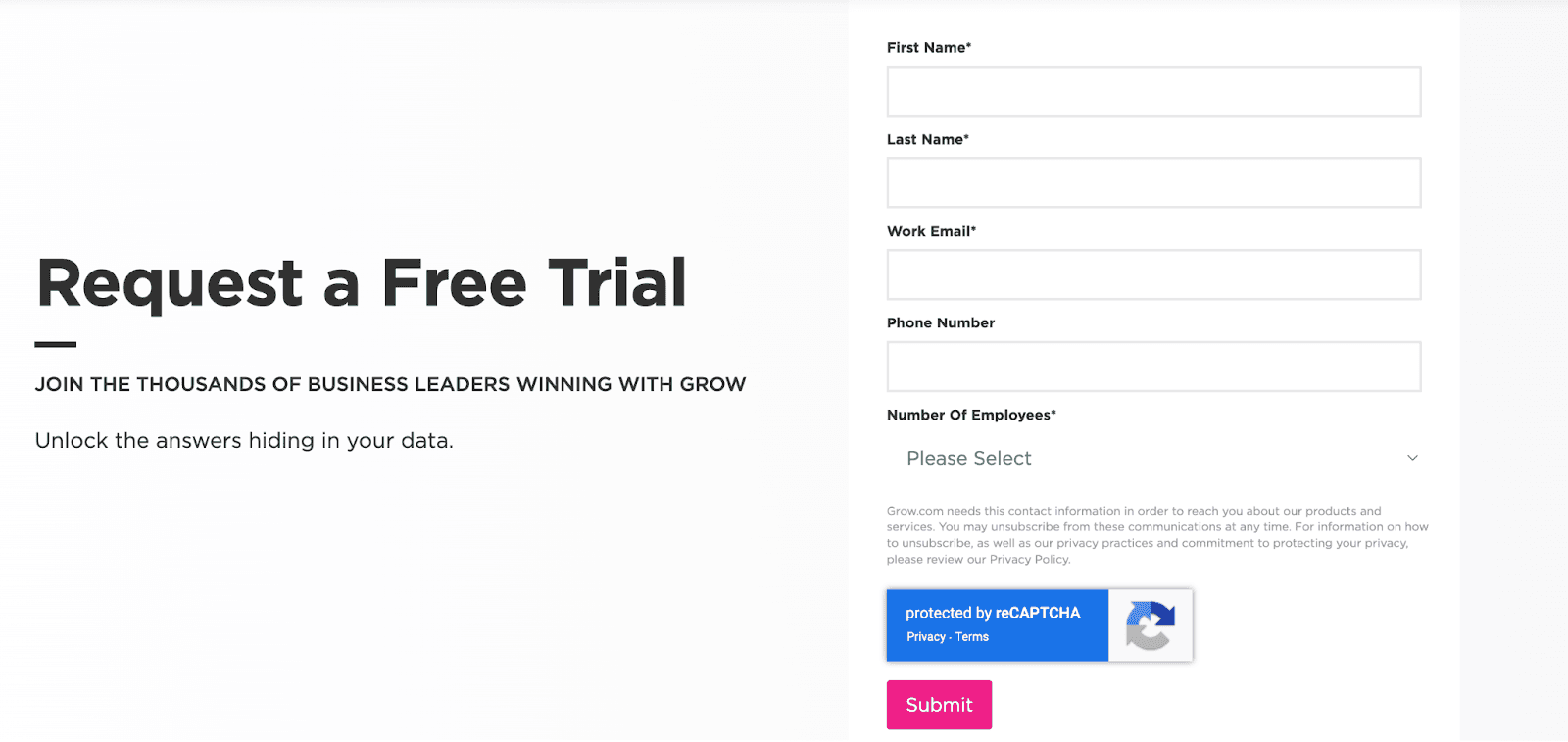
Grow has no pricing mentioned on its official website. However, you can request a free trial and test the product yourself.
Pros and Cons
Pros
✅No-code platform (best for non-technical users)
✅Well-integrated with popular tools and platforms
✅Highly customizable dashboards with great user-interface
Cons
❌Takes a long time to update specific categories
❌Lags in ‘real-time’ data updation
#6. Infogram
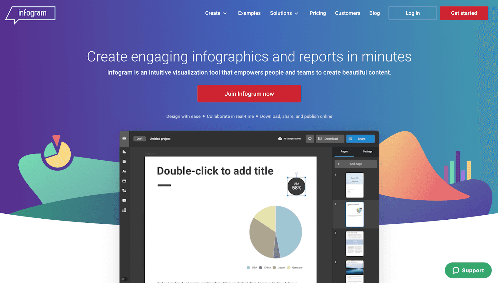
Infogram is an intuitive visualization tool that empowers teams to create infographics, reports, data dashboards, and pictorial representations of all kinds.
Infogram is not entirely a KPI dashboarding tool, but when it comes to data visualizations, it has the most amazing collection of visualization elements, among other tools.
Who Is It For?
Infographic is for marketing teams, business teams, early-stage designers, and professionals who want to transform their raw and messy data into stunning visualizations.
Features
-
Has an extensive gallery of the pre-built dashboard and report templates with an intuitive interface that's easy to play around with and learn
-
Choose from a pictorial library of graphs, charts, infographics, and other visual elements to quickly create stunning visuals
-
Scorecards to gamify certain data elements and provide analytical guidance; library of historical snapshots for quick reference
-
Enable role-based management to control who can view/access/edit data; create custom tracking links and share them with clients
-
Uses state-of-the-art technologies to offer the best possible experience for the web and mobile devices
Pricing
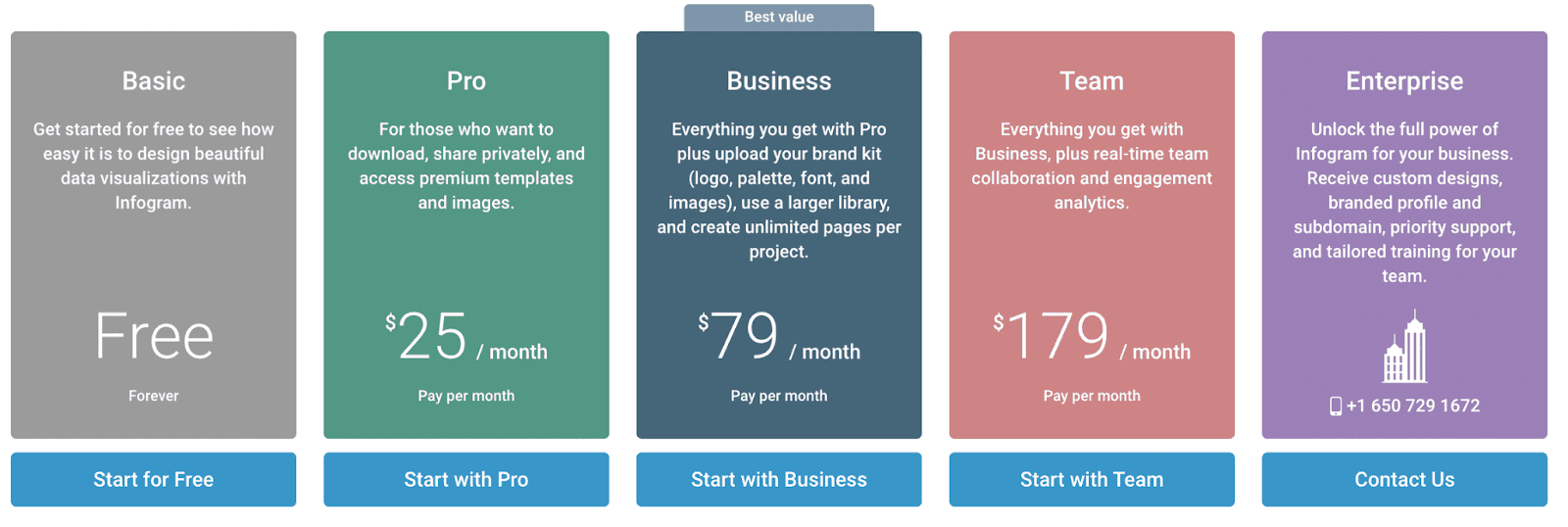
Infogram offers a free-forever plan with 37+ interactive charts and up to 10 projects. Apart from this, it has three premium plans, namely:
-
Pro: $25/month
-
Business: $79/month
-
Team: $179/month
-
Enterprise: Contact the sales team
Pros and Cons
Pros
✅Easy for non-technical professionals with a simple interface to visualize data
✅Satisfactory amount of charts and graphs
✅Easier integration with standalone landing pages and social embed
✅Mobile responsiveness
Cons
❌Doesn’t support complex visualizations with multiple layers of data and dependability
❌Inability to add custom class or CSS style sheets
❌Inability to download charts and graphs (until you have a pro, business, or enterprise plan)
#7. Agency Analytics

Agency analytics is the only agency-first platform to offer data visualization needed by small to large agencies, mainly in the marketing services sector. It gives you the freedom to create stunning dashboards connecting all your clients under one roof.
Who Is It For?
Agency Analytics is for agencies and professionals who provide branding and marketing services to a set of customers and want to share live reports.
Features
-
Over 70+ integrations with popular marketing platforms (new integrations released frequently)
-
Use its intuitive drag-and-drop report builder to customize the look and feel of your dashboard
-
Comes with a white-label feature to create fully branded reports featuring your logo and colors and host them on your domain
-
Has a full suite of SEO tools to Track keyword rankings, perform a site audit, and monitor backlinks
Pricing
Agency Analytics offers a 14-day risk-free trial. After which it has three premium plans:
-
Freelancer: $12/month
-
Agency: $18/month
-
Enterprise: Custom Pricing

Pros and Cons
Pros
✅Impactful and numerous integrations
✅Clear and secure data handling
✅Excellent customer support
Cons
❌Unable to process complex databases
❌Inefficient and flawed conversion and goal tracking in some cases
#8. DashThis
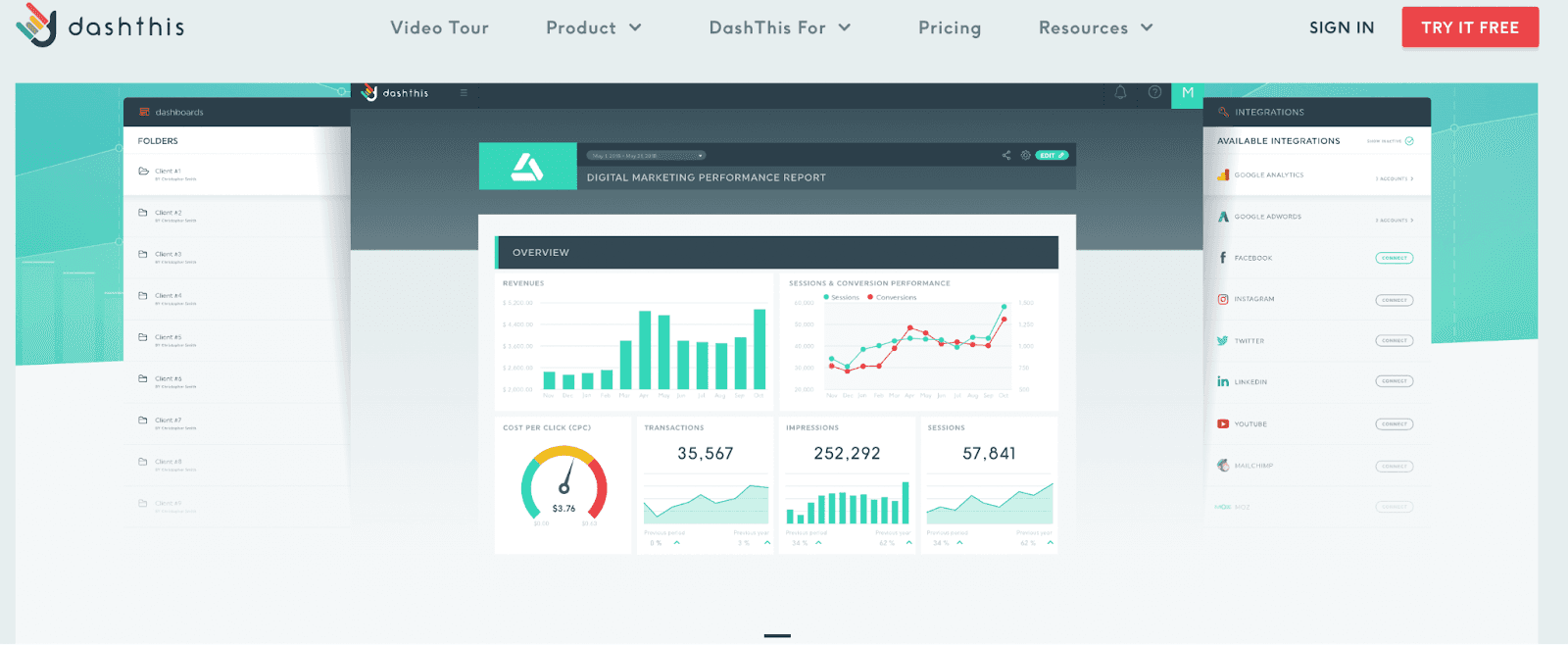
DashThis is a cloud-based automated marketing reporting tool that allows users to create custom dashboards and streamline their reporting process hassle-free.
Who Is It For?
DashThis is for digital marketers and agencies who thrive on data-driven insights in a cost-effective manner.
Features
-
Easily import data from multiple data sources with over 30+ integration to popular marketing platforms
-
Quickly create beautiful and insight-driven dashboards with pre-built templates and 500+ custom KPIs
-
Share dashboards via email, smart URLs, and in multiple formats with a single click; schedule automated report sharing via email
-
Use the white-label feature to create custom dashboard URLs, customize the dashboard with your brand logo, colors, and tailor-made widgets
Pricing
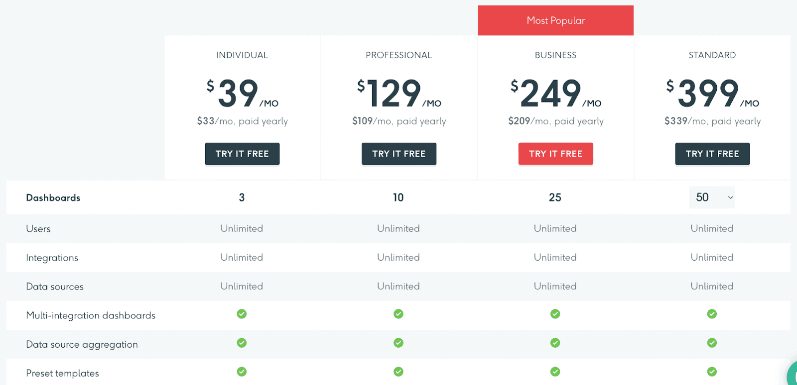
DashThis has a 15-day free trial period, after which the platform offers four premium plans, namely:
-
Individual: $39/month
-
Professional: $129/month
-
Business: $249/month
-
Standard: $399/month
Pros and Cons
Pros
✅Easy to use with quick setup
✅In-depth functionality and flexibility
✅Reliable customer support
Cons
❌ Pricing policy is complicated (price increases with an increase in the number of dashboard creations)
#9. Geckoboard
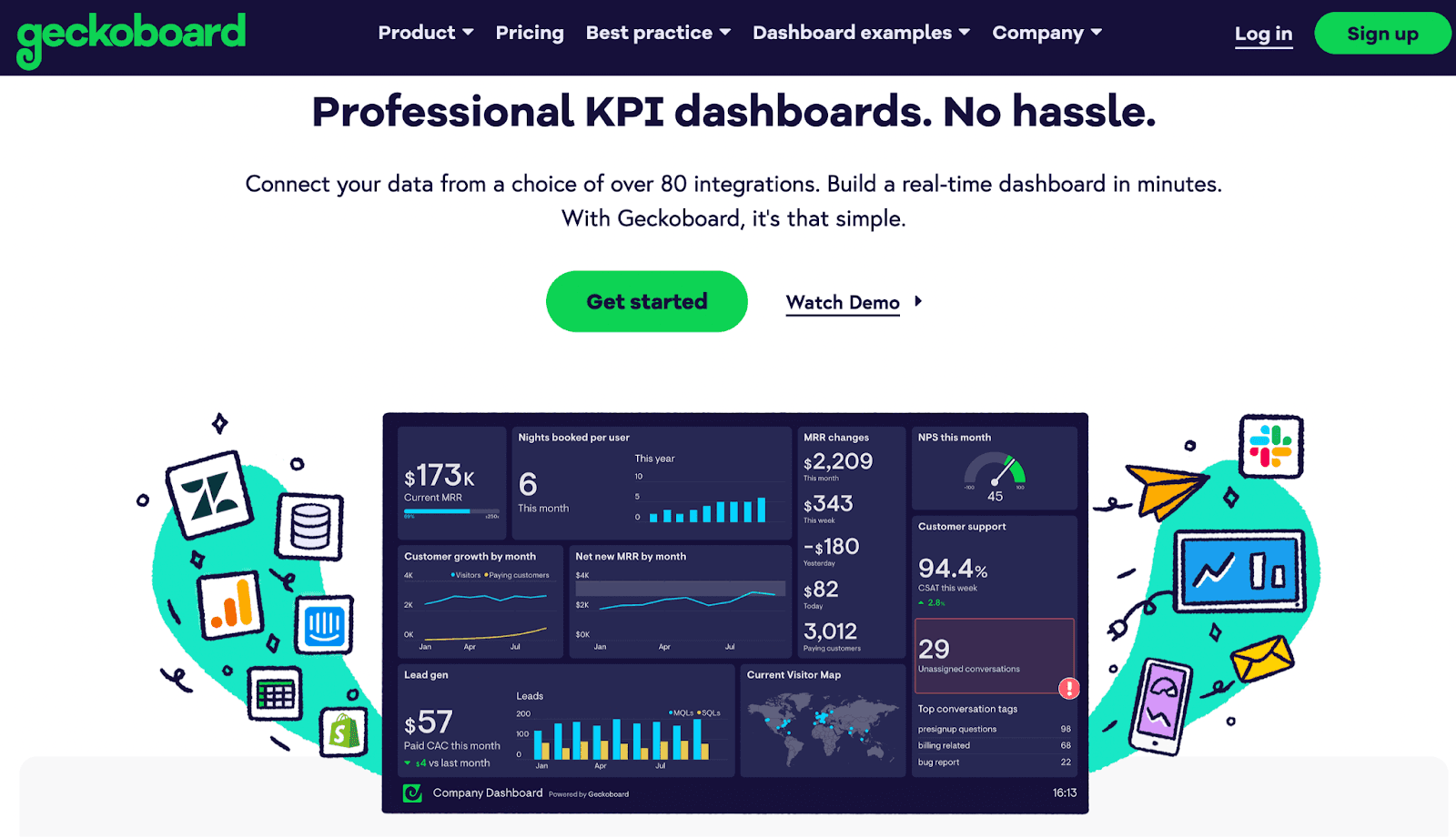
Geckoboard helps you create a professional real-time dashboard in a matter of minutes. Its robust integrations and user-friendly interface allow anyone to build dashboards and track KPIs on the go.
Who Is It For?
Geckoboard is trusted by 1000s of data-driven organizations, including Airbnb, BuzzSumo, and more. It's perfect for everyone - company, investor, marketing, sales, support, ecommerce departments, and more.
Features
-
Quickly import data from over 80+ data sources, including Google Analytics, Google Sheets, Zendesk, and Salesforce
-
Use advanced filters to select the exact metrics and ranges to track; choose from a range of templates to display data via stunning visuals
-
Generate smart links to share live dashboards via email or embed them into a website landing page
-
Automatically share screenshots of your dashboards via emails or Slack on a daily/weekly/monthly basis
-
Has display-to-TV feature to broadcast live dashboards to a wider audience; use mobile to check dashboards on the go
Pricing
Geckoboard offers a free plan which includes a single spreadsheet-powered dashboard. Apart from this, it has three premium plans:
-
Essential: $49/month
-
Pro: $99/month
-
Scale: $699/month (Enterprise-grade)

Pros and Cons
Pros
✅Come with a lot of integrations
✅Can build mobile-friendly dashboards
✅Easy to share live dashboards
Cons
❌No dedicated mobile app
❌Free version offers a single dashboard
Keep All Your KPIs In Your Pocket?
Unlike the tools mentioned above, which have some pros, cons, complexity, or expensive price attached to them. Datapad is a standalone software that assists you in managing your business hassle-free.
But that's just not it!
Datapad lets you track all your KPIs in one place; it doesn’t make you switch between the web app and the mobile app for data updation or customization.
Sign up to our platform, download the app, and get started in no time.
Read more:
12 Best Dashboard Tools in 2023 [In Depth Guide]