
Google Sheets is undoubtedly a great way to create statistical dashboards and track KPIs.
The Google Sheets charts and graphs provide a clear overview of KPIs and help you and your team make data-driven decisions.
Creating a dynamic dashboard in Google Sheets is easy and similar to Excel dashboard creation, but a lot of manual procedures go into its making.
In this article, you will discover what a dynamic dashboard is, how to build one in Google Sheets, its limitations, and an alternative to track your KPIs better.
But let’s first understand the basics.
What is a Dynamic Dashboard in Google Sheets?
A dynamic dashboard is an interactive dashboard that you can access and make changes in real-time.
Such dashboards are required in time-sensitive situations or are great for companies whose KPIs change frequently and must act upon them immediately.
You can add, remove, or edit any data from the dynamic dashboard and it reflects the changes in the front-end immediately without much delay.
Creating a dynamic dashboard with Google Sheets is a tricky yet effective process. There are 6 steps to creating a dynamic dashboard in Google Sheets which we will be discussing later.
One of the best examples of a dynamic dashboard is the dashboard you see in any car. 🚘
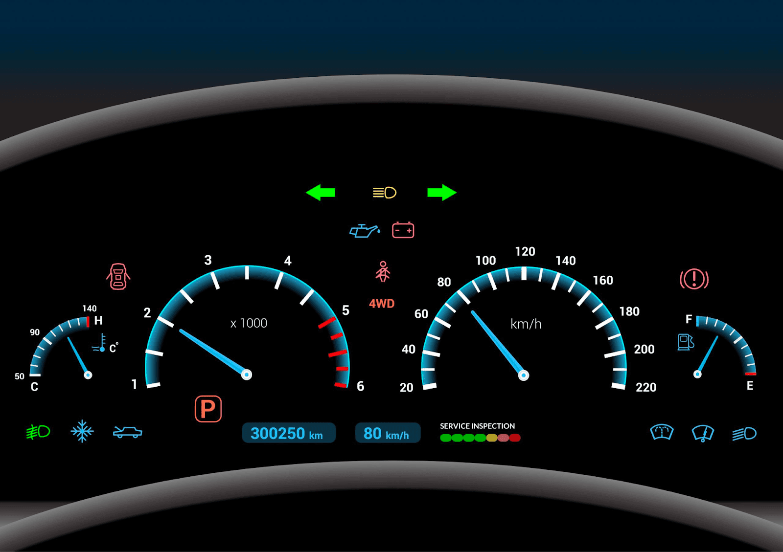
You can see how the speed fluctuates when you increase or decrease the car speed, you can see the distance traveled increasing as you keep traveling, the fuel indicator lets you know about the amount of fuel you have left, and many more KPIs.
But a car dashboard is a more advanced dynamic dashboard; creating such dashboards on Google Sheets is a tough and lengthy process.
Benefits of Using a Dynamic Dashboard to Track KPIs
-
Lets You Make Real-Time Changes: As mentioned earlier, you and your team can make all the changes a KPIs needs in a dynamic dashboard’s back-end, and it will reflect immediately in the front-end of the dashboard.
-
Easy to Edit: With dynamic dashboards in Google Sheets, you and your team can make changes easily. Via strong data visualization features, you can transform your raw data into charts immediately.
-
Drill Down on Insights: The best benefit of using a dynamic dashboard instead of a static dashboard is that when you want to know what’s the reason behind the fall of a KPI, you can click on its graph and access all the live data. This will help you and your team identify the problem and rectify it instantly.
Now that you know what a dynamic dashboard is in Google Sheets let's look at a tutorial you need to follow to create one.
How to Build a Dynamic Dashboard in Google Sheets - Step-by-Step
Step 1: Import or Collect Data to Analyze
The very first step in dynamic dashboard creation is to compile all the KPI-related data you want to track.
You can use a Google Form to collect data manually or import data from a data source like Google Analytics or as a CSV file.
If you choose to go by the route of Google Form, you can automatically convert the form into a Google Sheet and use the data to create a dynamic dashboard.
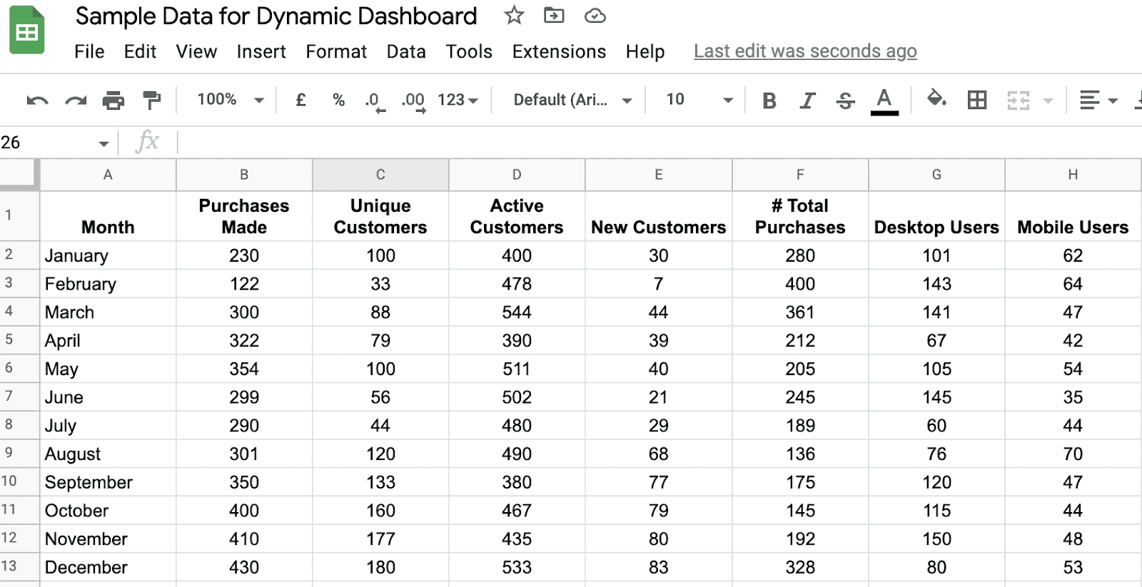
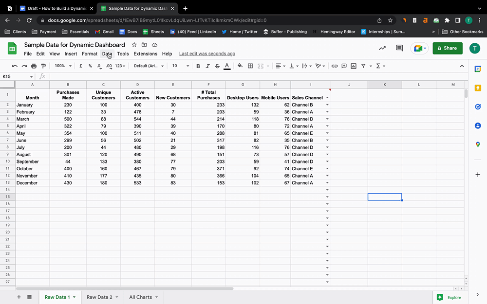
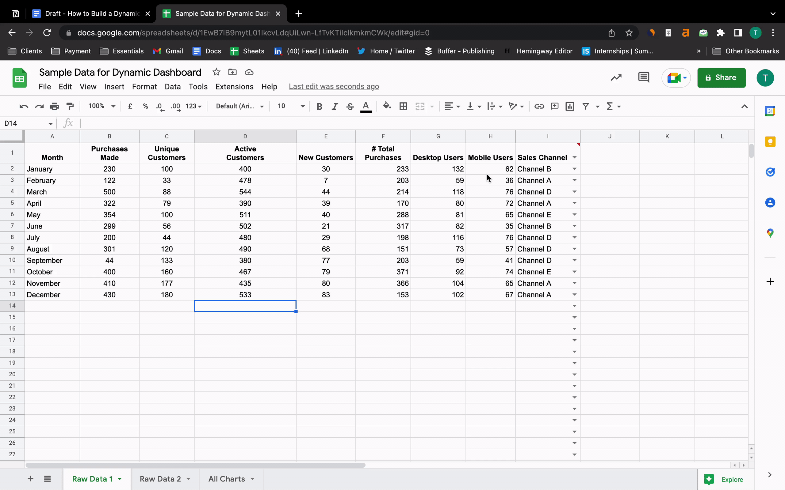
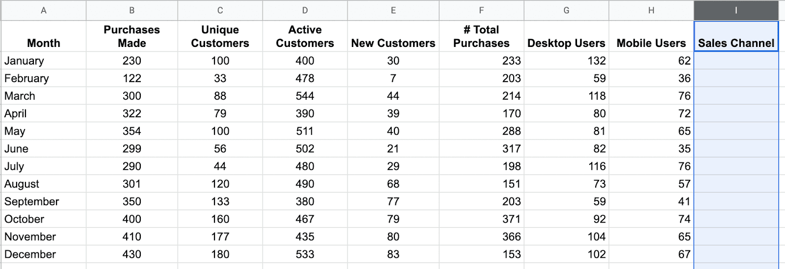
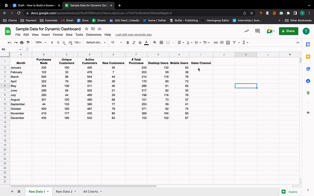
Here’s an image of a small set of data we will be using as an example to create a dynamic dashboard in Google Sheets.
Step 2: Elements You Should Know About When Creating Dynamic Dashboards
When creating a dynamic dashboard in Google Sheets, there are several elements that you will use. Let’s first understand the functionality of these elements before creating a dashboard.
#1. Pivot Table
A pivot table gives you the summary of a large database you already created in Google Sheets. It helps you condense the data into aggregated form to extract and find the specific data range or sets you want.
For example, if you have an ecommerce store with multiple products.
A pivot table can help you identify the total revenue generated by a certain product in a certain location.
Essentially, pivot tables give you a birds-eye view of your raw data and help you understand it better.
With the current dataset (you can see the image in Step 1), let's say we want to know which sales channels were used the most over the year.
You can do that via a pivot table; here’s how:

Note: You can use Google Sheets formulas to derive insights like the example above, but pivot tables are much faster and easier to use. It also reduces the chances of human error and data inaccuracies.
#2. Charts
Charts are the most prominent feature of Google Sheets that you will be using when creating a dynamic dashboard.
They help you quickly analyze a large set of data via visual representation.
You can make charts from raw data as well as pivot tables as long as it has an X and a Y axis.
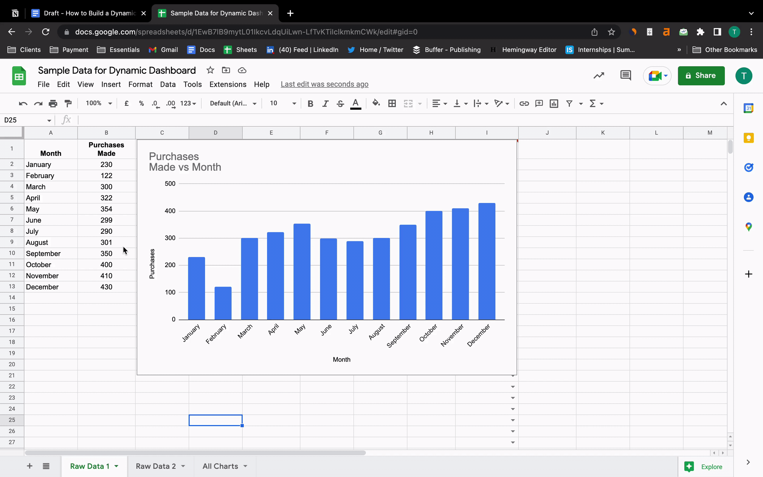
Here’s an example of a bar chart we created from our raw data.
One great thing about these charts is that you can change your raw data and see the change in the chart immediately.
#3. Slicer
The slicer function of Google Sheets lets you ‘slice away’ data from a dataset, so you can focus on what’s important.
You can use the slicer feature for pivot tables, and they're also essential to keep control of the charts and graphs in your dynamic dashboard.
Here’s a little sneak-a-peek into the Slicer function. Setting the slicer up just takes seconds, and it can be a real help when you have a large dataset to analyze.
#4. Lookup Formulas
Lookup formulas help you find a specific value in a large set of data.
There are two types of Lookups:
-
Vertical Lookup (VLOOKUP): Finds the key value in the first column of a range that you define and returns a value from another column that’s in the same row.
-
Horizontal Lookup (HLOOKUP): Same as vertical lookup, just horizontally.
Here’s an example of VLOOKUP in action:

The formula for VLOOKUP in Google Sheets goes like this:
=VLOOKUP(search_key, range, index, [is_sorter])
Where,
Search Key is the value of the search in the column.
Range is the upper and lower values to be considered for the search.
Index is the column number to search for value in (must be a positive integer).
Is_sorter is an optional input that you can choose:
Type true if you’ve sorted your data in any way,
And false if it’s unsorted.
#5. Sparkline
Sparkline helps you create a small line graph without any axes instantly. It can be helpful to analyze a data trend instantly.
Here’s how to make use sparkline formula on Google Sheets:
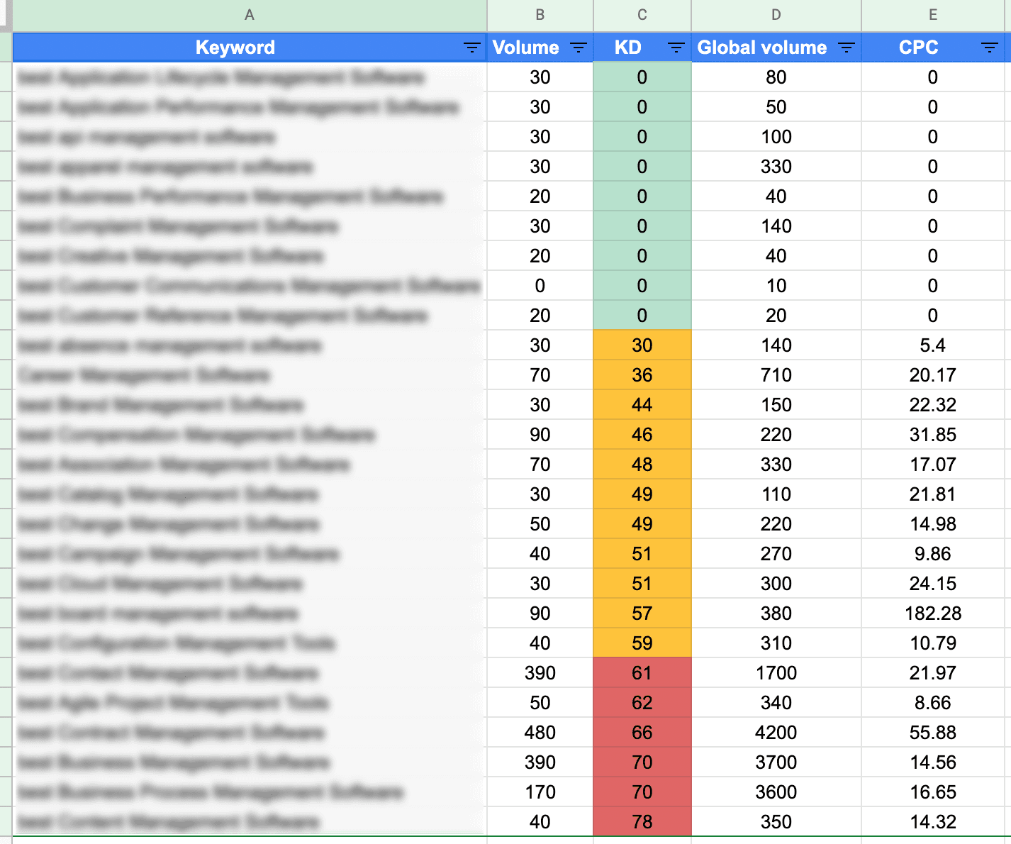
#6. Conditional Formatting
With conditional formatting, you can sort data in ascending or descending order, assign a color schema to data, and hide data that you don’t need.
It’s quite helpful when you have a specific goal assigned for a specific range of values.
The best use of conditional formatting is done when someone is doing keyword research.
One important metric to track when doing keyword research is keyword difficulty.
With conditional formatting, you can set color schemes for different keywords.
One such color scheme could be:
-
Green for keywords with difficulty 0 to 29
-
Yellow for keywords with difficulty 30 to 59
-
Red for keywords with difficulty 60+
Step 3: Create Chart/Tables For Your Raw Data
When it comes to dynamic dashboards in Google Sheets, charts and tables are your only option to track KPIs.
We say only, but they’re enough to track every KPI you can think of.
Let’s see how you can create a table to track KPIs via a dynamic dashboard.
From the raw data example, if you want to track the number of new users per month. You can select both columns and create a pivot table as we did in Step 2.
The same is true for charts.
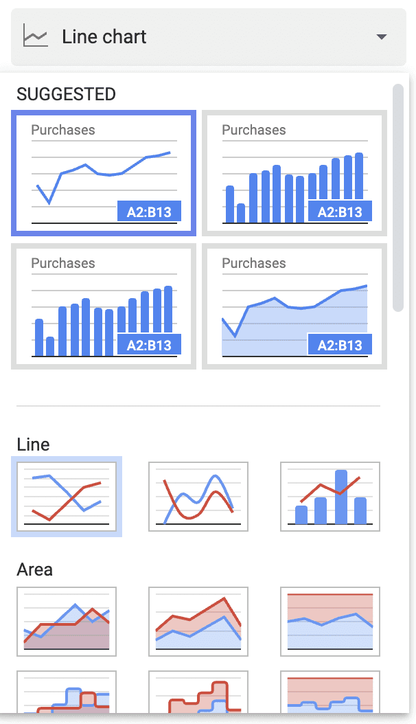
With Google Sheets, you can create 8 types of charts:
-
Line charts
-
Column (Bar) charts
-
Combos
-
Area charts
-
Pie charts
-
Scatter diagram
-
Maps
-
Miscellaneous charts
Step 4: Use Data Validation Feature
The data validation feature of Google Sheets is used to ensure that you only input a value in a column that's valid.
Let us explain it to you with an example.
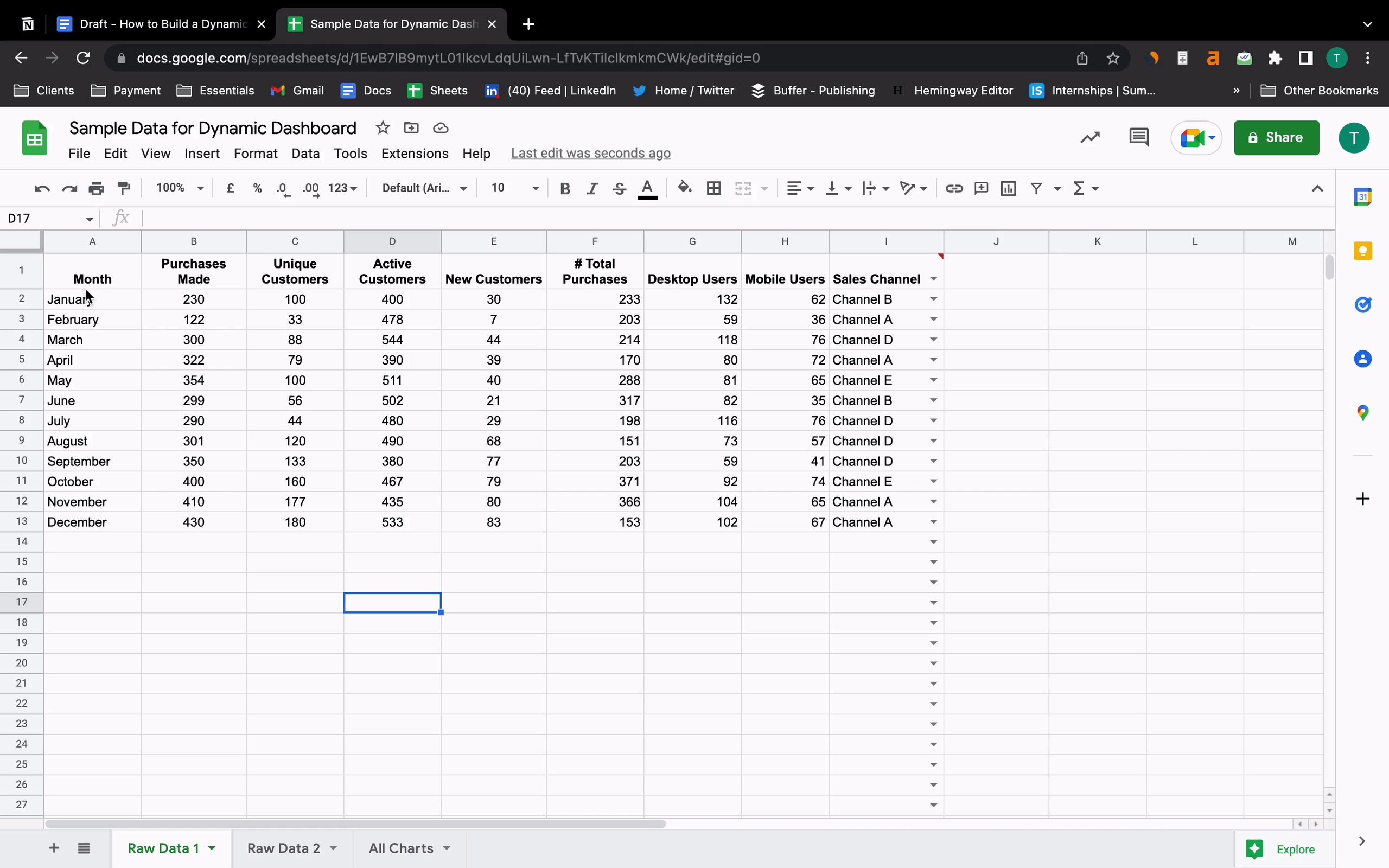
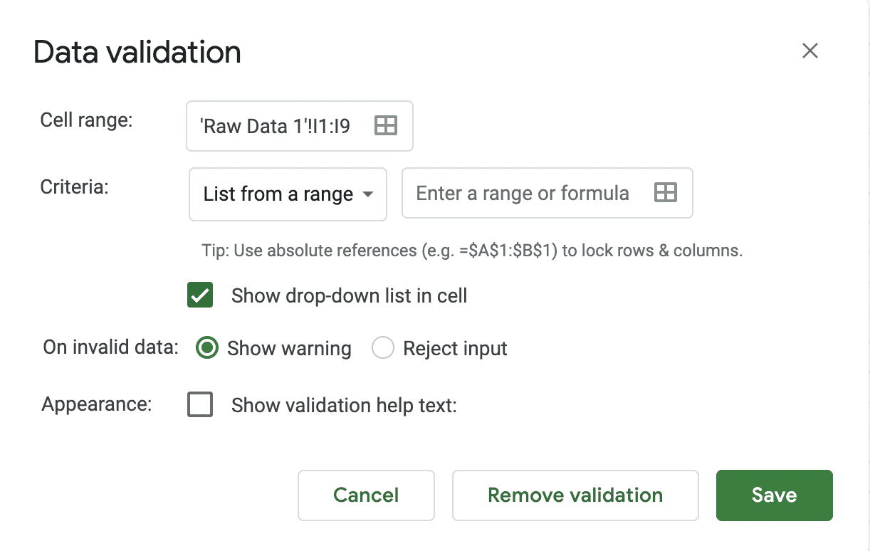
Suppose there are 5 sales channels - A, B, C, D, and E, and we want to add those to our raw data sheet.
Data validation is the best way to ensure that you or your teammates don't add any other option in any of the cells apart from the 5 channels we mentioned above.
To do so, select the column you want to validate.
Go to Data in the menu and click on ‘Data Validation.’
You will see a data validation window open, like the one below.
In the Criteria option, change ‘List from a range’ to ‘List of items’ and write the five channel names separated by commas.
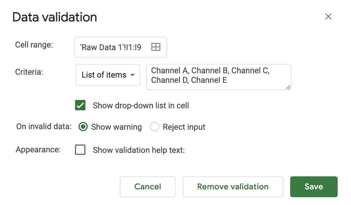
Click on Save after you’re done.
You will now see a drop-down in the column named ‘Sales Channel’ from which you can select the channel for each month.
Step 5: Formatting and Customization
Formatting and customization can be done for both raw data and the charts you make to track KPIs via a dynamic dashboard.
For formatting the raw data, you can use conditional formatting. You can see how to do it in Step 2 of this guide.
When it comes to formatting charts, Google Sheets has an array of features.
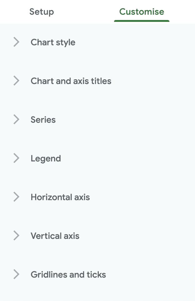
Here’s what you can do with the formatting options for charts:
-
Select the graph type you want for your KPI from multiple options
-
Change the color and font of the chart
-
Change the axes titles or flip the axes if required
-
Insert error bars, data labels, or trend lines if needed
-
Introduce a legend axis
-
Enables gridlines and ticks on the charts
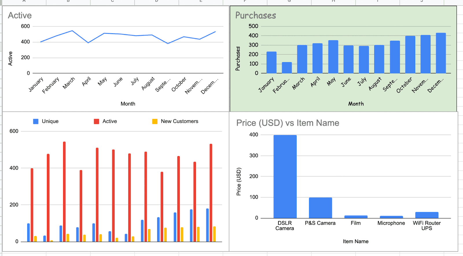
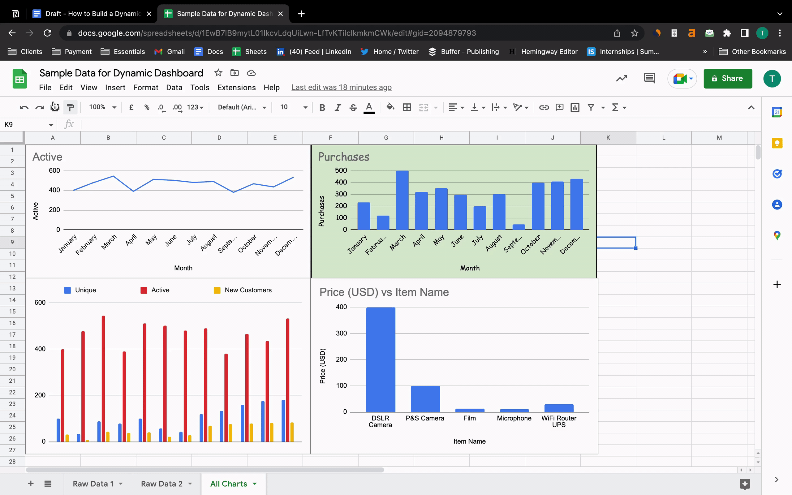
Step 6: Convert all the Charts into a Dynamic Dashboard
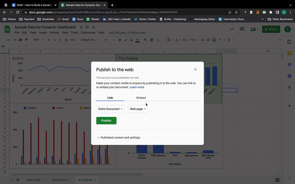
To make a dynamic dashboard in Google Sheets, you must publish the charts onto a webpage.
To do so, open a new sub sheet and copy and paste all the charts on it.
After that, go to File > Share > Publish to Web.
A small window will pop up on the screen.
Instead of the ‘Entire document’ option, choose ‘All Charts’ from the drop-down menu and click Publish. Copy the link and paste it into a new Google tab.
Here’s your dynamic dashboard that you can share with your teammates.
Drawbacks of Creating Dynamic Dashboards in Google Sheets
#1. Your Dashboard Can Easily be Ruined by Someone Else
Keeping track of business KPIs via a dynamic dashboard on Google Sheets is great if you’re an individual doing all the heavy lifting. But if you have a team to help you out track KPIs, Google Sheets can be your new nightmare.
Especially if some teammates of yours are complete beginners to KPI tracking.
They might change a few things in a dashboard to test the waters, and there are chances it'll completely ruin your dashboard.
Also, there's always a risk of sharing the sheet accidentally with someone outside your organization, leading to data leaks.
#2. No Mobility
The mobile experience of Google Sheets isn't great; you have to scroll both horizontally and vertically to look at your KPIs. Apart from this, it's also very tough to edit something on Google Sheets via a mobile phone.
Our suggestion is, don’t rely too much on Google Sheets for your dashboards when you need quick access.
What happens if you need to check specific data in your investor meeting when they ask you to?
You can’t just sit there firing up a laptop and taking your own time to give them an answer.
#3. It’s Hard to Maintain a Dashboard on Sheets
Google Sheets dynamic dashboards are a decent option for just getting started with KPI tracking, which means that it's great to track a handful of KPIs (5 or 6).
But due to a lot of manual procedures, tracking multiple KPIs will take a lot of time.
When your company grows, you will have multiple departments tracking a bunch of KPIs separately.
Maintaining Google Sheets dashboards is tough at that point in time, and also, with so much data loaded in the Google Sheets, it becomes slow.
There might come a point where the time taken by the dashboard to load will be more than the time required for you and your team to track KPIs, and you can't afford such a waste of time when you have to track KPIs almost every day.
Solution: Keep Track of All Your Key Metrics in One Place for Free with Datapad
With the above dynamic dashboard in Google Sheets, it's quite evident that you can't track KPIs on the go.
But there must be some app that lets you do it, right? 🤔
And there is!
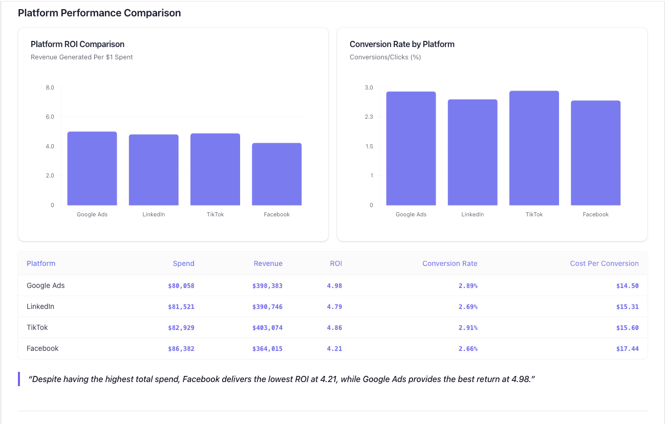
Datapad is designed to make data analysis easier, especially for those using Google Sheets. Whether you're creating a dashboard to track sales or a graph to visualize trends, Datapad integrates seamlessly with your Sheets to provide powerful insights.
The beauty of Datapad lies in its simplicity and ease of use. With our tool, anyone in your team with zero technical knowledge can start building reports in mere seconds.
#1. Google Sheets Integration:
Tired of copying and pasting data from your spreadsheets into visualization tools? Or worse, rebuilding your charts every time your data updates? Datapad solves this headache by connecting directly to your Google Sheets, transforming your data into stunning visualizations without the technical complexity.
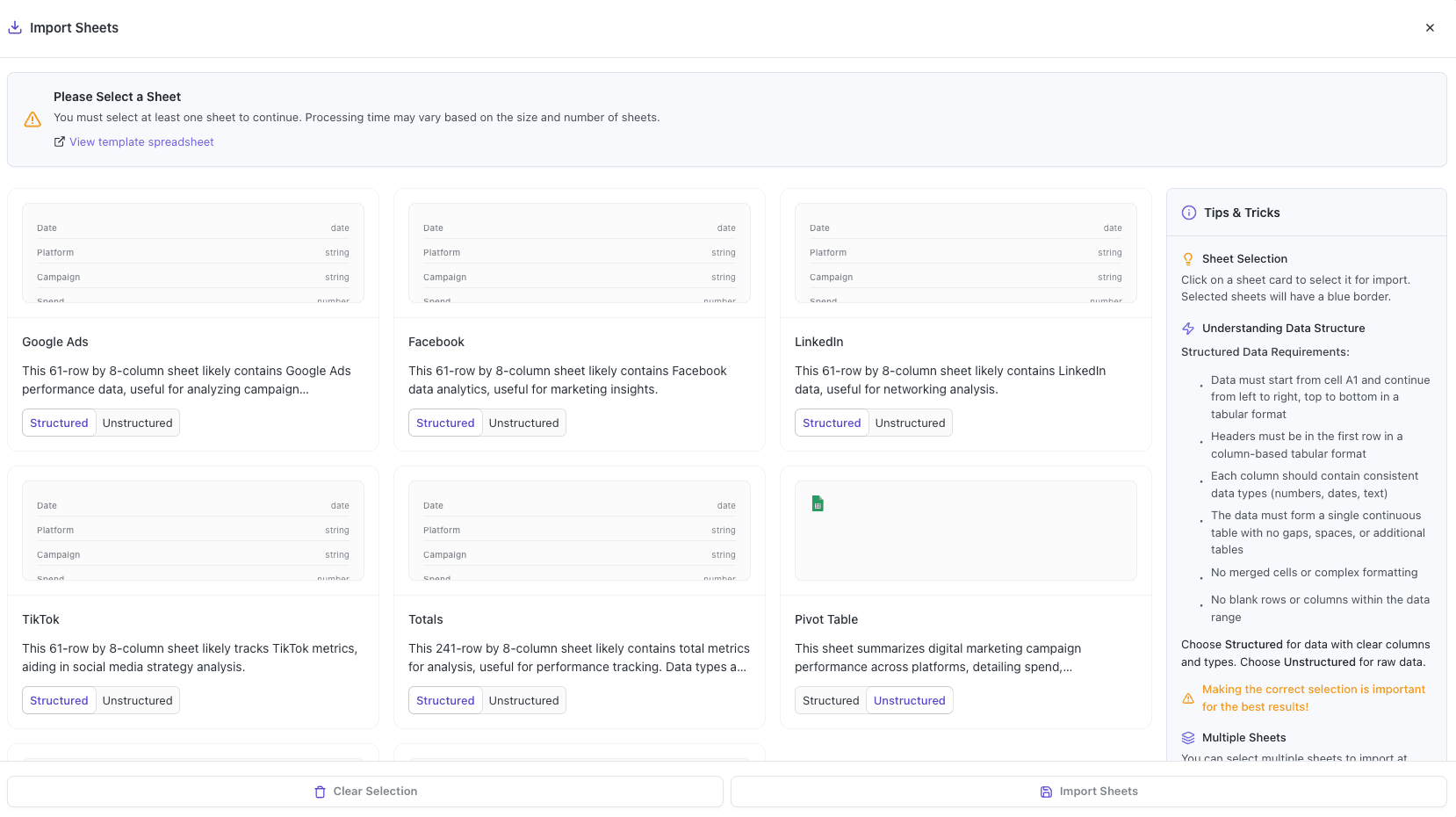
With Datapad's Google Sheets integration, you can:
-
Connect any Google Sheet with just a few clicks—no coding required
-
Watch as your dashboards update automatically when your spreadsheet changes
-
Visualize complex data in ways Google Sheets alone simply can't handle
-
Create beautiful, presentation-ready charts without fighting with formatting
Say goodbye to spreadsheet limitations and hello to data that works for you, not the other way around.
#2: AI-Driven Analysis
Ever wished you had a data analyst on call 24/7? With Datapad, you basically do. Skip the complex Excel formulas and simply ask questions in plain English like "What's our best-performing ad channel?" or "Show me last quarter's conversion trends." Datapad's AI instantly generates the perfect visualization to answer your question.
With Datapad's AI-powered analysis, you can:
-
Ask questions in everyday language and get immediate visual insights
-
Uncover hidden patterns and relationships in your data automatically
-
Focus on making decisions instead of fighting with chart settings
-
Transform complex data into clear, actionable intelligence in seconds
Your data has stories to tell—Datapad helps you hear them through simple conversation.
#3. Scheduled Reporting
End the monthly reporting grind forever. Datapad automatically delivers fresh insights straight to your inbox or Slack channel on your schedule. Set up your dashboard once and let automation take over—whether you need daily metrics, weekly performance snapshots, or monthly executive summaries. Choose from our library of ready-made templates to get started even faster with industry-specific KPIs and visualizations. Your team stays informed with zero manual effort, while you focus on acting on insights instead of creating reports. Perfect for agencies managing multiple clients or busy teams that need consistent data without the hassle.
Collaboration and KPI dashboards must go hand in hand, that’s how a company excels in KPIs tracking and setting strategic goals.
💭Food For Thought: We wanted to be innovative with our collaboration feature and thus spent hours brainstorming about how to make collaborations easy yet real-time.
So, here we are!
#4. Downloadable Reports
Sharing insights with your team or stakeholders should be straightforward. With Datapad, you can download your reports in PDF or HTML format, making it easy to distribute them. Whether you need to attach a report to an email, share it on a project management tool, or print it for a meeting, Datapad has you covered. No more scrambling to capture screenshots or manually compiling data. Your reports are ready to be shared in a professional format at the click of a button.
#5. Web Search Feature
Sometimes, understanding your data requires context from the wider world. Datapad's Web Search feature allows you to pull in external data for sector benchmarks and trends, enriching your analysis. Whether you're comparing your sales figures to industry averages or looking for the latest market trends, Datapad can help you find the information you need. This feature ensures that your analysis is not just based on internal data but also informed by external factors, giving you a more comprehensive view of your performance.Make Your Excel Dashboards Look Stunning with Datapad.
Table of Key Features and Benefits
| Feature | Description | Benefit |
| Google Sheets Integration | Connects directly to Google Sheets for data analysis. | Seamless workflow, leverages existing data. |
| AI-Powered Analysis | Allows plain English queries, generates graphs and dashboards. | Reduces technical barriers, fast insights. |
| Dashboard and Report Creation | Supports bar graphs, line charts, pie charts, Gantt charts, etc. | Visualizes data effectively for decision-making. |
| Scheduling Reports | Delivers reports via email or Slack at scheduled intervals. | Keeps users informed without manual effort. |
| Download Options | Reports available in PDF or HTML format. | Easy sharing with stakeholders or teams. |
| Web Search Feature | Pulls external data for benchmarks and trends. | Enhances analysis with industry context. |
Datapad is a free kpi dashboard tool that allows you to connect data sources and keep track of all your metrics in one place. We claim that Datapad is the easiest kpi tool out there.
If you are keeping your dashboards on excel or sheets, you can use our integration to take all your data from spreadsheets and build stunning dashboards on Datapad.
Must-read Related Posts:
How to Create an Excel Dashboard in 2023 (Free Templates Included): Learn how to create dashboards in excel, drawbacks of using it and many more.
How to Make a Pie Chart in Google Sheets? [Secret of Creating Stunning Charts]: You will learn about how to make a stunning pie chart on sheets and also discover a better alternative for it
How to Make a Chart in Google Sheets: Easiest Method Explained Here: Find out about the easiest method of creating stunning charts on sheets.