
Some of the best executive dashboard software for visualizing your metrics and KPIs are Datapad, Klipfolio, Geckoboard, InetSoft, Qlik, GoodData, Sisense, Datapine, and Databox.
In this guide, you will find a detailed review of these executive dashboard software and find out the best software that serves your business needs and purpose.
But first, let’s understand what executive dashboard software is.
What Is Executive Dashboard Software?
A typical executive dashboard software is a key performance indicator tracking and dashboarding tool that enables c-suites to monitor trends and visualize overall business performance via charts and interactive visuals.
Simply put, the platform gives C-level executives a holistic view of overall business performance and the ability to gauge performance against set goals.
Executive dashboard software are mostly quick and lets you track KPIs on the go with minimal effort.
That’s because being an executive, you have a lot on your plate. You can’t spend time scratching your head around KPIs.
All you want is the broader details of business KPIs and not the nitty-gritty details.
Read more: Executive Reporting: A Guide You Have Been Waiting For [2022]
Importance of Executive Dashboard Software
As of today, the digital world is producing over 2.5 quintillion (yup, a real number) bytes of data every day - that's eighteen zeros, to be specific.
This means organizations hold a treasure trove of knowledge at their fingertips: a treasure, if harnessed the right way, has the power to offer a competitive advantage, spark innovation, and create ever-evolving and well-oiled business strategies.
An executive dashboard software will help you do just that.
It will empower you to collect, organize, and analyze crucial business metrics while allowing you to beat the competition with better data-driven decision-making.
Besides, executive dashboard software connects relevant data sources with your existing systems, such as accounting software, customer relationship management (CRM) programs, email networks, and in-built website analytics.
With the help of these connectors, the software centralizes your data in one place, empowering you to view your business performance at once without logging into different platforms and mixing up valuable insights.
But not all executive dashboard software are worth your attention and time. Here are a few factors that make some dashboard software stand out from the crowd.
Factors to Consider When Choosing the Best Executive Dashboard Software
#1. Is It Easy Enough for You to Set Up?
One of the most important factors to look for in an executive dashboard software is the ease of setup and learning curve.
As we said earlier, c-suites have a lot on their plate and can't spend much time tracking KPIs.
Who wants to wait for their team to set a dashboard up in a couple of days while you can set up the tool in 5 minutes and start tracking your metrics, right?
So when finalizing your executive dashboard software, see to it that you can create dashboards in minutes and that there’s less to no manual work required to pull data in from multiple data sources.
#2. Would It Give You Quick Access to Your Dashboards?
Being a part of the company's core management, you're expected to stay up-to-date with the company's performance. When you want a quick overview of a team’s performance, an executive dashboard will come in handy. But it will only be beneficial if you have quick access to your dashboard.
#3. On-the-Go Access?
It's a fact that the top executives of any organization have little freedom to be off the workplace, but that doesn't make them work less.
Since you're part of the decision-making committee, you must be able to track your business metrics from anywhere – from a beach 🏄♂️ in Bali to a comfy bathroom in your home.
To ensure you have access anytime and anywhere, look for software that offers mobile-friendly CX or a dedicated mobile app.
Now that you know what to look for in a typical executive dashboard software let's get through a list of the 9 best dashboard software for executives.
What Are the Best Executive Dashboard Software?
#1. Datapad

Datapad is a mobile-friendly KPI tracking and dashboarding software that allows executives to collect, monitor, and visualize crucial business KPIs via beautiful dashboards.
Who Is It For?
Datapad is best suited for executives. Do you know why?
For starters, it's a mobile-first app that lets you create dashboards in just 2 clicks. Apart from this, it has not many but all major data source integrations that let an executive track the broader KPIs in your company.
Here are the features that a c-suite can leverage and streamline the KPI tracking process.
Key Feature #1. Quick Access to Dashboards
Unlike other mobile-friendly dashboard software, Datapad is compatible with all known small-screen devices. It's designed to present pixel-perfect dashboards no matter how much data or visualization you add to it.
Moreover, its highly responsive mobile app and a gallery of pre-built charts and widgets lets you create dashboards quickly. All you have to do is tap it!
What’s more, with Datapad, you can search for a specific KPI from any dashboards you create and get insights in seconds. Here’s how:

Key Feature #2. Easy Set-up and Training
Datapad is a no-code executive dashboard software. This means that you neither need to hire a developer to set up the platform nor do you require any technical jargon or coding expertise.
You can download the Datapad app (available for Android and iOS), create your first executive dashboard, and quickly onboard your team members via email invites.
Moreover, with Datapad, you can easily connect to multiple data points through its one-click integrations to popular data sources like Google Sheets, Facebook Ads, Google Analytics, and more.
Key Feature #3. Real-Time Team Collaboration
With Datapad, you can start a conversation with your team by simply commenting under a KPI.
At the same time, your team is notified of your message via mobile phone alerts and push notifications in near real-time.
Similarly, your teammates can continue the discussion by replying to your comment. It's similar to the chat threads we use on Twitter.

Key Feature #4. Highly Customizable Dashboards
Last but not least, Datapad offers flexible customization options. You can easily customize every section of your dashboard with its intuitive drag-and-drop feature.
Besides, you get a gallery of pre-built data visualization elements such as charts, bar graphs, tables, and more.
You can also perform granular formatting like customizing fonts, colors, or text to give the dashboard your company's look and feel.
Pros and Cons
Pros
✅ Easy access to your dashboards
✅ Tool is designed specifically for executives to stay on top of their business
✅ Keep everything on your phone for instant access
✅ Set up alerts and push notifications to stay on top of your business
Cons
❌ No web version right now (coming soon)
❌ Not suitable for creating sophisticated dashboards
❌ Not many integrations right now, but many to come soon
#2. Klipfolio
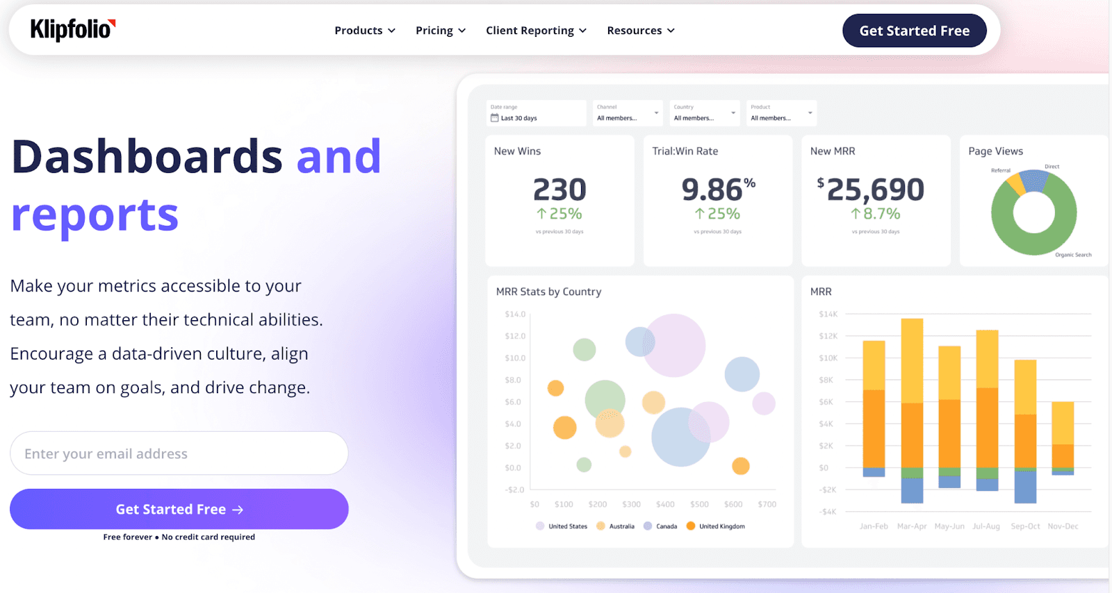
Klipfolio is a cloud-based business intelligence (BI) platform that assists businesses in making data-driven decisions. Klips, a product of Klipfolio, is a custom dashboard builder that lets you create interactive executive business dashboards from scratch.
Who Is It For?
Klipfolio serves over 50,000+ customers across the globe. It's a low-code platform with competitive pricing best suited for medium to large-size organizations.
Features
-
Use Integrations to 300+ data sources to pull in data or manually import data using REST/URL options, spreadsheets, or custom queries
-
Leverage Klip Editor to easily customize dashboards; choose from a pool of pre-built visual elements and custom themes to quickly create comprehensive dashboards
-
Comes with excel formulas that you can leverage with a click
-
Enable role-based management to control who can access business data; securely share dashboards via PDFs or published links
-
Create one-of-a-kind custom visualizations using HTML template components, inline CSS, or Javascript
Pros and Cons
Pros
✅ Great for creating an executive dashboard with multiple KPIs to track quickly
✅ Excellent number of integrations and data-import options
✅ Reliable custom support
Cons
❌ It's a low-code platform but requires some level of technical expertise
❌ Might get slow while creating sophisticated dashboards
#3. Geckoboard
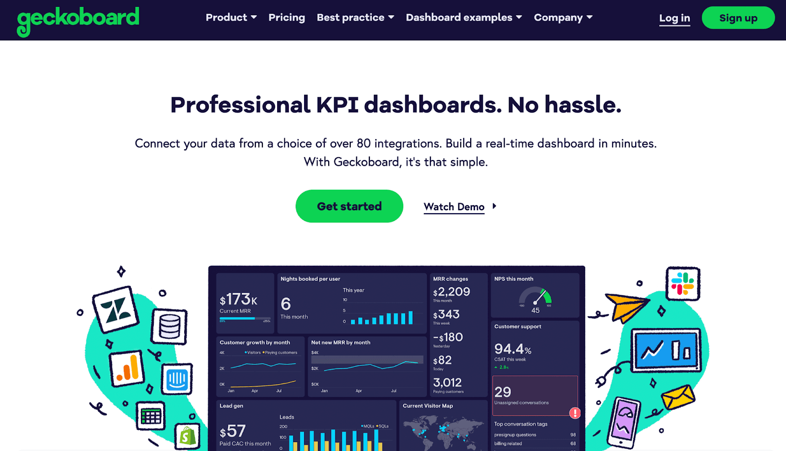
Professionalism is an important aspect to consider when creating executive-level dashboards, and Geckoboard does just that. It allows C-level executives to build professional KPI dashboards within minutes.
Who Is It For?
Geckoboard is an easy-to-use platform used by 1000s of organizations like Airbnb, Buzzsumo, and more. It also offers a free-forever plan, thus making it a suitable choice for c-suites who don’t want to spend on KPIs tracking just yet.
Features
-
Automatically connect data sets from over 80+ data points or manually import data using spreadsheets, databases, and custom APIs
-
In-built drag-and-drop editor to customize dashboards and easily place widgets such as status indicators, comparison charts, and more
-
Securely share live dashboards via smart links or schedule emails of dashboard snapshots to clients
-
Use the display-to-TV feature to broadcast live dashboards on office TV screens; control who can access, edit, or share dashboards
Pros and Cons
Pros
✅ Automatically refreshes your dashboard data in real-time
✅ Easy to configure and use
✅ Free plan included
Cons
❌ Lacks real-time alerts and notifications
❌ Scaling with the platform might cost you a fortune
#4. InetSoft
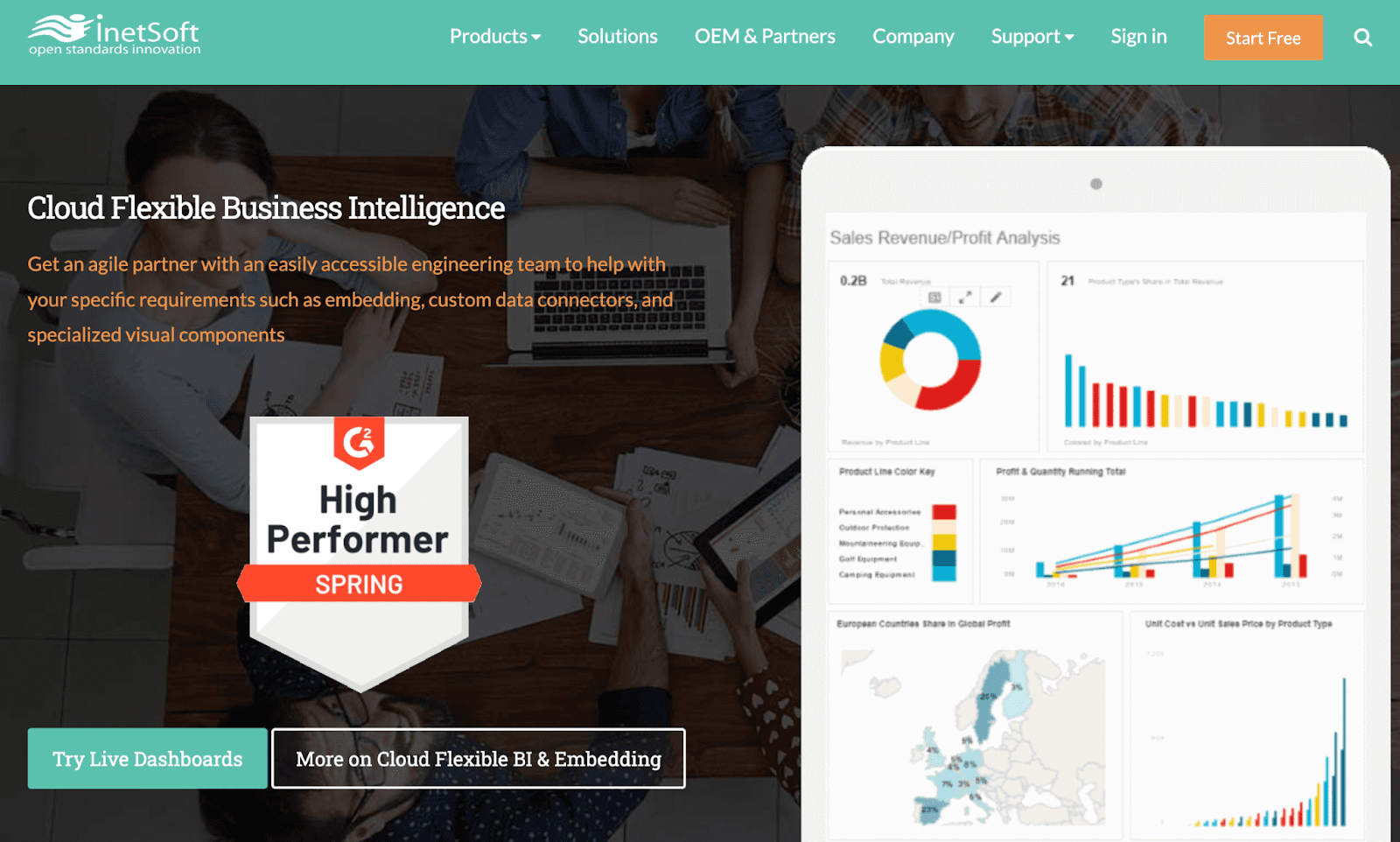
InetSoft is a leading big data analytics and dashboard reporting software that helps management executives collect, analyze, and visualize data using great-looking dashboards and reports.
Who Is It For?
InetSoft is best suited for large and midsized enterprises spanning all industries, plus OEMs offering Web-based solutions.
Features
-
Use the in-built ML engine and data mashup technology to easily blend data from multiple sources and uncover hidden insights
-
Has an extensive library of interactive visualizations and pre-built dashboard templates to quickly create executive dashboards from scratch
-
Use in-built features such as data streaming, pagination, and searching to find specific KPIs or quickly jump to relevant pages on reports
Pros and Cons
Pros
✅ Easy to setup and use
✅ Great for creating sophisticated dashboards
✅ Excellent customer support service
Cons
❌ Requires know-how in JavaScript and SQL
❌ Altering data sources might take time
#5. GoodData
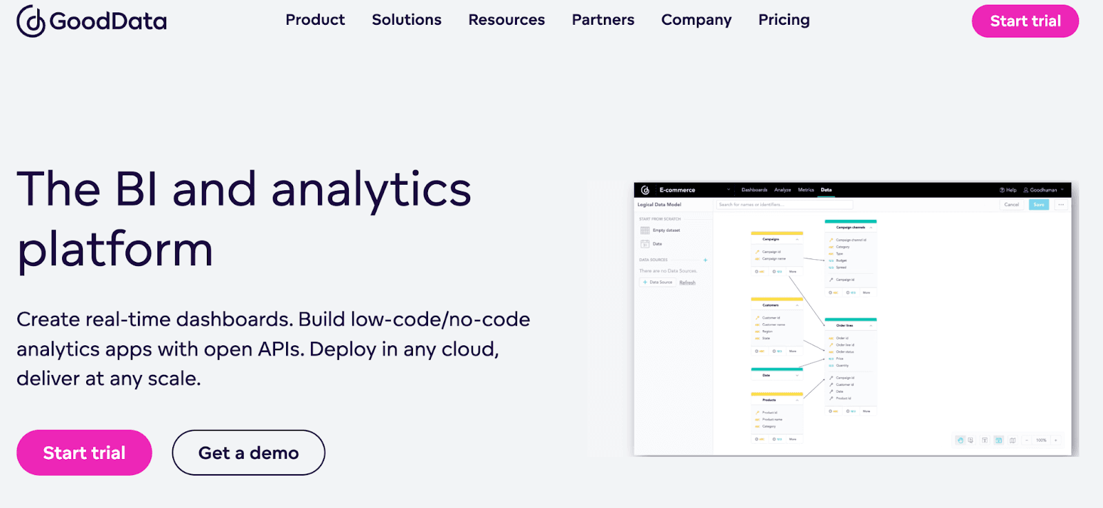
GoodData is a low-code BI and analytics platform that gives decision-makers access to real-time executive dashboards and reports, empowering them to make better data-driven decisions.
Who Is It For?
Over 140,000+ companies trust GoodData’s analytics and data visualization services globally. Its developer-friendly and low-code capabilities make it a popular choice among developers and tech geeks.
Features
-
Easily integrate the platform with your existing infrastructure via APIs or open-source SDKs; connect to data warehouses such as Snowflake, Vertices, and more
-
Use its intuitive drag-and-drop designer to easily create interactive real-time dashboards
-
Leverage multi-tenancy architecture to share the same data model, key metrics, and dashboard layout among separate teams
-
Use dashboard plugins to develop and integrate custom code, charts, or contents into dashboard components - suited for developers and coders
Pros and Cons
Pros
✅ Has an automatic data import function
✅ Allows you to embed analytics into the app
✅ Reliable customer support
Cons
❌ Requires basic coding knowledge
❌ Not a 100% self-service platform
#6. Sisense
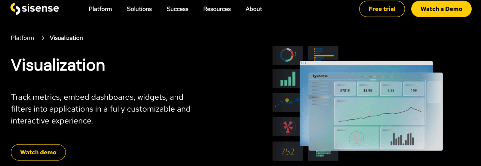
Sisense is an API-first business analytics and dashboard platform that helps anyone visualize data and act on it. Moreover, its plug-and-play connectors allow users to import data to the dashboard easily.
Who Is It For?
Sisense caters to top global companies, including Skullcandy, Air Canada, Philips, ZoomInfo, and more. It's a tremendous executive dashboard software for SaaS, health care, and finance industries.
Features
-
Leverage 100+ live-data connectors to get most of your data from any platform or data warehouses
-
Use Elasticube to quickly merge, manipulate, or query the data from multiple data sources
-
Create custom dashboards using the drag-and-drop interface; choose from a gallery of visual elements and widgets to quickly create dashboards
-
Generate automatic PDF reports and easily share dashboards via URLs and emails
-
Build app-like functionalities using the platform's robust API and SDK capabilities
Pros and Cons
Pros
✅ Allows data mashup for a holistic view
✅ The platform is flexible and scalable
Cons
❌ Doesn't let you change the dashboard font
#7. Qlik Sense
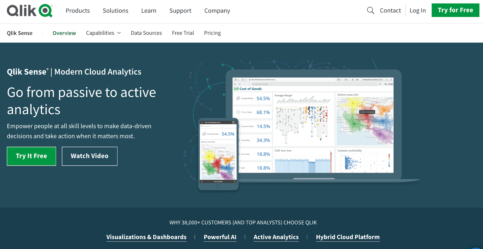
Qlik Sense is a data visualization and discovery software that empowers executives to create flexible, interactive dashboards, generate actionable insights, and make confident business decisions.
Who Is It For?
Qlik has over 38,000+ customers, including c-level executives. Its best use cases are from SaaS enterprises, e-commerce businesses, and IT companies with complex business operations.
Features
-
Leverage the insight-advisor tool to auto-generate insights, get charting recommendations and perform data mashups
-
Use its application automation technology to automate workflow, streamline tasks, and trigger event-driven actions
-
Enjoy complete data governance with an in-built Data Catalog that helps to find the right data within seconds and know its origin and journey
Pros and Cons
Pros
✅ Offers smart analytics like Insight advisor and Advanced Calculations
✅ Allows custom application development
✅ Complete data governance and authority
Cons
❌ Not compatible with small screen devices
❌ Frequent bugs and glitches in operating Qlik Engine
#8. Datapine
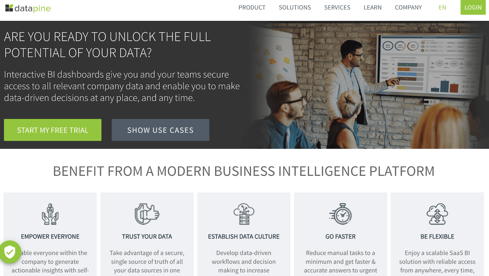
Datapine is a cloud-based BI and dashboard platform that helps executives create intercity BI dashboards and make better data-driven decisions.
Who Is It For?
Datapine is a diversified software that can blend into your business requirements. However, considering its feature-rich interface, it's an excellent tool for execs to skim through KPIs quickly and efficiently.
Features
-
Over 50+ fast and easy-to-use connectors allow seamless data inflow to the dashboard
-
Leverage self-service analytics to blend data sources, run-cross database queries, and perform predictive analysis
-
Over 80+ pre-built dashboard templates and 25+ chart types to ease your dashboard creation process
-
In-built drag-and-drop editor to quickly customize templates or create custom dashboards from scratch
Pros and Cons
Pros
✅ Excellent data governance and security features
✅ Has cross-device accessibility
✅ In-built white-label feature included with paid plans
Cons
❌ Has a steep learning curve due to multiple features
#9. Databox
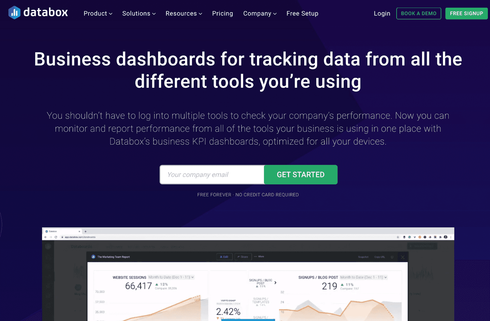
Databox is a leading business analytics and dashboarding platform that eliminates the guesswork from the book and allows you to monitor trends and discover insights with the help of interactive dashboards and reports.
Who Is It For?
Over 20,000+ customers, including top executives, leverage Databox for their dashboarding needs. Also, the platform is great for startups requiring too many integrations and custom connectors.
Features
-
Over 70+ native integrations and a robust set of custom APIs and connectors to securely pull in data to dashboards
-
Intuitive no-code dashboard designer tool to customize dashboard templates or create custom dashboards from scratch
-
Comes with 200+ pre-built templates, hundreds of configured data blocks, and thousands of default metrics
-
Set up custom alerts and push notifications for changes in KPI trends; share white-label reports and dashboards on custom domains or via custom email
Pros and Cons
Pros
✅ Excellent number of native integrations
✅ Share dashboards on TV screens (popular among executives)
✅ Offers free-forever plan
Cons
❌ Has limited time frames for viewing historical data (depends on the plan)
❌ Limited customization options
Have All Your Dashboards In Your Pocket For Free with Datapad
From what we have on our list, any C-level executive can easily prepare their first dashboard from scratch.
However, if you prefer mobile phones rather than desktops to track KPIs and measure performance, we know of a software that caters to your needs - Datapad.
Datapad is a mobile-friendly KPI tracking and executive dashboard software that helps hustling business experts and professionals keep track of their business performance on the go.
Why sit and stare at your dashboard when you can access them anytime and anywhere from your smartphone? 🤷♂️
Want to experience the first-ever mobile-only executive dashboard software? Scan the QR code below and download the app today!
